Top Signs Your 2D Maps Aren’t Clearly Communicating Surface & Subsurface Data
When you’re sharing surface and subsurface data with stakeholders, your main objective is simple: make the information easy to understand so everyone can make informed decisions. But if you’re still leaning heavily on 2D maps to do that, your visuals might not be helping you achieve your primary goal.
Why 2D Maps Don’t Always Work
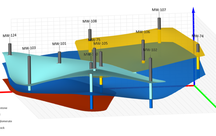
A flat map can’t always capture a complex, multi-layered reality. It may show the surface just fine, but the moment you need to illustrate how subsurface features interact—like contamination migrating through multiple geological layers—2D maps can come up short. Tactics such as layering everything onto one map or splitting a visualization into several simpler ones can lead to complicated, over-loaded visuals. The result? Stakeholders who struggle to understand key data points to make informed decisions.
Key Signs Your Stakeholders Aren’t Getting the Full Picture
So how can you know your 2D maps of the surface and subsurface aren’t giving stakeholders the understanding they need to make the best decisions? Typically, there are four clear signs that appear when sharing your visualization.
You’re Constantly Fielding Follow-Up Questions
If you regularly have to explain what your map is showing, or find yourself answering the same questions about a particular map, it’s a strong sign stakeholders aren’t understanding your visual. This often happens when important features—like contamination plumes or drillhole paths—are flattened on a map. Without those key details in clear view, your audience is left guessing, asking for clarification, and struggling to grasp the full picture.
It’s Difficult to Build Support for Your Recommendation
If your proposed solution isn’t getting traction, the problem might not be the idea but the way it’s being presented. A 2D map might show the surface-level issue just fine, but if the root cause lies underground and isn’t clearly visualized, stakeholders may not understand why your solution is necessary. When the risk or urgency isn’t obvious, buy-in becomes harder to secure.
Project Funding Hits a Wall
If budget approvals keep getting stalled or denied, ask yourself: is the “why” behind your request visually obvious? With only a flat map to work from, stakeholders might have to mentally piece together the information themselves, which can lead to doubt, hesitation, or outright rejection for funding another project. A visualization that fails to show the full extent of a problem or opportunity rarely inspires investment.
The Wrong Decisions Get Greenlit
Sometimes the most telling sign your map isn’t understandable is when stakeholders confidently move in the wrong direction. If your 2D visualization didn’t highlight the scope or scale of the issue or opportunity clearly, decision-makers may approve a course of action that doesn’t fully address the situation.
2D May Not Work, But 3D Can
When it comes to communicating both surface and subsurface data, 2D maps aren’t usually the right option. If your stakeholders are constantly confused, hesitant to act, unwilling to fund solutions, or making decisions that don’t align with the reality in your data, it’s a sign that the flat map may not be effective.
Fortunately, there is a solution: creating 3D models. These types of visualizations equip you to communicate complex spatial relationships in a way that stakeholders can understand and use to make informed decisions. Curious to learn how? Download our free guide, Why 2D Isn’t Enough: The Cost of Overlooking 3D in Geoscience & Engineering.