- Jun 17, 2026|Gabbie Rhodes|8 min read
Both work and family require energy and intentionality. To ensure you approach them effectively, discover tips to balance work and family life.

About Golden Software
Since 1983, Golden Software has been at the forefront of scientific data visualization.
Today, we empower professionals to solve real-world problems by transforming complex data into clear, impactful visual stories through our industry-leading software and legendary customer support.
Surfer – Create an Immersive 2D/3D Model in Under 2 Minutes!
Grapher – If You Can Imagine It, You Can Graph It!
- Jun 17, 2026|Gabbie Rhodes|11 min
Senior Technical Sales Specialist Drew Dudley hosted a webinar to provide tips for ensuring coordinate systems display accurately and consistently.
- Jun 10, 2026|Gabbie Rhodes|9 min
During peak season, it’s hard to complete high-quality work on time. Fortunately, some practical workplace productivity hacks can help.
- Jun 10, 2026|Gabbie Rhodes|5 min
When it comes to software, the right licensing model matters. A one-time fee and subscription are common options. Which is right for you?
- Jun 3, 2026|Gabbie Rhodes|9 min
What's the difference between these two 3D data visualizations: 3D View and 3D surface maps? Discover their top differentiators.
- Jun 3, 2026|Gabbie Rhodes|8 min
Hiring a skilled geoscientist or engineer is the first step to strengthening your team. The next is training new employees for success.
- May 27, 2026|Gabbie Rhodes|5 min
Dennis Seger has played a key role at Golden Software, and our team took time to celebrate his leadership legacy as he steps into retirement.
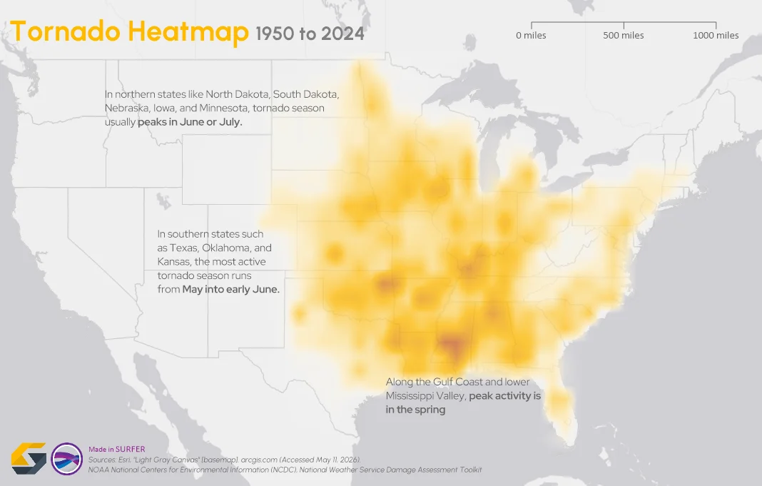
- May 20, 2026|Gabbie Rhodes|14 min
To truly answer the question, "what damage can a tornado cause," the first step is analyzing broader patterns across communities and landscapes.
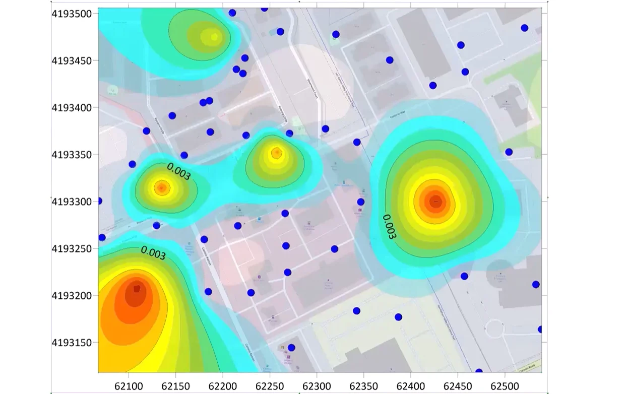
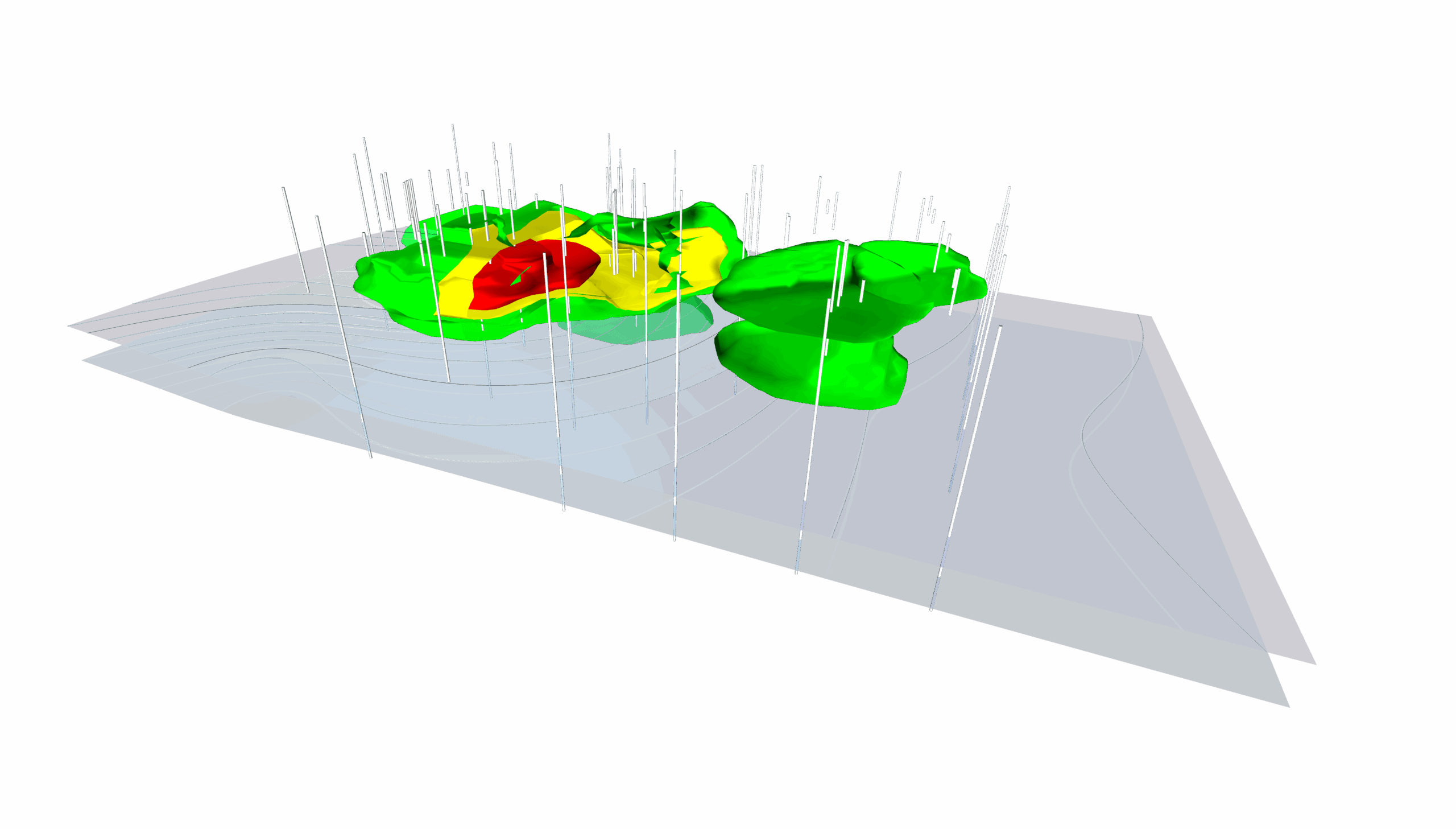
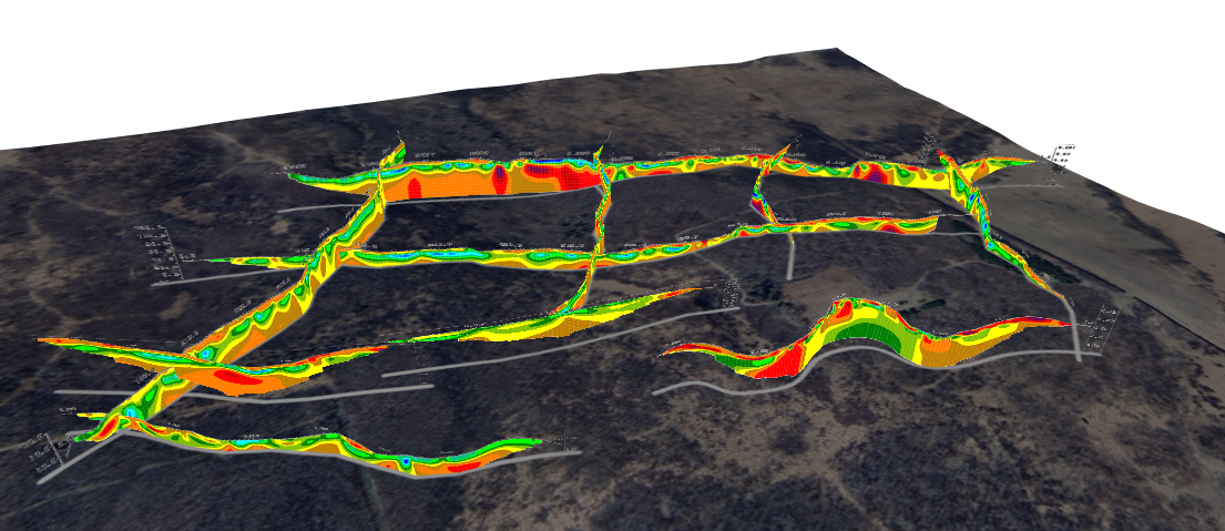
- May 20, 2026|Gabbie Rhodes|7 min
The gap between analysis and true spatial understanding has real consequences in subsurface mapping. 3D modeling closes that gap.
- May 14, 2026|Gabbie Rhodes|10 min
Should you create a grouped, stacked, or a simple bar chart? The structure you choose matters. Discover bar chart examples to guide your choice.
- May 14, 2026|Gabbie Rhodes|7 min
Discover how a scientific bar chart translates technical datasets into structured, understandable insights for stakeholders.
- May 5, 2026|Gabbie Rhodes|9 min
Geoscience and engineering projects rarely live inside a single software. Learn how CAD integration with other tools can achieve project results.
- Apr 29, 2026|Gabbie Rhodes|10 min
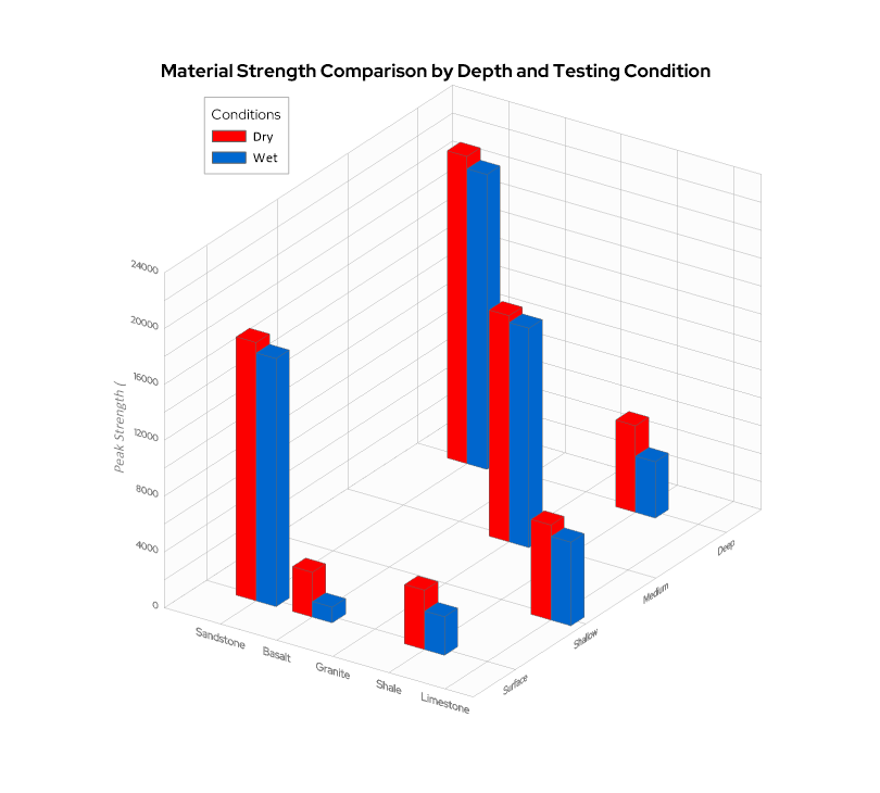
When you’re working with three variables that interact with one another—a 3D bar chart can reveal patterns that a flat chart can’t fully capture.