101 Guide to a Piper Plot: Its Purpose, Benefits, Use Cases, and How to Create & Recreate One With Ease
When you’re building a specialized graph like a piper plot, two challenges typically stand in your way. First, there’s the learning curve of creating the plot in a new tool. Even if the software is user-friendly, you still have to figure out how to locate the right plot type, format your data, assign axes, and customize the layout. Eventually, you figure it out—and the result is worth it. You now have a professional, story-driven visualization that clearly communicates your water chemistry data.
But then a few months pass, and you need to create another piper plot. The structure is the same—the only difference is the dataset. That’s when you hit the second challenge: remembering what you did the first time. Which data columns did you assign? What custom color settings did you apply? What background zones did you use to show water classifications?
This blog is here to help you overcome both problems. In this second installment of our Specialized Graphs blog series, we’ll walk through what makes piper plots so powerful and how you can use a ready-made template to create and recreate them with ease.
What Is a Piper Plot?
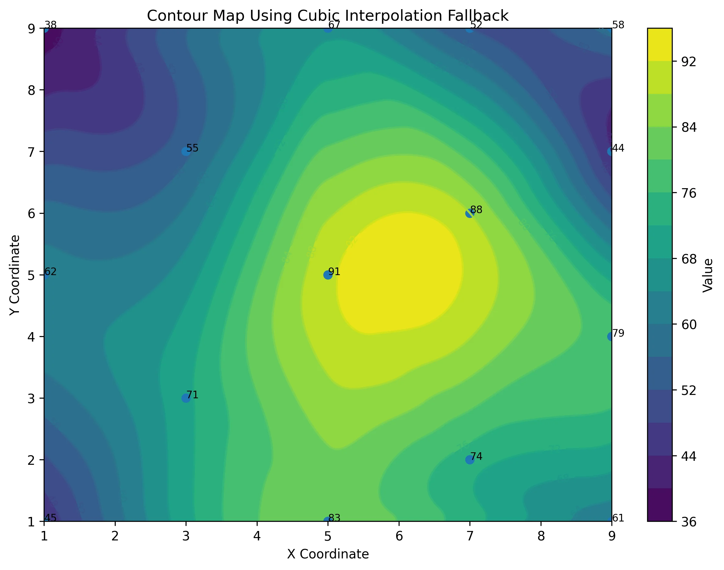
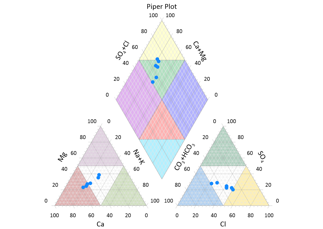
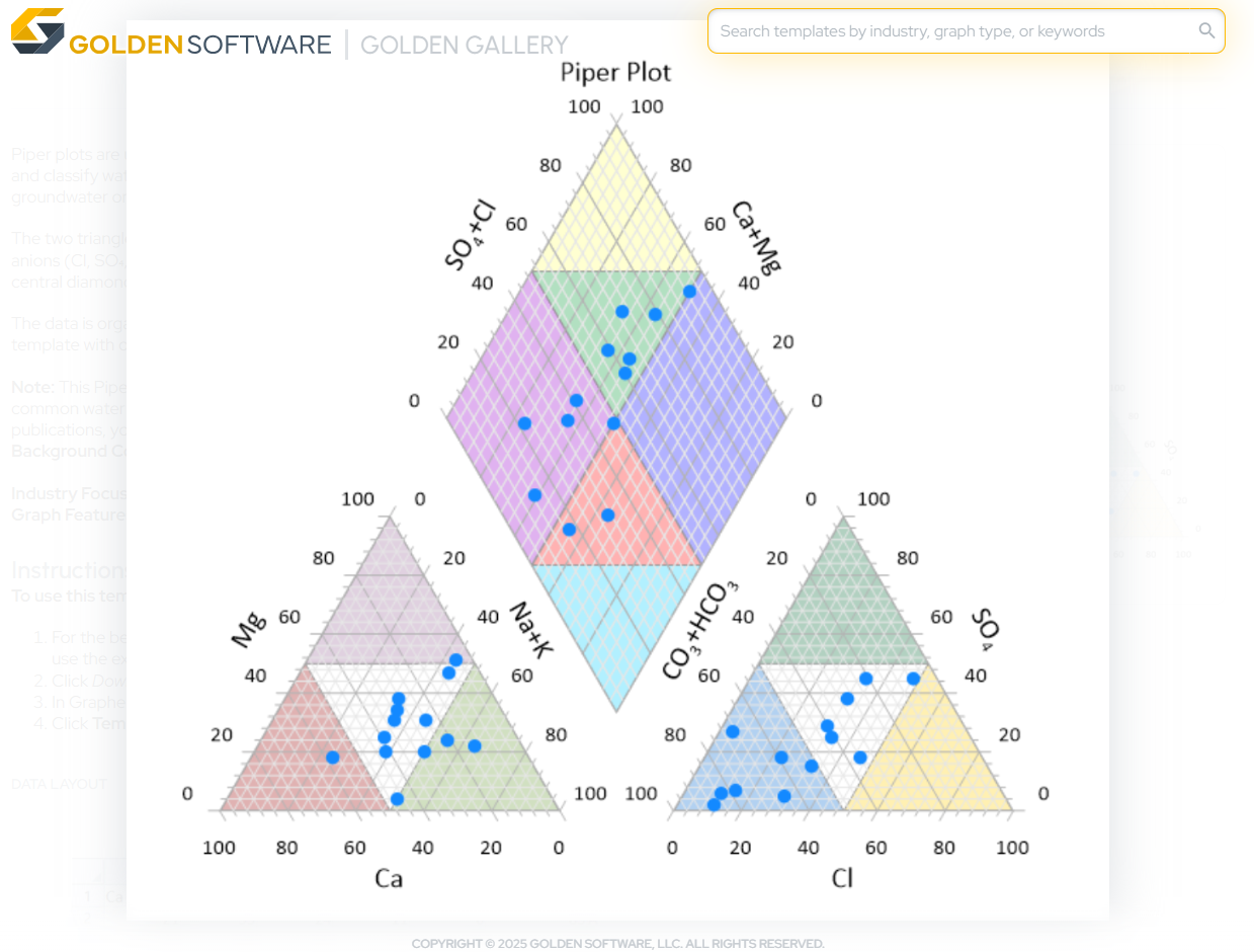
Let’s start with the basics. A piper plot is a specialized trilinear diagram used to graphically represent the chemistry of water samples. It includes two triangle plots—one for cations (positively charged ions like calcium, magnesium, sodium, and potassium) and one for anions (negatively charged ions like chloride, sulfate, and bicarbonate).
The positions from these two triangle plots are then projected into a central diamond-shaped field to show overall water composition. The result? A single, compact visualization that tells a rich story about your water sample’s ionic makeup, chemistry type, and spatial or temporal patterns.
The Benefits of a Piper Plot
Piper plots aren’t just specialized graphs; they’re incredibly informative. In fact, here are just six powerful reasons why they remain a go-to choice for hydrogeologists, environmental scientists, and water quality professionals.
1. Visualize Multiple Ions at Once
You can plot all major cations and anions in a single figure without juggling multiple charts. Both the left and right triangles give a clear picture of relative concentrations, while the central diamond ties it all together.
Why it matters: You can get a full view of water chemistry in a single glance, rather than piecing it together across separate visuals.
2. Easily Classify Water Types
The central diamond helps you quickly identify the hydrochemical facies, essentially classifying the type of water based on dominant ions.
Why it matters: Water type classification is critical for distinguishing sources, identifying contamination, and tracking changes over time.
3. Compare Multiple Samples Side-by-Side
With piper plots, you can visualize and compare multiple water samples in one figure. That makes spotting clusters, anomalies, or changes over time a breeze.
Why it matters: Whether managing regional datasets or examining one source over time, piper plots are excellent for comparative analysis.
4. Analyze Temporal and Spatial Trends
Piper plots equip you to see how chemistry shifts from one location to another or how it evolves over time.
Why it matters: Detecting geochemical trends can help guide remediation efforts, assess pollution, and inform long-term water resource planning.
5. Scientifically and Regulatorily Recognized
These plots are a standard tool in hydrogeology and are widely used and accepted by scientists, consultants, and regulators.
Why it matters: Using a piper plot adds credibility to your work and speeds up communication with stakeholders who already recognize the format.
6. Compact but Information-Dense
Despite their size, piper plots deliver a wealth of information. You get ionic distribution, dominant ion types, and sample relationships all in a single diagram.
Why it matters: These visualizations are perfect for tight report layouts, presentations, or publications where clarity and space are key.
When Might You Need to Recreate a Piper Plot?
Because piper plots are so valuable, it’s no surprise they can become a regular part of your workflow. But when the time comes to recreate one, things can quickly get frustrating as you try to remember all the steps you took to design the first visual. Here are just a few real-world examples of when you might experience that frustration first-hand as a result of needing to recreate a piper plot.
1. Ongoing Monitoring
You’ve been tracking groundwater chemistry at a landfill site for years. A new round of samples just came in, and you need to update the existing plot to reflect current conditions.
2. New Site Analysis
A new client needs a baseline hydrogeochemical assessment for a proposed industrial site. You prefer to use the same format as another project because it was visually effective and regulator-approved.
3. Temporal Trend Reporting
You’re preparing an annual report showing seasonal changes in water chemistry across several wells. You want to use the same piper plot layout as last year—just with updated data.
Templates Provide an Easier Way to Create and Recreate Piper Plots
Whether you’re making your first piper plot or recreating one for a new dataset, you don’t have to stumble through a learning curve to build from scratch or retrace your steps when recreating what you’ve designed before. Instead, you can use the Piper Plot Template available in the Golden Gallery.
A brand new feature that helps kickstart your workflow, the Golden Gallery is a curated library of templates. It offers fully customizable, publication-ready graph templates—each one designed for getting results with clarity, speed, and precision. The curated library includes a Piper Plot Template that makes it easy for you to create and recreate this specialized graph for projects.
Tech Tip: Benefits of Using the Piper Plot Template
To put the benefits of using a template into perspective, here are some of the ways the Piper Plot Template helps you create and recreate with more ease:
- Save Hours of Manual Work: Skip the process of updating data references one by one to get the data visualization you want. Instead, just download the Piper Plot Template and populate it with your new dataset.
- Instantly Classify Water Types: The template includes colored background segments that help you identify common water chemistry types at a glance—perfect for sharing results with stakeholders or analyzing your data.
- No Guesswork Required: Each template includes data format guidance, so you’ll know exactly how to structure your dataset for a perfect fit.
- Fully Customizable: Need to tweak the layout, colors, or labels? You still have full control after loading your data so your piper plot reflects exactly what you need it to.
- Easy for Colleagues to Use: If you want a team member to generate a new piper plot using your aesthetics and specifications, they’ll have a good foundation to easily build on. With the template, the workflow is simple for them to adapt with their own data.
Create and Recreate Smarter, Not Harder
Piper plots are powerful, precise tools for analyzing and presenting complex water chemistry. Whether you’re creating one for the first time or recreating it with fresh data, your process should be just as efficient as the insight the plot delivers.
With the Piper Plot Template in the Golden Gallery, you can skip the learning curves and stop struggling to retrace your steps. Instead, you can get consistent, publication-ready visuals in a fraction of the time and with zero frustration. So the next time you need to create or recreate a piper plot, don’t start from scratch. Start smart—with a template that does the heavy lifting for you.
Ready to use the Piper Plot Template to recreate this specialized graph? Access the Golden Gallery to download the template!
Recent Articles
- Jun 23, 2026|Gabbie Rhodes|10 min
Ever stop and wonder: does AI make mistakes? Before you start using AI tools to create your maps, discover the answer to this key question.
- Jun 23, 2026|Gabbie Rhodes|7 min
What contributions are women making in STEM? Discover eight examples of women in STEM fields and the meaningful impact they’re making.
- Jun 17, 2026|Gabbie Rhodes|8 min
Both work and family require energy and intentionality. To ensure you approach them effectively, discover tips to balance work and family life.
- Jun 17, 2026|Gabbie Rhodes|11 min
Senior Technical Sales Specialist Drew Dudley hosted a webinar to provide tips for ensuring coordinate systems display accurately and consistently.