101 Guide to a Ternary Class Scatter Plot: Its Purpose, Benefits, Use Cases, and the Best Way to Create & Recreate One Quickly
Creating a ternary class scatter plot can be incredibly rewarding—once you’ve figured it out. But getting to that point isn’t always straightforward. Like many specialized graphs, building your first ternary plot in a new data visualization software comes with a learning curve. Even when the software is user-friendly, you still have to go through a process of figuring out where the plot exists, how to format your data, and how to apply your customizations.
Once you’ve worked through all that, the result is worth the effort: a clear, compelling visual that communicates your data effectively. But what happens when you need to make another ternary class scatter plot down the line? One that’s just like the first—only with updated or new data? That’s when you run into a different challenge: remembering everything you did to create the first one. In this case, you might spend more time retracing your steps, re-assigning data columns, re-checking properties, and reapplying aesthetic tweaks than you do actually interpreting your data.
Fortunately, this blog post can help you avoid all those problems. In this fifth installment of our Specialized Graphs blog series, we’ll walk through all the things you need to know about ternary class scatter plots and explain how you can use a ready-made template to create and recreate them with confidence—no learning curve or no guesswork required.
What Is a Ternary Class Scatter Plot?
Let’s start with the basics. A ternary class scatter plot is a variation of a ternary plot, a Trilinear graph used to represent the relative proportions of three components. Those three components have proportions that are expressed relative to a fixed total—often normalized to 100%. In a ternary class scatter plot, each data point is classified into a group or category and color-coded accordingly. The result is a powerful visual that not only shows the composition of individual samples but also how different sample groups cluster or trend across the compositional space.
If you’re in geology, geochemistry, petrology, mineralogy and sedimentology, or environmental science, you may find yourself regularly creating these plots to analyze:
- Phase diagrams and stability fields
- Igneous and metamorphic classifications
- Sediment compositions
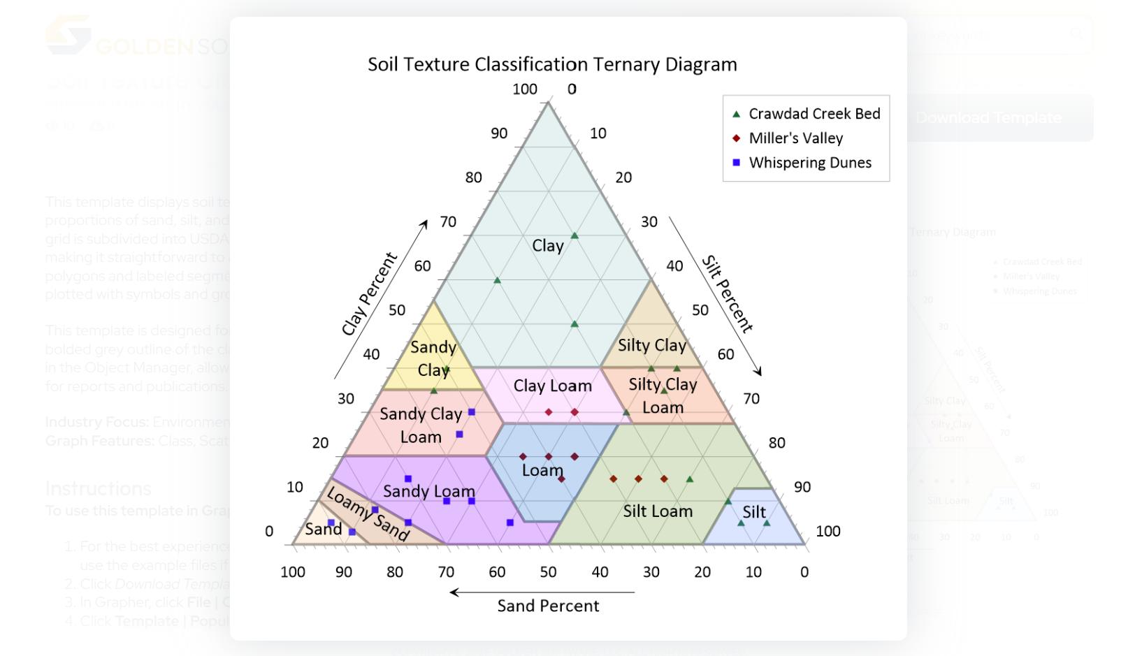
- Soil textures
- Mineralogical compositions
- Major oxides or isotopic compositions
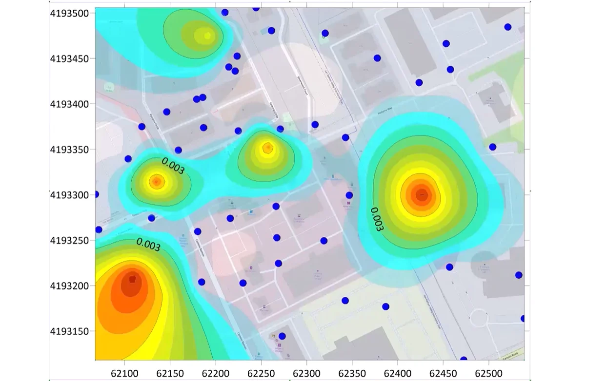
For example, if you’re analyzing sediment samples from a river delta, a ternary class scatter plot lets you visualize the sand-silt-clay ratios in each sample and classify them by location, depositional environment, or even contamination level—all neatly organized with color-coded clarity.
The Benefits of a Ternary Class Scatter Plot
Using a ternary class scatter plot to relay insights to stakeholders comes with multiple benefits. To bring that point home, here are four major advantages this specialized graph offers.
1. Rich Multivariate Insights
Instead of analyzing three variables in isolation, you get a comprehensive view of how they interact, which is ideal for understanding chemical mixtures, soil textures, or material compositions.
2. Clear Classification and Comparison
Classified groups make it easy to distinguish between different regions or sample types, equipping you for faster interpretation and more meaningful insights.
3. Pattern Recognition
You can quickly identify clusters, trends, and outliers, making it easier to spot groupings or transitions between sample classes.
4. Visual Storytelling
The triangle format is very conventional and highly effective. It presents complex data in a way that’s immediately digestible, which is perfect for reports, presentations, or client communication.
When You’d Need to Recreate a Ternary Class Scatter Plot
Because of its benefits, you may find yourself creating a ternary class scatter plot once—and then again and again for different projects. This specialized graph could easily become a staple in your workflow, depending on your field. Here are just a few real-world examples where you may find yourself recreating it.
Comparing Seasonal Changes in Soil Composition
You’re monitoring agricultural soil quality over multiple seasons. You’ve already created a ternary class scatter plot showing the sand-silt-clay ratios for spring samples. Now, summer data is in, and you want to generate the exact same plot structure, only with updated values. Rather than starting over, you use the previous project file to recreate the plot and maintain consistency across seasons.
Updating a Dataset for Regulatory Reporting
You’re a geochemist preparing a report for an environmental agency. You’ve plotted contaminant proportions across various sites using a ternary class scatter plot. A new round of sampling data comes in, and you need to recreate the graph with the latest results, keeping the color coding, axis ranges, and layout exactly the same for comparability.
Sharing a Plotting Workflow With a Teammate
You’ve created a ternary class scatter plot that perfectly represents your field samples—but now a colleague needs to make one for their own dataset using the same plot style. They’re not familiar with your visualization software, and you don’t have time to walk them through your workflow from scratch. To remedy the issue, you share your plot with them so they have a better starting point when recreating the visual using their own data.
The Best Way to Create and Recreate a Ternary Class Scatter Plot: Use the Ternary Plot Templates
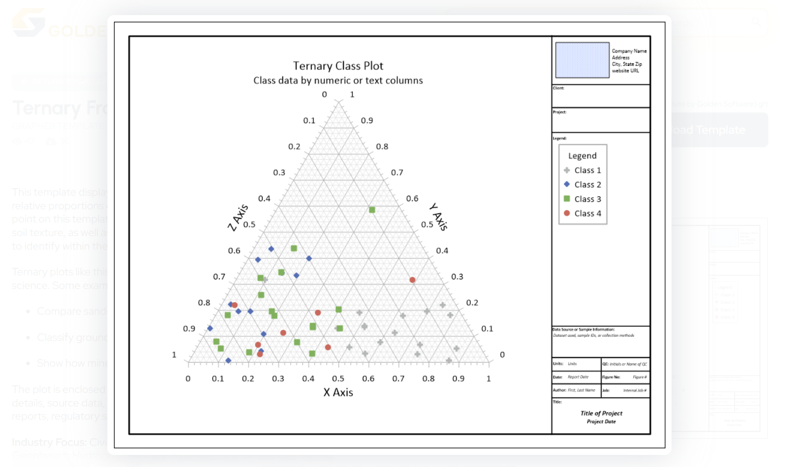
Whether you’re building a ternary class scatter plot for the first time or recreating one with new data, you don’t have to start from an inadequate state. Instead, you can skip the learning curve with the creation process and overcome the tedious recreation workflow by using the Ternary Frame Template or the Soil Texture Classification Ternary Diagram Template in the Golden Gallery, a curated library with dozens of scientific templates designed for precision, clarity, and speed.
Explore the Ternary Frame Template →
Explore the Soil Texture Classification Ternary Template →
Discover how to use templates from the Golden Gallery →
These templates give you a professionally designed starting point for your ternary class scatter plot. They also include formatting guidance and the flexibility to assign and reassign your own data columns, equipping you to jumpstart your workflow with ease.
Tech Tip: Why Templates Are a Game-Changer
A template makes a significant difference in your workflow. It has the power to take the time-consuming parts of your visualization process and transform them into smooth aspects you tackle with ease. How? Its benefits are varied. Here are just a few you can expect to notice.
- No Learning Curve: When you use a template like the Ternary Frame or Soil Texture Classification Ternary Diagram, you don’t have to figure out where the plot type lives or how to structure your data from scratch. The layout is already there—just import your data and go.
- Efficient Recreation Process: When it’s time to update or replicate your ternary class scatter plot, you don’t need to remember every little nuance from last time. Just reload the template, swap the dataset, and your plot is good to go.
- No Guesswork Required: Each template in the Golden Gallery includes guidance on how to format your data so that it works seamlessly with the plot structure. No trial and error required.
- Fully Customizable: Need to change the labels, update the colors, or tweak the scale? You can do that. Templates give you a strong visual foundation while still offering full control over every detail.
- Easy for Colleagues to Use: If a teammate needs to pick up where you left off, they won’t be guessing. The template provides a consistent structure and workflow that’s simple to adapt to their own dataset.
Create With Confidence. Recreate Without the Headache.
Ternary class scatter plots are powerful tools for visualizing compositional data, but creating and recreating them well doesn’t have to be a repeated challenge. Whether you’re making one for the first time or remaking it with updated data, the process should be smooth.
That’s why we recommend using the Ternary Frame Template or Soil Texture Classification Ternary Diagram Template in the Golden Gallery. With them, you’ll bypass the learning curve, eliminate the guesswork, and deliver clear, compelling visuals every time.
Ready to give it a try? Download the Ternary Frame Template or the Soil Texture Classification Ternary Diagram Template in the Golden Gallery!
Recent Articles
- Jun 17, 2026|Gabbie Rhodes|8 min
Both work and family require energy and intentionality. To ensure you approach them effectively, discover tips to balance work and family life.
- Jun 17, 2026|Gabbie Rhodes|11 min
Senior Technical Sales Specialist Drew Dudley hosted a webinar to provide tips for ensuring coordinate systems display accurately and consistently.
- Jun 10, 2026|Gabbie Rhodes|9 min
During peak season, it’s hard to complete high-quality work on time. Fortunately, some practical workplace productivity hacks can help.
- Jun 10, 2026|Gabbie Rhodes|5 min
When it comes to software, the right licensing model matters. A one-time fee and subscription are common options. Which is right for you?