A Look at the Flat-Headed Peccaries’ Extinction
Today, the collared peccary (Pecari tajacu), also known as the javelina, is the only species of peccary still living in the United States. But rewind about 12,000 years to the Late Pleistocene, and North America was home to three different peccary taxa: the collared peccary, the long-nosed peccary (Mylohyus nasutus), and the flat-headed peccary (Platygonus compressus).
Of the three types, the flat-headed peccary was by far the most common, with fossils found across much of the U.S.—particularly south of the regions once covered by the Wisconsinan ice sheet and east of the Rocky Mountains. Remains of this species have also been discovered as far north as the Yukon Territory in Canada and as far south as central Mexico, painting a picture of a widespread and adaptable animal. Given their prevalence and flexibility, Archaeologist and Iowa State University Professor Matt Hill has studied flat-headed peccaries extensively to learn more about this animal, including its extinction.
What We Know About the Flat-Headed Peccary
The flat-headed peccary was a unique animal of the last ice age. The Illinois State Museum suggests it was a similar size to the modern European wild boar, but with some notable differences, the most characteristic one being its downward-pointing tusks. Flat-headed peccaries were also very social. According to the museum, fossil evidence—including catastrophic and time-averaged bone accumulations found in Midwestern cave sites—suggests they were herding creatures that likely moved and lived in groups.
Similar to other species in its family, flat-headed peccaries were highly adaptable eaters. A recent paper published in Science Direct indicates that convergent isotopic and dental microwear data reveal that flat-headed peccaries could adjust to changing forage conditions. In Florida, for instance, they mainly ate C3 vegetation (such as shrubs and trees), but they also consumed C4 plants (like warm-season grasses). In other areas, their diet was almost exclusively C3 vegetation. This level of dietary flexibility likely helped them persist through a range of environmental fluctuations.
That said, even this adaptability had limits. The paper suggests that, although flat-headed peccaries may have been resilient to structural shifts in vegetation, they were still vulnerable to broader climatic pressures. The paper explains that rising atmospheric CO2 levels during the Late Glacial period may have reduced the nutritional quality and palatability of plants. Add to this a backdrop of increasing climatic seasonality and changes in solar radiation, and the paper indicates that it’s possible these factors significantly impacted flat-headed peccaries’ reproductive success and overall survival.
The Mystery of Their Disappearance
So, what happened to these fascinating herding animals to make them go extinct? To answer this question, Matt created a chart in Grapher to deliver a comprehensive look at the climate and events of the Late Pleistocene Epoch, a geological period that began 2.6 million years ago and ended 11,700 years ago, and included the last Ice Age. When explaining his chart, Matt admitted, “There’s a lot of spaghetti here, so it’s pretty busy,” but the chart is designed to capture a great deal of information.
“The squiggly blue features represent the nastiest part of the last 50,000 years, which was the coldest and driest period,” Matt said. “Between about 26,500 and 17,000 years ago, we had what’s called the Last Glacial Maximum. There was also a shorter cold period—the Younger Dryas—around 12,000 years ago.”
According to Britannica, the Last Glacial Maximum is the most recent geologic interval in which the Earth’s surface experienced a peak in ice sheets and glacier coverage. During this time, around eight percent of the Earth was covered in ice. According to NOAA, the Younger Dryas is defined as a time when the Earth’s climate began to shift from a cold glacial world to a warmer interglacial.
On top of visualizing these time periods, Matt’s chart includes a red line to illustrate CO2 levels as well as black dots labeled AMS to represent “radiocarbon dates that we have on peccary bone from various places,” showing when these animals were living. The chart also has a grey bar, indicating the Clovis period, which is when the first people entered the United States south of Alaska. And the brown bar is the modeled (predicted) terminal extinction of the flat-headed peccary, based on the radiocarbon dates.
“Although the animal survived for several hundred years after people arrived on the scene, there is no evidence for hunting them,” Matt said. “There’s a 500- or 300-year gap between when humans arrived and when the flat-headed peccaries went extinct, so it appears their extinction is being driven by climate change, not by human hunting, contrary to what some people think.”
Piecing Together the Past
Matt Hill’s work provides compelling insight into the factors that led to the extinction of the flat-headed peccary, and it also demonstrates how powerful visualizations can be in transforming complex data into a coherent story. His chart takes time periods, CO2 levels, and radiocarbon dates and weaves them into a narrative that makes sense of tens of thousands of years of environmental change and its impact on flat-headed peccaries’ extinction.
Because of the various details Matt visualizes on his chart, he can clearly see how multiple stressors lined up to push an adaptable species past its breaking point. That level of synthesis is hard to achieve with text or tables alone, making Matt’s chart a great reminder to scientists that data visualization isn’t just a presentation tool but an analysis tool as well. By layering datasets and contextualizing them over time, visualizations like Matt’s help uncover the “why” behind the “what.” They expose tipping points to shed light on the cause for certain events. And in Matt’s case, the tipping point is clear: the flat-headed peccary’s extinction wasn’t sudden, but the result of gradual climate shifts.
Want additional stories detailing the intersection of our world and data visualization, be sure to subscribe to our blog! You’ll be the first to know about scientists and researchers who are making an impact.
Recent Articles
- May 14, 2026|Gabbie Rhodes|10 min
Should you create a grouped, stacked, or a simple bar chart? The structure you choose matters. Discover bar chart examples to guide your choice.
- May 14, 2026|Gabbie Rhodes|7 min
Discover how a scientific bar chart translates technical datasets into structured, understandable insights for stakeholders.
- May 5, 2026|Gabbie Rhodes|9 min
Geoscience and engineering projects rarely live inside a single software. Learn how CAD integration with other tools can achieve project results.
- Apr 29, 2026|Gabbie Rhodes|10 min
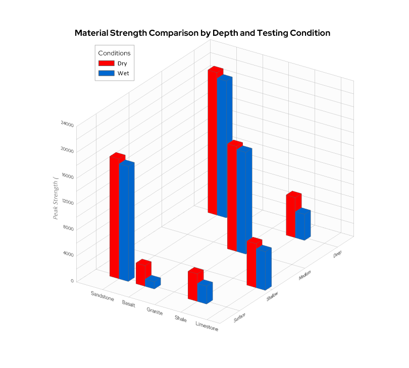
When you’re working with three variables that interact with one another—a 3D bar chart can reveal patterns that a flat chart can’t fully capture.


