Unveiling the Secrets of Swan Lake: A Decade of Water Quality Monitoring with Surfer and Grapher
For a decade, Robert Bowen, CEO of Diversified Scientific Solutions, has been returning to the shores of Swan Lake with one goal: to better understand its health. From May through September each year, Robert makes weekly site visits to measure an extensive list of lake parameters, such as the following: dissolved oxygen, pH, oxygen reduction potential, chlorophyll-a, phycocyanin, temperature, total dissolved solids, conductivity, salinity, phosphates, nitrates, algal species, weather patterns, and zooplankton.
Why so many measurements? Swan Lake is shallow, warm, and nutrient-rich, which are conditions that create the perfect storm for summer algal blooms. By collecting various water quality attributes, Robert can track seasonal change, compare conditions across years, understand the ecology of the system, and ultimately, piece together how different forces interact to influence the lake’s health.
Visualizing a Decade of Change with Surfer and Grapher
To identify complex relationships impacting Swan Lake’s health, Robert plans to take a deeper look at the data he’s collected over the years. A key component of his analysis will be the data visualizations he’s created using Surfer and Grapher.
“These versatile software reveal the inner workings of a dynamic system,” Robert noted.
He’s currently in the process of analyzing his data visualizations but has already noticed key insights that will help him detect bigger patterns. In fact, here are just two takeaways Robert has already gathered.
The Algae Bloom and Anoxic Connection
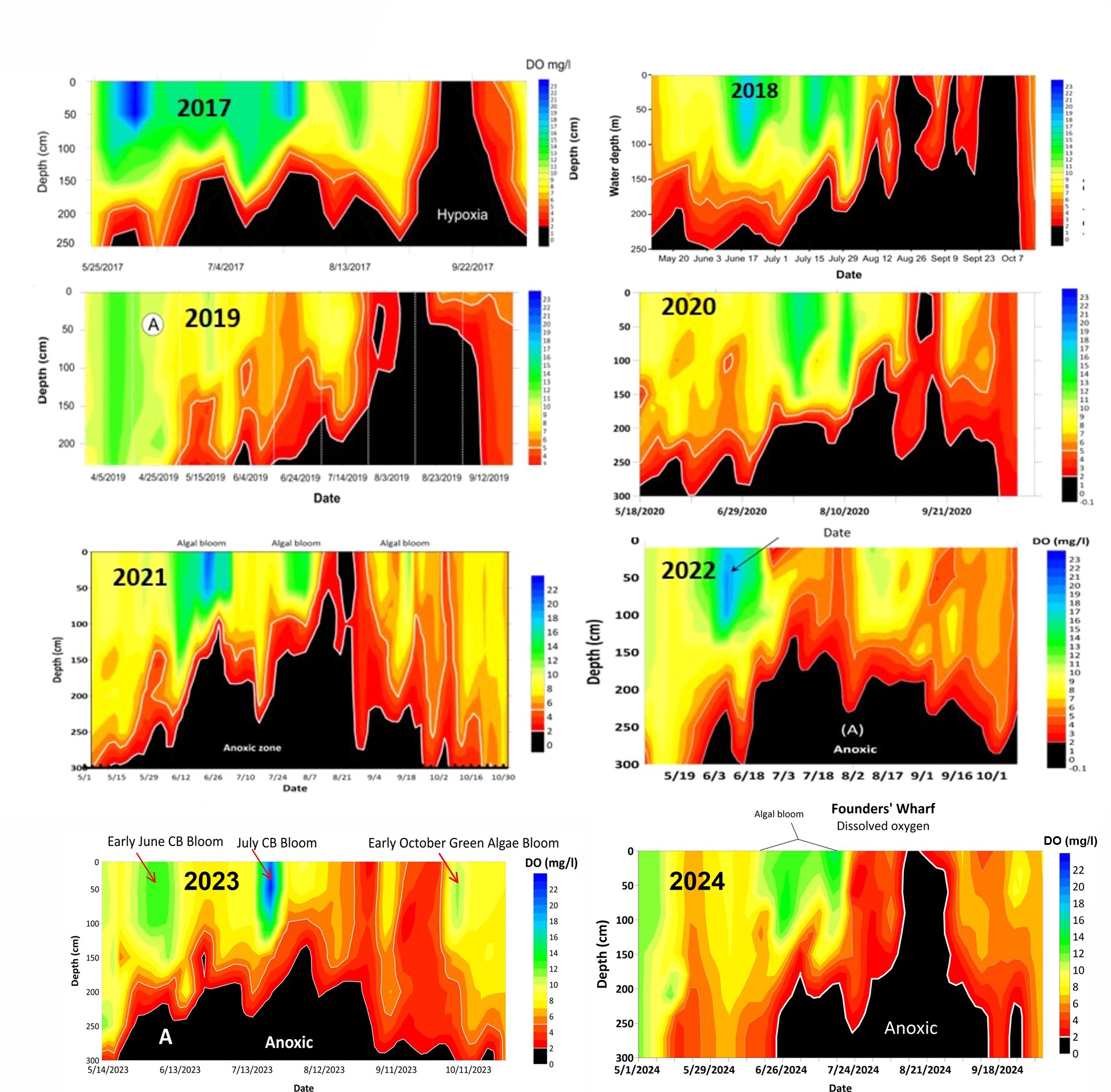
Perhaps the clearest insight to emerge from Robert’s decade of monitoring is the cycle linking cyanobacteria (or blue-green algal blooms) to water column oxygen concentrations. Through photosynthesis, algae consume dissolved carbon dioxide and nutrients—especially phosphorus—and pump oxygen into the surface waters. However, when an algal bloom exhausts the available nutrients and collapses, the organisms sink. In the benthic zone, decomposers break them down, consuming oxygen in the process and resulting in an expansion of an oxygen-poor anoxic layer.
“A big bloom occurs when there are high concentrations of nutrients, warm temperatures, and bright sun,” Robert explained. “As the bloom ramps up, the algae consumes these nutrients, and when there’s no longer enough nutrients to support the bloom biomass, there is a mass die-off that rains down to the bottom. As a result, oxygen concentrations plummet throughout the water column, creating significant stress to fish and other organisms that rely on oxygen.”
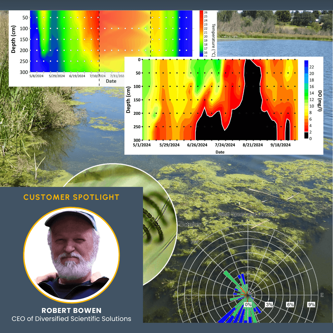
With Surfer, these shifts are visible. The annual contour plots of dissolved oxygen (DO) at depth reveal oxygen-rich periods in vivid blue and oxygen-depleted zones in stark black. These plots use date (X-axis), depth (Y-axis), and DO concentration (Z-axis) to tell the story of when and where oxygen vanishes. As the black zones expand across the plots, they point to times when severe oxygen depletion has occurred. And when the entire water column drops below 2 mg/l, the lake reaches a state of hypoxia, and observed fish kills occur.
Time Series Plots Reveal Diurnal Cycles
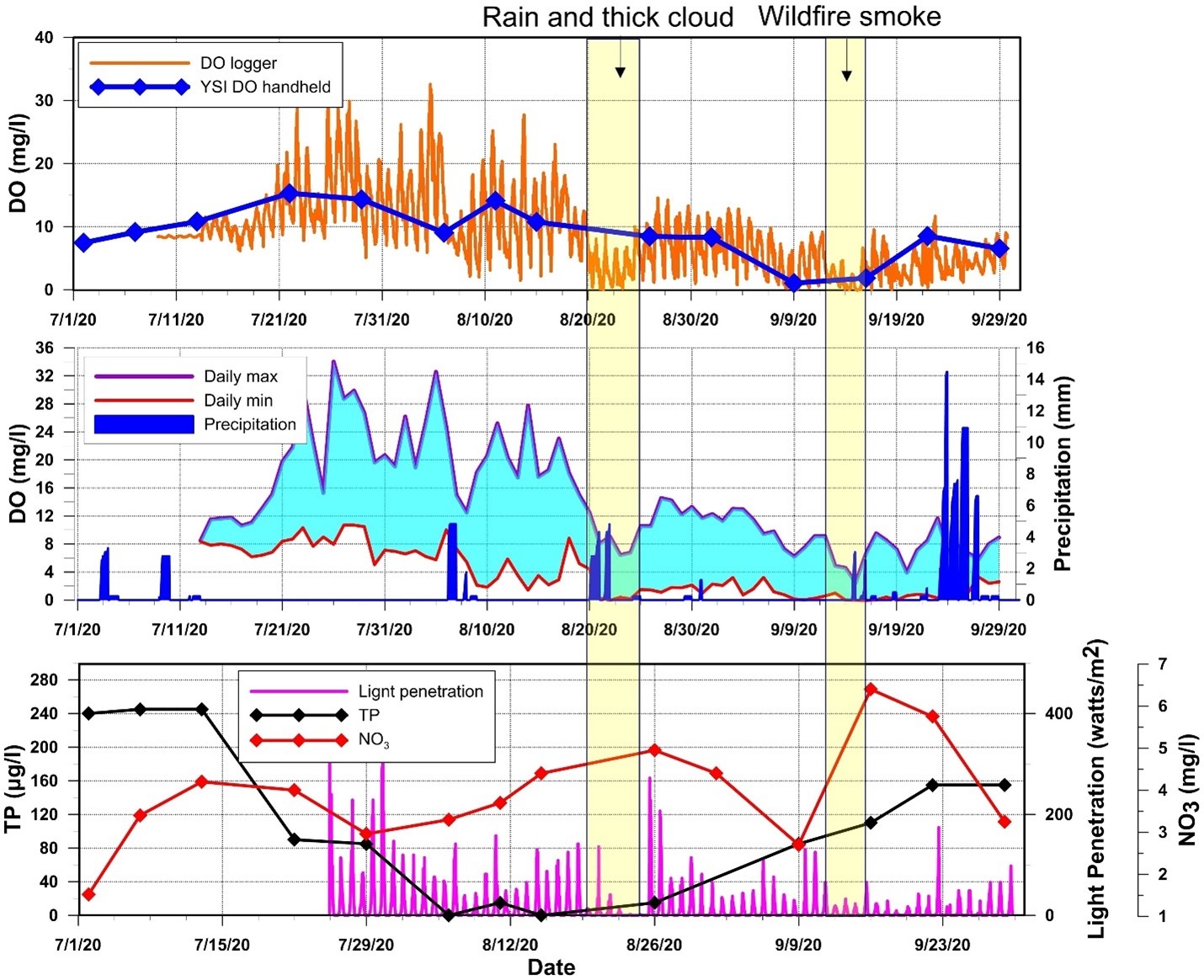
Robert also created time series plots in Grapher to showcase insights across multiple parameters. He often plotted several datasets against time, layering in both his weekly field samples and data logger outputs that recorded every 30 minutes. The DO weekly sample comparison with the continuous DO logger data revealed diurnal cycling of dissolved oxygen that the infrequent weekly checks would’ve missed.
“I’m using this multiparameter plot to show how several different data sources can be used to examine interdependence,” Robert said. “After looking at everything, I can say, ‘Okay, what happens when there’s a rain event, or how does smoke from wildfires impact the lake? What happened to the oxygen with light penetration? Or what’s the relationship between phosphorus and oxygen?’ This process of visual comparison helps to tease out insights that warrant further analytical study of the impact of the specific parameters measured. Now with ten years of data, the analysis can expand to weekly, seasonal, and even decadal time scales to look for patterns and trends.”
Looking for Trends in a Complex System
Of course, while Robert has insights he can lean on to detect the bigger trends, not all the annual data tells the same story. Weather, temperature, and nutrient cycling all play major roles, making it tough to identify long-term climate-driven trends.
“Lakes are complex,” Robert said. “One year’s wet and cold; the next is hot and dry. Teasing out a single process to know if there’s a trend is difficult.”
However, one pattern that appears to be common year to year is that Swan Lake seems to be at its lowest point of resilience during late summer. By August or September, as daylight hours start to decrease, the lake’s dissolved oxygen concentrations are low, leaving the overall lake health more vulnerable. A smoke event from a nearby fire once managed to push it over the edge, as the oxygen dropped across the entire water column, resulting in a fish kill. Fortunately, that wasn’t the end of the story for Swan Lake.
“Once the fish kill occurred, the lake had restoring forces that kicked in—coupled with the fall winds and cooler temperatures—and the fall lake turned over,” Robert said.
From Findings to Larger Trends
After a decade of monitoring Swan Lake, Robert has built a strong foundation of insights. Each of his discoveries is a stepping stone toward recognizing bigger trends that define the lake’s long-term health. However, what those larger trends will ultimately reveal remains to be seen. Lakes are complex systems, influenced by everything from nutrient cycling to shifting weather patterns—and teasing out consistent trends isn’t easy. But with years of meticulous data collection and the powerful visualizations he’s created in Surfer and Grapher, Robert is well-positioned to connect the dots. The groundwork is laid, and soon, the broader trends hidden in Swan Lake’s waters will begin to surface.
Want to learn more about the scientists tackling today’s biggest environmental questions and challenges? Subscribe to our blog so you don’t miss an update!
Recent Articles
- Apr 29, 2026|Gabbie Rhodes|10 min
When you’re working with three variables that interact with one another—a 3D bar chart can reveal patterns that a flat chart can’t fully capture.
- Apr 23, 2026|Gabbie Rhodes|16 min
The strongest candidates are often in high demand. But with the right approach, you can attract and recruit top talent to build a stronger team.
- Apr 23, 2026|Gabbie Rhodes|9 min
Even accurate data can fall short if time is displayed poorly. That’s why thoughtful time formatting is essential for your data visualization.
- Apr 15, 2026|Gabbie Rhodes|11 min
You’re trained to value precision. Every contour, parameter, and assumption matters. But how do you share complex data to non-experts? Learn tips.
