Turning Subsurface Data Into Opportunity: How a Geologist Uses Software & Expertise to Guide Drilling Decisions
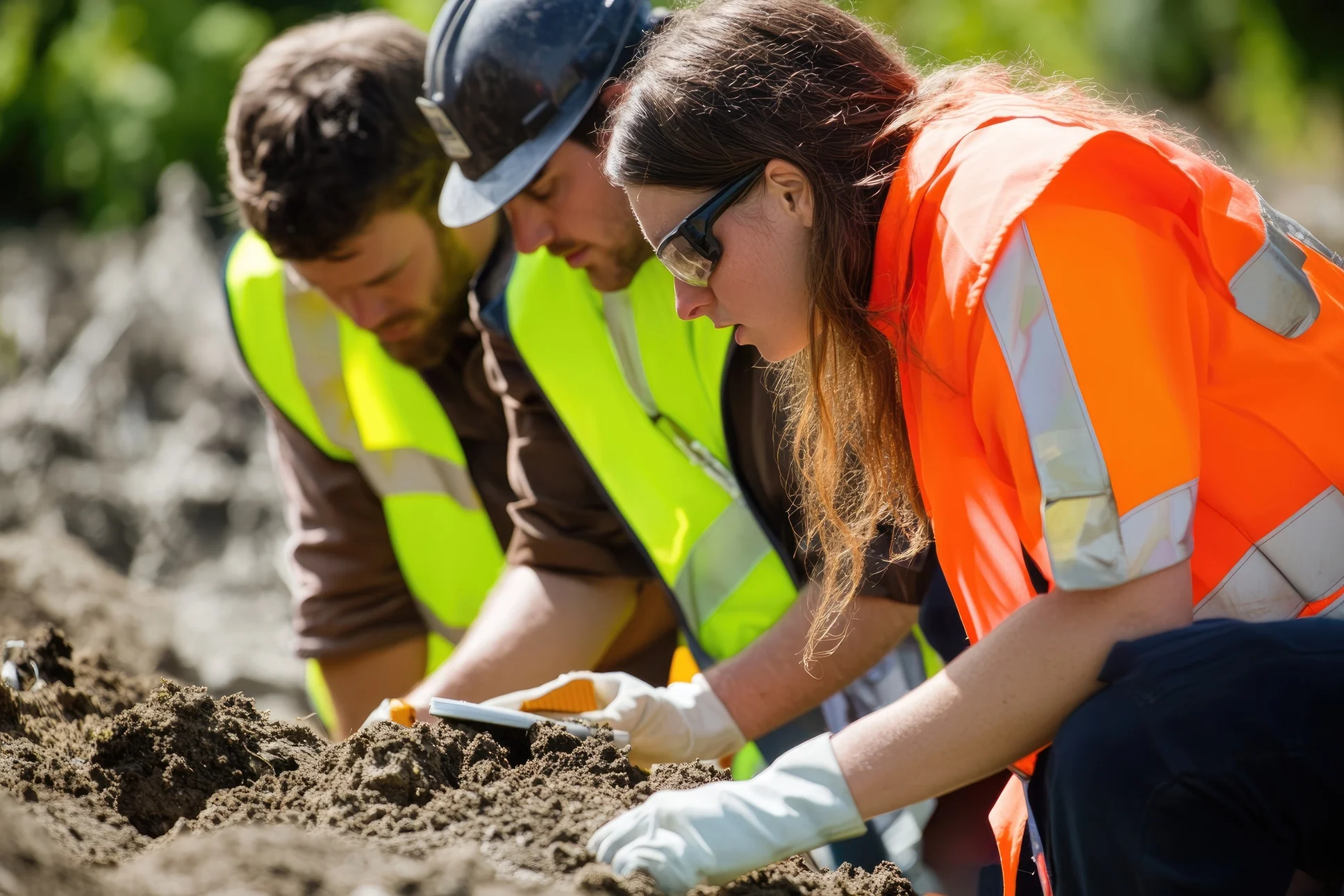
John Andersen is a geology consultant and Senior Geologist with O’Chiese Energy LP in Calgary, a city in Alberta, Canada. Working with the O’Chiese First Nation, which owns a 53-section block of land containing some of the largest natural gas pools in Western Canada, Andersen’s goal is to maximize the resource wealth for the Nation. Part of achieving this requires identifying new drilling opportunities that the First Nation can pursue for future growth to enhance their portfolio.
For Andersen, this work is impossible without precise, reliable subsurface mapping. He relies on the powerful capabilities of Surfer—using it as an essential add-on to his geological data platform, GeoScout—to transform vast, complex data into clear, actionable visuals.
The Evolution of Geological Mapping: From Microfiche to Digital Speed
Andersen’s career spans the evolution of geological data management, giving him a unique perspective on the power of modern tools. He recalls a time when creating a single map was an arduous, manual process.
“Typically, when I started in my career, we always hand-contoured all the mapping,” Andersen said. “We had to go in and create the data, pick the data, and then map it.”
Before the internet or digitized records, data storage was entirely physical. Geologists like Andersen relied on microfiche and paper printouts.
“If you go back in history, we had to actually create stuff from microfiche, look at it on the microfiche, and then make a note and save that on a map because there was no electronic media,” Andersen explained.
The shift to digitized data, spreadsheets, and eventually interactive 2D software like GeoScout pushed the industry forward by making it easier to store data and map it. And today, the addition of user-friendly mapping software like Surfer has improved efficiency and the visual design of maps significantly.
“The biggest success was increasing my efficiency to be able to put things out faster,” Andersen said. “Also, a computer can draw a nice smooth curve better than my pencil. So, it’s a prettier, more presentable product at the end of the day.”
The Mapping Process: Turning Raw Data into Subsurface Insight
To create a high-quality final product, Andersen’s process begins with raw field data, which includes seismic and stratigraphic measurements used to determine the exact location and depth of hydrocarbon reserves. This data is the foundation for his projects and leads to the following workflow:
- Data Acquisition and Input: The raw data is fed into GeoScout, and Andersen explained that having good data is critical. Surfer (which integrates with GeoScout) can only use the data you give it. If you’ve got bad data, you have to understand how to clean it accordingly.
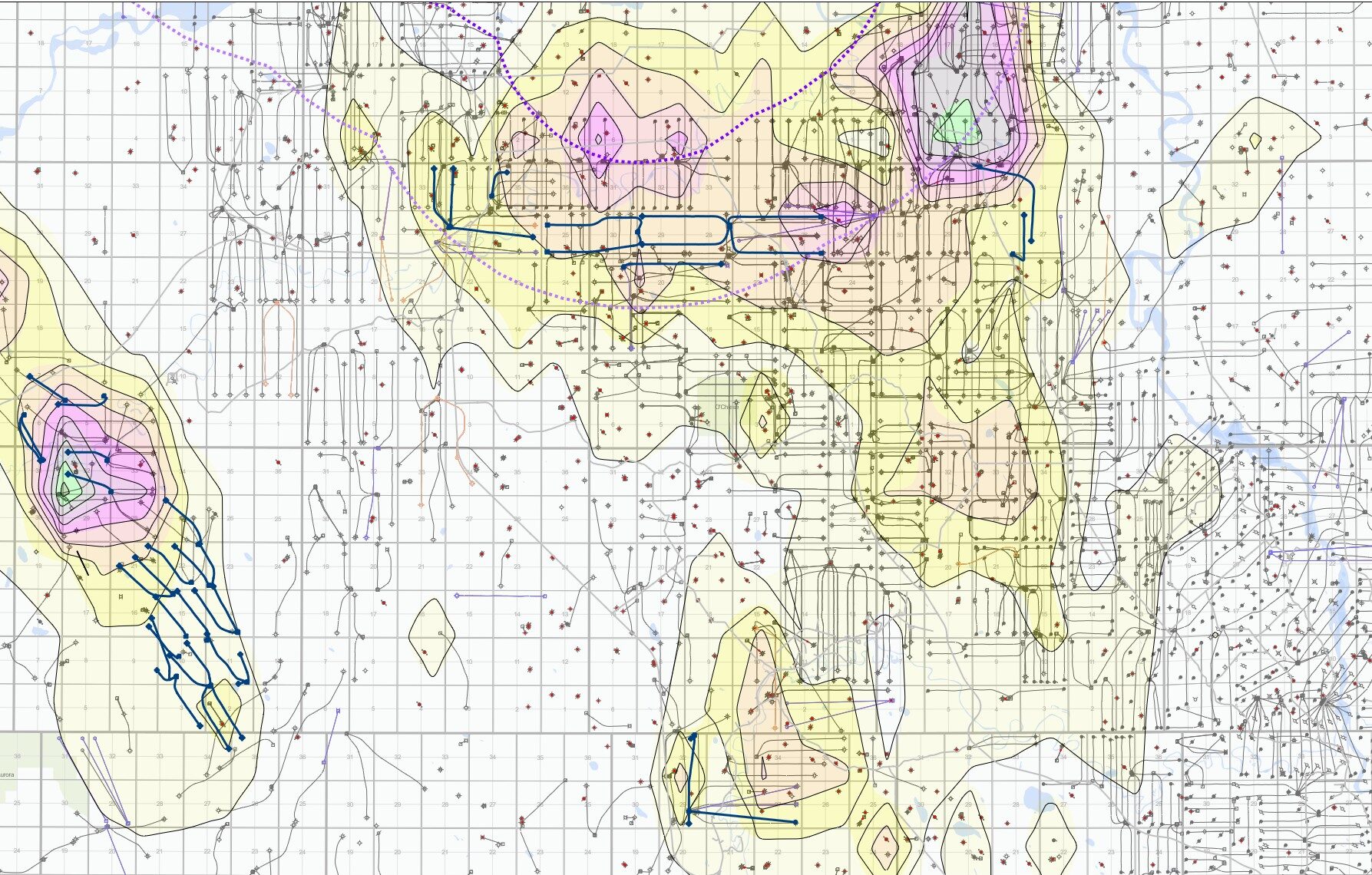
- Structural Contouring: Surfer generates the subsurface structural contour map. This map clearly outlines the O’Chiese Indian Reserve boundary, with a grid reflecting the original imperial-based survey (one-mile squares), even though Canada is now metric.
- Visualization and Layering: The map is then layered with well data. Different colors and symbols are used to distinguish horizontal wells targeting various hydrocarbon zones.
- Strategic Focus: By layering and isolating data points, Andersen uses the final map to determine optimal drilling locations. The goal is to decide where to drill more wells, leading to more financial opportunities in new areas.
“If you’re just coming into a new area you’ve never worked before, Surfer will create a map, and then you’ll have a much better handle on how to approach things in a proactive manner without literally thinking, ‘where do I start?'” Andersen explained.
The Geologist’s Value: Interpreting the Curves
While Andersen relies on user-friendly software to create maps that showcase drilling opportunities, he stresses that technology is merely a tool, and it doesn’t replace the expert interpreter. That’s particularly true when it comes to data integrity.
“The final output is only as good as the data you’re using,” Andersen said. “Do you believe what you’re using as your source?”
Andersen’s experience equips him to assess the validity of his data and the resulting map. With his technical expertise and understanding of geology and subsurface concepts, he can look at an area and confidently identify which of its multiple hydrocarbon layers offer the highest potential returns, equipping him to confidently say, “I think we can drill 10 more wells if you go this way.”
Communicating Complex Geology: The Power of Visualization
After analyzing data and gathering insights, the need for clear visual communication is paramount, especially when presenting to non-technical stakeholders. Andersen’s direct audience, the O’Chiese First Nation, are the owners, and while they live on the land, presenting a traditional cross-section diagram using industry jargon wouldn’t be helpful.
“That’s where a nice map is worth a thousand words,” Andersen noted.
By using Surfer to create intuitive visualizations—and providing graphical analogies along with it—he showcases what’s happening miles beneath his audience’s feet to explain the drilling targets.
“One of the things that was the most convincing was when we showed a story about the rocks,” Andersen said. “We showed a picture of a layer cake and said, ‘These are the layers, and then we’re drilling wells into the pink layer and the blue layer.’ That was huge in terms of getting traction for understanding the graphical, simplistic representation of what we’re trying to do.”
Additionally, Andersen uses Surfer’s 3D View to show how multiple wells target different layers at varying depths. Providing this model is key for clarity, helping the First Nation understand the subsurface reality of their resource portfolio so they can effectively pursue future growth.
Combining Expertise and Software Tools
Andersen’s work illustrates how modern technology and decades of geological expertise can come together to achieve meaningful results. While software plays a vital role in turning his raw data into clear, actionable visuals, it’s also Andersen’s deep understanding of geology—and his ability to interpret what the data truly means—that gives those visuals purpose.
In many ways, his approach represents the best of both worlds: human expertise grounded in experience and amplified by technology. The result is a workflow that helps transform geological complexity into economic empowerment, ensuring the O’Chiese First Nation can continue making informed decisions about its most valuable natural resources.
Want more stories on how geologists and engineers are making an impact around the world? Subscribe to our blog so you never miss an update!
Recent Articles
- Jul 22, 2026|Gabbie Rhodes|6 min
Your team needs to work together effectively. Discover strategies to enhance team collaboration, so projects move forward with greater confidence.
- Jul 22, 2026|Gabbie Rhodes|8 min
You need to produce clear, accurate maps, models, and graphs. Can AI tools for data visualization help? Here's the answer.
- Jul 15, 2026|Gabbie Rhodes|4 min
Technology has advanced, and now, Surfer has taken the lead over Voxler. Learn how to convert your Voxler file to a Surfer file to get better results.
- Jul 15, 2026|Gabbie Rhodes|12 min
Answering this question isn't easy: what damage can a hurricane cause? Multiple factors come into play, but maps and graphs can provide insight.