The Power of Fit Curves: Helping Audiences Understand & Trust Your Visualization
As a geoscientist or engineer, you need to provide graphs and charts that are understandable and trustworthy—and fit curves help achieve those goals. You might know them as “trendlines” in Excel, the classic example being a set of data points where you draw a line to show whether things are generally trending up or down. In Grapher, these trendlines are called fit curves.
For non-technical audiences, fit curves make data understandable. Instead of interpreting a scatter of points, stakeholders without a technical background can simply analyze a clear, visual story of what the data is doing—whether it’s rising, falling, or following a more complex pattern. For technical audiences, on the other hand, fit curves offer an added layer of trust, particularly because you can generate fit statistics (standard deviation, covariance, and other measures) that show exactly how well your data aligns with your model.
Given these advantages, you may already add fit curves to your graphs and charts. But are you consistently using the same ones to make your visual understandable and trustworthy? If so, we want to reveal the many different fit curves in Grapher so you know all your options for enhancing accessibility and confidence.
The Many Faces of Fit Curves in Grapher
There are more than a dozen fit curves in Grapher. Some are designed specifically for scatter plots, while others are tailored to histograms. To help you quickly see what’s available (and when to use it), here’s a breakdown of the different fit curves you can apply in Grapher, along with practical examples of how each one can bring clarity to your data.
Scatter Plot Fits
These fits are designed to model the relationship between two continuous variables plotted on a scatter plot. They are often used for interpolation, extrapolation, and determining the strength of a correlation.
| Fit Curve | What It Is | Practical Use Case |
|---|---|---|
| Linear Fit | A straight line (Y=a+bX) that minimizes the sum of the squared vertical distances between the data points and the line. It assumes a direct, constant relationship between X and Y. | Calibration: A civil engineer calibrates a pressure sensor by measuring known weights (X) against the sensor’s voltage output (Y). They use a linear fit to establish the calibration equation. |
| Logarithmic Fit | A curve defined by the equation Y=a+bln(X). It’s used when the rate of change in Y decreases as X increases. | Soil Consolidation: A geotech engineer studies how the void ratio (Y) of a soil sample decreases logarithmically with the effective stress (X) during a consolidation test. |
| Exponential Fit | A curve defined by Y=aebX. It models data where the rate of change is proportional to the current value, leading to rapid increase or decrease. | Radioactive Decay: A geochronologist uses an exponential fit to model the remaining concentration (Y) of a parent isotope over time (X) to determine the age of a rock sample. |
| Power Fit | A curve defined by the equation Y=aXb. It is common for “scaling” laws where one property is related to another by a power. | Fluid Mechanics: An environmental engineer models the relationship between flow velocity (X) and the hydraulic resistance (head loss, Y) in a pipe, which often follows a power law. |
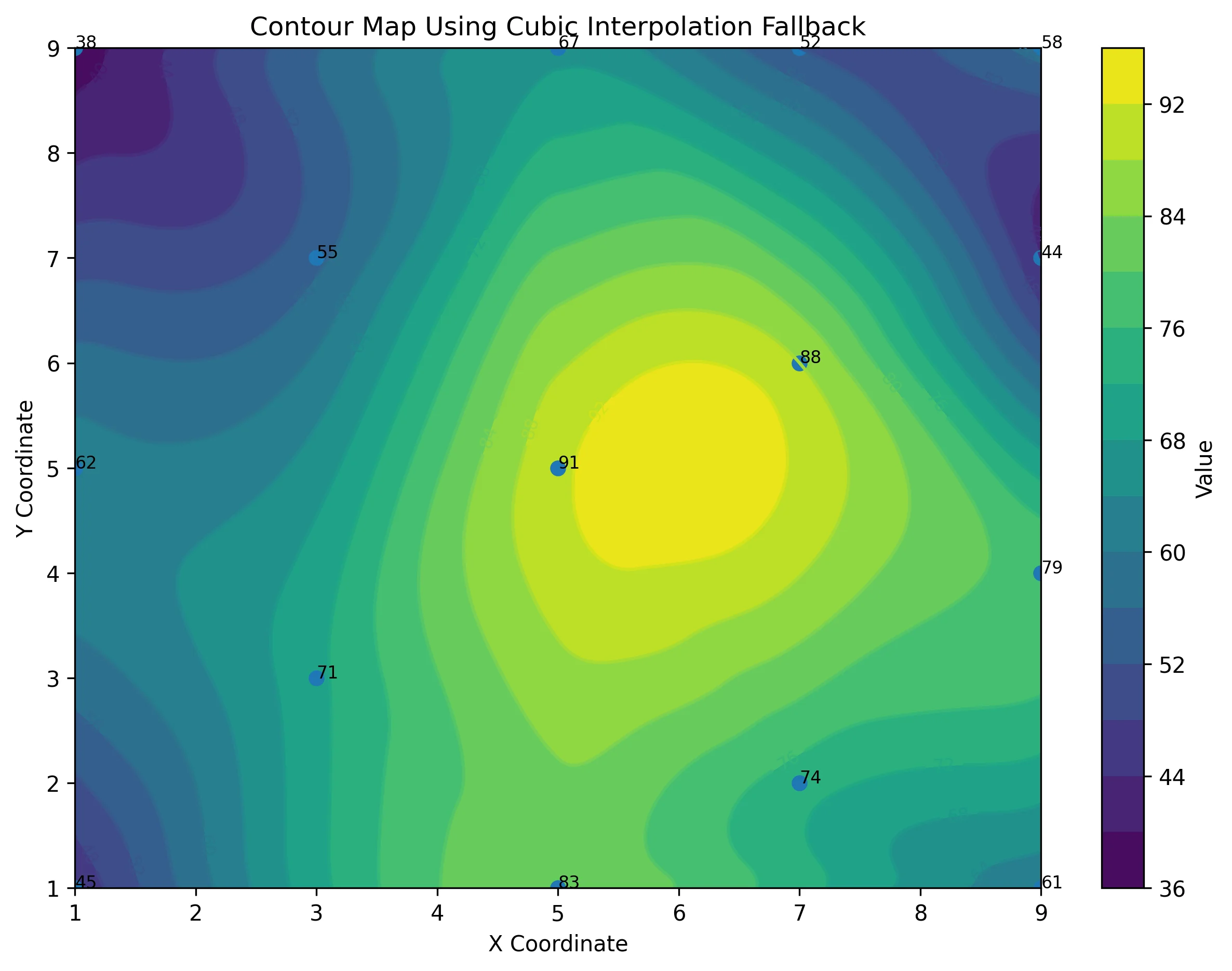
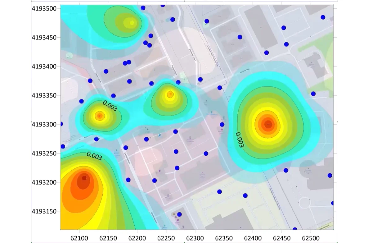
| Spline Smoothing | It’s not a mathematical function, but a smooth curve that passes directly through or very near to the data points, created by a series of connected polynomial segments. It’s best for visualizing trends without making predictive equations | Topographic Profiling: A geologist uses spline smoothing to create a visually appealing, smooth profile of elevation (Y) across a distance (X) for a cross-section, honoring the exact data points. |
| Polynomial & Orthogonal Polynomial Fits | A general curve of the form Y=a0+a1X1+a2X2+⋯+anXn. These fits can capture complex curves with multiple bends. The degree (n) dictates the complexity. Orthogonal polynomials are mathematically easier to compute and less prone to calculation errors. | Material Strength vs. Temperature: A mechanical engineer fits a high-degree polynomial to model how the yield strength (Y) of an alloy changes across a wide range of operational temperatures (X). |
| Through-Origin Fit | This is a linear fit that is mathematically forced to pass through the point (0,0). This is only appropriate when a zero value in X must correspond to a zero value in Y. | Strain Measurement: A civil engineer measures the elastic strain (Y) of a steel rod as a function of the applied stress (X) in the elastic regime (Hooke’s Law). Since zero stress must result in zero strain (by definition of the elastic phase), the fit line is forced through the origin to accurately determine the modulus of elasticity (which is the slope of the line). |
| Running and Weighted Average | A non-parametric smoothing technique that calculates the average of Y values within a specified “window” of X values. Weighted averages give more importance to points closer to the center of the window. | Seismic Data Processing: A geophysicist uses running averages to smooth out high-frequency noise (Y) in a seismic trace collected over time (X), revealing the underlying geological features. |
| LOESS (or LOWESS) Fit | This is a robust, non-parametric method that creates a smooth curve by fitting a low-degree polynomial to a localized subset of the data. It’s less sensitive to outliers than traditional regression. | Environmental Monitoring: An environmental scientist uses a LOESS fit to model the general trend of daily pollutant concentration (Y) over a year (X), minimizing the influence of erratic, one-off high-pollution days. |
| Reduced Major Axis (RMA) Fit | Unlike standard linear regression (which minimizes vertical error), RMA minimizes the perpendicular distance from the data points to the line. It’s used when there is measurement error in both the X and Y variables. | Paleomagnetic Analysis: A geologist uses RMA to compare two sets of paleomagnetic measurements (X and Y) to ensure both variables’ inherent uncertainties are accounted for in the regression line. |
Histogram Fits
These fits are used to model the frequency distribution of a single variable, typically plotted on a histogram. They help you understand the probability of a specific value occurring.
| Fit Curve | What It Is | Practical Geoscience/Engineering Example |
|---|---|---|
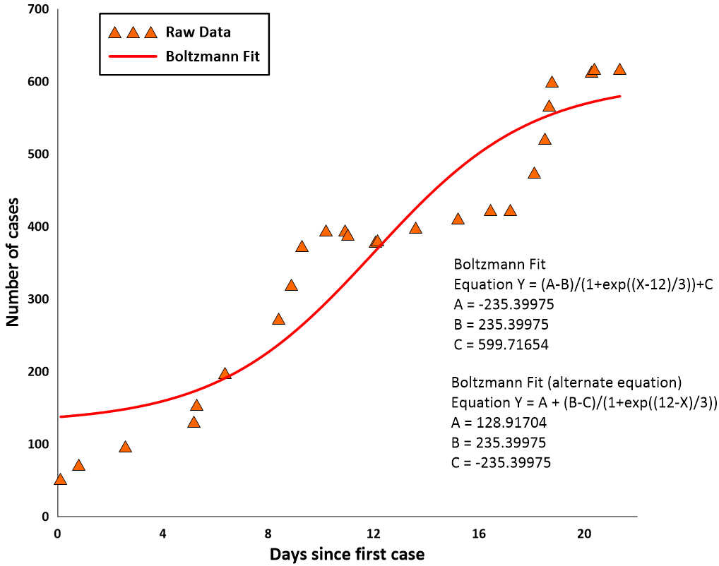
| Normal Distribution | This is the classic “bell-shaped” curve. It models data where values are symmetrically distributed around a mean, and extreme values are rare. It’s defined by its mean (μ) and standard deviation (σ). | Quality Control: An engineer monitors the diameter of thousands of manufactured parts (X) to ensure the distribution is normal and centered on the design specification, indicating a stable process. |
| Lognormal Distribution | A distribution whose logarithm follows a normal distribution. It is skewed to the right, meaning it has a long tail of high values. It’s often used for variables that cannot be negative. | Mineral Grade or Porosity: A mining engineer models the distribution of gold concentration (grade) in a deposit. Since grade cannot be negative and is often skewed toward lower values with a few very rich pockets, the lognormal distribution is typically the best fit |
| Exponential Distribution | A right-skewed distribution that describes the time or distance between events in a Poisson process (events that occur continuously and independently at a constant average rate). | Failure Rate Analysis: A reliability engineer models the time between failures (X) for a critical piece of equipment like a pump. |
| Power Distribution | A distribution where the probability of a value occurring is inversely proportional to a power of that value. This is used for phenomena where a few events are extremely large, and many are very small (a “heavy-tailed” distribution). | Earthquake Magnitude: A seismologist models the frequency of earthquakes (Y) against their magnitude (X). The distribution shows many small tremors and very few large ones (Gutenberg-Richter law). |
| Inverse Gaussian Distribution | This is a distribution that models the time a Brownian motion with positive drift takes to reach a fixed positive level. It is similar to the lognormal but has different mathematical properties. | Groundwater Transport: A hydrogeologist models the travel time (X) of a contaminant released at a source to reach a monitoring well a fixed distance away. |
There are two other things to keep in mind. First, you can get fit statistics for any fit curve to ensure technical audiences who value that insight and confidence in your model have what they need. Second, choosing the right fit curve for your data is one thing, but setting it up every time you need it is another story. If you want to make your workflow easier, you can always use templates. Instead of building your graphs or charts and applying fit curves from scratch, you can start with a template that already includes the right curve and formatting. That way, you’re not only making your data easier to understand and trust but also streamlining your workflow in the process.
Check out the Drillhole Log Template (Fit Curve Included) →
Check out the Distribution Comparison (Fit Curve Included) →
When the Fit You Need Isn’t on the List
With more than a dozen built-in fit curves, Grapher covers a wide range of use cases—but it’s no secret that not every dataset fits neatly into a predefined model. That’s why you have the flexibility to create your own custom fits. If you have a formula or method that isn’t included in the standard list, you can define it yourself and apply it directly to your data. This ensures you’re never limited by the defaults and always have the opportunity to provide the accessibility and confidence your audience needs in your data visualization.
Related Resources:
From Trends to Trust: Why Fit Curves Matter
Fit curves are great tools for making your data both understandable and trustworthy. Whether you’re presenting to a non-technical audience that needs a clear visual trend or a technical team that values fit statistics and confidence in a model, you have the flexibility to do both in Grapher. With more than a dozen predefined fits for scatter plots and histograms—and the option to build your own custom fit if necessary—you’ll always have an opportunity to communicate patterns in a way that’s understandable and trustworthy.
Want to keep sharpening your data visualizations? Subscribe to our blog to get fresh tips, guides, and insights delivered right to you, helping you get the most out of Grapher and more!
Recent Articles
- Jun 23, 2026|Gabbie Rhodes|10 min
Ever stop and wonder: does AI make mistakes? Before you start using AI tools to create your maps, discover the answer to this key question.
- Jun 23, 2026|Gabbie Rhodes|7 min
What contributions are women making in STEM? Discover eight examples of women in STEM fields and the meaningful impact they’re making.
- Jun 17, 2026|Gabbie Rhodes|8 min
Both work and family require energy and intentionality. To ensure you approach them effectively, discover tips to balance work and family life.
- Jun 17, 2026|Gabbie Rhodes|11 min
Senior Technical Sales Specialist Drew Dudley hosted a webinar to provide tips for ensuring coordinate systems display accurately and consistently.