The Latest Version of Surfer Is Enhancing Efficiency and Improving Stakeholder Understanding
The newest version of Surfer is officially here—and it’s built with your biggest priorities in mind: working more efficiently and helping stakeholders understand your findings. From time-saving tools to new ways to present complex data with clarity, this update is designed to support your workflow from start to finish.
“The latest version of Surfer delivers features that help users create meaningful maps and models faster while clearly communicating results to any audience,” said Surfer Product Manager Kari Dickenson. “I’m especially excited about contact points. They make visualizing subsurface data easier and lay the groundwork for even more powerful tools in the future. And that’s just one of many valuable updates in this release.”
So, what are all of the features you can enjoy in this latest Surfer release? Let’s unpack what you can use to start enhancing efficiency and stakeholder understanding.
1. Create, Edit, and Export Contact Points—All in One Place
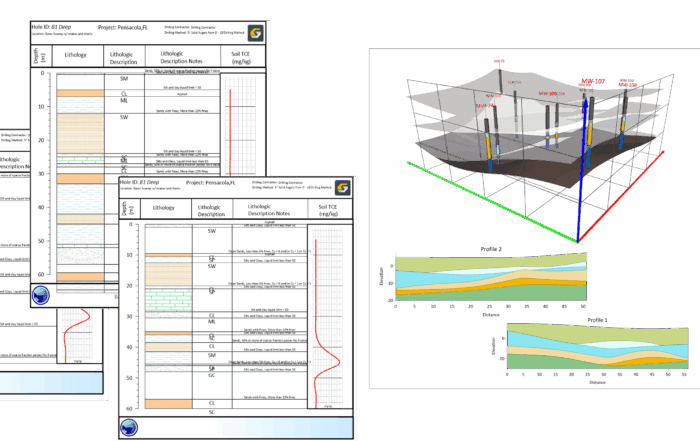
If you work with drillhole data, you already know how important it is to generate accurate underground surfaces (e.g. horizons and layers) and how much time it can take to get there. The main challenge is obtaining the contact points in each drillhole that’ll be used to create the surfaces. In the past, identifying the contact points from drillhole data involved manual steps or reliance on external tools just to prepare the data for visualization in Surfer.
But now, that workflow just got a major upgrade.
In the latest version of Surfer, you can create, edit, and export contact points from drillhole data directly within the software. No more jumping between tools or cobbling together workarounds. Surfer gives you a faster, streamlined way to create contact points from drillhole data so you can export them and create your surfaces.
Whether you’re trying to showcase lithology, mineralogy, or a coal seam, this new feature helps you move from raw data to meaningful visualizations with ease. The result? A clearer understanding of what’s happening underground and better, faster decisions for stakeholders.
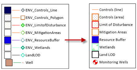
2. Clearer Maps, Faster: Legends for Base Layers Using Unique Values Symbology
When you use attributes to assign symbology on your base map—like different colors or shapes to represent categories—you’re making it easier for your audience to understand the data. But unless you have a clear legend, that visual clarity can fall apart fast.
In the past, your options for improvement were limited. You either settled for an automatically generated legend that didn’t quite match your message, contained extraneous information, and created confusion when you weren’t there to walk stakeholders through your map, or you built one from scratch using drawing tools—a tedious and time-consuming process.
Now, Surfer makes it easy to generate a clean, customizable legend for your base layers using the unique values symbology. In the latest version of the software, you can clearly communicate what each symbol or color means to stakeholders and skip any manual work. Only show the features that are applied in the map, resize lines and symbols, and adjust the names presented in the legend. This means faster map creation for you and easier interpretation for the people who rely on your maps to make smart decisions.
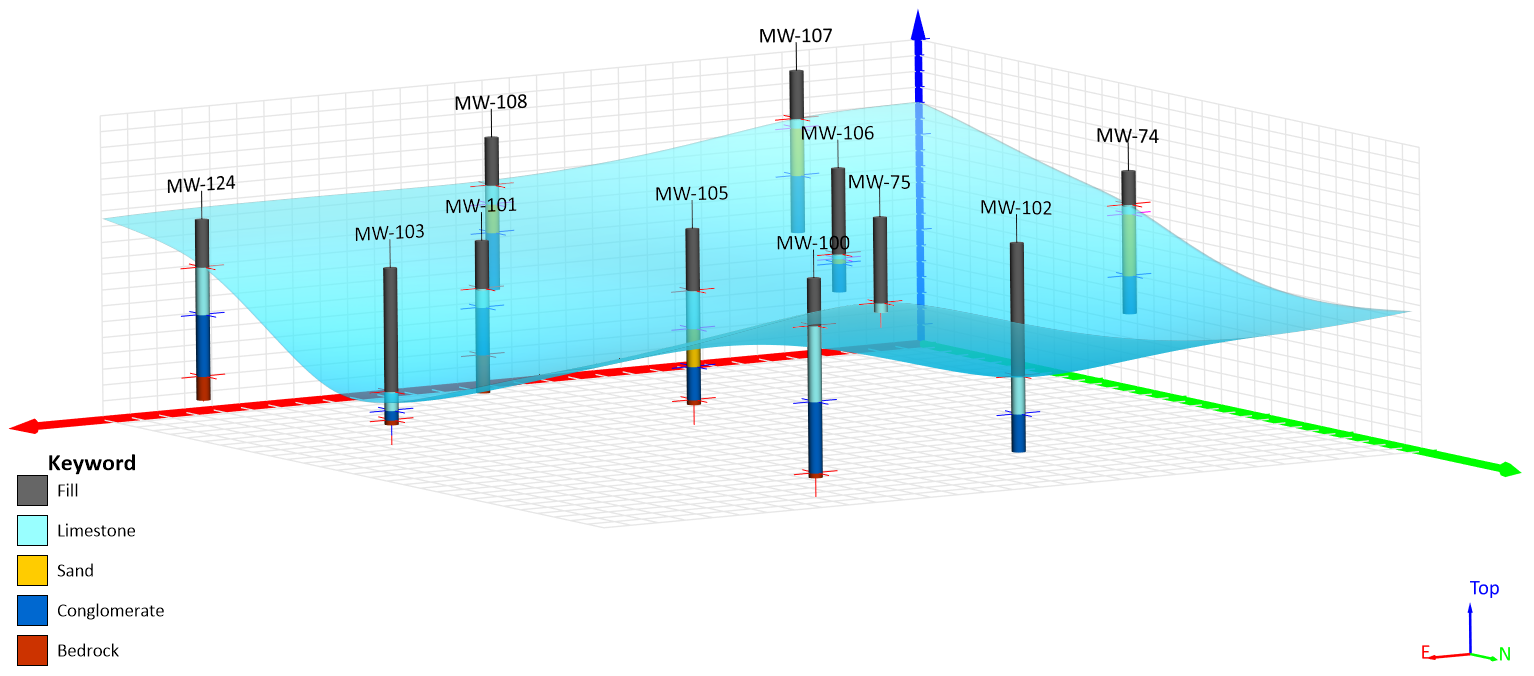
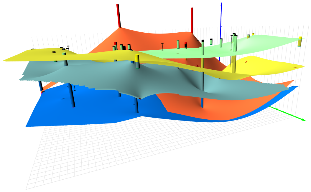
3. Shine a Light on Every Layer: Improved 3D View Lighting
When it comes to 3D models, lighting makes all the difference. But if you’ve ever had to choose between highlighting your drillholes or your topography surface, you know the challenges that can come with it. Until now, if you had multiple layers in your model, one (or more) of those layers may have had to take a back seat—either dimmed or lost in shadows.
With the latest version of Surfer, that tradeoff is gone. You can now add up to four point or directional light sources to your model in the 3D View, giving you full control over how your model is illuminated. You no longer have to tilt the model, simplify your visual unnecessarily, or hide layers just to get the lighting right.
Now, everything—from surface layers to boreholes—is equally visible. Stakeholders can see the whole picture to better understand what’s happening. You don’t need to compromise clarity to make your model work.
4. Fewer Clicks In Your Workflow: Update Fonts in Seconds
It’s a familiar scenario: you’ve completed your map or model, and everything looks perfect until someone from the documentation or marketing team says, “We’re switching to a new font.” Suddenly, you’re faced with the tedious task of manually updating every text object in your Surfer project.
With the latest version of Surfer, that frustration is behind you. A new sample script equips you to quickly change the fonts for all the copy supported by automation in your project—no more clicking through dozens of objects one by one. Whether you’re standardizing your typography for a client report or aligning your visuals with new branding guidelines, this tool gets it done in a fraction of the time.
Even better? This script is a great introduction to automating Surfer workflows. If you haven’t explored scripting yet, this is an easy win that saves time now and opens the door to future efficiency gains later.
5. Your Feedback in Action: Smarter Tools for Smoother Workflows
If you’ve ever created multiple image slices or layered 3D models, you’ve seen how quickly things can get confusing in the Contents window, especially when every single layer is named “Image Slice.” Without clear names, identifying the layer you want means clicking through each one manually. It’s inefficient, frustrating, and it slows down your workflow.
In the latest release of Surfer, that problem is solved. You can now rename layers directly in the 3D View, making it easy to stay organized—especially when working with complex models or multiple variations. Whether you’re preparing for a stakeholder presentation or fine-tuning your analysis, knowing exactly what you’re looking at saves time and reduces mental overhead.
Additionally, if you have a collection of colormaps you like in Voxler, there’s more good news. Surfer now supports importing Voxler CLR files, meaning you don’t have to spend time recreating colormaps from scratch. Just bring your existing colormaps from Voxler into Surfer and keep moving forward.
Undoubtedly, both of these updates will enhance your efficiency. But more than anything else, they’re a direct result of your feedback. We heard your requests, and we listened. Now, you don’t need to spend time wrestling with file conversions or misnamed layers. Instead, you can spend more time generating insights and impact.
Experience the New Features in Action
The latest version of Surfer is here—and it’s all about helping you work faster and communicate more clearly so stakeholders understand your data. From streamlining your workflows with font automation to improving stakeholder understanding with enhanced 3D lighting, this release was designed with your biggest needs in mind.
Ready to experience all the latest tools for yourself? Download the latest version of Surfer and start using the new features to boost your efficiency, clarity, and confidence!