Enhancing Efficiency & Visual Quality at the Same Time: Here’s the Latest Version of Grapher
The latest version of Grapher is here! This release focuses on increasing efficiency without sacrificing visual quality, so you can create graphs fast but still deliver a publication-ready output that impresses stakeholders and colleagues.
“The enhanced template experience is one of our newest updates, and it enables first-time Grapher users to generate professional, easy-to-understand charts and graphs for reports much faster than previously possible,” said Ruth Rodman, Grapher Product Manager. “Long-time users will find the new templates are fully compatible with their existing graphing projects while still offering the option to easily tweak their documents.”
As previously mentioned, the enhanced template experience is just one of the latest updates in Grapher. There are many more exciting tools in this latest release that’ll enhance both your workflow and visuals, and this blog will dive into the main ones.
A Closer Look at What’s New
The latest Grapher release has several new features that’ll help you work faster while still delivering clear, compelling graphs. Each tool streamlines a different part of the graphing process—from setup to sharing—so your entire workflow is efficient and designed to provide high-quality visualizations. Ready to discover what’s new? Here are five of the latest features you can start using.
1. New Template Experience
Graphing can be time-consuming. You have to manage fieldwork, data analysis, and reporting under immense time pressure. The last thing you need in this situation is complicated software that makes it hard to visualize your data, but avoiding this scenario often means settling for less-than-ideal outputs when deadlines loom.
The new template experience in Grapher gives you an easy way to generate a final output that’ll impress stakeholders. Every template now shows a visual preview of the final look before you even load your data, and it updates in real-time as you import data using the built-in guidance on data requirements that’s available. This experience makes it dramatically easier to get started; there’s no deep product knowledge or guesswork required, ensuring you can work faster. Also, all the templates follow visualization best practices so you can deliver high-quality work in a reasonable timeframe.
Additionally, the template experience makes it easier to quickly create routine reports or change data for projects. When it’s time to recreate the same visualization for a new dataset, you don’t have to rebuild anything. Just open the template, swap in your updated data, and the template will preserve your layout, formatting, styling, and all your carefully crafted design decisions. This not only enhances efficiency but also ensures your outputs stay consistent across similar projects.
It’s also worth noting that, because templates are easy to understand, you can share them with team members to collaborate more efficiently. All your colleagues have to do is download the template and populate it with their data. With the help of your template, they can produce publication-quality graphs with confidence and consistency.
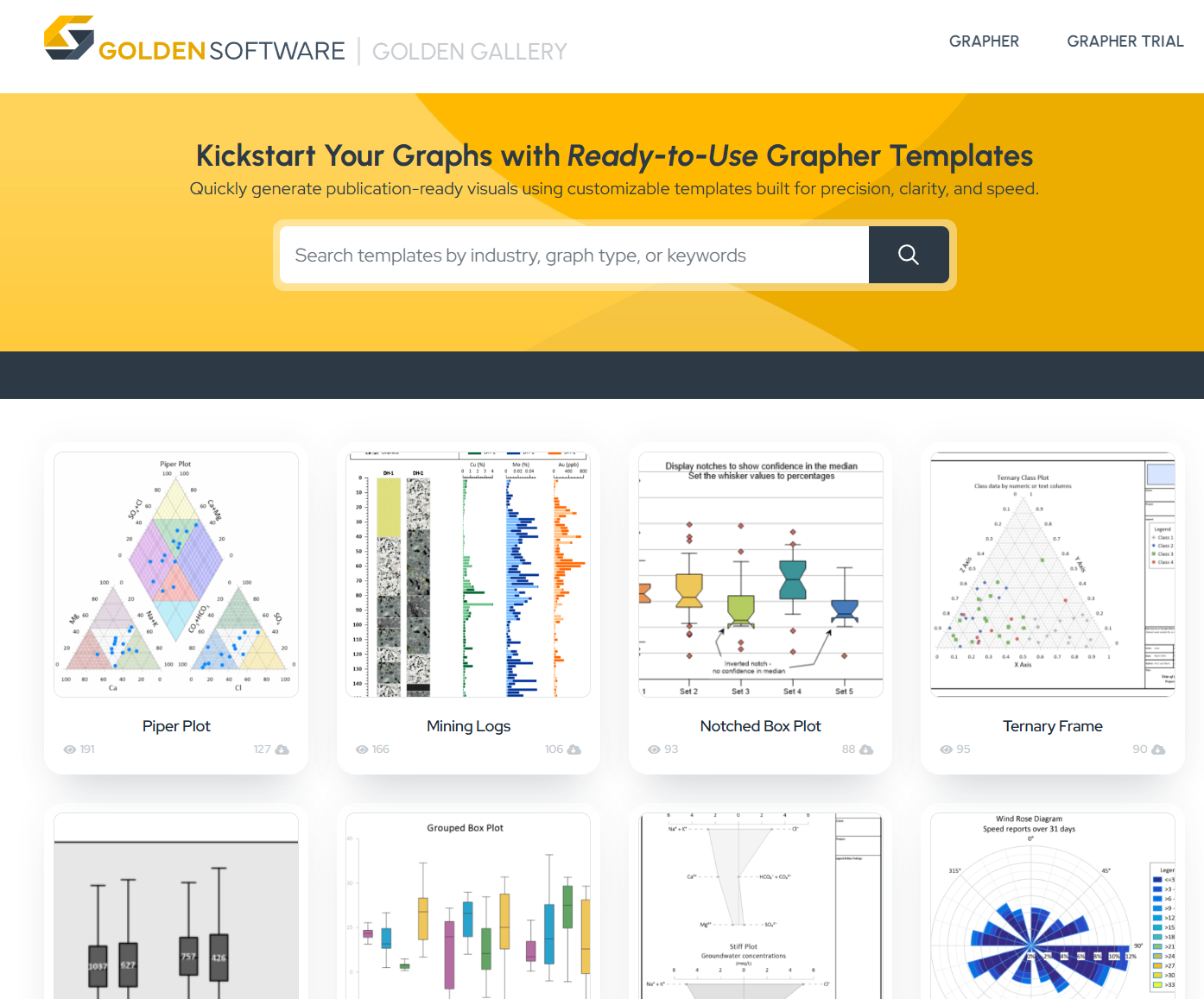
2. Templates in the Golden Gallery
Even the best template system needs a reliable source of ready-made templates that you can use. That’s where the Golden Gallery comes in. It’s a growing collection of templates designed by and for engineers and scientists. Each template follows data visualization best practices and is designed to help you showcase complex data efficiently and effectively—whether that’s environmental trends, soil texture classifications, or cumulative CO2 emissions.
To get started, you can browse templates on the Golden Gallery for inspiration and then download and customize them to match your needs. Any template you customize can be saved and reused later, so you don’t have to remember what settings you used to get a particular style. You can also contribute your own templates to the Golden Gallery to help advance the craft of data visualization across the broader scientific and engineering community. This way, your peers also have a successful framework for producing high-quality graphs efficiently.
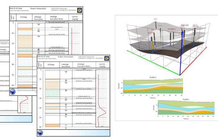
3. Use Grapher (and Surfer) for Your Drillhole Data
Current borelogging or cross-section software doesn’t give you the customization or visual quality you need for showcasing your drillhole data. The tools might produce a basic log, but they often lack flexibility, modern styling, or the ability to tailor your final output to meet stakeholders’ expectations and requirements.
With the latest release of Grapher—and its compatibility with Surfer—you now have a better way to showcase drillhole data: use templates.
The Golden Gallery offers multiple templates to help you create drillholes and other related visuals in Grapher. Each template has a polished layout, styling, and structure already in place, giving you a head start in achieving the final output stakeholders need. You can also make any customizations you want in Grapher to get the exact look you’re trying to achieve with your drillhole data. You can tailor any existing templates (or create your own), ensuring every project maintains a consistent visual style and meets stakeholders’ expectations.
Tech Tip: Check out templates that’ll help you quickly and effectively visualize your drillhole data! There are multiple you can choose from in the Golden Gallery, including the Drillhole Logs Template. Its layout equips you to show downhole geochemical profiles for multiple drillholes, so you can quickly create a clear visual comparison of grade variability between your drillholes.
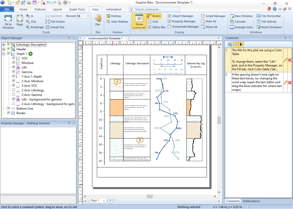
4. Document Comments
If you’ve ever opened an old project and thought, “How did I set this up again?”, you’re not alone. Many scientists and engineers work on seasonal or recurring projects that can be difficult to revisit months later. Remembering exactly which settings you used, which filters you applied, and what you need to update is tedious and time-consuming.
The same challenge often arises when collaborating with others. You might send a project file to a team member, but they may spend considerable time trying to understand your data filters, settings, and customizations to successfully replicate your output.
Fortunately, the new Document Comments feature is designed to solve these issues. You can now add comments directly inside your project file to document key design decisions and provide instructions for collaborators. These comments stay in the file, so whether you’re revisiting a project after several months or sharing it with a teammate, all the essential details are right there in view so everyone can work quickly at creating a polished final output.
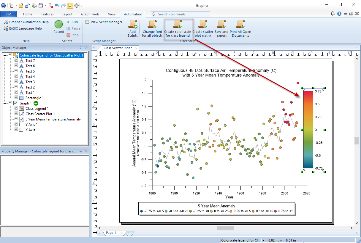
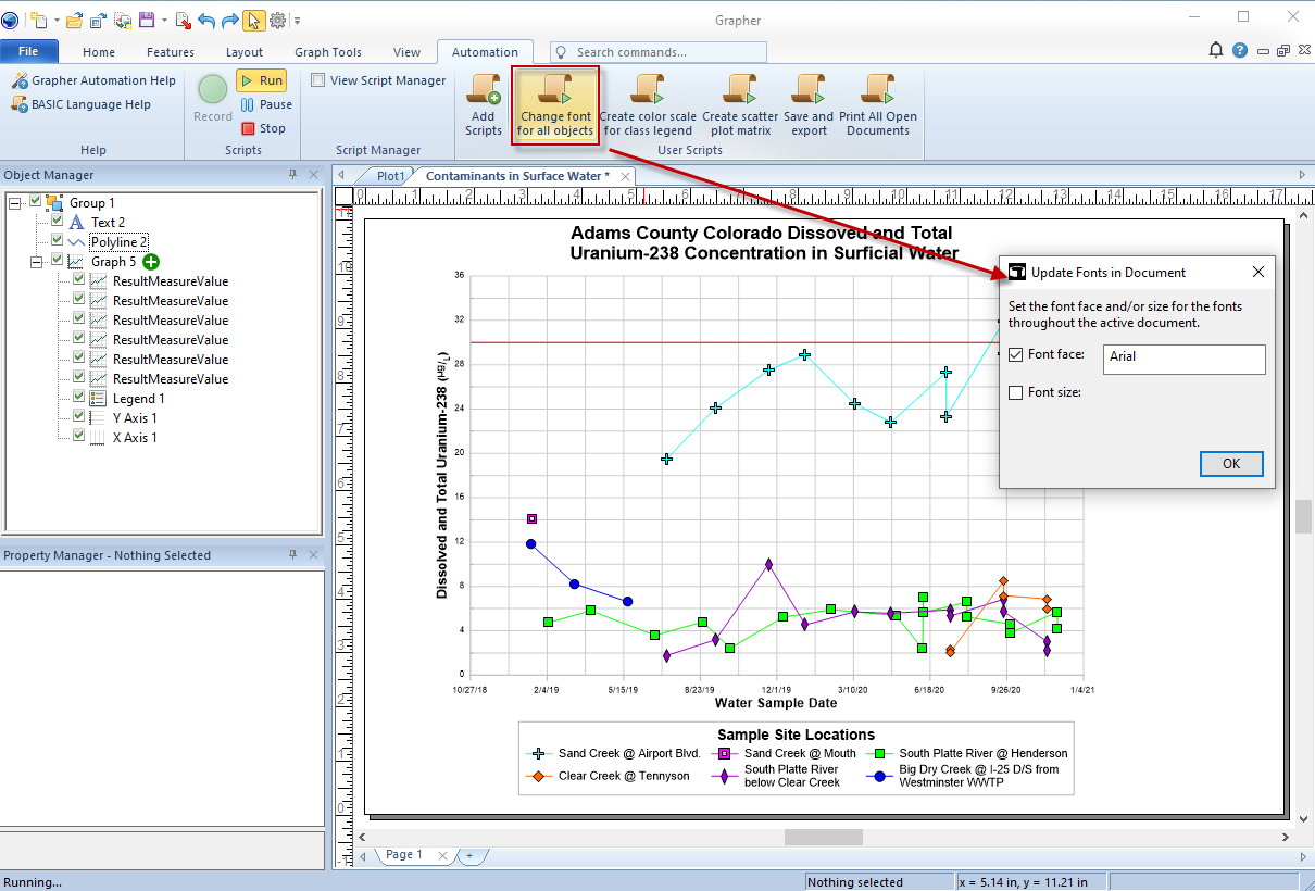
5. New Default Scripts to Help You
Whether it’s reformatting fonts across the project or manually creating continuous color scales, tedious tasks can add up and create stress, especially when deadlines are tight. Automation is a great way to handle this kind of work, but you may not have the time (or desire) to write scripts from scratch. That’s when you can depend on a couple of new default automation scripts in Grapher.
The latest scripts available simplify two tedious tasks in your workflow: creating a continuous color scale for class plot legends and changing fonts across all objects in your project. These scripts are packaged with Grapher, meaning you can run them instantly. There’s no coding required. All you have to do is press a button to start getting the consistent, clean, and polished output you want without spending unnecessary time on tedious steps. This easy, straightforward process is also a great way to explore the power of scripting and unlock more possibilities for what you can script!
Get More Done Without Sacrificing Quality
Each of these new features in the latest Grapher release is designed to help you work more efficiently while still delivering compelling graphs. From the new template experience and Golden Gallery to document comments, default scripts, and the ability to better handle drillhole data, every improvement enhances both speed and the quality of your visual output. Are you ready to try these new tools yourself? Upgrade to the latest version of Grapher to create data visualizations quickly while maintaining a high standard of quality.