Data Presentation That Makes an Impact: How to Communicate Insights Clearly
In geoscience and engineering, doing great data collection and analysis is only half the job. The other half—and sometimes the harder one—is communicating the insights that actually came from those efforts. No matter how rigorous your data gathering or how precise your calculations, your insights only make an impact when stakeholders understand them.
Unfortunately, that’s where many projects stumble. Insights can lose their value if visuals aren’t clear. When maps, models, or graphs are cluttered, confusing, or overly technical, stakeholders can easily misinterpret takeaways, leading to a decrease in confidence, rejected recommendations, and poor decision-making.
That’s why great data presentation is a core professional skill. Being able to share insights clearly, whether in 2D or 3D, equips you to bridge the gap between complex data collection and analysis and actionable understanding.
Common Data Presentation Mistakes (and How to Avoid Them)
Now, what steps can help enhance data presentation skills? First, it’s important to know what mistakes to avoid. Even skilled geoscientists and engineers can unintentionally make choices that weaken their visuals, causing key insights to get lost or misunderstood. To avoid that from happening, here are a few of the most common data presentation mistakes geoscientists and engineers make.
Mistake 1: Placing Importance on Every Data Point
When every dataset, layer, or variable is shown at once, the main insights get buried. Instead of clarifying the takeaways, the visual becomes overwhelming, leaving stakeholders confused about what matters and what they should focus on. The result? A misinterpretation of the findings, leading to delayed decisions.
Mistake 2: Using Default Settings Without Question
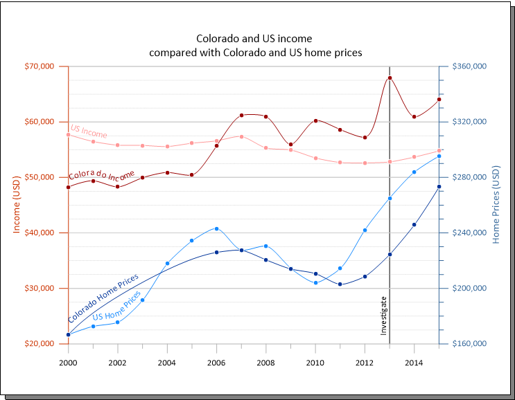
Default color scales, contour intervals, or axis scales are great, but they’re not always tailored to your specific data. They can unintentionally mask important variations or exaggerate patterns that don’t actually exist. Relying on them every time—without considering customizations you can make—leads to maps, models, and graphs that don’t effectively honor your data, creating confusion rather than clarity.
Mistake 3: Assuming the Audience Understands the Data
Because you’re familiar with every assumption, limitation, and nuance of your data, it’s easy to forget your audience isn’t, especially if they’re non-technical stakeholders. When labels, legends, or visual cues aren’t clear, your audience will have to guess at meanings, and guesswork almost always leads to misunderstanding or hesitation.
Best Practices for Clear, Confident Data Presentation
Once you know what mistakes to avoid, the next step is to simply implement best practices that’ll help you communicate insights. However, keep this in mind: strong data presentation isn’t just about making your map, model, or graph “pretty”; it’s about making intentional design choices that give stakeholders a clear understanding of your main takeaways so they can take informed action. That said, here are some core best practices for approaching data presentation effectively.
Choose the Right Visualization for the Story You Need to Tell
The foundation of effective data presentation is choosing the visual format. No single map or graph works for every scenario. Different visuals highlight different relationships, and selecting the wrong one can unintentionally obscure your insights. Below is a quick look at common and specialized map and graph types and when each one is the right choice.
When to Use Different Map Types
- Contour Maps: Best for showing smooth, continuous variation across a surface—like groundwater levels, temperature, or topography.
- Color Relief Maps: Ideal when you want audiences to quickly grasp spatial gradients or intensity changes using intuitive color scales.
- Shaded Relief Maps: Use these when terrain interpretation matters; shading creates a realistic sense of elevation and slope.
- 3D Surface Maps: Choose this when elevation, volume, or surface geometry is essential to understanding your data, especially when depth relationships influence interpretation.
- Base Maps: Useful when your goal is to anchor your data to real-world locations using imagery, streets, or land cover for context.
- Classed Post Maps: Best for showing how sample locations fall into key categories or thresholds (e.g., contamination levels, soil types).
- Vector Maps (Arrows, Quivers): Choose these for directional data, such as groundwater flow, wind direction, or current movement.
- Volumetric or Isosurface Maps: Best for visualizing 3D plumes, ore bodies, or subsurface concentration zones that cannot be interpreted easily in 2D.
When to Use Different Graph Types
- Line Graphs: The go-to for showing change over time, trends, or continuity between data points.
- Scatter Plots: Use these to highlight relationships or correlations between two variables, which is great for exploratory analysis.
- Bar Charts: Best for comparing discrete categories or summarizing grouped data.
- Histograms: Ideal for understanding data distribution, spread, or skew—commonly used in QA/QC or statistical analysis.
- Box Plots: Use this visual when comparing distributions across multiple groups; they quickly show medians, variability, and outliers.
- Ternary Diagrams: Choose these when analyzing three-component systems, such as soil composition or geochemical ratios.
- Stiff, Piper, or Durov Diagrams: These are essential for water chemistry interpretation, equipping you to compare ionic composition and classify water types.
- Polar or Wind Rose Plots: Great for directional datasets where frequency and magnitude depend on angle (e.g., wind speed, flow direction).
- Bubble Charts: Helpful when you need to show relationships among three variables (x, y, and bubble size) in a compact visual.
Ultimately, you have a lot of visual formats at your disposal, but choosing the right one is the first step toward ensuring you communicate your data-driven insights well.
Reduce Clutter So the Insight Stands Out
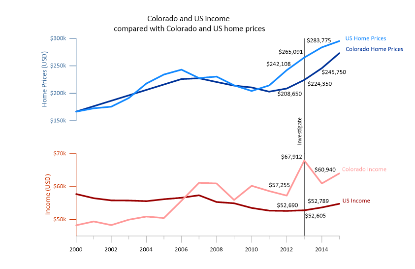
Overloaded visuals bury your message. When a map, model, or graph tries to show everything at once—too many layers, labels, symbols, or colors—the most important takeaways aren’t easily identifiable. To overcome that issue, prioritize the insights stakeholders need to see first, then strip away anything that doesn’t directly relate to those points.
Use Color, Scale, and Symbology Intentionally
The wrong color scale can misrepresent gradients, hide subtle variation, or introduce bias. Likewise, poorly chosen contour intervals, axis limits, or symbol sizes can distort meaning.
Choose color scales that reflect the nature of your data, set scales that accurately represent values, and maintain consistent symbology across figures. When every stylistic choice supports clarity, stakeholders can immediately focus on the meaning behind your insights rather than the mechanics.
Guide Stakeholders With Clear Annotations and Context
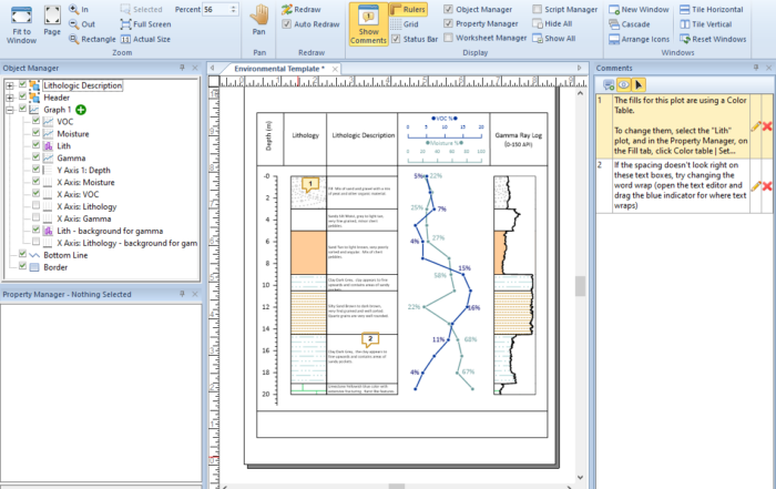
Even strong visuals can fall flat if stakeholders don’t know what they’re viewing. That’s why annotations are great. Labels, callouts, and legends guide your audience through your visual so they understand the main takeaways. However, please remember that just enough context prevents confusion; too much creates noise. Use annotations where necessary to ensure stakeholders have the insights they need and don’t get bogged down by the details.
Structure a Data Narrative That Leads to Decisions
Data presentation is storytelling. A strong narrative follows a logical arc: Question → Method → Insights. Your visuals should follow this same progression. Sequence it so each design element builds on the last, helping your audience connect steps and arrive at your insights naturally. When the story flows, decision-making becomes faster and more confident.
Know When 3D Adds Clarity and When It Doesn’t
3D visualization is an incredibly powerful tool, but like any tool, it’s most effective when used intentionally. Not every dataset or deliverable needs a 3D model, and using 3D at the wrong time can confuse your audience. The key is understanding when 3D genuinely enhances clarity and when a well-crafted 2D visual communicates the message more effectively.
Here are general guidelines for when each approach works best:
- When 3D helps: Subsurface mapping, overlapping features, volume interpretation, and spatial relationships that can’t be seen clearly in 2D.
- When 2D is better: Simple comparisons, regulatory deliverables, quick checks, or time-sensitive workflows.
Ultimately, using 3D should be a thoughtful decision to ensure you get the most benefits from it. Choosing the right dimensionality will support your ability to effectively communicate insights from your data.
Tailor Visuals to Your Audience
Different audiences bring different levels of technical expertise, priorities, and expectations to the table. A visual that works perfectly for an engineer may overwhelm a community stakeholder, and a simplified public-facing graphic may be too imprecise for a regulatory agency.
Understanding what each group needs to see is essential to ensuring your message lands. For example:
- Clients and regulators typically need accuracy, analysis, and defensibility.
- Internal teams may need more technical depth to collaborate effectively.
- Public audiences often require simplified visuals without losing factual accuracy.
The strongest data presentations meet viewers where they are. They give each audience exactly what they need to understand the insights so they can make informed decisions.
What Leads to Great Real-World Decision-Making
Effective data presentation is about sharing insights in a way stakeholders can understand and act on. When your visuals achieve that goal, they bridge the gap between technical data collection and analysis and actionable understanding. That’s what transforms your work from “informative” to truly influential. So whether you choose a 2D map, a scientific diagram, or a 3D model, the goal is the same: help stakeholders understand the insights from your data. Mastering this takes practice, but the payoff is significant.
Want to continue sharpening your data visualization skills and growing as a geoscientist and engineer? Subscribe to the Golden Software blog!


