PFAS in the U.S. (Part 4): Analyzing and Visualizing PFAS at California Airports
Per- and polyfluoroalkyl substances (PFAS) have become one of the most pressing environmental and public health challenges of our time. These resilient synthetic compounds—often called “forever chemicals”—can persist in the environment for decades, impacting our water, soil, air, wildlife, and bodies. They can also stem from multiple sources, with one of the biggest contributors being aviation.
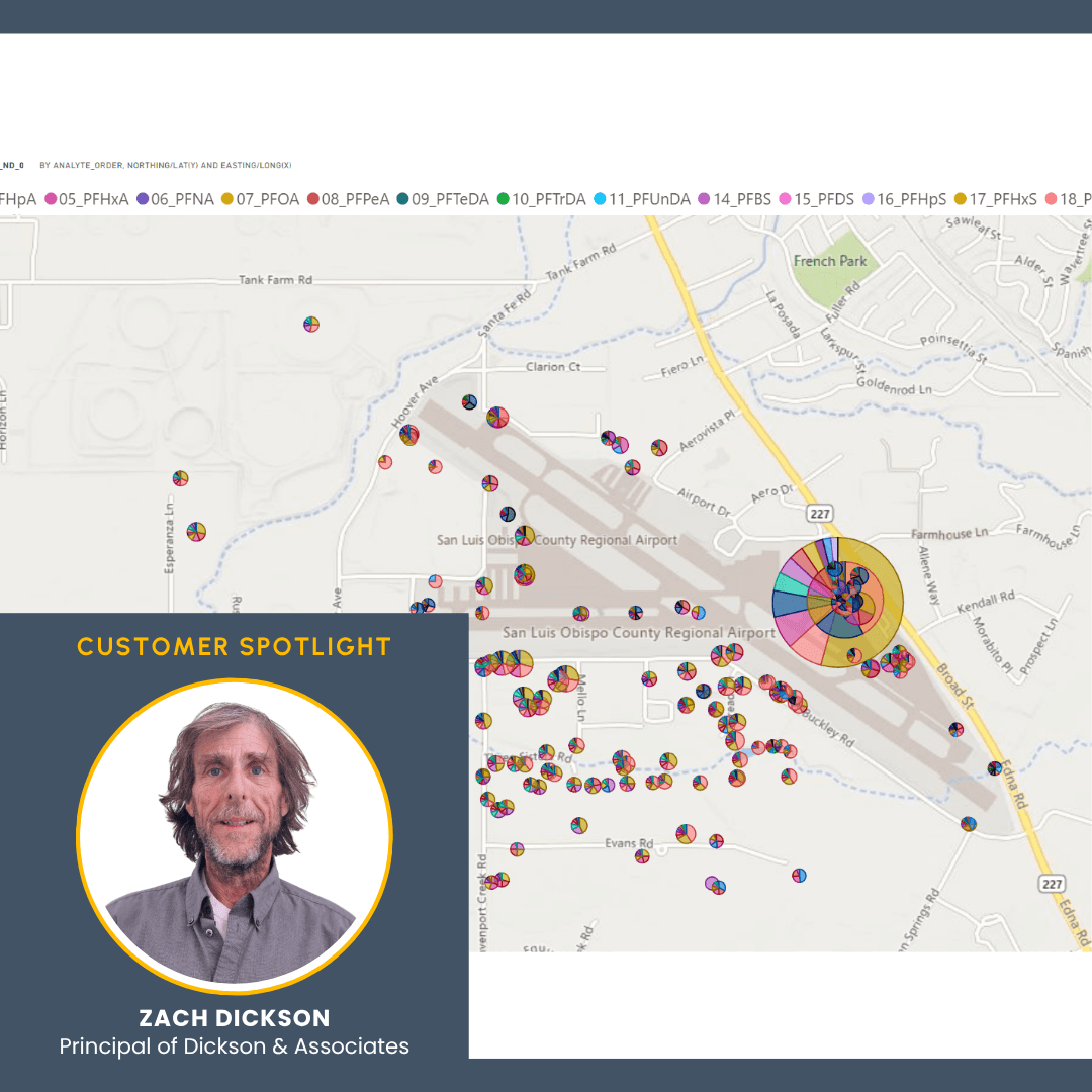
In the fourth installment of our “PFAS in the U.S.” blog series, we’re turning our attention to a key contributor to PFAS pollution in California: airports. To better understand the scope and scale of the issue, Zach Dickson, Principal of Dickson & Associates, developed an interactive PFAS model that offers researchers and the public a user-friendly way to explore PFAS contaminant impacts near airport facilities. Built using publicly available environmental data, Surfer, and Microsoft 365 tools, Zach’s model is a much-needed resource at a time when Californians are becoming more concerned about the PFAS contamination coming from airports.
“There was a fire at a laboratory near an airport,” Zach explained. “The firefighting response involved the use of aqueous film-forming foam [AFFF], and according to reports, the foam ran down a nearby creek inches thick. While this is only a single example of a PFAS discharge event in that area, other airport AFFF use, including storage fire training and emergency discharges, illustrate how local drainages and underlying groundwater resources become widely impacted, particularly in industrial areas. Homes and businesses reliant on groundwater resources in such areas may want to further evaluate the PFAS impacts not only on their and their family’s health but on crops, domestic animals, and livestock.”
PFAS Contamination at California Airports
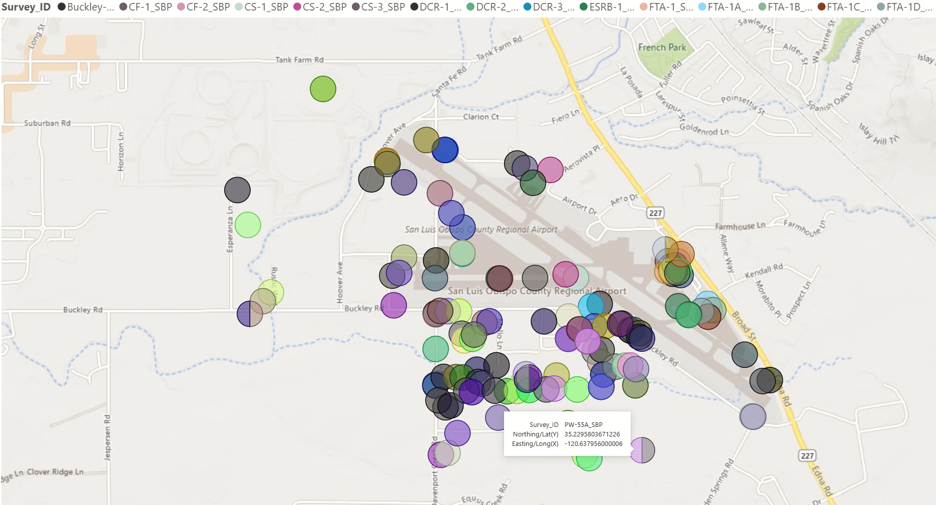
Airports across California are emerging as significant sources of PFAS contamination—and one site in particular has become an example of the problem: San Luis Obispo County Regional Airport. For nearly 50 years, PFAS compounds have been leaching into the groundwater beneath and surrounding the airport. The contamination is linked to the use of AFFF, a special firefighting substance mandated by the Federal Aviation Administration for use in aircraft fire emergencies and training exercises.
“Airports were required for many years to have PFAS-related firefighting foams,” Zach explained. “That’s been phased out over time as they try to get to safer products, but because PFAS-related firefighting foams were once required to be stored and readily available at certain types of airports—particularly military and military-linked civilian ones—the facilities were also required to test them. So, you’d have highly concentrated mixtures of PFAS that were combined with water and sprayed to make the foam, and that was tested and used across a facilities’ properties, possibly even in undocumented areas.
AFFF is now widely known to contain high concentrations of PFAS, and its use at airports has left a persistent chemical footprint across California. In 2019, the California State Water Board directed 30 airports across the state to begin investigating PFAS pollution. Every single one showed some level of contamination. San Luis Obispo County Regional Airport was one, with more than 70 nearby wells—many of them private wells used by homes and local businesses—having shown PFAS impacts. For residents in San Luis Obispo, some of whom have lived across the street from the airport for decades, the news was unsettling.
However, San Luis Obispo has put together a formal response plan. Will other airports follow suit? That remains to be seen, but one thing that’s certain is that the San Luis Obispo County Regional Airport is an example of the broader challenges facing airport communities—and underscores the necessity of tools like the California Airport PFAS model to better understand and address the issue.
What the California Airport PFAS Model Helps Reveal
The California Airport PFAS model delivers powerful insight into a complicated—and still evolving—environmental challenge. Designed to be dynamic, interactive, and accessible, the model equips researchers and the public to make sense of extensive contamination data without needing in-depth site reports or insider knowledge.
Here are just a few key takeaways this model helps illuminate:
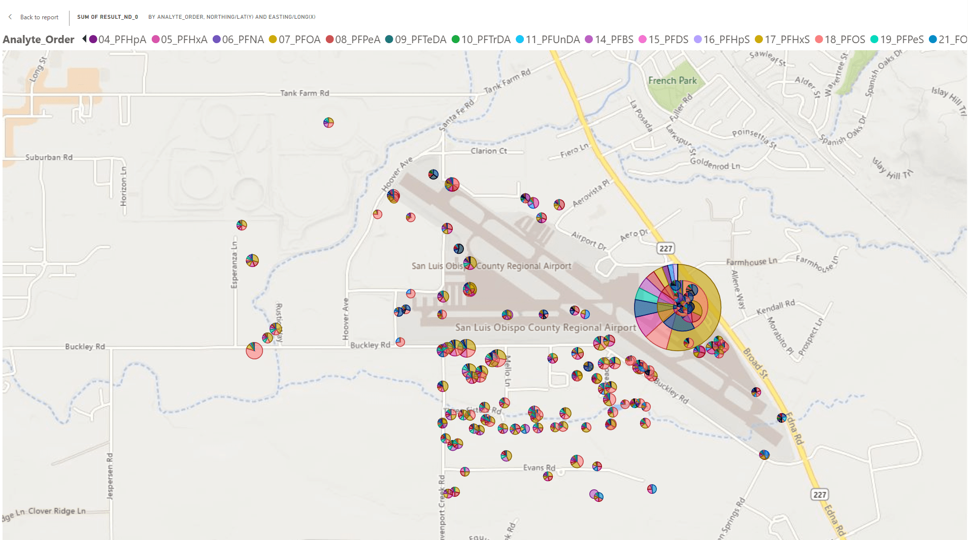
- Pinpointing the most impacted sites and samples: At a glance, users can identify which airport locations and specific samples show the highest PFAS concentrations. For example, the model indicates that San Luis Obispo County Regional Airport is associated with the highest analyte concentrations.
- Identifying dominant PFAS compounds: The model doesn’t just show where PFAS is present—it helps determine which specific analytes are most prevalent. For instance, histogram pages within the model show that San Luis Obispo County Regional Airport’s PFAS profile is dominated by PFHxS, PFOS, 6:2 FTS, and PFHxA. These trends can also be compared across other airports in the dataset.
- Making meaningful comparisons: The model equips users to compare any sample—or entire sets of samples—against others. This supports side-by-side evaluation of PFAS profiles between different airports or areas of concern and helps users spot similarities, differences, and outliers in the data.
- Spotting potential bias in the data: With tools that count how often each analyte was tested, the model highlights inconsistencies in sample coverage. That makes it easier to detect gaps in the dataset—like under-tested compounds—and avoid drawing premature conclusions.
- Leveraging geospatial insight: Because the data is georeferenced, users can overlay PFAS data with real-world geographic features like groundwater wells, agricultural zones, and infiltration pathways. This is critical when evaluating how PFAS may move through soil, groundwater, or surface water—and what communities or water sources might be at risk.
Of course, Zach Dickson emphasizes that the model is in demonstration mode, so findings aren’t automatically conclusions. They’re simply clues about how PFAS may be impacting airports and their surrounding areas so that researchers and the public can start developing a better understanding of what’s happening.
How the California Airports PFAS Model Was Built
Creating a model for researchers and the public to explore PFAS in and around airports required multiple steps, including reducing datasets, validating data points, and building an intuitive presentation. To tackle everything, Zach used Surfer and Microsoft 365 tools—a powerful combination that helped him transform complex environmental data into something understandable and engaging. His process can be outlined in three main steps.
Step 1: Data Reduction and Cleanup with Power Query
The first phase of the project started with Power Query, Microsoft 365’s data transformation tool. Zach began with a mountain of raw data—hundreds of thousands of points pulled from public environmental records—and needed to filter out noise, inconsistencies, and irrelevant entries.
Power Query made it possible to consolidate this information into a manageable dataset focused solely on PFAS samples from 27 California airports. The tool also equipped Zach to identify which records were meaningful and prepare the data for deeper analysis—all before a single map was made.
Step 2: Validation and Mapping with Surfer
Once the data was reduced, Surfer became the central tool for verifying its integrity and bringing it to life spatially. With thousands of PFAS records to analyze, Zach used Surfer’s advanced mapping features to make sure everything aligned with real-world geography and environmental conditions.
Surfer’s pie charting and class posting tools proved especially valuable for visualizing the data. Each chart helped showcase the dominant PFAS analytes at a given location—letting him quickly identify which compounds were present and in what proportions. Zach also used BNA files to load California’s state, county, and city boundaries directly into Surfer. This allowed for highly detailed and zoomable maps that revealed both the location and relative impact of contamination at each airport.
“Surfer presented this data in a way no other program could,” Zach said simply.
Beyond visualization, Surfer played a key role in data validation. Zach explained, “Surfer will fail if your data isn’t structured properly. Microsoft will fail, too—but in a different way. Surfer tells me things I might not otherwise see.” This made the software an essential part of Zach’s quality assurance and control process.
Step 3: Building the Interactive Model with Power BI
With the data validated and visualized, Zach turned to Power BI, Microsoft 365’s data modeling platform, to build the interactive experience users see today. Power BI allowed him to create an online dashboard that makes it easy to:
- Filter by site or analyte
- Compare concentrations between airports
- Visualize PFAS data across geography
This final layer of interactivity would equip researchers and the public to explore California’s airport PFAS data with ease and clarity to get the insights they need.
TECH TIP
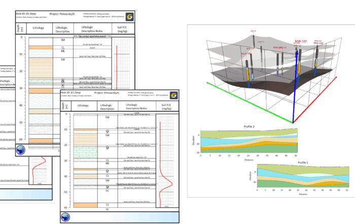
While Power BI models provide for an unparalleled comparative and big-picture evaluation of PFAS impacts, Surfer provides the tools necessary to show the contextual details that will truly help visualize and understand those impacts. To demonstrate this, Zach prepared a highly detailed Surfer model of the San Luis Obispo Airport PFAS and nearby Buckley Road Area TCE contaminant distribution. The Surfer model incorporated topography, lithology, perched and regional groundwater, and other relevant metrics.
To see the Surfer model Zach prepared, as well as a demonstration from Senior Business Development Manager Drew Dudley on how to create and share useful PFAS visualizations, watch the following: Environmental Insights: An Expert’s Approach to Site Characterization with Surfer (Webinar)
Bringing PFAS Insights to Light—One Airport at a Time
As concerns over PFAS continue to rise across the U.S., it’s becoming increasingly important to make sense of where and how these “forever chemicals” enter the environment. California airports, with their reliance on AFFF, are one source—and the contamination they’ve left behind must be fully understood.
Thanks to Zach Dickson’s California Airport PFAS model, we now have an accessible, interactive tool that helps uncover the story buried in the data. From highlighting the most impacted airports and wells to identifying specific PFAS compounds, the model helps bring a new level of clarity to a complex issue. So whether you’re a researcher hoping to compare PFAS profiles across airports or a member of the public who wants a better handle on how airport-related PFAS use has affected your area, this model makes it possible.
Want to keep reading stories like this? Subscribe to the Golden Software blog to stay up to date with future posts in our PFAS series—and discover even more stories that blend science, data, and visualization to uncover what’s happening beneath the surface.
Subscribe to the blog for more!