PFAS in the US (Part 2): Analyzing and Visualizing PFAS in Colorado
Per- and polyfluoroalkyl substances (PFAS) continue to emerge as one of the most pressing environmental and public health concerns across the United States. These persistent chemicals—often called “forever chemicals”—are known to contaminate water, soil, and even air, and they’ve been linked to serious risks for both ecosystems and human health.
Every state is grappling with the PFAS problem, but in this second part of our blog series, we’re focusing on one in particular: Colorado.
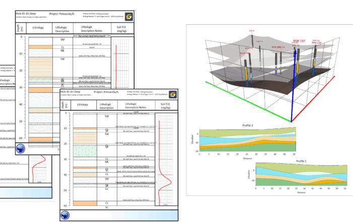
To help bring clarity to a complex and evolving issue, Zach Dickson, Principal of Dickson & Associates, developed a dynamic, interactive, and geo-referenced PFAS model on the state. Using publicly available datasets and a combination of Surfer and Microsoft 365’s Power Query and BI, Zach built tools that equip researchers and the public to explore PFAS contaminant impacts to surface and purveyor supplied drinking water sources across Colorado. Curious to see what the model can reveal about the Centennial State—and how the visualization was built? Let’s dive in.
What the Colorado PFAS Model Reveals
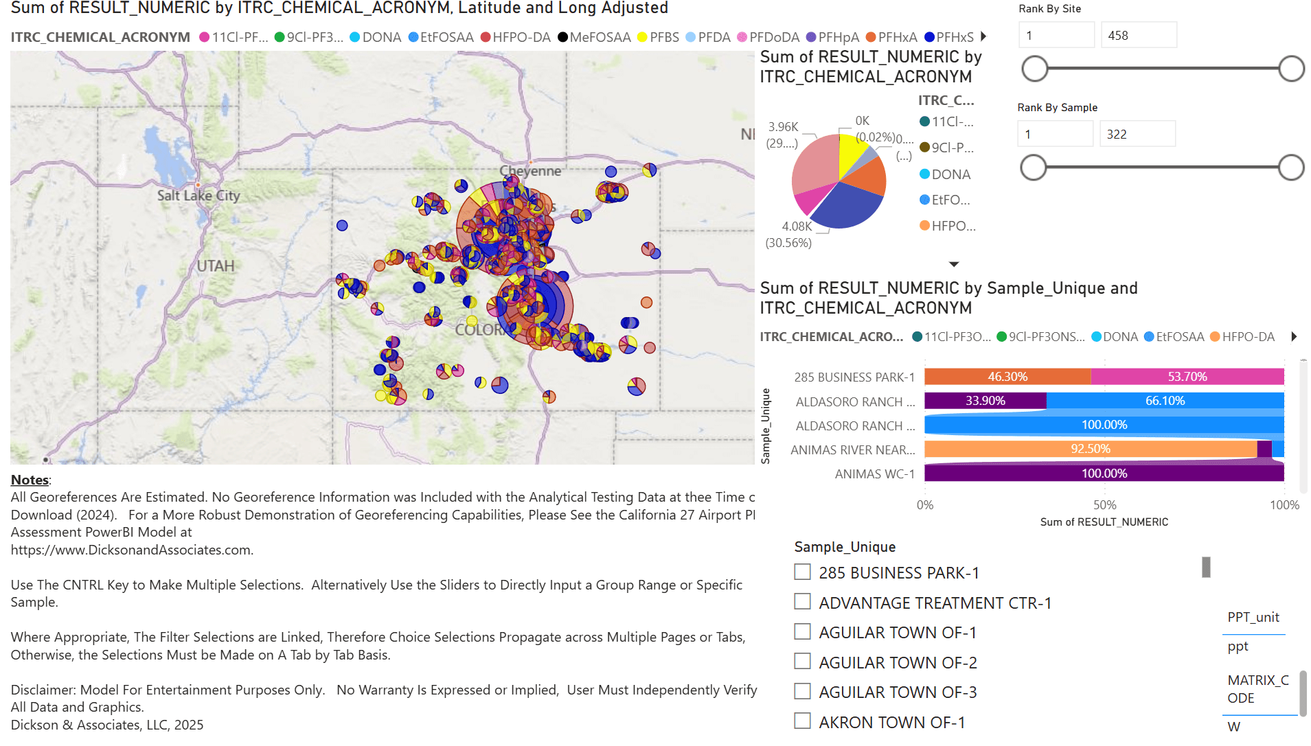
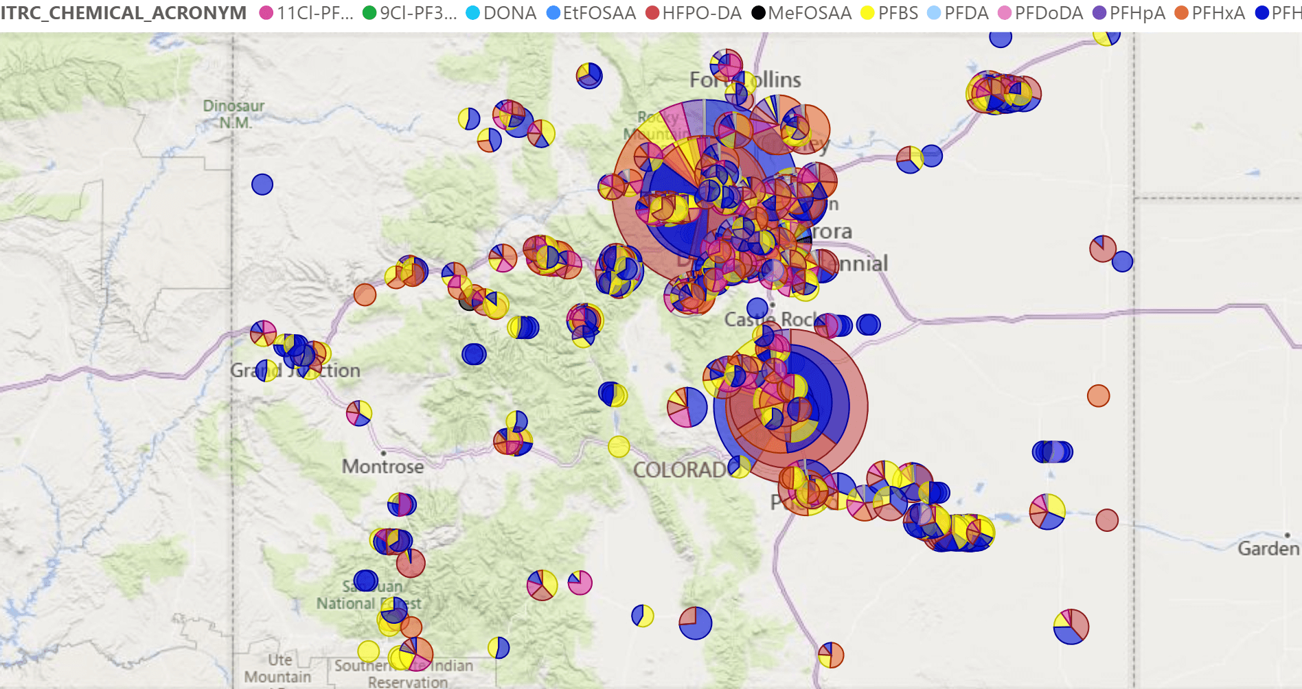
The interactive PFAS model for Colorado offers a compelling snapshot of how PFAS compounds are distributed across the state—particularly through water providers and purveyors. What you’ll see in the model are visualizations—often in the form of color-coded pie charts—representing relative PFAS concentrations at various sampling locations. But it’s important to understand what that really means.
Larger pie charts don’t automatically equate to a severe health hazard or emergency situation. Instead, they show where PFAS concentrations are higher relative to other sampled locations in the dataset. It’s all about comparison, not absolutes. For instance, a smaller pie chart at one site might represent a type of PFAS associated with a major airport’s runoff, while a larger chart elsewhere could come from an entirely different source—perhaps industrial discharge or consumer waste. The scale and significance of each pie chart should be interpreted with care.
That said, the model does offer early clues about how PFAS may be spreading across landscapes. If you notice the coloring in the visualization and look at certain areas where the state did low-level surveys of manufacturers that were potentially putting Teflon coatings on pans, you can see hints of those colors coming down some of Colorado’s drainages. However, as Zach emphasizes, these observations are preliminary. They’re not conclusions—they’re conversation starters.
“These are demonstration models,” Zach notes. “They haven’t gone through peer review, and they’re based on raw, publicly available data processed in a way that I thought might be helpful. Are they valuable? I believe they are—but they’re meant to be explored, refined, and interpreted with context.”
Ultimately, the goal of the Colorado PFAS model is not to sound alarms—it’s to encourage exploration, provide accessible insight, and empower people to start asking the right questions about where PFAS is showing up, how it may be spreading, and where to prioritize future research or remediation.
How the Colorado PFAS Model Was Created—And Where Surfer Played a Critical Role
To provide helpful insight, creating the Colorado PFAS model required the right combination of data processing tools and visualization software, and that’s where both Surfer and Microsoft 365’s Power Query and BI came into play.
To start, Zach used Microsoft 365 tools in the initial data reduction phase. Power Query equipped Zach to efficiently clean and organize raw PFAS datasets—many of which were pulled from publicly available sources provided by state agencies. These datasets can be massive, so the ability to reduce the data to what matters most was essential. Once processed, Surfer brought the data to life spatially—and served as an essential validation tool.
“Surfer was incredibly helpful in the geospatial analysis,” Zach shared. “Using the BNA files, I was able to very quickly put together the state boundaries, the counties, and the cities and get all those things onto the map. Then, I created my pie charts and put them relatively where I needed them.”
Because many of the Colorado datasets lacked geo-referenced coordinates, Zach manually hand-referenced sites based on descriptions and his own familiarity with the state. Using Surfer’s support for BNA files and built-in state, county, and city boundaries, he was able to assemble a layered, visually rich map in a short amount of time. The class posting and pie mapping tools in Surfer made it easy to visualize the relative importance of each PFAS compound at different sites—helping to show both overall concentration and chemical composition.
“The pie charts gave me the big picture—what are the important PFAS compounds and where are they concentrated?” Zach explained. “Then, I could zoom in to identify which site is which and rank them by impact across the state.”
Importantly, Surfer also helped verify the data’s integrity. If the data wasn’t formatted properly—if there were missing fields or invalid records—Surfer would raise red flags, allowing Zach to catch issues he might not have seen in Microsoft tools. This made Surfer a critical step in his QA/QC process.
“Surfer allowed me to verify that my data was correct,” Zach said. “Surfer will fail if my data is not in the proper order. Microsoft will fail, too—but it’ll fail in a different way. Surfer, however, will tell me certain things that I might not otherwise see, so it’s part of my data-checking process.
The result? A beautiful, high-quality, and accurate map that was easy to explore and easy to trust.
“Surfer presents data in a way no other program could. It accepted my cleaned-up data and generated all those pie charts and map layers nearly instantaneously,” Zach said.
From early-stage verification to polished visual outputs, Surfer became an essential tool for beautifully visualizing accurate data. All Zach had to do from there was take everything he had created to build a dynamic, shareable model using Power BI. This tool helped him take everything and turn it into an online interactive dashboard where users can explore data by region, filter by specific PFAS compounds, and view state-wide trends.
Stay Tuned: California Is Up Next
As more data becomes publicly available and concern around PFAS continues to grow, tools like Zach’s Colorado PFAS model will play an increasingly important role in helping researchers and everyday people in the state visualize, understand, and act on information. But Colorado isn’t the only state we’re highlighting.
The next post in our “PFAS in the US” blog series will explore another model Zach created—this time focusing on California. With a larger population and a different regulatory approach, the California PFAS model reveals new insights, patterns, and questions around these persistent pollutants.
So stay tuned. The next installment will dive into California’s soil and groundwater data and unpack how Zach visualized contamination across one of the nation’s most complex and populous states.
Subscribe to the blog for more!