6 Specialized Graphs You Can Create and Recreate With Ease
Sometimes, you need to create a specialized graph—but the process for doing so is rarely seamless if it’s your first time creating one with a particular software. Usually, you have to stumble through some sort of learning curve. Even when the tool is intuitive and simple, you need to figure out where the specialized graph type lives in the interface, how your data should be formatted, and how to customize labels, scales, and colors to fit your needs.
Eventually, you crack it. You create the specialized graph you need. But what happens when it’s time to make a similar plot, just with new or updated data? In this case, you run into a different kind of challenge. You’re no longer battling a learning curve. Instead, you’re trying to remember what you did the first time: which settings you used, where you tweaked the styles, and what little adjustments made the final plot just right.
Fortunately, there’s a way to make the creation and recreation processes much easier.
In our new six-part Specialized Graphs blog series, we’re walking through the best way to make and remake specialized graphs without the learning curve or guesswork. That way, you can create publication-ready visualizations for stakeholders with ease.
The Six Specialized Graphs This Series Will Explore
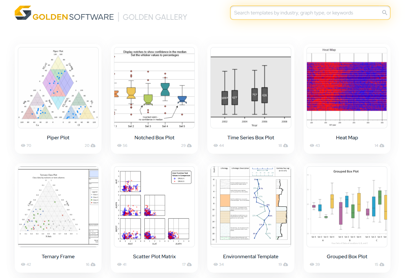
Each of the specialized graphs we’ll feature in our blog series is uniquely suited to visualizing complex scientific data. These plots aren’t your everyday bar charts and line graphs. They’re unique, purposeful tools, and once you’ve created one successfully, you’ll want to recreate it when similar projects arise—only with new data and zero hassle. But to make sure we’re on the same page about what this blog series will cover, here’s a look at the specialized graphs we’ll be diving into.
Piper Plots
Piper plots are essential for water quality and hydrochemical classification. They help visualize the chemical composition of water samples using a trilinear diagram. By plotting major cations and anions, piper plots make it easy to compare samples and quickly identify water types and potential trends across geographic or temporal datasets.
Box Plots
Box plots (also called box-and-whisker plots) are ideal for summarizing distributions and spotting outliers in your data. They provide a quick, intuitive sense of a dataset’s median, range, and variability—great for comparing groups, summarizing field data, or visualizing summary stats across locations or time periods.
Stiff Plots
Stiff plots are another key tool for water chemistry analysis, especially for comparing ion concentrations between samples. The mirrored polygon shape makes it easy to spot differences or similarities across a dataset.
Ternary Plots
Ternary plots help visualize the relative proportions of three variables in a triangle-shaped plot. Whether analyzing sediment compositions, chemical proportions, or mineral contents, ternary plots are a go-to visual for compositional data.
Polar Wind Plots
Also known as wind roses, these plots show the frequency and direction of wind speeds (or any directional data). They’re especially useful in environmental studies, site assessments, and regulatory reports where it’s important to show patterns over time.
Durov Plots
Durov plots are similar to piper plots but offer an expanded way to interpret water chemistry. They combine two ternary diagrams and a central square plot to give a more complete picture of hydrochemical facies and potential processes affecting water quality.
The Secret to Recreating Specialized Graphs Quickly: Templates
Now, let’s briefly discuss the solution we’re going to suggest for creating and recreating these six specialized graphs with ease. As we already know, when creating a specialized graph in a particular software for the first time, there’s always some trial and error involved as you figure out where to find the plot type, how to format your data, and how to make customizations. Once you’ve figured all this out, the second challenge comes whenever it’s time to make a similar plot. Now, you have to remember the answers to these questions: Which data columns did you assign where? What did you change in the properties? How did you customize the labels, legends, and scale?
To bypass all these challenges and questions, templates can really save the day.
There are high-quality, ready-to-use templates of specialized graphs that you can use to create and recreate scientific plots with ease. These templates are designed to move you from data to publication-ready visuals without the hassle. Instead of navigating a learning curve or reconfiguring plots, styles, labels, and legends, you can just open a template for a specialized graph, import your dataset, customize it further if necessary, send it to your stakeholder, and reuse the template when necessary. In a nutshell, with templates, creating and recreating specialized graphs is easier and more enjoyable—and throughout this blog series, we’ll point to where you can find a template for each of the six plots we discuss.
Ready to Recreate Specialized Graphs With Ease?
Whether you’re building a specialized graph for the first time or trying to recreate one you made months ago, the process shouldn’t slow you down. Creating and recreating clear, compelling, and scientifically accurate visuals should be a seamless part of your workflow, not a roadblock. With templates, that expectation is now a reality, and this Specialized Graphs blog series will make that clear. So stay tuned as we dive into each specialized plot in more detail and explain how to recreate them with ease using templates as your guide.
Subscribe to our blog for updates!