Streamline, Explore, Discover, and Reuse: The Top Enhancements in the Latest Grapher Release
It’s release day—and this one’s all about making your workflow smoother, faster, and more creative. The latest update to Grapher is packed with enhancements designed to help you move more efficiently from raw data to polished visuals, while also giving you more ways to explore, discover, and reuse what’s worked best along the way.
Here’s what Product Team Lead Ruth Rodman had to say about the new release: “Grapher has always partnered closely with its loyal fans to level up with each release, and this is no exception. I’m especially excited for users to take advantage of the new template experience to really launch off and turn their data into visualizations in record time.”
Ready to learn more about the exciting features taking Grapher to a new level? Here are three key improvements you can start enjoying with this latest release!
1. Fewer Clicks to Accomplish Your Goal
Let’s face it—when you’re under pressure to meet a deadline, every extra click counts, but sometimes the smallest tasks slow you down the most. One example is toggling the visibility of various plots one by one. This repetitive step adds friction to your workflow and chips away at your time and focus.
Fortunately, in the latest Grapher release, we focused on streamlining the steps it takes to move from raw data to a great graph stakeholders engage with and understand. The goal? Help you work faster without compromising the precision or customization you count on Grapher for. To achieve that objective, we made toggling visibility significantly easier.
When you have plots you want to turn on and off to see particular data or export to a final visualization, you don’t have to toggle the visibility one by one anymore. Now, whenever you select multiple objects in the Object Manager, you can toggle visibility for all of them in one go—no more clicking through each one. You can even complement this with an existing feature for legends to show “visible plots only.” This tool will update your legend so it only showcases the plots that are visible in your document, streamlining your design process so you have what you need more quickly and can analyze or make exports of particular portions of your graph in little to no time.
This improvement may seem small on the surface, but it adds up in a big way, especially if you’re managing large or complex graphs. With toggling visibility made easier, you’ll spend less time clicking and more time analyzing, refining, and delivering high-quality visuals. And for new users, Grapher will now feel more intuitive and aligned with the way you expect software to work. Put simply: Grapher has always given you control. Now, it gives you more efficiency too.
2. Easier Exploration and Experimentation
Exploration is a big part of graphing, and experimenting with different visual styles should feel exciting—not risky. But when a single change causes your graph to break, disappear, or lose custom settings, the momentum in your exploration can stop in its tracks.
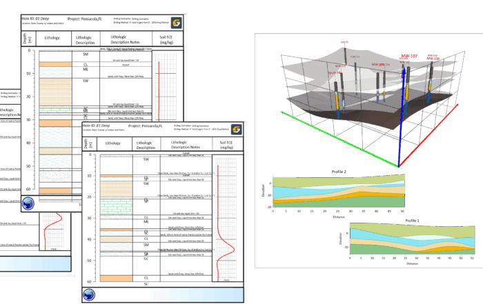
That’s why this Grapher release includes several enhancements that make it easier to experiment freely and confidently. From better default behavior in bar charts to smarter responses when switching axis types, you can now explore new ways to present your data without breaking your progress—or your stride. Here’s what’s new in Grapher to make all this happen:
- Better default axis limits: Grapher now creates more balanced spacing between bars on an axis, so your graphs feel centered and polished right from the start.
- Automatic adjustments for axis scale changes: Switching to a non-linear axis type like logarithmic for your bar chart? If the custom values are invalid, Grapher will automatically revert them to auto selected values, so your graph doesn’t break or disappear.
- Axis label settings persist across axis type changes: You can now explore different axis types without losing your custom label preferences.
- Smarter linking between object names, titles, and colors: See titles update with object names and colors as you modify your graph and charts—making changes more intuitive and visually consistent.
When you’re not quite sure how you want to present your data, these enhancements make it easier to experiment confidently. Instead of worrying that one wrong move might erase your progress, you can try new things, switch formats, and cycle through options—knowing that Grapher will preserve key formatting decisions and prevent avoidable mishaps. Combined with tools like the undo, redo, multiple selection, and copy and paste format features, this release makes it easier than ever to explore different graphing directions without backtracking or starting from scratch.
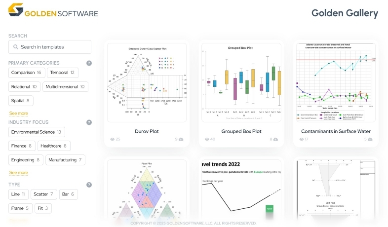
3. Discover, Reuse and Share: Templates in Grapher Beta
Sometimes, you have to make a new report that’s similar to one you’ve already created—the new one just has different or updated data. To get the job done, you may reuse GRF or GPJ files, but updating all the data references can be time-consuming and tedious, and it’s not like you can give the work to another colleague. They may not understand how to use Grapher the way you do. On the flip side, maybe you don’t want to reuse a project file but would prefer to replicate a graph or chart that inspired you. While it’s possible, it’s not easy. At least, it wasn’t easy until now.
We’re thrilled to introduce the Golden Gallery, a brand-new curated template library in Grapher Beta, which you can access when using the latest version of Grapher. This dynamic, ever-growing resource enhances how you reuse effective designs by letting scientists and engineers like you look at, use, and even contribute publication-ready templates built for clear, effective storytelling.
The templates are easy to browse, filter, and search, making it quick to find one that shows the results and the message you’re trying to communicate. They also come with guidance so you know how to use them. And since the Golden Gallery is part of our Beta program, you can provide feedback and suggestions directly to our team to help refine and improve the collection of templates over time. The result? Less time rebuilding graphs from scratch, more time focusing on your analysis, and more consistent visuals across your team or organization.
If you’re ready to reuse successful graph designs, see templates for your specific industry, or simply get inspired, now’s the perfect time to install Grapher Beta and start exploring the Golden Gallery. You’ll be among the first to shape this innovative new way of working—and take your data visualization to the next level.
Graph Smarter, Not Harder
Whether you’re racing to meet a deadline, exploring the best way to visualize a new dataset, or trying to replicate a winning graph, the latest Grapher release was designed with you in mind. With fewer clicks, better defaults, and powerful new tools like an updated template experience in Grapher Beta, we’re making it easier for you to create insightful, high-quality visuals—faster.
So, if you haven’t downloaded the latest Grapher or Grapher Beta release yet, it’s time to dive in. Whether you’re an experienced user or just getting started, the newest improvements will help you streamline your workflow, explore creative possibilities, and bring your data to life like never before.
Ready to get started? Download the latest version of Grapher and Grapher Beta if you’re already a current user. Otherwise, you can download a 14-day free trial now or purchase a license.