Tackling the PFAS Crisis with Surfer: A Webinar on Contamination Modeling
Per- and polyfluoroalkyl substances (PFAS) are an urgent environmental and public health concern, contaminating water, soil, and air across the globe. Known as “forever chemicals” for their persistence in the environment, PFAS compounds demand timely and targeted remediation. But effective remediation starts with understanding the problem—and that’s where Surfer can make a major difference.
In our recent webinar, Tackling the PFAS Crisis with Surfer, Golden Software’s Senior Business Development Manager Drew Dudley demonstrated how Surfer empowers users to create PFAS contamination models that not only highlight the scope of pollution but also communicate findings clearly to stakeholders. For insight into the methods and tools mentioned in the session, keep reading for details!
Building Contamination Models That Communicate
Our recent webinar wasn’t our typical “how to build a project.” Instead, Drew took attendees behind the scenes of what goes into crafting polished, stakeholder-ready deliverables such as detailed 3D PFAS models that tell a complete story.
His workflow included:
- Creating 2D PFAS contour maps
- Importing PFAS data to a drillhole layer
- Gridding drillhole data to create 3D plume visualizations
- A sneak peek at generating surfaces from drillhole picks
- Designing a professional layout using Surfer’s frame templates
- Exporting and sharing results through vector images and 3D PDFs
Drew went through each part of his workflow step-by-step, equipping webinar attendees to implement similar strategies whenever they have PFAS data. We encourage you to check out the webinar recording to see the workflow in action—but for now, here’s a brief look into how Drew created an amazing PFAS model in Surfer.
Creating 2D PFAS Contour Maps
Drew began by importing PFAS data from a public California dataset. Once in Surfer, he plotted the data using pie chart symbology to show the concentration and distribution of various PFAS compounds across the map. The use of pie charts made it easy to see which contaminants—such as PFHxS—were most dominant in each sample location.
From there, Drew demonstrated how to isolate and grid a specific contaminant (PFHxS) and generate a contour map that visualizes high and low concentration areas. That way, attendees would know how to give stakeholders a powerful snapshot of where potential PFAS investigations and remediation efforts are needed at the regional level.
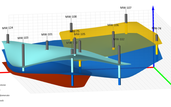
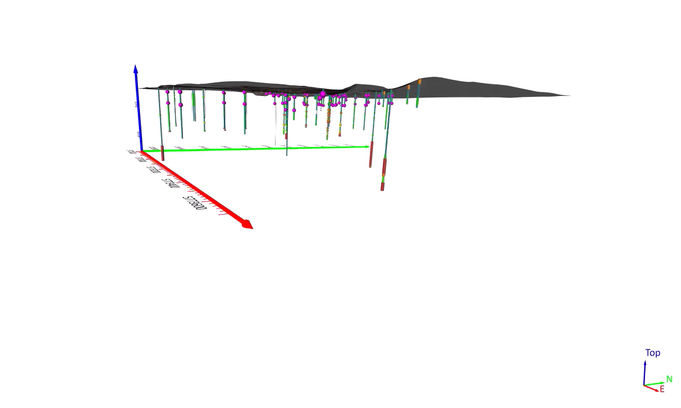
Creating 3D Models with Drillhole Data
To dive deeper, Drew focused on a local area of interest. Using Surfer’s drillhole layer capabilities, he started building a 3D model to showcase the PFAS data. After importing collar, survey, point, and interval data, Drew visualized PFAS concentrations (again using PFHxS) alongside soil classifications (via USCS lithology values) using color-coded intervals. He also pulled aerial imagery directly from online map services to give his model more context.
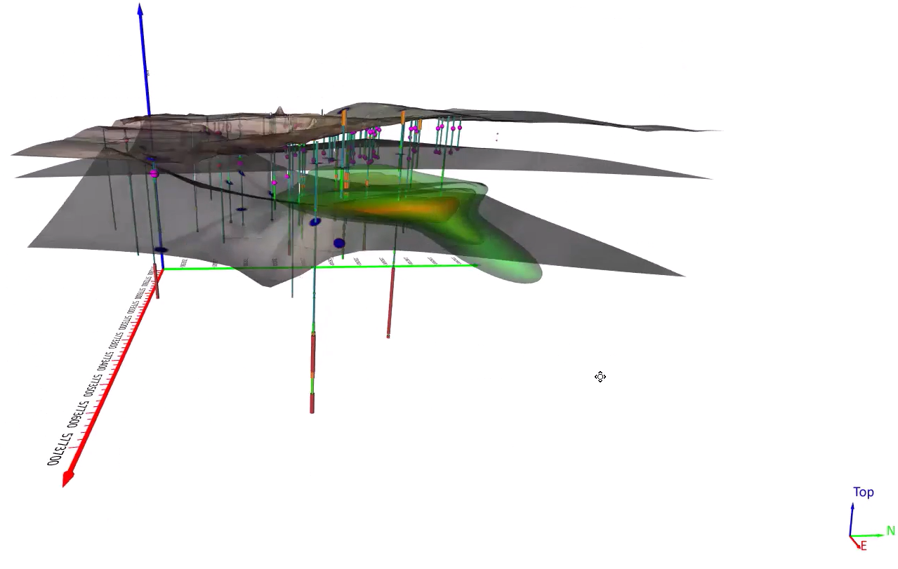
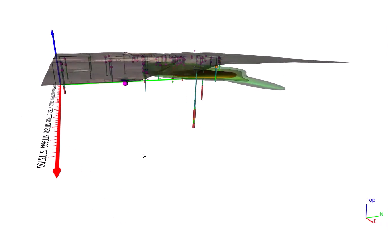
Visualizing Contamination Plumes in 3D
With the drillhole data in place, Drew moved on to gridding the downhole PFHxS data to visualize contamination plumes using isosurfaces. He demonstrated how to set threshold levels (e.g., 66,500; 76,000; and 86,600) to represent different concentrations in 3D space. The result? A volumetric visualization that clearly communicated the extent and intensity of the contamination—a valuable tool for site characterization and planning cleanup strategies.
Bonus Preview: Drillhole Picks & Subsurface Modeling
As a special treat, Drew also previewed a new feature currently available in Surfer Beta: contact picks that can be exported to create surfaces. Using keyword-based intervals (such as Unified Soil Classification System codes), Surfer Beta can now identify contact points along drillhole paths to help generate surfaces that represent various subsurface layers. Drew showed how this enhancement would allow webinar attendees to analyze how different soil types interact with contamination—adding another layer of insight to site models.
Presenting Results with Professional Polish
To wrap things up, Drew illustrated how to use Surfer’s frame templates to design organized, professional layouts for stakeholder presentations. Through this demonstration, attendees saw how frame templates could provide a consistent look and feel for reports, as the feature made it easy to add logos, project details, and multiple visuals in a single layout.
Additionally, Drew highlighted Surfer’s export options. He showed that whether you’re exporting 2D contour maps as vector PDFs, sending 3D isosurfaces to shapefile formats, or sharing fully interactive 3D PDFs, Surfer would give attendees plenty of ways to communicate results effectively across audiences.
Helping You Take the Next Step
This recent webinar was designed to give environmental professionals, scientists, and consultants the tools to model and communicate PFAS contamination with clarity and confidence. If you fall into one of those groups and are mapping contamination across an entire region or drilling down into subsurface behavior, Surfer delivers the flexibility, power, and presentation tools you need to move your project forward. To see this in action, watch the full webinar recording now and let us know what you think!