The Latest Features You Can Enjoy In Grapher Beta (August 2025 Edition)
At Golden Software, we’re always looking for ways to make your work easier, faster, and more impactful. That’s why we continually refine and improve our products—not just behind closed doors, but with your feedback front and center. One way we make that possible? Insert Grapher Beta.
Grapher Beta is more than just a sneak peek. It’s your chance to get early access to upcoming features, test them in real workflows, and help shape the future of the software you rely on. And in Q3 2025, there are four powerful features in Grapher Beta you can try right now to make great data visualizations.
What’s New in Grapher Beta: August 2025 Edition
Grapher Beta’s new features are designed to save you time, streamline your visualization process, and make graphing even more intuitive. Whether you’re focused on environmental analysis, engineering projects, water resource reports, or resource exploration, these tools were built to fit into your workflow and make it better. Ready to see what’s waiting for you in Grapher Beta? Here’s what you can start using (and shaping) in the program right now.
1. Publication-Ready Templates
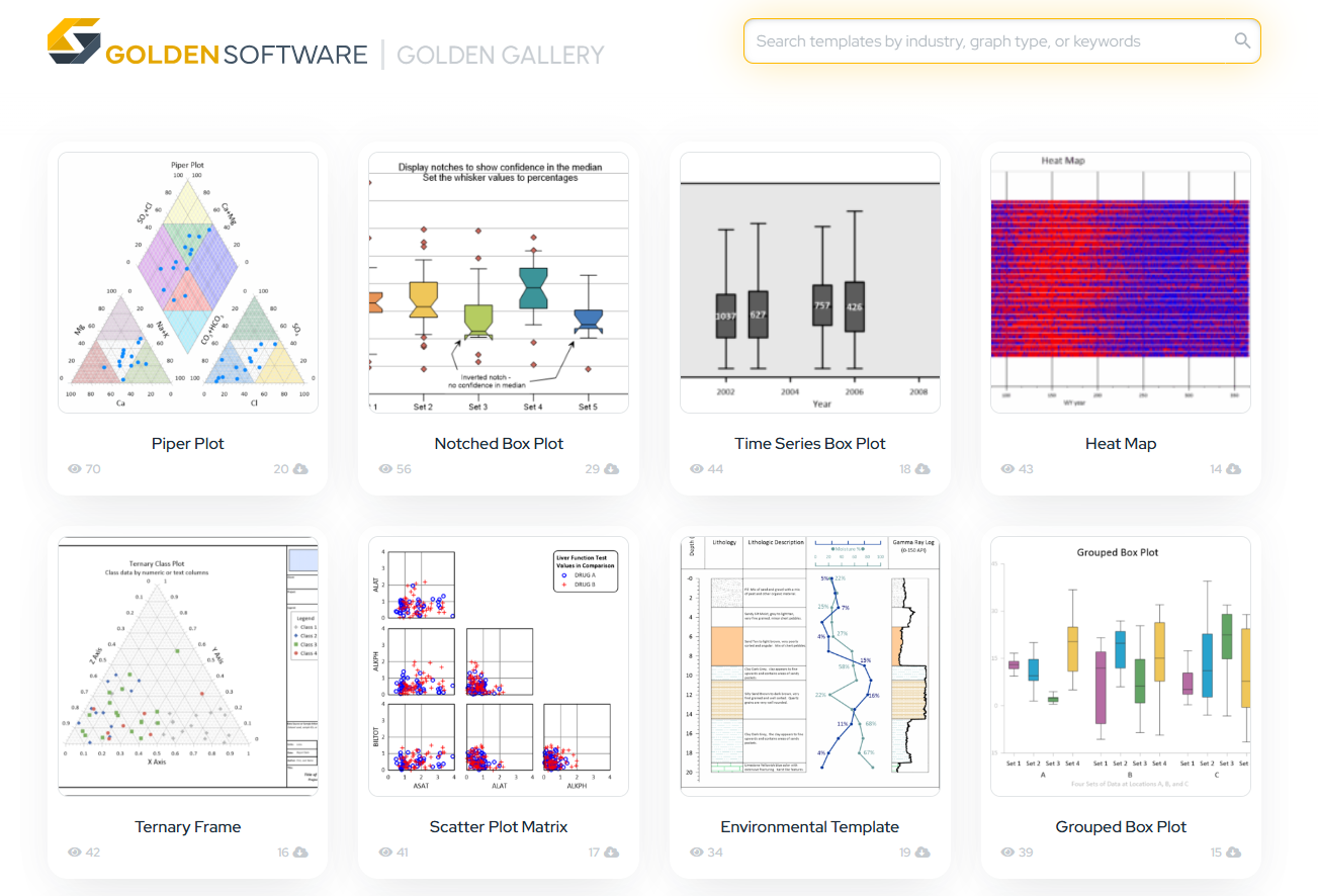
Have you ever spent too much time wondering how to replicate a plot that inspired you or trying to create a report that’s similar to one you’ve already made but just includes updated data? If so, you’re going to love this new feature. The Golden Gallery in Grapher Beta includes a collection of publication-ready templates that you can browse, customize, and reuse. That means less time building plots from scratch and more time focused on understanding what your data is telling you.
Why You Need Publication-Ready Templates
- Environmental Management: Suppose you’re assessing groundwater samples across multiple monitoring wells. You can use the Piper Plot template to show the relative proportions of major cation and anion concentrations across samples. The template will help you quickly visualize the chemical makeup of samples and classify water types, which is ideal for identifying contamination patterns or trends.
- Engineering: If you’re an agriculturalist or a civil engineer evaluating suitability of water for agricultural irrigation, the Wilcox Diagram template makes quick work of classifying water quality based on potential effects on soil permeability and crop health. Just populate the template with your data, and Grapher Beta will automatically plot your results in the publication-ready diagram to help you draw conclusions fast.
- Water Resources: Need to report streamflow trends over time? The Hydrograph template is perfect for visualizing discharge data alongside precipitation and baseflow. It’s especially useful if you regularly monitor seasonal changes or rainfall events and need to produce clear, time-series visuals for your reports to stakeholders.
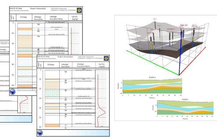
- Resource Exploration: Working with drillhole data from a mining site? The Mining Logs template lets you quickly create depth-based strip logs with lithology columns, sample intervals, and assay data—all plotted and formatted automatically. It’s an easy way to present stratigraphic data with clarity and consistency across multiple boreholes.
2. Automate Loading Multiple Files for Templates
When you need to repeatedly use a single template with new data files, you need an easy way to load and process all the data. Fortunately, Grapher Beta makes things seamless. With this new feature, you can run a script that loads a template and all of its required data files at once. And because every template will remember the data layout after it’s adapted, you can use the same template for similar data in the future with just a few clicks. The takeaway? You can batch process results repeatedly with ease.
Why You Need to Load Multiple Files with Automation
- Environmental Management: Suppose you’re managing quarterly sampling results across multiple sites. Instead of trying to remember what you did to complete the Piper Plot template last time, you can automate the entire process. A single script will open your template, populate it with the latest data, and produce a polished final output—perfect for recurring compliance reporting.
- Engineering: If you’re conducting water quality testing across many infrastructure sites, automation can help you load all the data into the Wilcox Diagram template. There’s no need to touch the layout. Just run the script and get a ready-to-go visualization.
- Water Resources: Working with precipitation, discharge, and groundwater levels over time? Automate loading those datasets into the Hydrograph template so you can produce up-to-date time series plots at the click of a button. It’s a game-changer for monthly or seasonal monitoring reports.
- Resource Exploration: If your project spans dozens of boreholes, use automation to batch-load geochemical and lithology data into the Mining Log template. It’s a fast way to generate standardized visuals for each drillhole, helping you identify resource potential or stratigraphic trends without spending hours formatting each log manually.
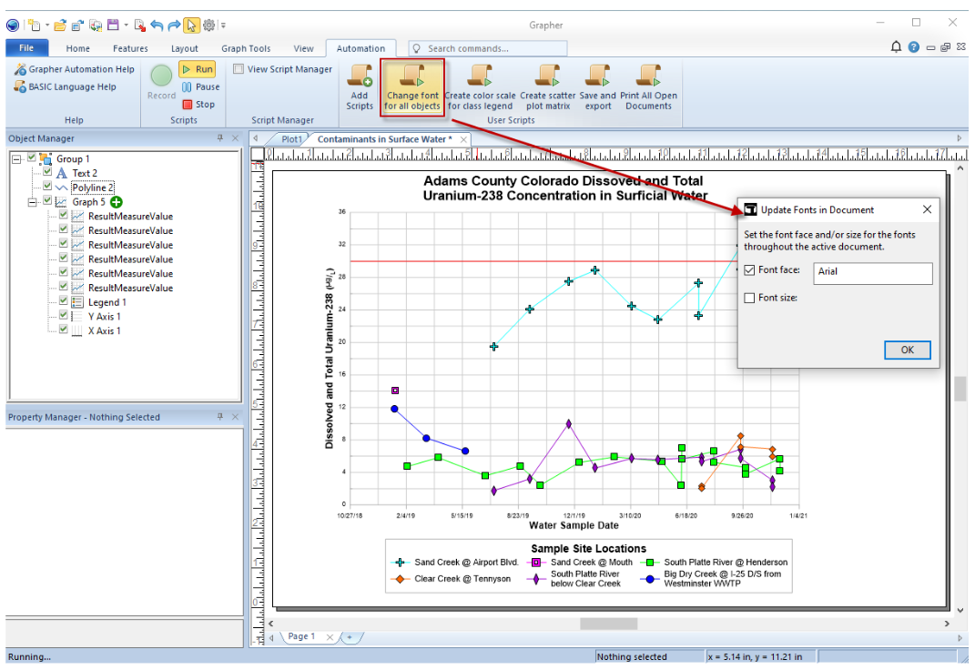
3. New Script: Change Font for All Objects
Changing fonts manually across an entire graph can be tedious. When you’re finalizing a report or tailoring a visual for a presentation, consistency matters. That’s where this new Grapher Beta script comes in. With a single command, you can change the font and size if needed for every object in your document at once. It’s fast, uniform, and makes final formatting tasks a breeze.
Why You Need a Script For Changing Fonts
Whether you’re in environmental consulting, engineering, water resources, or resource exploration, you might find yourself preparing a regulatory visual for stakeholders at some point—and a clean, professional font will help ensure your plot is easily understood. With one script, you can quickly apply an agency-approved typeface across all the objects in your plot, saving time and leading to a polished, consistent appearance.
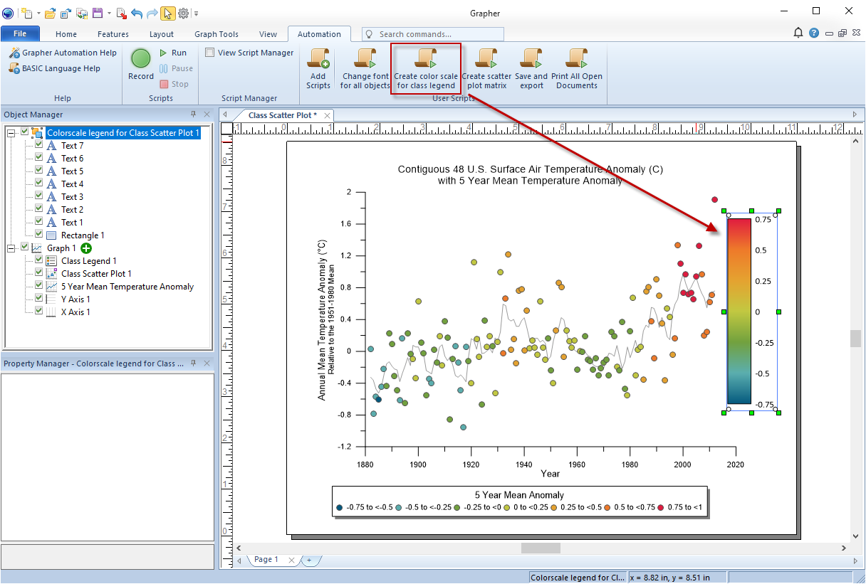
4. New Script: Create Color Scale for Class Legend
If you work with class-type plots—like scatter plots, ternary diagrams, or polar charts—you already know how tricky it can be to convey meaning through a crowded legend. This new script solves that. Instead of displaying discrete values, you can now create a smooth, color scale for the class legend with automation. That means cleaner visuals, easier interpretation, and more space for the insights that matter—all done in one click.
Instead of explaining why you need this new feature in your specific workflow, an image in this situation would tell a thousand words. So, here’s what a legend with a color scale looks like when created using the new script.
Try These Features and Shape the Future of Grapher
From time-saving templates to automation scripts, each new tool in Grapher Beta is built with your workflows in mind. And because these features are fully functional and high quality, you can start using them right away—without worrying about disruptions to your visualization process.
Best of all, you can have a voice in the development process. As you explore these features, you can deliver direct feedback to our product team that’ll help shape the future of Grapher. So if you’re ready to try powerful tools before anyone else, streamline your work, and make your voice heard, now’s the time to dive into Grapher Beta.