101 Guide to a Wind Rose Diagram: Its Purpose, Benefits, Use Cases, and the Best Way to Create & Recreate One Quickly
When you open your data visualization software to create a wind rose diagram—also known as a polar wind chart in Grapher—you’re usually met with a familiar challenge: the learning curve. Even with user-friendly tools, creating any specialized plot takes time. You have to figure out where the graph type is located, how to format your data correctly, and which customizations matter most for your project. Eventually, you get it just right, and you end up with a plot that clearly communicates your wind direction and speed data in a way other visualizations simply can’t.
But then, several months later, you’re tasked with creating another wind rose diagram. Same format, same style—just a new dataset. That’s when the second challenge kicks in: remembering what you did to design the first one. You might find yourself digging through the old project file trying to recreate custom color bins, axis ranges, or label settings. Worse still, you might miss something, leading to inconsistency, confusion, or errors in your report or presentation.
To avoid both of those issues, you’re in the right place. In this sixth post of our Specialized Graphs blog series, we’ll show you how to confidently create and recreate wind rose diagrams using a template. But first, let’s make sure we’re clear on what a wind rose diagram is and why it’s such a valuable data visualization tool.
What Is a Wind Rose Diagram—and Why Would You Create One?
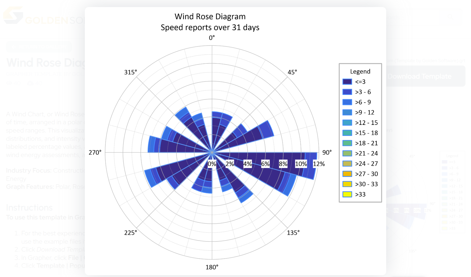
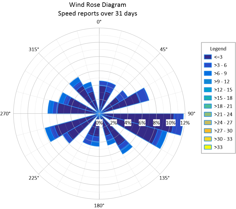
A wind rose diagram is a circular chart that displays how wind speed and direction are distributed in a particular location. It’s commonly used in environmental monitoring, meteorology, site assessments, and air quality studies.
Rather than showing data in a traditional x-y format, this plot uses direction as the angular coordinate (with North typically at the top) and frequency as the radial component. Each “petal” of the rose shows how often the wind blows from a particular direction, and color bands indicate speed categories.
The Benefits of a Wind Rose Diagram
Wind rose diagrams offer a level of clarity and visual impact that traditional charts simply can’t match, especially when dealing with directional data. Here’s why they’re so powerful.
1. Comprehensive Yet Concise
A wind rose diagram condenses large datasets into a single chart that’s both compact and information-rich. You can visualize days, weeks, or months of wind data at a glance.
2. Highlights Directional Trends
By representing wind direction and frequency simultaneously, this plot allows you to easily spot dominant wind patterns. This is critical for air quality assessments, siting wind turbines, or planning construction around wind exposure.
3. Pattern Recognition
Environmental consultants, engineers, and regulators rely on wind plots to make high-impact decisions—whether it’s determining where airborne pollutants might travel or how a facility’s design should account for prevailing winds.
4. Visually Engaging and Intuitive
The radial layout not only looks clean and professional but also invites quick understanding, making your data easy to interpret for colleagues and clients.
When You’d Need to Recreate a Wind Rose Diagram
Creating a wind rose diagram once is just the beginning. In most real-world workflows, you’ll need to recreate it with updated data—whether you’re reporting monthly trends, comparing seasonal variations, or analyzing post-project conditions. Here are just a few examples where that reality kicks in.
Updating Monthly Wind Patterns for a Site Assessment
You’re conducting a year-long environmental assessment and reporting monthly wind conditions around a proposed development site. You’ve already built the perfect wind rose diagram for January. When February rolls around, you want to maintain the same formatting and style to ensure consistency in your report. Recreating the diagram manually means reapplying every setting.
Comparing Pre- and Post-Construction Wind Impacts
You’re evaluating the impact of a new building on local wind patterns. You have wind data from before construction and another dataset collected after the structure was completed. To make an accurate side-by-side comparison, you need to recreate your original wind rose diagram using the updated data but still keep the bins, colors, scale, and layout the exact same.
Creating Diagrams for Multiple Monitoring Locations
You’re monitoring wind conditions at multiple points around a facility. Each location needs its own wind rose diagram using the same style. You don’t want to rebuild each one from scratch, and you don’t want to risk formatting inconsistencies that could confuse your audience. So, you need to quickly learn how to create a wind rose diagram and then reuse the file to try to build the others.
The Best Way to Create and Recreate a Wind Rose Diagram: Use a Template
Rather than trying to learn quickly—or hoping to remember how you formatted a past project—you can streamline your workflow by using the Wind Rose Diagram Template in the Golden Gallery, a curated template library for geoscientists and engineers.
Check out the Wind Rose Diagram template →
Discover other templates for visualizing wind data →
Discover how to use templates from the Golden Gallery →
This ready-to-use template is designed to give you a polished starting point for your wind rose diagram. You can import your data, map it to the right variables, and customize the plot as needed with zero hassles, making your workflow smooth and easy to navigate.
Tech Tip: Why Use a Template? The Key Benefits
The best part about templates is that they offer multiple benefits to streamline your visualization process. They help you create and recreate with ease because of these five benefits.
- No Learning Curve: Forget the struggle of figuring out where the plot type lives within the software interface or how to format your data. The Wind Rose Diagram Template gives you a working visual from the start, so you can learn by doing and get results faster.
- Efficient Recreation Process: Need to recreate a wind rose diagram with new data? Just reload the template, drop in the updated dataset, and you’re good to go. No need to reassign every data reference or manually match previous settings.
- No Guesswork Required: Each template includes guidance on how to structure your data, so you’ll know exactly how to format your inputs. You can focus on interpretation, not trial and error.
- Fully Customizable: Templates provide structure but not at the expense of flexibility. You can still change titles, color bins, label formatting, and more to suit your specific project needs.
- Easy for Colleagues to Use: If a colleague needs to recreate the same plot with their own data, the template gives them a solid, preformatted foundation. They don’t have to decode your original project file. They just follow the template instructions and go.
Take the Wind Out of the Guesswork
Wind rose diagrams are essential tools in environmental monitoring, air quality analysis, and site planning. They take directional data and turn it into a clear, compact visual that drives real-world decisions. But as powerful as they are, they shouldn’t take hours to create or recreate.
By using the Wind Rose Diagram Template from the Golden Gallery, you can eliminate the learning curve and skip the tedious rework. Whether you’re generating a wind rose diagram for a new dataset or handing off the process to a colleague, the template ensures consistency, ease, and accuracy.
Want to experience it yourself? Download the Wind Rose Diagram Template in the Golden Gallery and start using it to visualize your data.