101 Guide to Stiff Plots: Its Purpose, Benefits, Use Cases, and the Best Way to Create & Recreate One With Ease
If you’ve ever created a stiff plot, you know how satisfying it is to finally get everything in place—the data aligned, the axes formatted, the layout refined to communicate exactly what you need. But whether you’re creating one for the first time or revisiting one to create another, getting the design just right can take longer than expected.
At first, the challenge is figuring out how to create the plot: Where does the graph type exist in your software’s interface? How should the data be formatted? Which ions go where? But once you’ve solved that and nailed the design, a new challenge often follows later on: trying to recreate the same plot with new or updated data. Suddenly, you’re digging through old project files, retracing steps, and trying to remember what you customized the first time around.
Fortunately, things don’t have to remain this hard.
In the fourth post in our Specialized Graphs blog series, we’ll explain how you can simplify the entire process of creating and recreating stiff plots using a template. However, before diving into that solution, let’s break down the purpose of a stiff plot and why it’s so valuable.
What Is a Stiff Plot?
A stiff plot is a visualization that displays the ionic composition of water samples. It visualizes cations and anions—typically the four major ones on each side of a central axis—as polygonal shapes, offering a “chemical fingerprint” of the sample.
To create one, you need to plot concentrations of cations on the left and anions on the right. Each ion’s concentration will be represented by its horizontal distance from a central vertical zero-axis, and connecting these points will form a closed polygon. The shape of that polygon will ultimately reflect the water’s chemistry.
Once you’ve created a stiff plot, it will show how one sample compares to another by illustrating the shape and size of the different diagrams. No lengthy data tables or guesswork are required to get key insights across to stakeholders. With a stiff plot, you just have a great data visualization that you can easily explain to viewers who want to understand the ionic compositions of water samples.
Why Stiff Plots Are So Powerful: 5 Key Benefits
When it comes to visualizing water chemistry, few plots offer the same clarity and efficiency as a stiff plot. That’s why scientists across disciplines rely on them. But to put the benefits of this visualization into perspective, here are five key advantages of creating a stiff plot.
1. Quick Comparison of Water Chemistry
Stiff plots let you compare the ionic makeup of different water samples at a glance. Similar shapes mean similar chemistry. Distinct shapes suggest variation and possibly contamination or changes in the water source.
Why it matters: Instead of scrolling through rows of cation and anion data, you can spot similarities or differences visually. This is essential when comparing samples from multiple wells, aquifers, or time periods.
2. Easily Detect Spatial and Temporal Trends
Whether you’re tracking groundwater chemistry over time at a single location or comparing samples from various sites on a map, stiff plots let you spot trends fast.
Why it matters: When you plot stiff diagrams across space or time, patterns become obvious, like seasonal shifts or growing contamination plumes.
3. Compact but Insightful
Each stiff diagram packs the relative concentrations of up to eight major ions into one tidy shape. That means you don’t need to provide lengthy chemical breakdowns every time you present results.
Why it matters: A stiff plot communicates complex chemical data clearly and concisely, making it perfect for reports, regulatory documents, or on-field decision-making.
4. Detects Mixing of Water Sources
Different water sources have different chemical signatures. When two sources mix—like fresh groundwater blending with seawater—it will show up in the stiff plot as a shape that reflects both sources.
Why it matters: Spotting these mixing zones is critical in environmental investigations, especially when evaluating the health of drinking water supplies or assessing aquifer sustainability.
5. Effective for Field Use
Because the plots are visual, compact, and quick to interpret, they’re especially useful in the field. You can include stiff plots in well logs or overlay them on maps for instant insight.
Why it matters: Instead of waiting to crunch the numbers back at the office, you can assess site conditions in real time, saving time and improving responsiveness.
Real-World Scenarios: When You’d Need to Recreate a Stiff Plot
Given their benefits, it’s no wonder stiff plots aren’t one-and-done visuals. You often need to recreate them with fresh data. In fact, here are just a few situations when you might find yourself doing that very thing (if you haven’t already).
Tracking Seawater Intrusion in a Coastal Aquifer
You’re a hydrogeologist monitoring wells near a coastline where over-pumping threatens to draw seawater into freshwater aquifers. Initial stiff plots show a normal ionic balance. But after a few months of heavy pumping, new data suggest rising sodium and chloride levels. By recreating the original stiff plot with updated data, you can confirm the intrusion and document the shift clearly.
Comparing Upstream and Downstream Water Chemistry Near an Industrial Site
You’re an environmental consultant assessing whether a factory is impacting river chemistry. Samples are taken upstream, beside the facility, and downstream. You plot each sample using stiff diagrams to compare chemical signatures. Later, additional samples are collected, requiring you to recreate the same plots with new data for a clear before-and-after comparison.
Evaluating Well Water Changes Before and After a Remediation Project
You’re a remediation engineer collecting water samples from several monitoring wells before starting a cleanup project. The results are plotted using stiff diagrams. Months later, after treatment is complete, another round of samples is collected. You recreate the stiff plots to evaluate the change in water chemistry, helping determine whether the remediation reduced contaminants and altered the chemical balance as expected.
The Best Way to Recreate a Stiff Plot
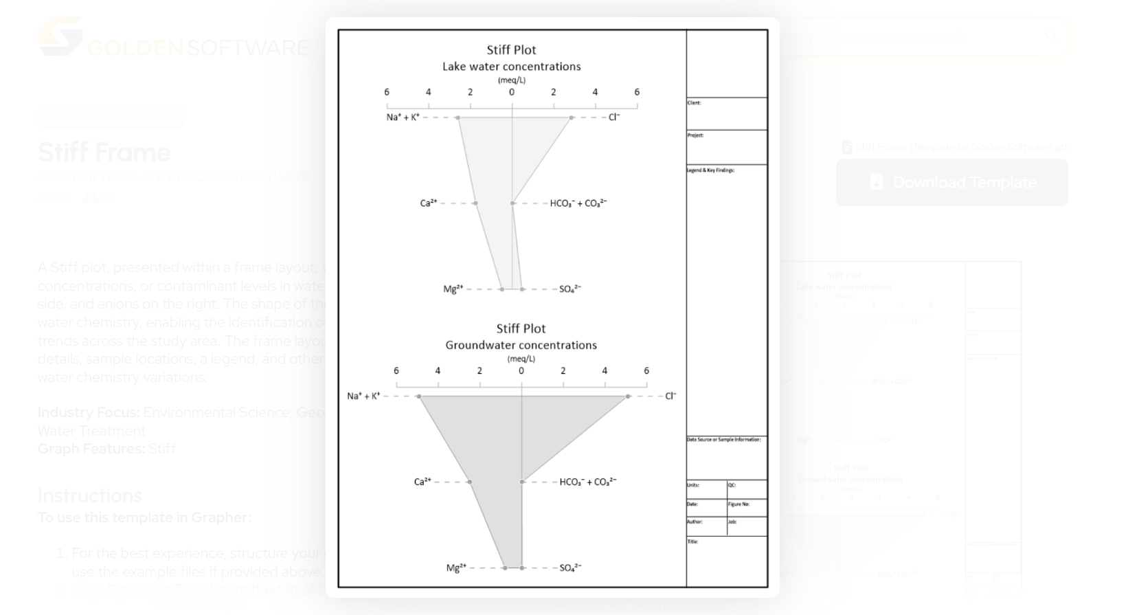
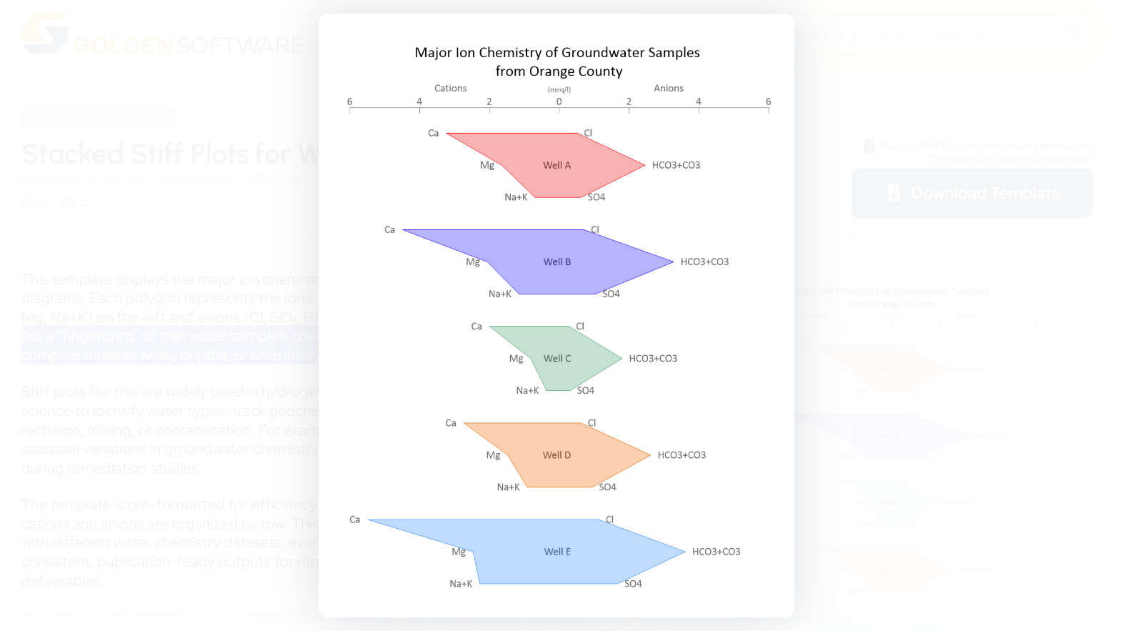
Whether you’re making a stiff plot for the first time or recreating one with fresh data, there’s no reason it needs to be a hassle. The easiest way to create and recreate this visualization is to use the Stiff Frame Template or Stacked Stiff Plots for Water Sample Analysis Template in the Golden Gallery, a curated library of templates for geoscientists and engineers.
This library offers dozens of publication-ready visuals that are clean, customizable, and easy to use. Each template also gives you a pre-configured layout, so you don’t have to do anything but plug in your data and make any final adjustments.
To get started, use the Stiff Frame Template to visualize the major ion composition, concentrations, or contaminant levels in water samples. On the other hand, if you want to not only display the major ion chemistry of groundwater samples but also have a shape that acts like a “fingerprint” of that water sample’s chemical signature to compare multiple wells, depths, or time intervals, use the Stacked Stiff Plots for Water Analysis Template.
Explore the Stiff Frame Template →
Tech Tip: Why Use a Stiff Plot Template?
For greater context into the benefits of using the stiff plot templates, here are several ways the tool will help you create and recreate with ease:
- No Learning Curve: Skip the setup. The layout, plot structure, and formatting are already built into the template—you can just load your data and go.
- Efficient Recreation Process: Need to recreate the plot for a new dataset? Open the template, import the new data, and you’re done. No need to remember the axis setup, data assignments, or formatting decisions from last time.
- No Guesswork Required: Each template includes guidance on how to structure your data so it fits perfectly into the plot. No trial and error, just results.
- Fully Customizable: Want to change color schemes, add titles, or adjust axis scaling? The template gives you a strong starting point without locking you into a rigid design.
- Easy Handoff: If someone else needs to recreate your stiff plot—or generate one using your formatting—it’s simple. The template provides a clear, structured foundation for collaboration.
Create Once, Reuse Often—Without the Hassle
Stiff plots are an essential tool for understanding and communicating complex water chemistry. But whether you’re creating them for a new project or recreating them with updated data, the process shouldn’t be a headache.
With the Stiff Frame Template and Stacked Stiff Plots for Water Analysis Template in the Golden Gallery, you can streamline both creation and recreation. No more navigating through learning curves or second-guessing your workflow. Just open the template, add your data, and get to the insights faster.
If you’re ready to skip a few steps and create your plots with ease, start with the Stiff Frame Template or Stacked Stiff Plots for Water Analysis Template to make things simple so you can focus on what matters most: analyzing your data.
Want to try the Stiff Plot Template or Stacked Stiff Plots for Water Analysis Template? Go to the Golden Gallery to download and use the templates!