Unpacking Surfer’s Gridding Algorithms: How They Work & Mistakes to Avoid
Gridding is one of the most essential—and sometimes most misunderstood—parts of the mapping process. Whether you’re modeling groundwater flow, visualizing soil contamination, or creating elevation maps, the quality of your final output depends heavily on how your data is gridded. However, it’s common to run into trouble when gridding data.
There are a handful of mistakes that scientists and engineers often make that put them on a fast track to creating a surface that’s misleading, confusing, or just plain wrong. The good news? In Surfer, these mistakes are avoidable once you understand the various gridding methods and know what mishaps to avoid.
A Look at the Gridding Algorithms in Surfer
First things first: what gridding methods are available in Surfer? To be honest, Surfer offers a wide range of gridding algorithms—each designed to achieve different visualization goals. Below is a brief breakdown of the most commonly used methods. All of them are beneficial and can help tell your data’s story, but the one you ultimately choose will come down to the particular story you want to deliver to stakeholders. With that said, here are the most popular gridding methods in Surfer.
(Pro Tip: There’s a sample script in Surfer named GridData_Comparison.bas that creates maps from a data file using the top eight gridding methods. Use it to help choose the “best” algorithm for your data.)
Kriging
Highly flexible and an effective default option in many cases, Kriging is great for most datasets and delivers a smooth, accurate surface. It can also extrapolate beyond your Z data range. While powerful, this gridding algorithm can be slower for large datasets—but it’s still a go-to choice for high-quality results and is often the first algorithm we recommend.
Inverse Distance to a Power
This method is fast, as it can create a basic surface from a large dataset more quickly than many of the other algorithms. However, it can sometimes produce “bull’s-eye” patterns around data points—especially when those points are far apart. This algorithm is ideal for creating basic surfaces, but it doesn’t extrapolate beyond the range of your Z values.
Minimum Curvature
This is a smooth surface generator that’s quick to process. It can be prone to creating artifacts in areas without data, but you can control the smoothness using internal and boundary tension. This algorithm also extrapolates outside your dataset’s Z range. If you like the look that Kriging provides but need to include faults, use this gridding method.
Natural Neighbor
This particular gridding algorithm works well when your dataset has clusters of dense points and sparse points in various areas. It’s excellent for maintaining realistic contours but does not extrapolate values beyond where data exists.
Nearest Neighbor
Perfect for nearly complete grids with a few missing holes, Nearest Neighbor fills in those gaps or assigns a NoData value where information is missing. It’s best suited for datasets that are already close to a grid pattern. It does not extrapolate Z grid values beyond your data’s range.
Radial Basis Function
A flexible option, this method often produces results similar to Kriging and is useful for a variety of datasets. It’s especially effective when you want high-quality, overall interpretations without the complexity of Kriging variograms. This gridding method is a great choice for creating surfaces from contact picks in drillhole layers. When you export contact picks, this is the method you should use.
Triangulation with Linear Interpolation
This fast algorithm is especially useful for small datasets. It connects data points with triangles and fills in the gaps using linear interpolation. It doesn’t extrapolate beyond the data’s bounds.
Gridding Mistakes to Avoid—and How to Get the Best Results
Gridding is a powerful step in the visualization process, but even seasoned users can run into issues that lead to confusing contours, unrealistic surfaces, or time-consuming rework. To help you avoid those pitfalls, here’s a breakdown of the most common mistakes people make when gridding in Surfer—and what you can do to avoid them.
1. Using Sparse or Inconsistent Data
Gridding works best when your data is evenly distributed. If you’ve got dense data in your area of interest but sparse coverage elsewhere, applying the same grid resolution across your entire dataset can create visual artifacts like unintended patterns or “hallucinations” in areas with little data. The solution? Define your resolution based on the highest level of detail you actually need.
For example, if you’re working on a site with measurements every foot, set your grid spacing accordingly. But if your data points are hundreds of feet apart in other regions, don’t expect fine-scale features to appear accurately there. Consider applying smoothing or using the Grid Editor to manually refine those less detailed areas. And if you’re working with a dataset that only has three points? That’s not enough to generate a meaningful surface—in that situation, it may be time to collect more data.
2. Gridding Collinear or Flat Data
If all your Z-values are the same (say, 100 across the board), you’re essentially trying to create a flat surface. Surfer’s gridding algorithms aren’t designed for this—they look for variation and patterns in the data. Instead, use Surfer’s GridData Function to generate a flat surface. You can apply a simple equation—such as Z equals whatever the elevation is—to skip the unnecessary complexity.
3. Accidentally Using Text Instead of Numbers
This one sounds simple, but it comes up more often than you’d think. If your worksheet includes degree symbols or text labels—like “45°N” instead of a numeric coordinate—Surfer treats that data as text, not a usable number. When working with geographic coordinates, make sure you convert them to decimal degrees first. That way, Surfer can process them correctly during gridding.
4. Not Accounting for Spikes in Concentration Data
Concentration data—like chemical or contaminant levels—requires special treatment. A single high-value spike surrounded by lower values can throw off your gridding algorithm, leading to over-smoothed or misleading results. That’s because Surfer will try to spread that high value over too large an area. Instead, use the “Log, Save as Linear” option. This approach helps preserve the integrity of your spikes and avoids the distortion that can come from traditional gridding methods. For more on this, check out our blog on best practices for gridding concentration data.
5. Importing High-Resolution Data but Not Adjusting Grid Resolution
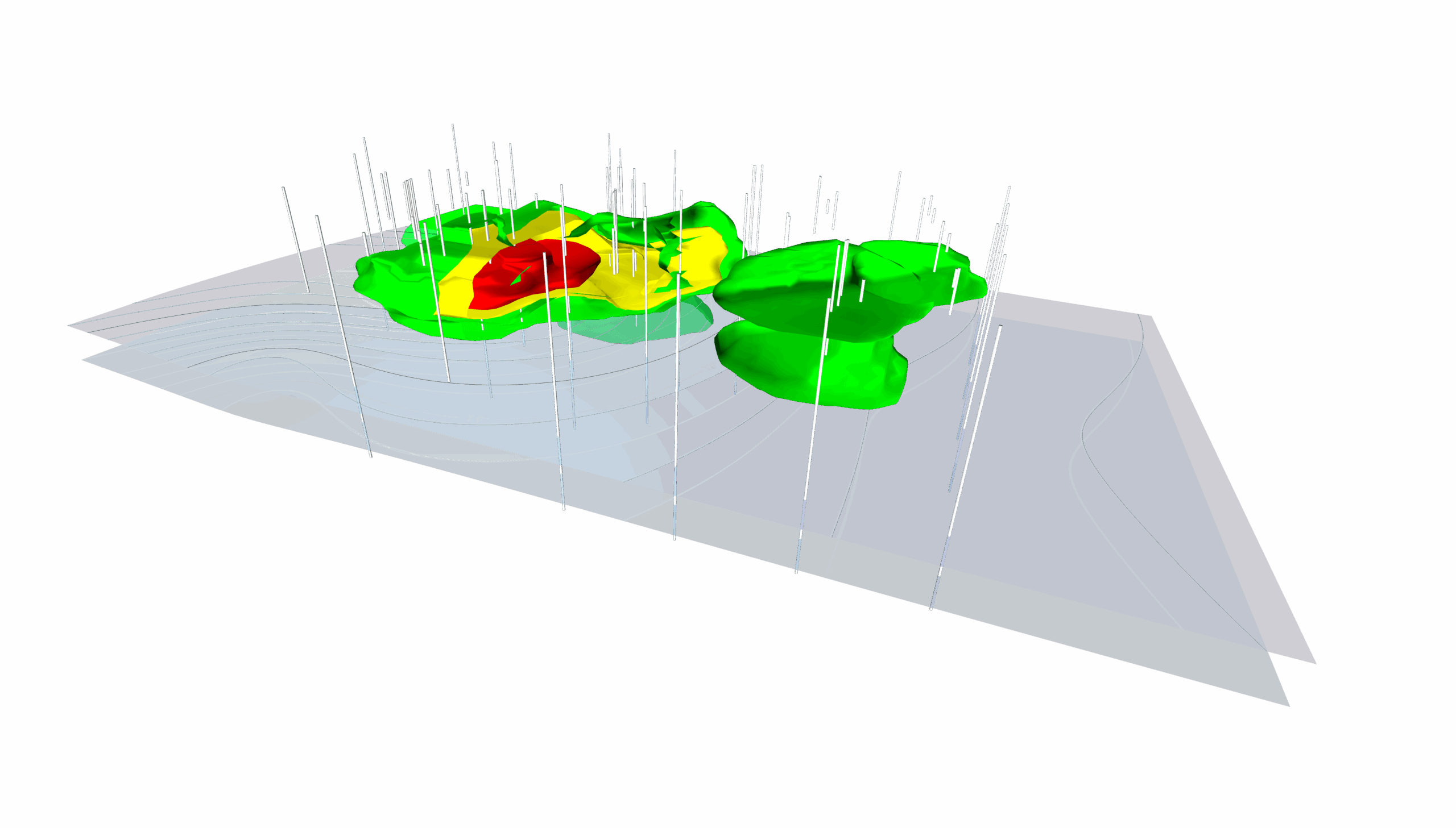
You’ve imported super-detailed data, but your map still looks coarse and underwhelming. Why? You probably haven’t updated your grid resolution. Surfer doesn’t automatically match your data’s resolution—so you might have to define a finer grid spacing when needed. This is also important with 3D gridding. For example, when gridding drillhole data, you may have very dense vertical measurements. In that case, you’d want to adjust the Z-direction resolution in the 3D grid to capture the detail and improve vertical accuracy. Ultimately, you don’t always want to settle for default settings. Sometimes, you need to tweak your resolution to match the richness of your data.
6. Using Standard Gridding Algorithms on Large LiDAR Datasets
LiDAR datasets are massive—and trying to run them through Surfer’s standard gridding tools can significantly slow down your workflow. If you’re working with LiDAR, use the point cloud workflow instead. Surfer has a specialized LiDAR gridding tool that’s built to handle this type of data quickly and efficiently. You’ll save time and get a better-quality result, especially when your point cloud layer has millions of points.
Gridding Smarter with Surfer
Gridding might seem like just another step in your workflow, but the choices you make here can dramatically shape the quality, clarity, and credibility of your final output. Whether you’re creating maps for environmental monitoring, mining, infrastructure, or archaeological surveys, selecting the right gridding algorithm—and avoiding common pitfalls—can mean the difference between an insightful visualization and one that misses the mark.
Fortunately, Surfer gives you the tools and flexibility to get it right. With a wide range of powerful gridding algorithms and customization options, you can tailor your approach to match the needs of your dataset and project goals. Combine that with a solid understanding of your data and attention to grid resolution, and you’ll be set up for success.
So, the next time you grid your data, do it with confidence. You’ve got the knowledge, you’ve got the tools—and now, you’ve got the insight to make your visualizations shine.
Want more tips like this? Subscribe to our blog to discover and stay updated on the latest stories and strategies impacting geoscience!
Recent Articles
- Jun 10, 2026|Gabbie Rhodes|9 min
During peak season, it’s hard to complete high-quality work on time. Fortunately, some practical workplace productivity hacks can help.
- Jun 10, 2026|Gabbie Rhodes|5 min
When it comes to software, the right licensing model matters. A one-time fee and subscription are common options. Which is right for you?
- Jun 3, 2026|Gabbie Rhodes|9 min
What's the difference between these two 3D data visualizations: 3D View and 3D surface maps? Discover their top differentiators.
- Jun 3, 2026|Gabbie Rhodes|8 min
Hiring a skilled geoscientist or engineer is the first step to strengthening your team. The next is training new employees for success.