PFAS in the US (Part 3): Analyzing and Visualizing PFAS in California
Per- and polyfluoroalkyl substances, better known as PFAS, continue to make headlines. These synthetic chemicals are incredibly durable—so much so that they’ve earned the nickname “forever chemicals.” Once released into the environment, they can linger for decades, accumulating in water, soil, wildlife, and even the human body. And this is a concern throughout the U.S., California is one of the states facing the most widespread PFAS challenges.
In the third installment of our “PFAS in the U.S.” blog series, we’re turning our attention to the Golden State.
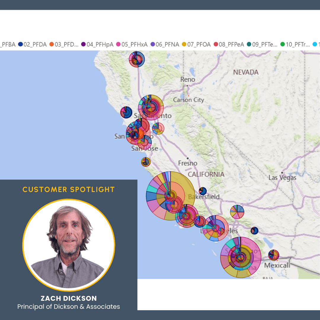
To bring much-needed clarity to the PFAS problems in California, Zach Dickson, Principal of Dickson & Associates, created a dynamic, interactive PFAS model. Built using publicly available data, Surfer, and Microsoft 365’s Power Query and BI, the model equips researchers and the public to explore PFAS contaminant impacts to surface and purveyor supplied drinking water sources across California. Curious to learn what it reveals? Let’s take a closer look at how PFAS is impacting California—and how Zach’s model can help people understand and address it.
PFAS Contamination in California: A Widespread and Growing Concern
California’s PFAS challenge is vast. According to a 2023 analysis by CalMatters, 214 water systems with 796 public wells exceed the new federal drinking water limits for PFAS. These numbers represent not just statistical findings but real communities where PFAS contamination is a daily reality and a growing health concern.
New research from the U.S. Geological Survey offers further insight into the scale of the problem. In what’s considered the first national study of its kind to examine PFAS in both private wells and public water supplies, researchers found that at least 45% of drinking water in the United States may contain one or more PFAS compounds. For southern and central Californians, researchers found that the odds of being exposed to PFAS might be more common.
If Californians live in urban areas, the situation is even worse. The research stated that the likelihood of detecting PFAS in tap water when living in urban areas exceeds 70%. In contrast, rural parts are far less likely to be exposed, with detection rates around 8%.
Why the gap? Urban areas tend to be closer to common PFAS sources—airports, industrial zones, military bases, and wastewater treatment facilities—all of which can contribute to PFAS leaching into water supplies. As U.S. Geological Survey research hydrologist and lead study author Kelly Smalling explained, “There’s also more people using everyday items that contain them,” amplifying the cumulative exposure in densely populated areas.
Together, these findings paint a stark picture of PFAS in California: a widespread issue with concentrated hotspots in urban centers. The need for accessible, data-driven tools to explore and understand this contamination is more important than ever. That’s where the California PFAS model developed by Zach comes into play.
What the California PFAS Model Helps Reveal
The California PFAS model—like its Colorado counterpart—is more than just a map. It’s a dynamic, interactive tool that helps make sense of a complex and rapidly evolving environmental challenge. Built to be both informative and exploratory, the model offers a preliminary overview of PFAS distribution throughout California, and it does so in a way that’s easy to understand.
Here are some of the most valuable insights this model brings to the table:
- Pinpointing the most impacted sites: The model helps identify which specific locations—and individual samples—show the highest PFAS concentrations. That means researchers and citizens can determine where contamination may be most severe.
- Highlighting dominant PFAS compounds: With dozens of PFAS analytes in circulation, it can be difficult to determine which compounds are most prevalent. This model makes it easy to isolate and identify which specific analytes are most common in a given region or sample set.
- Enabling side-by-side comparisons: One of the model’s most powerful features is the ability to compare any sample or group of samples against another. This helps reveal trends and outliers, assess regional variation, and make informed decisions about where to investigate next.
- Spotting Sampling Bias: The model also reveals discrepancies in testing coverage by showing how many samples were actually tested for each analyte. This lets users spot potential gaps or inconsistencies in the data, which is essential for drawing accurate conclusions.
The inclusion of georeferenced data adds another layer of insight to the model, equipping researchers and the public to assess PFAS distribution in context with real-world geography. With this functionality, it’s possible to:
- Evaluate how PFAS contamination aligns with population centers, agricultural zones, or domestic and public water supply wells.
- Investigate how surface drainages or infiltration pathways might be carrying PFAS from one area to another.
- Examine potential soil, vapor, and groundwater interactions—either within a single boring or across a broader flow path.
All of this can be done without needing access to Phase I or II environmental site assessments, remedial investigation reports, or historical knowledge of a facility’s PFAS use. However, the model still presents the data with what Zach calls “warts and all.”
“Due to the complexities associated with data compilation, completeness, and validation where the process involves so many different contributing stakeholders, including regulatory agencies, laboratories, consultants, and data managers for thousands of sites, it can result in various inconsistencies and occasionally discrepancy between a consultant’s final reporting and available regulatory data downloads,” Zach explained. “Users are therefore directed to relevant reports to verify data model values and any conclusions that may be drawn.”
This insight doesn’t mean the California PFAS model lacks value. It simply means the tool is a starting point for exploration and discussion so researchers and the public can begin developing a better understanding of what’s happening.
How the California PFAS Model Was Created—and Where Surfer Played a Critical Role
Building the California PFAS model so it’s valuable to researchers and the public was no small feat. It required data reduction, visualization, and validation, as well as tools that could handle complex environmental datasets. For Zach, the workflow included Surfer and Microsoft 365’s Power Query and BI, a pairing that proved essential for transforming raw data into something useful, reliable, and accessible. The first step to putting the tools to work? Reduce the data within Microsoft’s ecosystem.
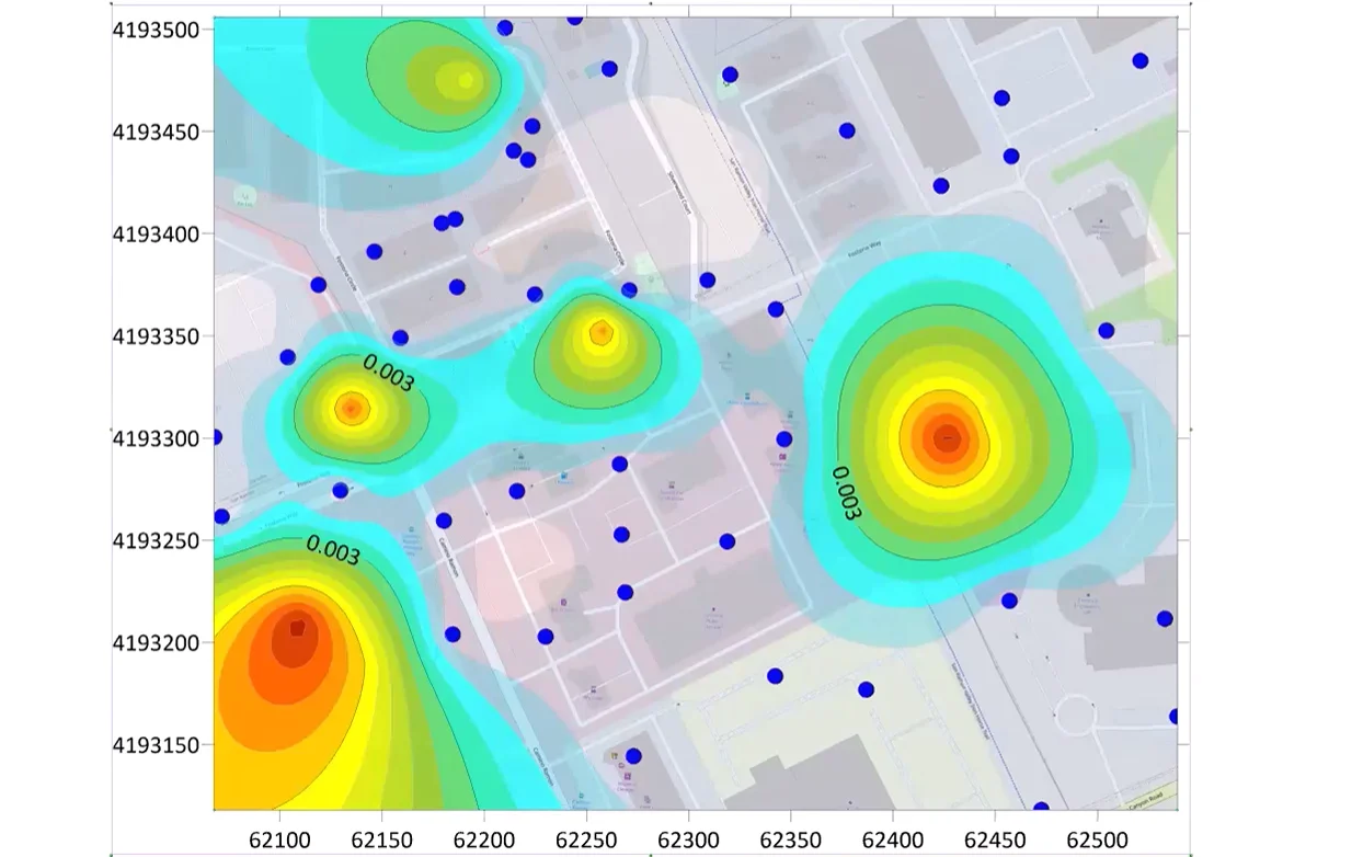
Zach used Power Query to decrease the PFAS dataset, much of which came from publicly available state sources. Once the dataset was smaller, Surfer was essential for validation and geospatial accuracy, so Zach turned to it to check his work. Was the data matching up with real-world locations? Were the right analytes showing up in the right areas? Were there duplicates or inconsistencies? Surfer helped catch any red flags quickly.
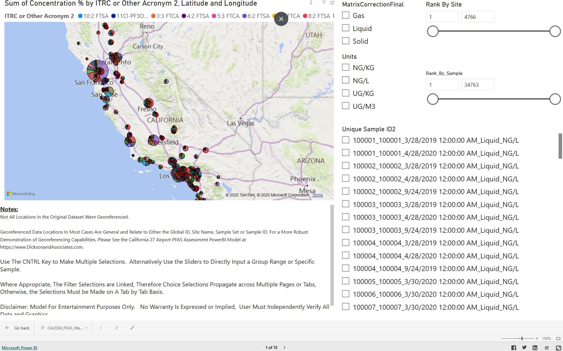
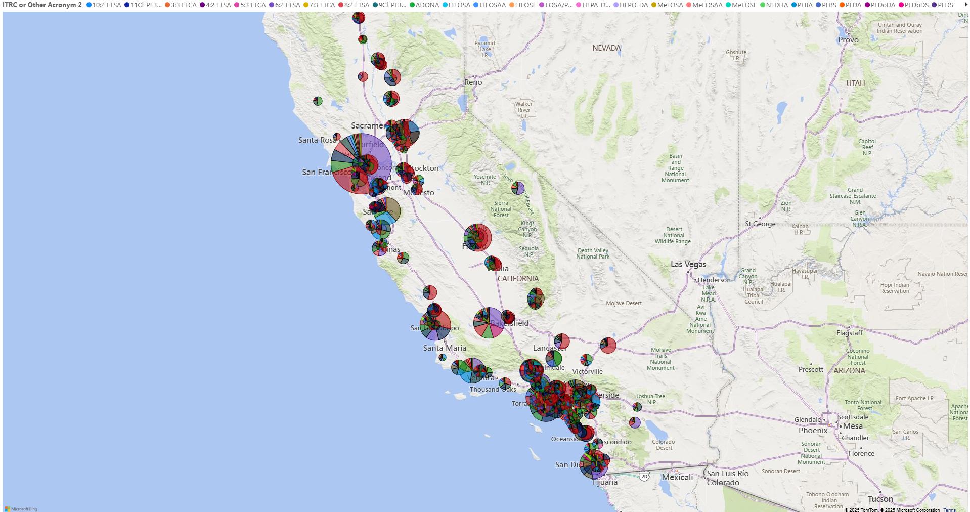
Using BNA files, Zach also loaded California’s state, county, and city boundaries, then overlaid PFAS data and plotted individual sites with precision. Afterward, he used Surfer to create high-resolution maps that equipped him to zoom in and understand what was going on at each location. These maps showed not just where a site was located, but how it ranked statewide in terms of PFAS impact. Surfer’s class posting and pie mapping tools were immensely helpful in visualizing all of this. When mentioning these features, Zach said: “They gave me the big picture—what are the important PFAS compounds, and where are they concentrated?”
Once he finished visualizing the data in Surfer, Zach created the California PFAS model using Power BI, Microsoft’s interactive data visualization platform. Power BI gave Zach the ability to build an intuitive online model that lets users filter by site, compare analyte concentrations, and see patterns across geography, providing a dynamic experience.
Ultimately, this multiple-software workflow—Surfer for spatial verification and visualizing and Microsoft 365’s Power Query and BI for data reduction and presentation—resulted in a model that’s useful to researchers and everyday members of the public who want to dig into California’s PFAS data in ways that are interactive, insightful, and understandable.
A Powerful Tool for Understanding a Complex Issue
Without a doubt, the PFAS crisis in California is urgent, but Zach’s model helps bring much-needed clarity to the chaos. Whether someone is trying to pinpoint high-concentration sites, compare analytes, or examine patterns across regions, his model makes it possible—but Zach isn’t stopping here.
To further spotlight the PFAS issue in California, Zach developed an additional model that focuses specifically on airport-related contamination—a major source of PFAS in the state. Curious to know what it reveals? Stay tuned for the next installment in our “PFAS in the U.S.” series.
Want more stories like this delivered to your inbox? Subscribe to the Golden Software blog to stay up to date on the latest innovations, use cases, and expert insights from across the geoscience community.
Subscribe to the blog for more!
Recent Articles
- Jun 17, 2026|Gabbie Rhodes|8 min
Both work and family require energy and intentionality. To ensure you approach them effectively, discover tips to balance work and family life.
- Jun 17, 2026|Gabbie Rhodes|11 min
Senior Technical Sales Specialist Drew Dudley hosted a webinar to provide tips for ensuring coordinate systems display accurately and consistently.
- Jun 10, 2026|Gabbie Rhodes|9 min
During peak season, it’s hard to complete high-quality work on time. Fortunately, some practical workplace productivity hacks can help.
- Jun 10, 2026|Gabbie Rhodes|5 min
When it comes to software, the right licensing model matters. A one-time fee and subscription are common options. Which is right for you?