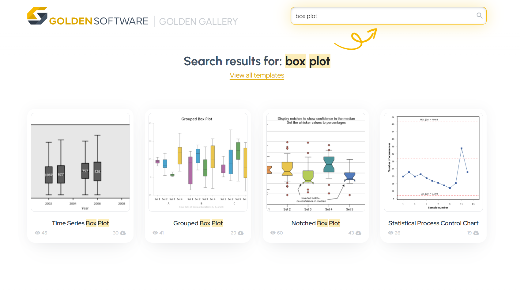
101 Guide to Box Plots: Their Purpose, Benefits, Use Cases, and the Best Way to Create & Recreate Them With Ease
Box plots are one of the most versatile and trusted statistical graphs out there—ideal for summarizing data distributions, spotting outliers, and comparing variability across groups. But whether you’re building one for the first time or recreating a version you’ve used in the past, the design process can slow you down.
At first, the challenge might be simply learning how to build a specific type of box plot in your data visualization tool. Even if the software is intuitive, you still have to discover how your data should be formatted, how to apply customizations, and where to find the plot type. At some point, you figure it out and get a result that’s clean, effective, and ready for use.
But down the road—when you need to recreate that same plot with new or updated data—you face a different challenge: trying to remember what you did the first time. Did you manually adjust the axis scale? Group the data a certain way? Apply specific colors or labels? It can quickly turn into a frustrating, time-consuming task.
That’s where this post comes in to help. In this third installment of our Specialized Graphs blog series, we’ll do a deep dive into everything you need to know about creating and recreating box plots, including how to streamline the entire process using publication-ready templates.
Quick Overview
What is a Box Plot?
Definition: A box plot is a standardized way of displaying the distribution of data based on a five-number summary:
- Minimum: The lowest data point (excluding outliers).
- First Quartile (Q1): The median of the lower half of the dataset (25th percentile).
- Median (Q2): The middle value of the dataset.
- Third Quartile (Q3): The median of the upper half of the dataset (75th percentile).
- Maximum: The highest data point (excluding outliers).
What Is a Box Plot?
A deep dive must begin with the basics, so let’s start at the top. A box plot (also called a box-and-whisker plot) is a statistical graph that helps you visualize the distribution of a dataset. It consists of two main parts: the box, which represents the middle 50% of your data, and the whiskers, which are the lines extending to show the range of the remaining data points. A box plot also shows the minimum, first quartile, median, third quartile, and maximum values—all in one clean data visualization. Some versions also highlight outliers or display confidence intervals.
When it comes to their usefulness, box plots are especially great when you need to:
- Compare distributions across multiple datasets
- Identify outliers or skewed data
- Visualize trends over time or conditions
- Summarize large amounts of numerical data quickly
To put those use cases more plainly, box plots are a go-to visualization when you need to communicate variability and central tendency without overwhelming your audience.
How to Interpret Box Plots
Understanding the definition of a box plot is only half the battle; you also need to know what the shape tells you about your data. While some researchers choose a standard deviation approach for error bars, box plots use quartiles to reveal the “skewness” of a dataset:
- Symmetrical: The median is in the center of the box, and the whiskers are roughly equal in length.
- Positively Skewed: The median is closer to the bottom (Q1), and the top whisker is significantly longer.
- Negatively Skewed: The median is closer to the top (Q3), and the bottom whisker is significantly longer.
By identifying these patterns, you can quickly determine whether your data is balanced or leaning toward a specific extreme. Ultimately, mastering this visual shorthand equips you to move beyond simple averages and communicate the true behavior of your variables with much greater precision.
Different Types of Box Plots and Their Benefits
Now, what are the different types of box plots you might need to create and recreate? While the standard box plot is the most well-known, there are several specialized variations that can help you tailor your visualization to the data at hand. Each type offers unique advantages depending on your goals, comparison needs, and data structure. For context, let’s dive into each type of box plot and briefly discuss what it is and why it’s beneficial.
1. Standard Box Plot
What it is: A standard box plot is a visual summary of a dataset that uses five key statistical measures, such as lower quartile, upper quartile, minimum, median, and maximum.
Top Three Benefits:
- Summarizes data concisely and visually
- Makes it easy to spot outliers
- Supports comparisons across multiple datasets
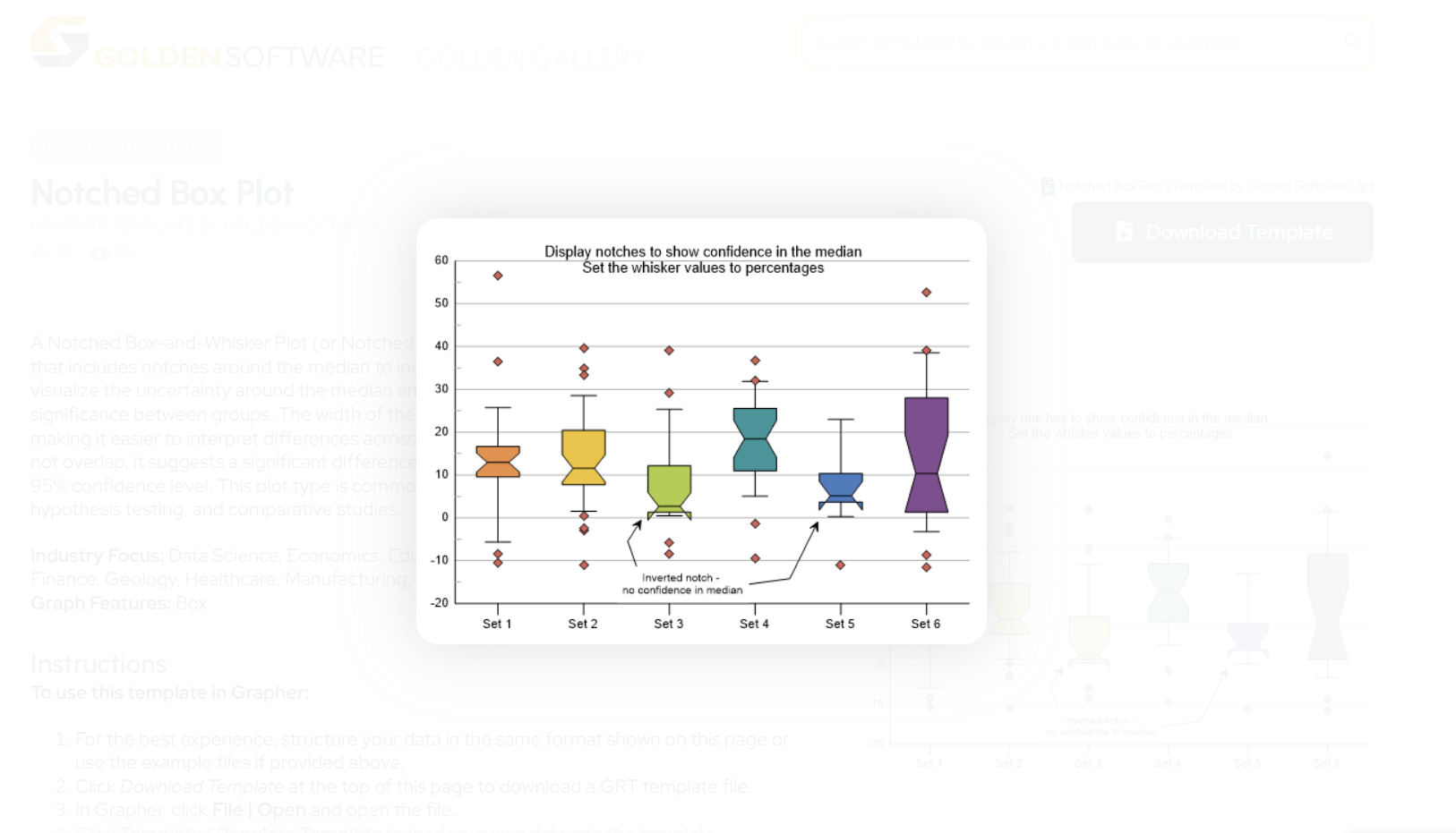
2. Notched Box Plot
What it is: A notched box plot has notches around the median to indicate confidence intervals, making it easier to assess whether medians are significantly different.
Top Three Benefits:
- Adds a layer of statistical inference to the visualization
- Helps you see if medians differ significantly between datasets
- Keeps the classic box plot format while enhancing interpretation
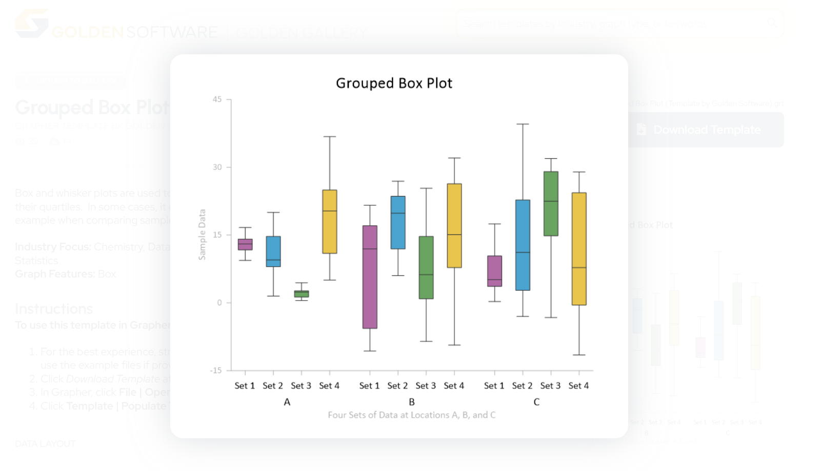
3. Grouped Box Plot
What it is: A grouped box plot is an arrangement of multiple box plots that are grouped by a shared category to compare subgroups within a dataset.
Top Three Benefits:
- Highlights differences within and between groups
- Ideal for multi-category comparisons
- Organizes complex datasets clearly
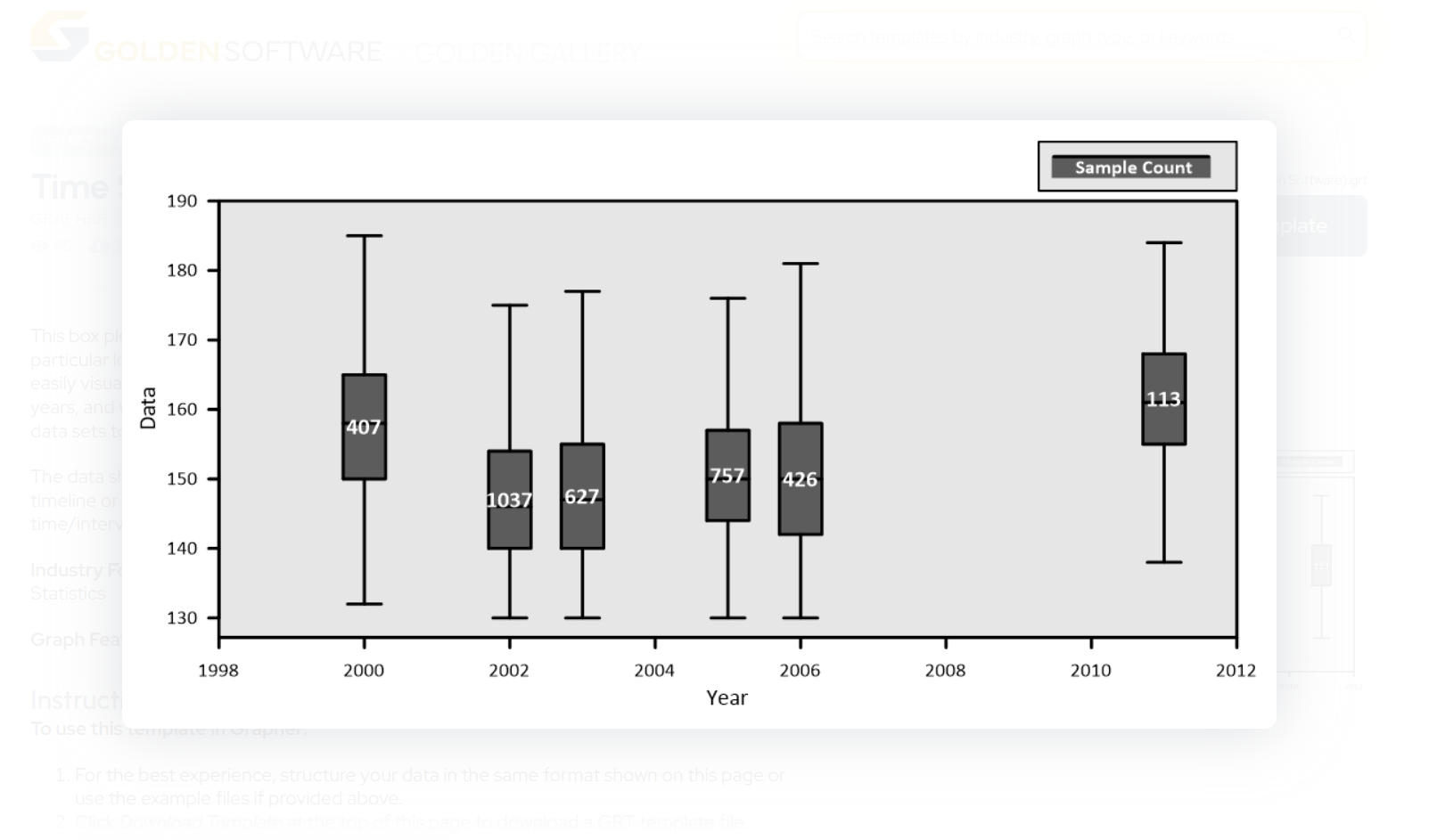
4. Time Series Box Plot
What it is: A time series box plot is a variation of a grouped box plot designed to display distributions at specific data values—perfect for visualizing data collected over time or at set intervals.
Top Three Benefits:
- Ensures accurate comparisons
- Lets your represent box data on linear, log, or probability scaled axes
- Especially useful for datasets showcasing changes in values over time
| Box Plot Type | Key Feature | Best Use Case |
|---|---|---|
| Standard | 5-number summary | General data distribution |
| Notched | Narrowed area at median | Comparing statistical significance |
| Grouped | Side-by-side boxes | Comparing sub-categories (e.g., land use) |
| Time Series | Plotted over X-axis time | Visualizing trends over months/years |
Real-World Scenarios: When You’d Need to Recreate Each Type of Box Plot
Knowing the types of box plots and their benefits are one thing, but in what scenarios would you actually need to recreate any of the specialized versions? As you may already know, there are multiple scenarios where you might need to remake one of the box plots we’ve discussed. Here are just a few real-world situations where scientists like you need to do so.
1. Standard Box Plot
You’re a hydrologist monitoring nitrate concentrations across different wells. Last year, you created a box plot to compare seasonal variation across those sites. This year, you’ve gathered new data and need the same analysis—just with updated values. Rebuilding the entire plot from scratch would be a waste of time when the plot layout hasn’t changed.
2. Notched Box Plot
You’re in environmental toxicology, studying mercury concentrations in fish from two different rivers. After your first round of data collection, you used a notched box plot to compare the medians and visually highlight any significant differences. After some time goes by, you complete a second round of sampling. Now, you need to recreate the last analysis using a notched box plot and then take it a step further by creating a grouped box plot that combines the two rounds of data by season. That way, you can compare seasonal variation in the mercury concentrations. The findings will be insightful, but the process to getting there won’t be easy—not when you have to recreate your analysis before even creating the grouped box plot.
3. Grouped Box Plot
As a soil scientist, you’re studying metal concentrations in surface soils under three types of land use: urban, agricultural, and forested. You’ve previously created a grouped box plot that shows differences across these land uses and individual sampling sites. Now, you’ve returned to the field and collected more recent samples, and you want to recreate the plot with new data while keeping the same grouping structure.
4. Time Series Box Plot
You’re a geochemist analyzing trace element concentrations in groundwater. Your dataset includes elements like calcium and magnesium, which occur in high concentrations, as well as trace metals like arsenic and lead. You already created a time series box plot to visualize the data you collected two years ago. New test results just came in, and now you need to add the new data into the plot for the right dates.
The Easy Way to Create and Recreate Box Plots
Whether you’re building a specific box plot for the first time or remaking one you’ve used in the past, the process shouldn’t be a time sink. But as you’ve likely experienced, even small steps during the creation process—like finding the correct plot in the interface, formatting your dataset correctly, and assigning plot variables—can add up. And if you’re trying to recreate a plot that worked well before? You might spend more time hunting through old files and reapplying custom settings than actually analyzing your data.
That’s where templates can completely transform your workflow.
With the Golden Gallery, you have access to a curated collection of fully-functional, professional, and publication-ready templates—including templates for every box plot variation covered in this article. Each one is designed to help you skip the learning curve and time spent retracing your steps and jump straight to a polished, presentation-ready visual. Whether you’re creating a box plot from scratch or remaking one with new data, these templates do the heavy lifting.
Here’s what’s available:
- Notched Box Plot Template: Great for evaluating confidence intervals around the median and identifying statistically significant differences.
- Grouped Box Plot Template: Ideal for comparing subgroups within categories like treatment types, land use classes, or sampling sites.
- Time Series Box Plot Template: Perfect when your data spans a time interval and needs accurate placement in a series.
Tech Tip: Why Use a Box Plot Template?
Using templates gives you a smarter, more repeatable visualization process. But if it’s your first time considering templates for your workflow, here’s a straightforward look at their benefits:
- No Learning Curve: You don’t need to figure out the layout or formatting structure on your own. Each template shows you exactly how your data should be arranged.
- Faster Setup: Just import your dataset and reassign the variables as needed. The structure is already there, so you can go from raw data to a complete visualization in minutes.
- Efficient Recreation: When you need to reuse the same layout for updated data, there’s no need to reverse-engineer an old project. Just reopen the template, drop in your new data, and you’re done.
- Fully Customizable: Want to change the axis scale, update colors, or revise labels? You can still make adjustments while benefiting from a solid foundation.
- Easy Collaboration: If a colleague needs to create or update a similar box plot, the template provides them with a pre-built structure to work from, making your workflow more shareable and scalable.
Whether you’re reporting results across time, comparing field sites, or sharing updates with stakeholders, templates give you consistency without the repetition.
Create and Recreate Box Plots Without the Rework
Box plots are essential for communicating variability, comparing datasets, and highlighting outliers—all while keeping your visualizations clean and concise. But creating one from scratch or trying to recreate a previous version shouldn’t slow you down.
Whether you’re building your first box plot or updating one for a new round of data, the process often involves various roadblocks, but templates eliminate the friction. With the ready-made box plot templates in the Golden Gallery, you can skip the challenges and focus on your insights. You can get a polished starting point and a faster path to results.
The bottom line? You don’t need to struggle through a learning curve or try to remember how you created a previous box plot. Use a template, plug in your data, and move forward with ease, knowing your visual is accurate, compelling, and presentation-ready.
Want to use a box plot template to make your workflow smoother? Download publication-ready box plot templates!
Recent Articles
- Apr 23, 2026|Gabbie Rhodes|16 min
- Apr 23, 2026|Gabbie Rhodes|9 min
- Apr 15, 2026|Gabbie Rhodes|11 min
- Apr 15, 2026|Gabbie Rhodes|12 min
