101 Guide to a Durov Diagram: Its Purpose, Benefits, Use Cases, and the Best Way to Create & Recreate One Quickly
Creating a Durov diagram from scratch is no small feat. Even with the right software, there’s still the matter of finding where the plot lives in the interface, formatting your geochemical data appropriately, and making all the customizations to communicate the data effectively. Eventually, you figure it out and generate a clean, informative diagram.
But what happens when you need to make another Durov diagram—maybe next month or next year—with updated data?
That’s when the real challenge sets in. You now have to remember exactly how you built the first one. What steps did you take? Which objects did you edit? What aesthetic tweaks made it stakeholder-ready? As you answer these questions, you could easily spend more time retracing your steps than analyzing your data.
However, the seventh installment in our Specialized Graphs blog series is designed to eliminate these hassles. In this post, you’ll learn how templates can help you create and recreate Durov diagrams with ease so you have a more efficient workflow. Before diving into this solution, let’s walk through some key background information.
What Is a Durov Diagram—and Why Would You Create One?
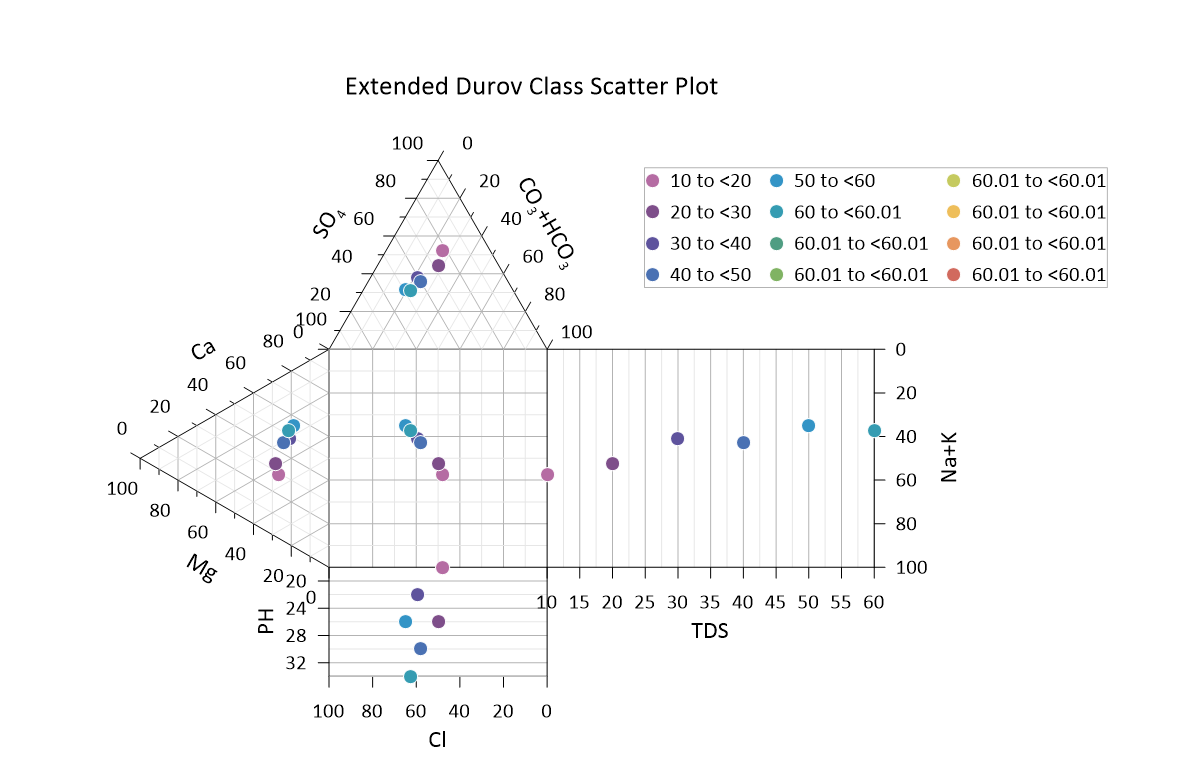
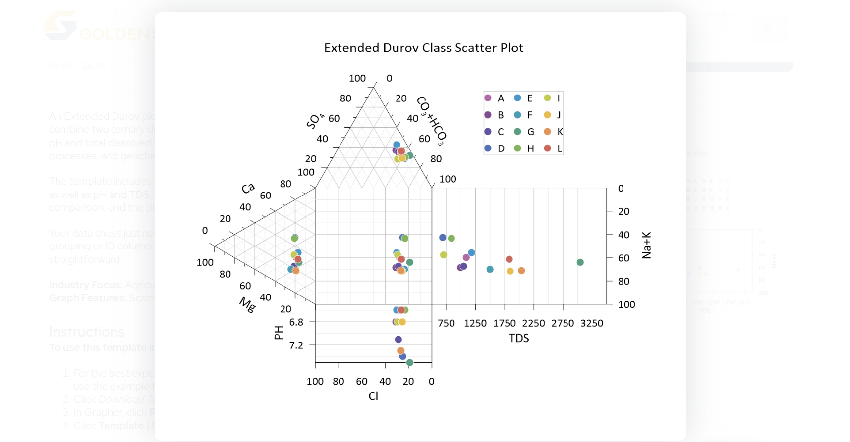
A Durov diagram is a rectangular field using Cartesian axes to plot total cation and anion percentages. The position of the points in the rectangular field can show information about hydrochemical facies, mixing trends, and geochemical processes like ion mixing, ion exchange, and mineral dissolution or precipitation.
If you’re working in hydrogeology, water resource management, or a related field, this visualization can be indispensable. It can help you do the following:
- Compare multiple water samples in a single view
- Classify water types based on ion composition
- Detect contamination or changes to groundwater chemistry
- Determine the effectiveness of remediation efforts
An extended version of the Durov diagram even appends pH and Total Dissolved Solids (TDS) plots, equipping you to explore how acidity, alkalinity, and salinity relate to water type. So whether you’re monitoring drinking water safety, analyzing industrial discharge, or evaluating aquifer health, this plot can provide a visual summary to stakeholders that raw data alone can’t do.
The Benefits of a Durov Diagram
Durov diagrams aren’t just unique visual summaries—they’re also uniquely effective. Here’s what makes them such a great option for visualizing water chemistry:
1. Integrated Hydrochemical Analysis
You’re not just seeing anions or cations in isolation. The Durov diagram equips you to identify hydrochemical facies and key processes such as ion exchange, simple mixing, evaporation concentration, and mineral dissolution.
2. Effective for Large Datasets
If you’re working with dozens or hundreds of water samples, a Durov diagram lets you spot clusters, outliers, or spatial patterns at a glance. Grouping by site, aquifer, or sampling round equips you to quickly compare multiple systems without losing clarity in your data.
3. Ideal for Monitoring Change Over Time
Need to detect subtle shifts in water quality due to seasonal variations or human impact? Durov diagrams make facies transitions and geochemical evolution patterns obvious, ensuring consistent year-over-year or season-over-season comparisons.
4. Strong Communication Tool
Whether you’re explaining results to a regulator, client, or team member, a Durov diagram offers a clean, publication-ready way to tell a detailed story about water chemistry.
5. Supports Informed Decision-Making
Because the layout forces consistent scaling and normalization, Durov diagrams give you a reproducible standard. This ensures your conclusions about water sources, mixing zones, or treatment effectiveness stand up to regulatory and peer review.
When You’d Need to Recreate a Durov Diagram
Because of their many benefits, Durov diagrams aren’t just one-and-done data visualizations. You’ll often need to revisit and recreate them with new or updated datasets, especially when you’re part of long-term projects. Here are just a few scenarios where that rings true.
Monitoring Changes in Water Chemistry During a Remediation Project
Say you’re a hydrogeologist overseeing a groundwater contamination cleanup. You initially plotted baseline data using a Durov diagram. Months later, after several rounds of treatment, you collect new samples. To ensure the expected shifts in water chemistry are easy to verify and attributed to treatment success, you need to recreate the original Durov diagram with all the same formatting—just with updated data.
Comparing Seasonal Water Quality Trends
As an environmental consultant, you might sample the same wells at the start and end of a dry season. Using a Durov diagram, you can see how the ion concentrations shift over time, giving stakeholders tangible evidence of seasonal water chemistry changes. But to maintain a clear comparison, each new diagram must be formatted exactly the same as the original.
Evaluating Water Composition at Multiple Sites
Maybe you’re a water resource manager comparing surface water sources across different regions. Rather than building a brand-new diagram from scratch each time, you’ll want to reuse the same Durov layout to make meaningful, apples-to-apples comparisons that highlight regional differences. Consistency is key, but recreating each diagram manually makes that hard to achieve.
The Best Way to Create and Recreate a Durov Diagram: Use the Durov Plot Template
Since Durov diagrams may be a regular part of your workflow, it’s important to have a smooth, seamless method for creating and recreating them. This brings us to the solution that can help. If you want to avoid tough learning curves or time spent retracing your steps, there’s an easier way to design what you need: use the Durov Plot template in the Golden Gallery.
This ready-made template gives you a launching pad to consistently create publication-ready Durov diagrams. It includes a well-designed layout, so all you have to do is populate it with your dataset, follow the data formatting guidance, and immediately see your results.
Tech Tip: Why Use a Template? Here Are the Key Benefits
There are practical reasons why the Durov Plot template provides such a smooth launching pad for the creation and recreation process. To show what we mean, here are the many ways this template helps you work smarter:
- No Learning Curve: Skip the trial and error. The Durov Plot template is pre-formatted and ready to go. You don’t have to dig through documentation to find out how to get started—it’s all built in.
- Efficient Recreation Process: Need to recreate a plot? Instead of opening an old file and guessing which object links to what, just open the template and load your new dataset. Your layout, labels, and plot types are already configured.
- No Guesswork Required: The template includes data formatting instructions, so you’ll know exactly how to structure your inputs. You won’t spend time troubleshooting why your plot isn’t rendering correctly.
- Fully Customizable: You still have full control over your plot. Want to change the color scheme, adjust axes, or tweak labels? Go for it. The template gives you an initial structure, not restrictions.
- Easy for Colleagues to Use: Need someone else to create the next Durov diagram? They don’t have to reverse-engineer your original project. With the template, they can simply plug their data into a consistent, pre-built format.
Stop Rebuilding From Scratch—Start With a Template Instead
Durov diagrams are powerful visuals that can reveal the full geochemical story of water samples—but creating and recreating them isn’t always easy. From navigating learning curves to wondering how you created the original plot, you can find yourself spending more time than necessary designing a data visualization for stakeholders.
However, with the Durov Plot template in the Golden Gallery, you don’t have to deal with those issues anymore. You can simply open the template and load your new data to experience a smooth path towards achieving a publication-ready plot. Ultimately, templates make your workflow fast, accurate, consistent, and a whole lot easier to delegate when needed.
Ready to create and recreate Durov diagrams with ease? Head to the Golden Gallery to try the Durov Plot template for yourself!
Recent Articles
- Jun 10, 2026|Gabbie Rhodes|9 min
During peak season, it’s hard to complete high-quality work on time. Fortunately, some practical workplace productivity hacks can help.
- Jun 10, 2026|Gabbie Rhodes|5 min
When it comes to software, the right licensing model matters. A one-time fee and subscription are common options. Which is right for you?
- Jun 3, 2026|Gabbie Rhodes|9 min
What's the difference between these two 3D data visualizations: 3D View and 3D surface maps? Discover their top differentiators.
- Jun 3, 2026|Gabbie Rhodes|8 min
Hiring a skilled geoscientist or engineer is the first step to strengthening your team. The next is training new employees for success.