Sinkhole Analysis Starts Here: How a Regional Hydrologist Unlocks the Power of the Peaks and Depressions Map Type
For geoscientists and hydrologists, identifying and mapping sinkholes is a critical step in a wide range of projects, from managing natural hazards to protecting sensitive cave environments. Paul Burger, Regional Hydrologist for the National Park Service in Alaska, knows this better than most. For years, he has relied on Surfer to perform rapid assessments of sinkholes, leveraging its peaks and depressions map type to quickly visualize the landscape and determine what deserves a more in-depth review.
A Long-Standing Partnership
Paul’s journey with Surfer began decades ago, during his graduate school days. His initial use of the software was for his thesis work in Central Colorado, a region known for its extensive cave and karst systems. In the early days, with only coarse DEM data available, the peaks and depressions map type equipped him to take a stab at identifying areas with many sinkholes.
Today, with the growing availability of high-resolution LiDAR data, identifying sinkholes is significantly easier. There are some project areas in Alaska where Paul can rely on available LiDAR, equipping him to create sharp and precise visualizations. However, even when LiDAR data isn’t available in certain areas in Alaska, Paul still finds that he can create a peaks and depression map that delivers a good look at the landscape—and do it very quickly.
“The thing I like about Surfer is that it has a really easy workflow,” Paul said. “You basically push one button, and it gives you the peaks and depressions. For identifying sinkholes, Surfer is super quick at picking those out.”
Quick, Cost-Effective Analysis
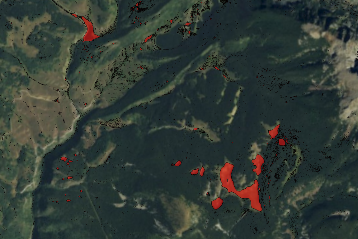
To illustrate the ease and efficiency of Surfer, Paul shared a peaks and depressions map he created of an area in Colorado. The map showed major and minor depressions of the terrain, but the minor ones had more to do with the glacial topography than actual caves and karst. In glacial areas, it’s common for chunks of ice to sit on the landscape, leading to small depressions and a kettle-type terrain. That said, Paul didn’t pay the minor depressions much attention. Instead, his focus was on quickly assessing the major depressions.
“By looking at this map, you can see that Surfer does a really good job of picking out the major features,” Paul explained. “All of these major features are truly sinkholes, some of which have caves in them. Surfer is really nice at doing this rapid assessment work.”
This rapid assessment is invaluable for projects requiring a quick overview. Paul recounted a time when he created a peaks and depressions map in Surfer to help a national agency. The organization was planning a logging operation and needed to identify sensitive areas to create buffer zones.
“The one thing you don’t want to do is major clear-cutting around the edges of sinkholes because it leads to increased erosion and sediment going into the system, which can harm the caves and the cave environment,” Paul said. “So, the agency wanted to create buffer zones around some of these features, and I worked with them on this.”
With the peaks and depressions map type in Surfer, Paul provided a visualization that delivered a high-level overview of the project area. This gave the agency quick insight into where sinkholes were located. However, to provide an even more detailed analysis, Paul used another software to highlight the sinkholes’ depths by color. That way, stakeholders knew which ones truly needed buffer zones.
“With my workflow, I take the data and create a snapshot of what things look like using Surfer. Then, I use a bigger software package to provide that more detailed look at things,” Paul explained. “So, usually, it starts with Surfer—and then I do the detailed analysis on another platform.”
This is especially true when Paul is handling a large dataset and needs to perform a quick analysis. On other platforms, he has to go through an extensive, multi-step process to achieve the same result that Surfer provides in a single click.
“In bigger packages, you’re doing all that data processing with each step,” Paul said. “Then, you have to subtract layers and do things to create a map that shows the depressions’ depths. It’s a multi-step process that’s way more cumbersome in other platforms versus one click in Surfer that gives me a pretty quick answer that I can analyze closer in the bigger package. As far as a quick, cost-effective analysis, Surfer definitely beats the bigger package hands down, so it’s great to start in Surfer and then use the other tool for the few remaining steps.”
A Fast, Reliable First Step in Sinkhole Analysis
For Paul, the peaks and depressions map type in Surfer offers a quick, intuitive way to identify major terrain features like sinkholes—often with just a single click. Using the tool, he can rapidly assess a glacial landscape, flag key features, and quickly give stakeholders a high-level overview. And when deeper analysis is needed, he has a solid visual foundation to build on using other software tools.
“Surfer gives you the big overview,” Paul noted. “From there, you can start looking at the sinkholes and say, ‘Okay, these are ones I really need to be worried about or look into more carefully.’ It’s so much easier to analyze a bigger area in Surfer than to bring that massive amount of data into another platform and go through all of the steps.”
Want more stories about geoscientists who are using innovative tools to visualize complex data? Subscribe to our blog so you don’t miss a story!
Recent Articles
- Apr 23, 2026|Gabbie Rhodes|16 min
- Apr 23, 2026|Gabbie Rhodes|9 min
- Apr 15, 2026|Gabbie Rhodes|11 min
- Apr 15, 2026|Gabbie Rhodes|12 min