Explore Your Data Like Never Before: Insights from a Grapher Guru
Sifting through vast datasets is essential to uncovering and visualizing insights that lead to informed decisions. But with thousands of data points collected for a single project, traditional methods of analysis can be time-consuming.
That’s where Grapher’s data filter features step in to save the day. They equip you to dynamically sort and visualize data, saving time and delivering deeper insights along the way. One person who understands these features well is Rick Koehler, PhD, PH, M.EWRI, A.M.ASCE, and CEO of Visual Data Analytics LLC. He regularly works with large hydrologic time series datasets but has seamlessly integrated Grapher’s filtering into his workflow to quicken his analysis and visualization process. What used to take days now takes minutes—and that’s not an exaggeration.
“Within minutes, I can start creating these graphs, whereas before, it would take a couple of days of going back and forth,” Rick said. “I created this process to make it easy for me. Now, I’m sharing it with others.”
The First Piece of Advice: Organize Your Data
If you want to quicken your workflow with Grapher’s filtering tools like Rick has done, there’s something you must do first: organize your data effectively. Rick emphasizes that proper data setup is essential for making the most out of Grapher’s filtering features, even saying that “it makes the data filtering much, much easier.”
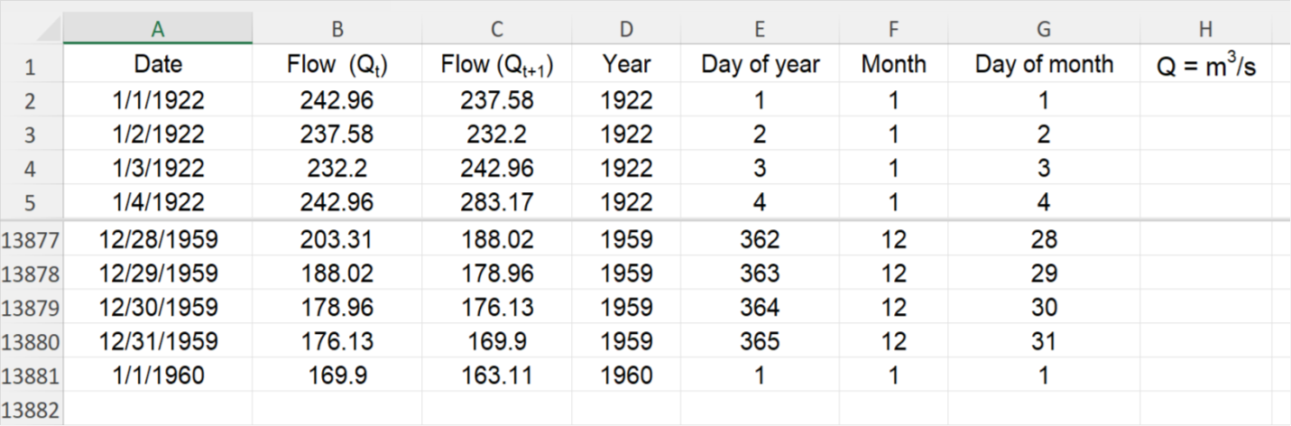
One spreadsheet Rick uses to highlight this point contains hydrology data gathered on the Colorado River at Lees Ferry, Arizona, between the years 1922 and 1960. The spreadsheet has about 14,000 daily flow measurements, which show seasonal trends across the years and are critical for historical comparisons. To organize the spreadsheet, Rick ensures each column’s name is clearly labeled at the top of the column and that the data is structured in a way that allows for easy selection and refinement in Grapher.
“The first thing I do is ensure all the columns are clearly defined,” Rick explained. “My datasets usually include observed river flow, year, month, day of the month, and day of the year. After setting up my data, that’s when the filtering comes in. I can create a single graph showing all the data points but then generate customized graphs of subsets on the fly within Grapher without having to do more manipulations within Excel or creating multiple graphs separately.”
One Dataset, Three Visualizations
To understand how Rick uses Grapher’s filter features once his data is organized, there’s an example that provides the perfect context—it includes three different visualizations that Rick has created using the same dataset on the Colorado River at Lees Ferry, just upstream of the Grand Canyon. However, before explaining how Grapher’s filter features come into play, here’s a quick rundown of each graph.
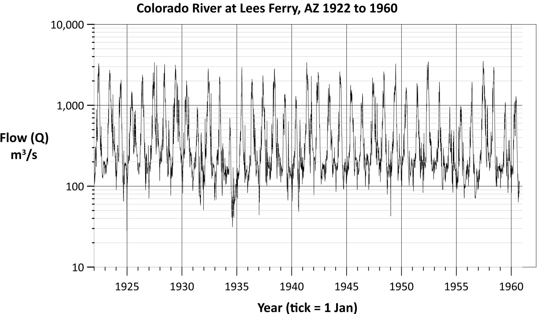
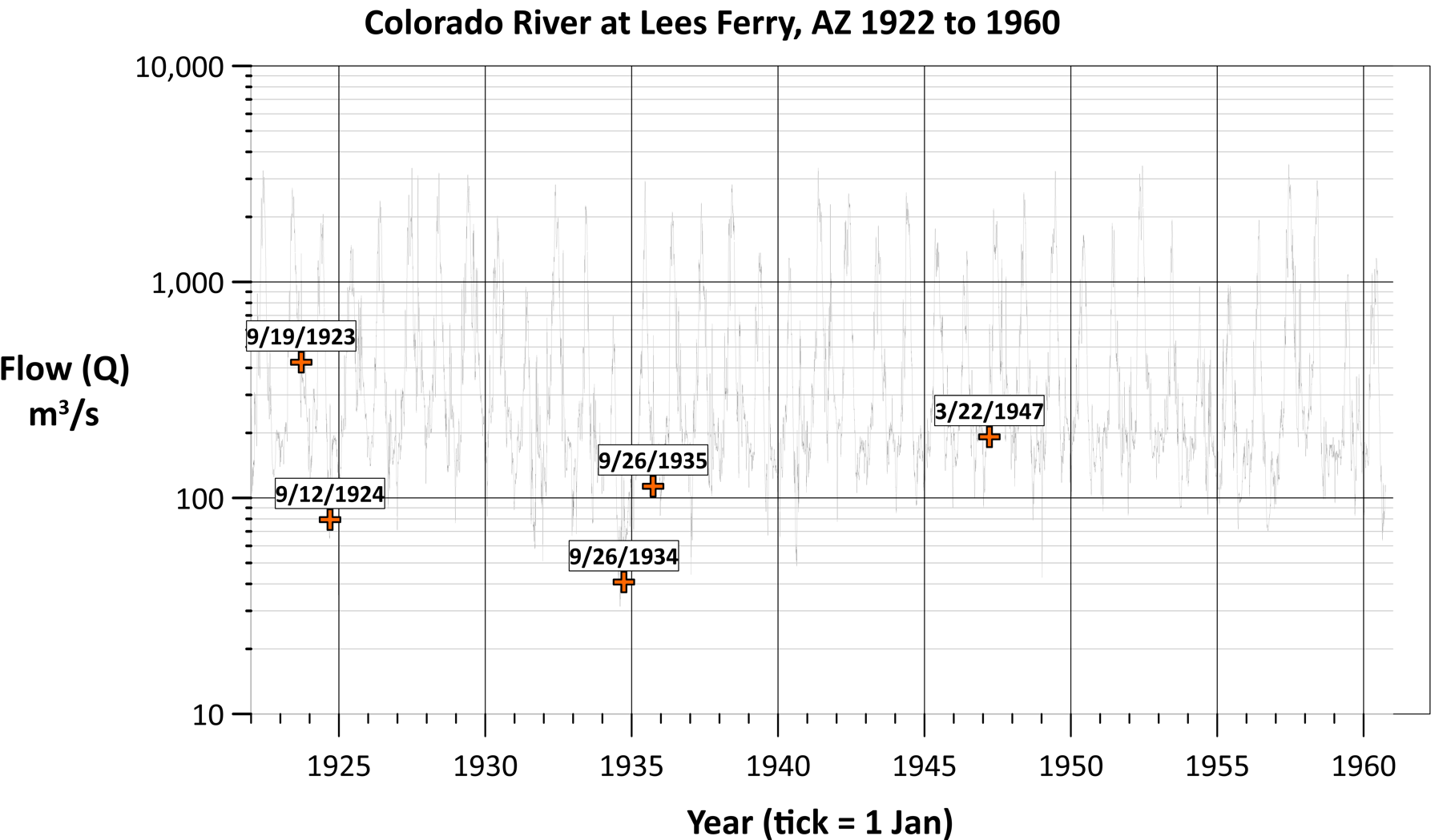
1. Traditional Hydrograph
The first visualization is a simple timeline hydrograph that any hydrologist would use to analyze river flow. The X-axis is the date, and the Y-axis is the observed streamflow. Overall, this common data visualization is straightforward.
“This first graph shows how you would normally look at rivers,” Rick said. “For me, I’m looking at how much the river is flowing from day to day. If the river starts in the mountains, you’d want to know how much water comes from the snowpack because when the snow melts, it flows into the river. You can see how the river flow changes over time.”
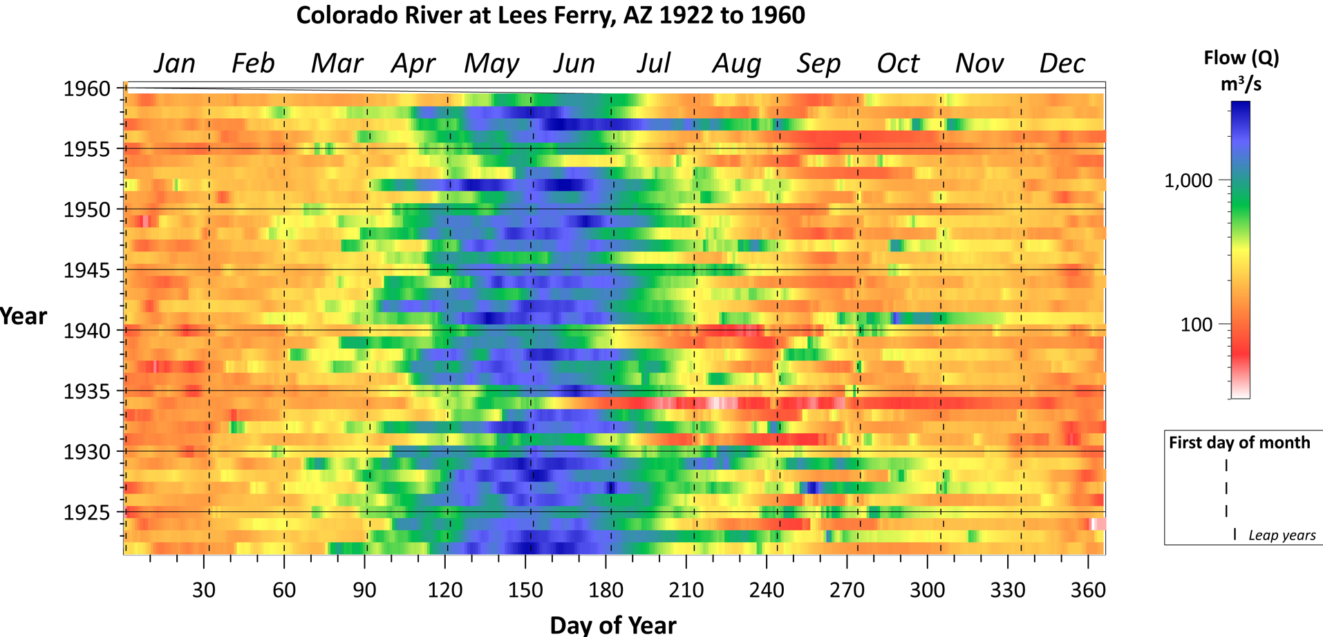
2. Scatterplot Graph
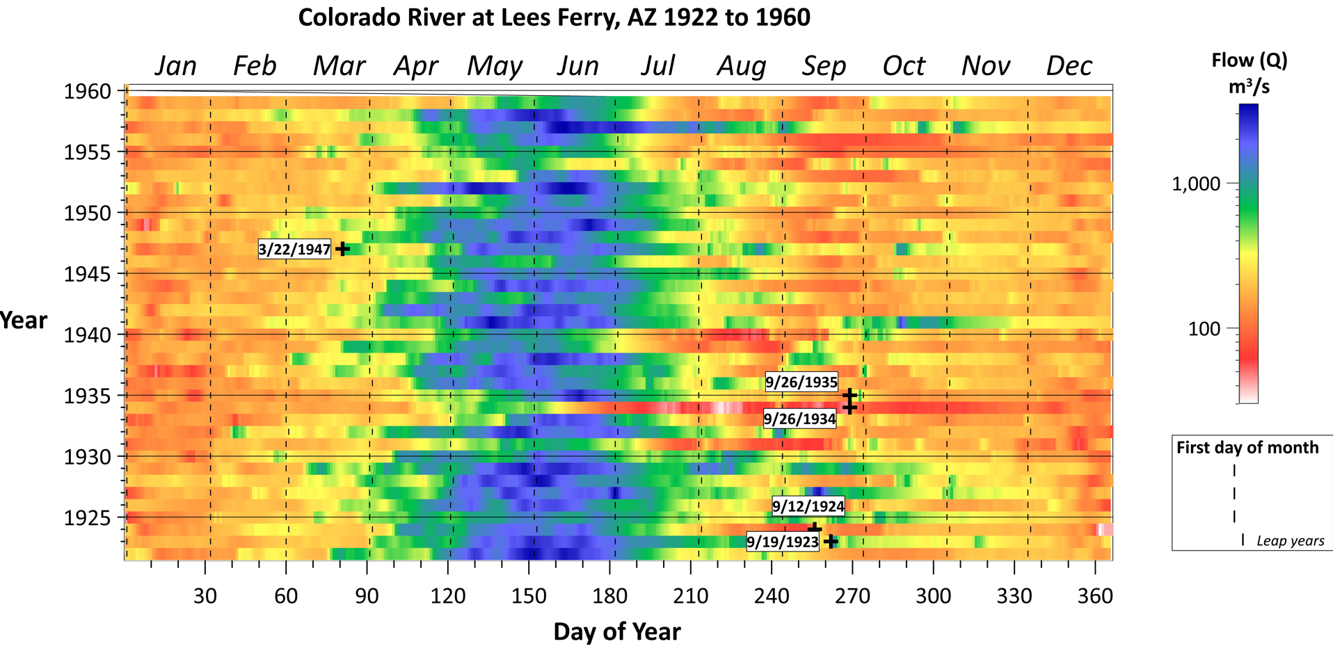
The second visualization is a scatterplot illustrating water flow as a raster heat map, with blue signifying the highest flows, and green, yellow, orange, red, and white showcasing decreasing flows. The raster graph also has vertical lines with small dashes to symbolize the first day of each month, making it easier to see which month contains which data. Additionally, every fourth dash is shifted one day to indicate leap years.
For this visual, the X-axis is the day of the year, and the Y-axis is the year. Data points are assigned colors based on the flow level. Another layer shows the first day of each month.
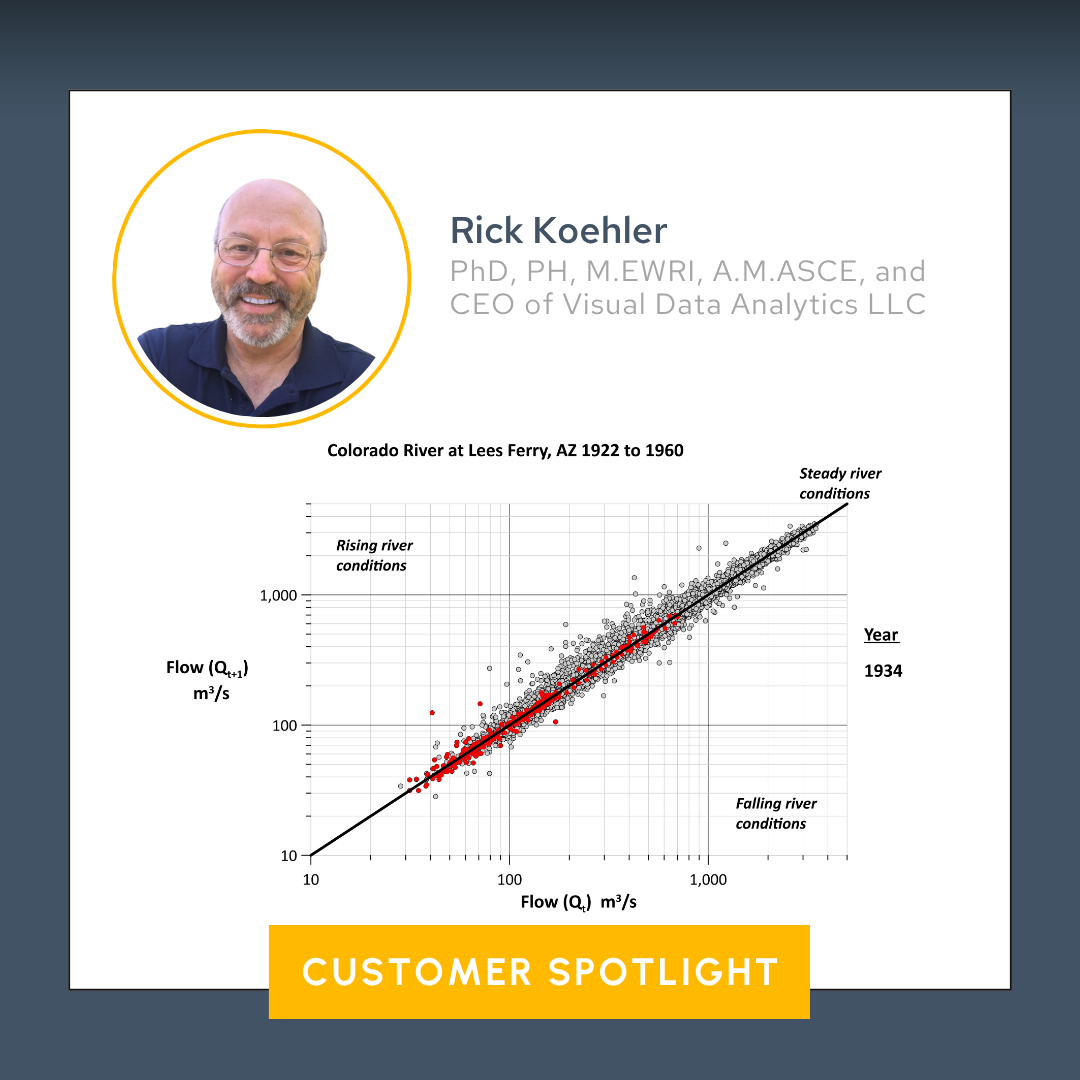
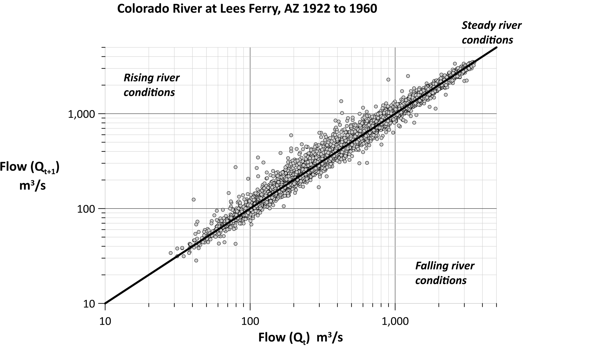
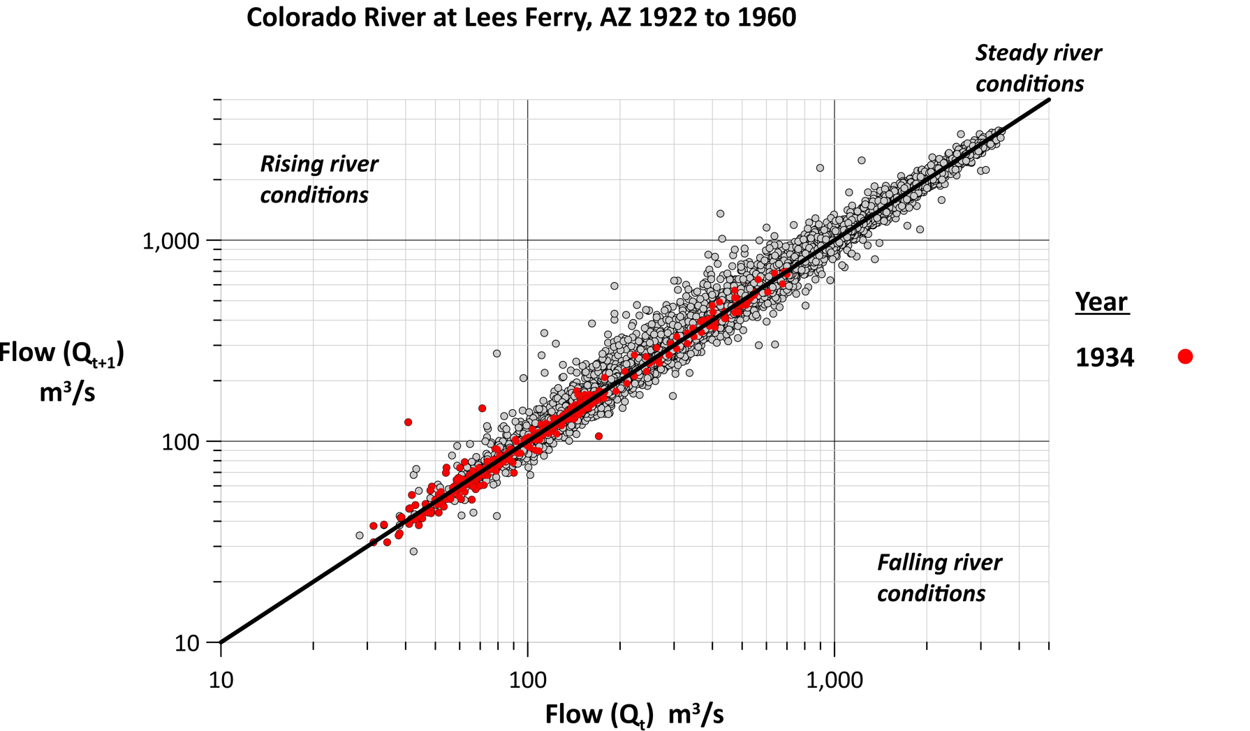
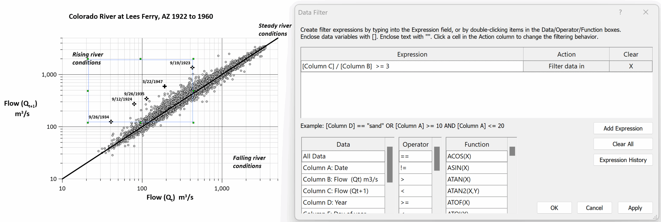
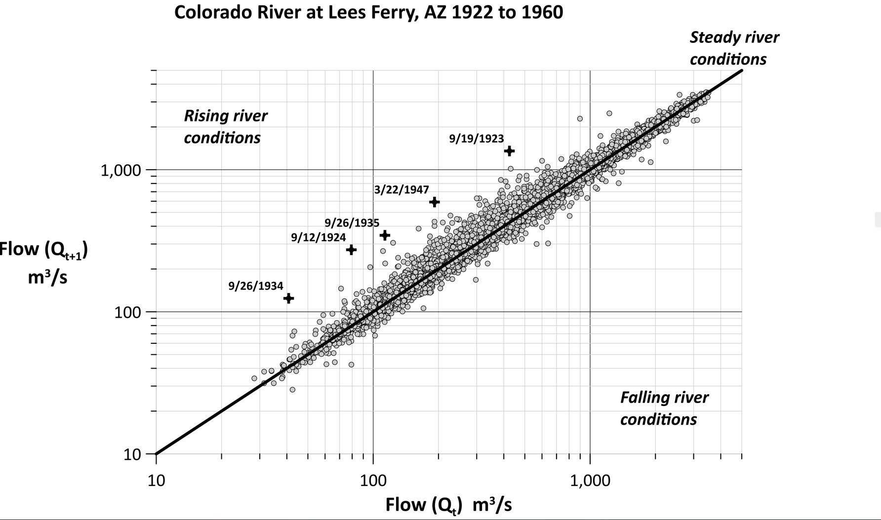
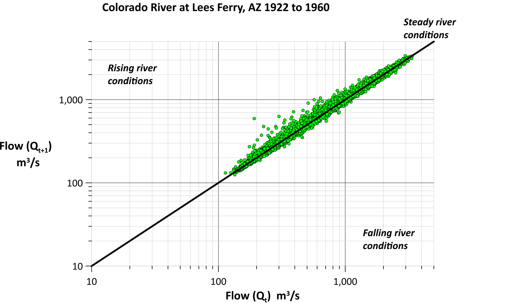
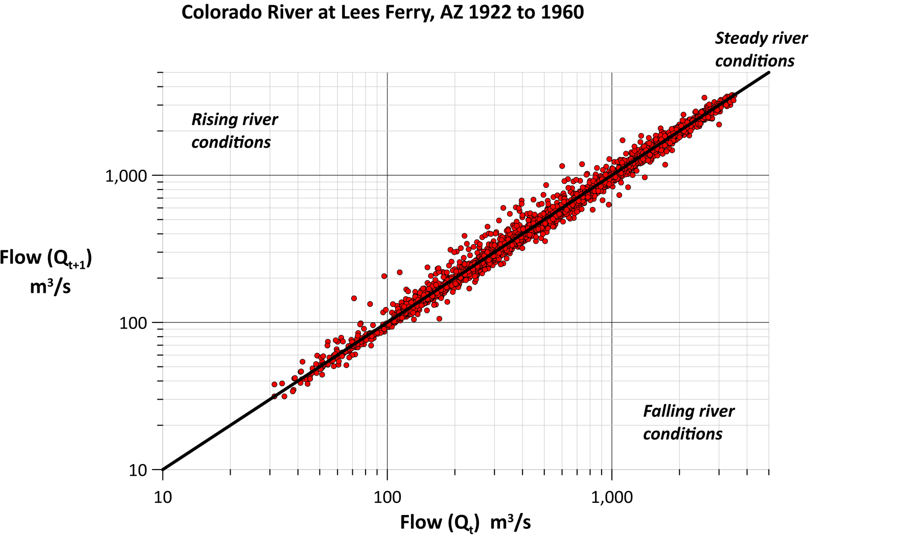
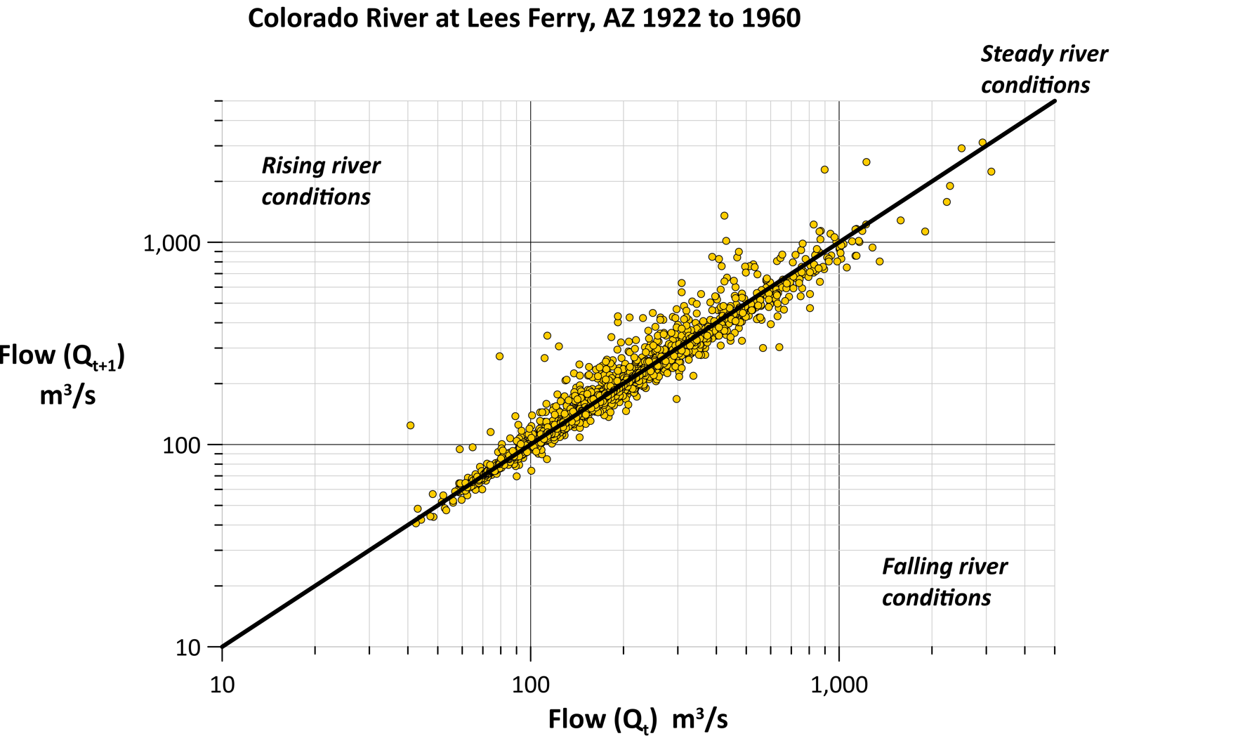
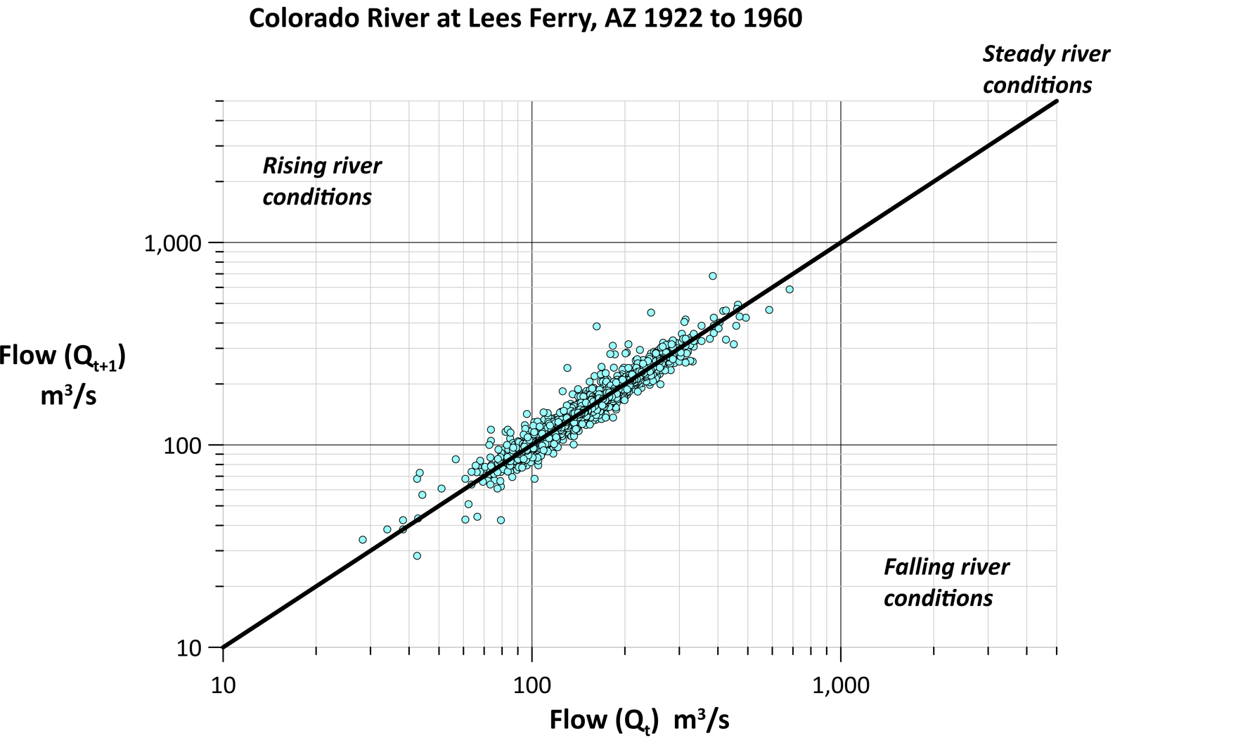
3. Change-in-flow Plot with Multiple Overlays
The third visualization has several layers, a benefit that’s only possible because of Rick’s detailed and organized spreadsheet. The first thing to pay attention to when looking at the visual is the flow—or “Q”—on the X and Y axis, as it represents the river streamflow. However, it’s critical to keep in mind that the X-axis represents the river flow for the current day, while the Y-axis represents the river flow for the next day. The second thing to pay attention to is the sloping black line that starts at the lower left corner and ends at the upper right corner.
“This line shows when the river has the same flow from one day to the next, meaning those data points will fall onto that line,” Rick explained. “If the next day’s river flow is greater than the current day, my points will plot above that line. Likewise, if the next day’s river flow is less than the current day’s flow, those points will plot below the line.”
Deeper Analysis Unlocked
Once Rick has his three visualizations ready to go, he unlocks the opportunity to analyze his data at deeper levels. This is where Grapher’s filter features come into play. Rick can assess his data from different angles and visualize multiple data stories to help stakeholders make informed decisions—all while using his three visualizations as the foundation for Grapher’s filter features to work. In fact, here are just a few ways Rick gains insights from his three visualizations when using filtering features in Grapher.
1. Filter by Variable to Isolate Key Events
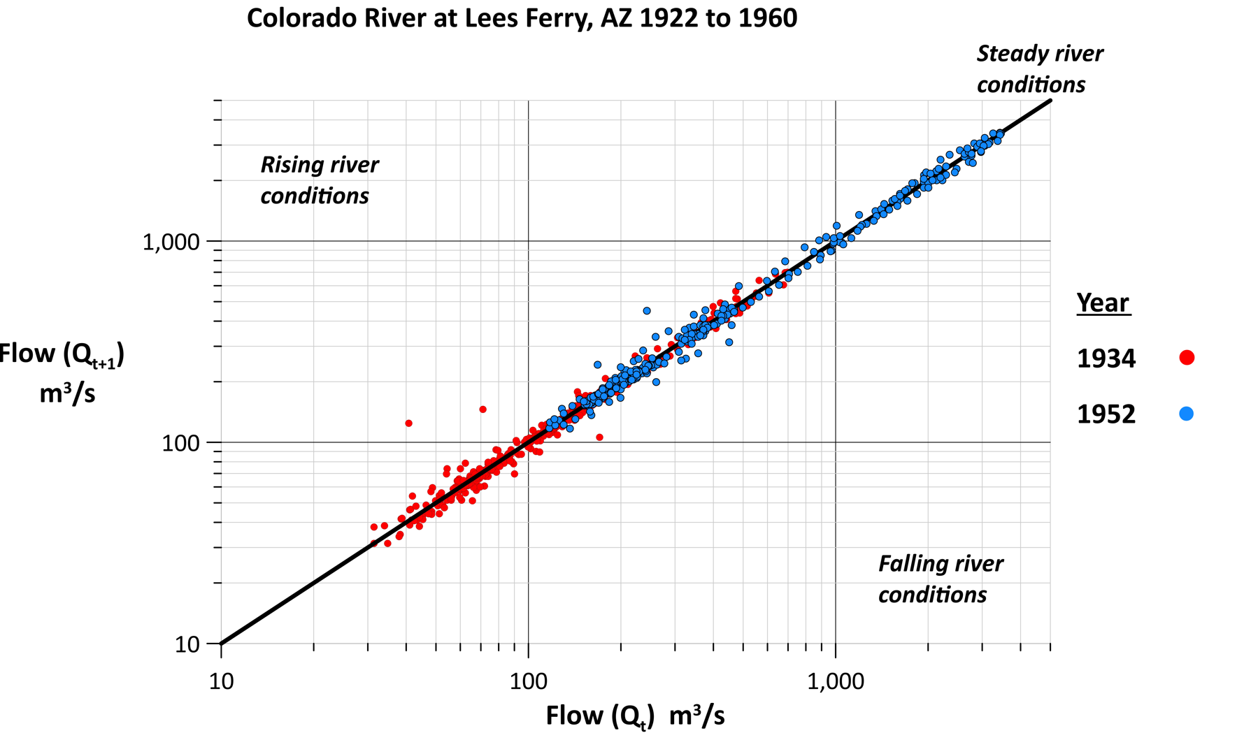
When working with 38 years’ worth of hydrology data, sifting through every value can feel overwhelming, but Rick knows how to quickly focus on specific moments using a filtering approach. For example, to examine drought conditions, he filters the dataset to only highlight points from 1934, a notably dry period. The result? A clean, focused visualization showing the river flow for that year. By comparing it to the full dataset, Rick can see that 1934 had only two significant storms. The same filtering technique can also work for high-flow years like 1952.
2. Compare Multiple Variables with Ease
Rick doesn’t stop at a single-year analysis. With just a few clicks, he duplicates filtered plots to layer different years like 1934 (in red) and 1952 (in blue). This allows for a visual side-by-side comparison of drought and flood years without altering the axis or restructuring the original data. With the filtering tools in Grapher, the process is fast, efficient, and highly informative, revealing how individual years deviate from long-term patterns.
3. Discover New Patterns by Filtering Relationships
One of Rick’s more powerful techniques is filtering based on a relationship between two columns in his data file, even when that relationship isn’t explicitly defined in his spreadsheet. For example, he calculates when the river flow tripled or more from one day to the next by using this filter equation in Grapher:
[Column C] / [Column B] >= 3.
Column C is the next-day flow, and Column B is the current-day flow. This filter uses data properties that are already in Rick’s dataset. Then, using the label variable tool, Rick simply adds dates directly to the plot—making it instantly clear when and how often these events occurred over nearly four decades of streamflow records.
4. Tell Different Stories with the Same Data
Grapher’s flexibility means that the same filter can be applied across multiple plots to tell different stories using the same dataset. For instance, applying the flow-tripling filter (when the flow increases by three times or more) to all of Rick’s visualizations reveals different dimensions:
- The traditional hydrograph shows these events are not tied to the largest flows.
- The raster plot highlights the timing of these events as mainly concentrated in September.
- The change-in-flow plot with multiple overlays shows how the filtered flows are displaced from the black ‘no change’ line more than any other flows. While not the largest or smallest actual flows, these are the largest percentage increases and are not easy to spot any other way.
Each graph reveals a piece of how the river system works—and together, they provide a well-rounded analysis of any change, from extreme to minor events.
5. Explore Data by Season (or Any Custom Category)
Rick also uses Grapher’s filters to break down his data seasonally, simply by grouping multiple months. Here’s how it works. To find flows during winter, Rick uses a filtering equation with the Boolean operator “OR” feature. That way, only the months of interest are shown in the plot. Here is an example of what the equation looks like (in the example, column M is the number of the month in winter):
[Column M] = 12 OR [Column M] =1 OR [Column M] =2
Rick can do this selective filter for any season just by changing the monthly numbers. This makes it easy to spot trends within and between seasons—like the high flows of spring snowmelt and the more erratic flows of summer thunderstorms.
Unlock More from Your Data—One Filter at a Time
Rick’s workflow is a powerful reminder that with the right tools—and the right data setup—you can uncover deep insights from even the most complex datasets in minutes instead of days. By combining Grapher’s filtering capabilities with well-organized spreadsheets and multiple visualization types, Rick shows how scientists can decrease design time to quickly find meaningful patterns.
So, whether you’re isolating drought years, comparing flood patterns, or discovering extreme events across decades, Grapher’s filtering tools give you the precision and flexibility to tell more complete, compelling data stories. If you haven’t used them yet, give them a try and see how they can significantly improve your workflow—and if you need any help, feel free to contact our customer support team!
Want more expert-driven tips, use cases, and inspiration like this? Subscribe to the Golden Software blog and stay connected to the latest innovations in geoscience and visualization!