How Watershed Maps Are Helping Stakeholders Manage Water Resources Better
Water is one of our most valuable resources, and managing it effectively is more critical than ever. With increasing worries about water scarcity, persistent contamination concerns, and the growing threat of extreme flooding events, stakeholders need accurate, data-driven insights to make informed decisions to ensure they manage water resources effectively. Fortunately, they can count on you.
As a scientist, your specific role may be to analyze and present hydrological data in a way that makes it clear and actionable for decision-makers. But how can you visually communicate the availability, contamination levels, and impact of water across a landscape? One of the most effective tools at your disposal is a watershed map.
From Hand-Drawn Maps to Precise Digital Visuals
Watershed maps have been essential tools for managing water resources for decades, but how they’re created has changed dramatically over time. Before the advent of digital mapping, watershed maps were drawn by hand. Scientists and surveyors would observe water flow patterns, trace the outlines of drainage basins, and sketch watershed boundaries based on visual assessments and topographic clues. While this approach was the standard, it was time-consuming and often relied on interpretation, making it less precise than today’s digital methods.
The move toward more accurate watershed mapping began in the early 20th century when the United States Geological Survey (USGS) started mapping the country’s water resources. By the 1930s, new technologies like photogrammetry revolutionized how watersheds were documented. Contour mapping techniques further refined the ability to depict changes in a watershed’s topography to show areas at risk for sedimentation and erosion.
World War II accelerated advancements in mapping technology, one reason being that the USGS mapped the terrain of battlefields. Their work spearheaded the development of aerial photography and radar, which was great for creating precise visuals. By the 1960s, computers became an integral part of how the USGS mapped watersheds, as the technology fostered more detailed visualizations that could help manage water resources effectively. The rise of Geographic Information Systems (GIS) also equipped the USGS to start layering multiple datasets onto a single watershed map, providing deeper insights into how different environmental factors interact and affect water resources.
Today, watershed maps are created using cutting-edge tools like satellite imagery, LiDAR (Light Detection and Ranging), drones, and advanced data visualization software like Surfer. These technologies produce highly detailed and accurate representations of watersheds, equipping scientists and decision-makers to analyze water flow patterns, predict flood risks, and understand contamination concerns to manage water resources more effectively than ever before.
What to Look for in a Watershed Mapping Tool
Not all watershed mapping tools are created equal. While various software solutions offer watershed analysis, they often come with unnecessary complexity, requiring you to navigate lengthy workflows, create multiple intermediate files, and regenerate layers for every minor adjustment.
Consider some massive data visualization packages, for example. Even after years of development, creating a watershed map in some of them remains a multi-step, time-consuming process. You have to go through numerous steps—sometimes as many as 15—just to generate a single watershed map. Each step requires saving and modifying grid files, leading to an overwhelming number of intermediate files before achieving the final result. If any setting needs to be adjusted, the process has to be repeated from the beginning, making it tedious to refine the map.
Some big packages offer a slightly more streamlined approach but present their own set of challenges. While they can quickly generate a watershed map, making adjustments is difficult. If you don’t get your settings right the first time, you must completely regenerate the watershed layer instead of simply editing it. This results in multiple redundant layers, making it hard to track which version contains your desired settings. Additionally, the process can involve navigating large, complex dialog boxes, which can be overwhelming if you’re looking for an intuitive experience.
With these challenges in mind, the ideal watershed mapping tool should offer:
- Speed and efficiency – A tool that eliminates unnecessary steps and intermediate files, allowing you to generate a watershed map in just a few clicks.
- Easy editing capabilities – The ability to adjust watershed properties in real time without needing to recreate the layer.
- A simple, intuitive interface – A workflow that equips you to focus on analysis rather than navigating complex settings.
That’s where Surfer stands out. Unlike other software, Surfer lets you create a clear, compelling, and accurate watershed map quickly—without requiring multiple steps or saving intermediate grid files. If adjustments are needed, you can simply modify the properties in the settings panel, and the watershed map will update in real-time. This makes experimenting with different parameters much easier, as there’s no need to regenerate new layers for every small change.
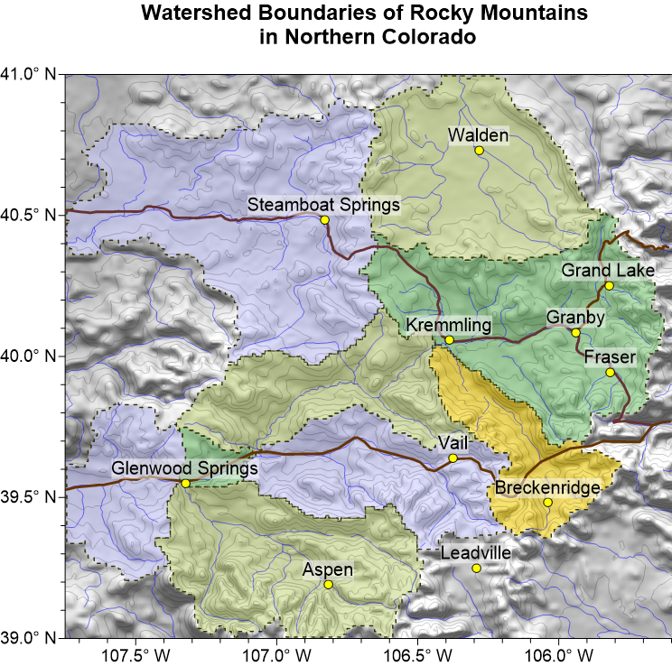
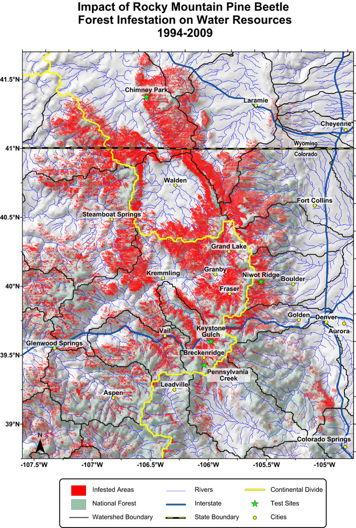
A Real-World Example: Mapping the Impact of the Rocky Mountain Pine Beetle Infestation
One powerful example of a watershed map created in Surfer is a visualization that shows the impact of the Rocky Mountain pine beetle infestation on water resources. The outbreak devastated vast stretches of forests from 1994 to 2009, leaving behind many dead trees. As these trees decayed, they released large amounts of organic matter into nearby waterways, raising concerns about contamination and changes in water quality. The project team tasked with gathering data about the infestation’s impact was supposed to assess how the widespread destruction of pine forests influenced water quality and discover which areas were most affected.
To support the project team, Surfer Product Manager Kari Dickenson created a watershed map to help visualize key data points. The map displayed:
- Watershed boundaries – Clearly outlined the regions where water drained into various rivers.
- Pine beetle-infested areas – Showed where the outbreak was most severe and how it overlapped with critical watersheds.
- National forest land – Identified impacted federal lands.
- Rivers – Highlighted major water systems that could be affected by increased organic runoff.
- Test sites – Marked locations where water quality measurements were taken to assess contamination levels.
This map provided the project team and stakeholders with a clear understanding of how the Rocky Mountain pine beetle infestation influenced water systems, helping them track contamination sources and assess the long-term environmental impact. Also, worth noting: the map was created quickly in Surfer. There were no complex workflows or many intermediate steps. Surfer ensured rapid and detailed visualization of the problem, so stakeholders could make informed decisions.
Streamline Your Watershed Mapping with Surfer
Watershed maps have long been critical tools for managing water resources, and with today’s technology, they are more powerful than ever. As water challenges like contamination, scarcity, and flooding persist, quickly and accurately visualizing water resources is essential–and Surfer makes that process easier than ever by offering a streamlined, intuitive approach to watershed mapping.
If you’re ready to create precise, insightful watershed maps without the hassle of complex workflows, try Surfer for free today with the 14-day free trial.