How Peaks and Depressions Maps Help Model Water Availability More Effectively
Water availability is never static—it shifts due to precipitation, runoff, evaporation, seepage, and discharge. Understanding these changes is critical if you’re a hydrologist, environmental scientist, or engineer managing water resources, predicting flood risks, or planning sustainable infrastructure. But understanding these changes start with analyzing and visualizing how landscapes—particularly those characterized by caves, sinkholes, fissures, and underground streams—interact with surface and subsurface water. That’s where peaks and depressions maps come into play.
Unlike traditional maps that only highlight elevations, peaks and depressions maps provide a clearer, more actionable picture of how water accumulates and drains within a given area. They help identify where water is likely to pool and how it may interact with different geological features. These capabilities make peaks and depressions maps invaluable for assessing water availability, as they can equip you to model water movement, determine risks related to flooding, and understand how to build infrastructure that lasts.
So if you’re working with Karst topography, catchment areas, or any region where water availability is dictated by complex surface and subsurface interactions, then peaks and depressions maps should be a key tool in your workflow. The only challenge is that most data visualization software don’t offer these maps, leaving you to rely on limited elevation data that doesn’t tell the full story. Fortunately, Surfer can help.
Why Highs and Lows Aren’t Enough—You Need Peaks & Depressions Maps
Most data visualization software lets you display high and low points on a map, but that’s not the same as identifying peaks and depressions. Knowing the highest and lowest elevation points in an area can be useful for basic elevation analysis, but it doesn’t provide the full picture of how water moves and accumulates across a landscape. It doesn’t tell you where entire basins form, where water pools before draining, or how interconnected peaks and valleys influence water availability. That’s why Surfer stepped in with the map type you need.
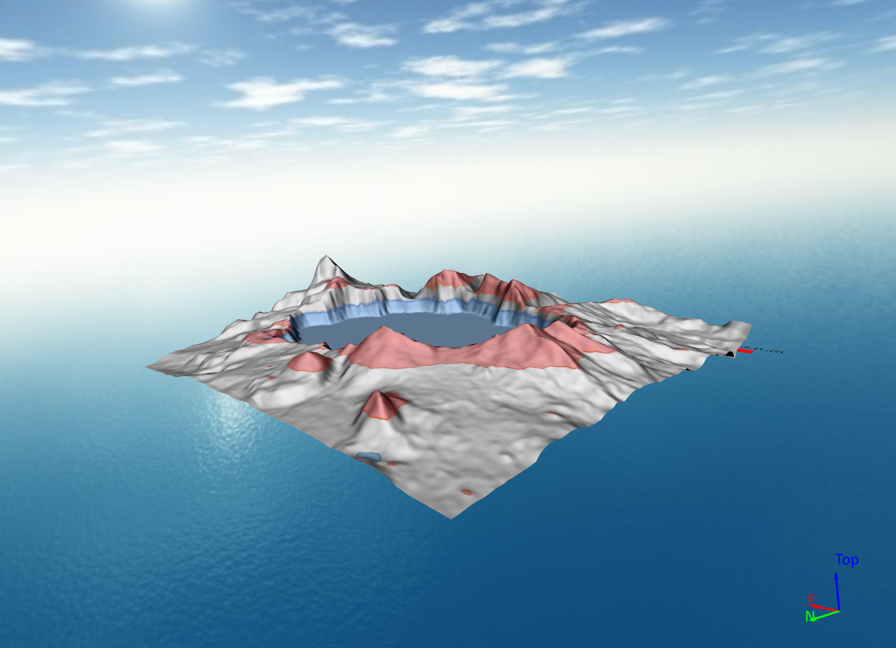
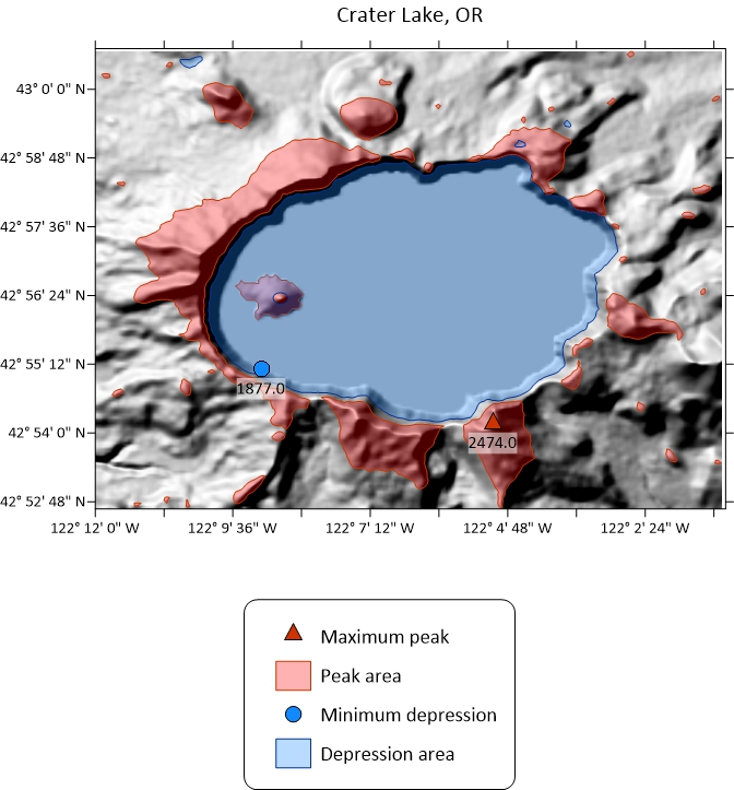
Peaks and depressions maps outline entire low-lying basins and even the lowest points within those basins. Similarly, they reveal the full extent of peaks, not just their highest points, helping you and stakeholders understand how elevation changes impact water flow, erosion, and resource distribution. To sum all the benefits up quickly, here’s what you can do with a peaks and depressions map:
- Instantly identify drainage patterns—See where water is naturally collecting or running off.
- Detect low-lying basins—Spot areas prone to flooding or where water may accumulate over time.
- Recognize elevation highs—Understand how peaks influence runoff and erosion.
- Improve decision-making—Plan infrastructure, land use, and environmental projects with confidence.
- Immediately highlight critical areas—Color-code your visualization to show where water is pooling (depressions) and where it’s flowing from (peaks).
- Showcase detailed insights—Get a report highlighting key insights about peaks and depressions, including their height, depth, length, width, orientation, and more.
These advantages fill a major gap. With peaks and depressions maps available in Surfer, you now have a tool that can properly visualize how water interacts with complex terrains so stakeholders can assess water availability. And in today’s world where water quantity is an issue around the world, having this type of tool is essential for a sustainable future.
Why Use Surfer for Peaks & Depressions Maps?
So now that you know the benefits of using a peaks and depressions map, how do you actually create one? The good news: Surfer makes it incredibly simple. With just a few clicks, you can generate a fully customizable peaks and depressions map, complete with color coding, symbols, and labeling that update in real time. Some standout benefits of Surfer’s peaks and depressions mapping tools include:
- Instant visualization—Just select the map type, choose your grid file, and your map is ready.
- No extra processing steps—No need to create intermediate grid files or manually edit layers.
- Customizable styling—Adjust colors, labels, and symbols to fit your needs.
- Seamless overlay options—Combine your peaks and depressions map with Google Maps or other imagery for a real-world perspective.
Surfer’s user-friendly approach saves time while providing powerful, data-driven insights. Instead of struggling with unnecessary steps, you can focus on analysis and fostering good conversations with stakeholders, making it the ideal tool for your needs.
Unlocking Better Water Modeling
Understanding how water moves above and below landscapes is critical for assessing water availability and effectively managing water resources, predicting flood risks, and planning sustainable infrastructure. But traditional maps only provide part of the picture, highlighting general highs and lows without showing where entire basins form or how interconnected peaks and valleys influence water availability.
That’s why peaks and depressions maps are such a game-changer. These maps provide a complete hydrological perspective, helping you visualize drainage patterns, identify flood-prone basins, and track how water interacts with complex geological formations like caves, sinkholes, and underground streams. And with Surfer, creating a peaks and depressions map is quick, intuitive, and customizable, so you can spend time on the right things! Want to see for yourself? Download a 14-day free trial of Surfer to get started!