PFAS in the US (Part 1): Making Its Presence and Impact Understandable to Researchers and the General Public
Per- and polyfluoroalkyl substances (PFAS) are an increasingly urgent concern across the United States. These persistent chemicals—often referred to as “forever chemicals”—are being detected more frequently in critical resources like soil, water, and air. And as their presence grows, so do the risks they pose to human health and the environment. From contaminated drinking water to long-lasting soil residues, PFAS pollution is a complex, widespread issue that demands clear insight and decisive action.
But understanding the scope of the problem isn’t easy. PFAS can behave unpredictably underground, and raw data alone often isn’t enough to drive the informed decisions needed for cleanup and mitigation efforts. That’s where visualization plays a key role. It’s also what inspired Zach Dickson, Principal of Dickson & Associates, to take action.
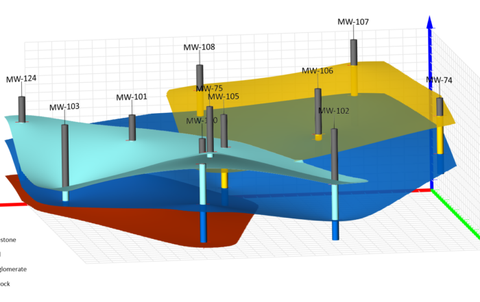
Recognizing the power of data storytelling, Zach developed dynamic, interactive, and geo-referenced models of PFAS contamination in soil and groundwater. By combining Surfer’s advanced mapping tools with Microsoft 365’s Power Query and BI, he created a clearer way to explore the extent of PFAS presence—helping scientists, researchers, and the public alike better understand what’s happening beneath the surface and where to go from there.
The Growing PFAS Problem in the U.S.
PFAS contamination is no longer a localized issue—it’s a nationwide crisis. According to newly released data from the Environmental Protection Agency (EPA), an additional 15 million Americans are now confirmed to be drinking water tainted with PFAS, bringing the total number of affected individuals to more than 158 million across the country.
These substances don’t easily break down in the environment. Once they enter the water supply, they can remain for decades—building up in the human body and the ecosystem over time. The concern is so serious that scientists now describe PFAS as a public health disaster in the making.
“Drinking water is a major source of PFAS exposure,” said Dr. David Andrews, senior scientist and deputy director of investigations at the Environmental Working Group in a press release. “The sheer number of contaminated sites shows that these chemicals are likely present in most of the U.S. water supply.”
These findings stem from the EPA’s Fifth Unregulated Contaminant Monitoring Rule (UCMR 5), a nationwide testing initiative that requires U.S. water utilities to monitor drinking water for 29 distinct PFAS compounds. So far, this round of testing has confirmed PFAS contamination at 2,719 locations—and the numbers continue to climb. With such a wide-reaching impact, the need for clear, actionable insight into where PFAS is present—and how it moves through soil and groundwater—has never been more urgent, which is why Zach’s models are available at the right time.
Why Zach Dickson Set Out to Build PFAS Models
Zach’s interest in PFAS didn’t begin in a lab—it began in the field, as he worked with clients who were directly impacted by these persistent chemicals. Faced with mounting pressure from state regulators, his clients needed to provide preliminary assessments that not only mapped out PFAS contamination but also began to answer these critical questions: How widespread is the problem? Where did these substances originate? And perhaps most importantly—who should be responsible for cleaning them up?
One client, in particular, was dealing with a complex groundwater contamination issue influenced by runoff from nearby sites. In that case, associating different sources of PFAS with specific entities was critical for distributing cleanup costs fairly. But Zach quickly realized that making those connections was easier said than done.
“We have a lot of PFAS compounds,” he said. “But we didn’t particularly have all the testing methods to look at the compounds that are important to us when it came to human health and environmental impact. We really wanted to get down to the nitty-gritty, but we had limited capabilities to identify those things.”
The situation started to change around 2019 when regulatory agencies across the country began gathering PFAS data in earnest. Using survey sheets, sampling programs, and surface water testing, states like California and Colorado started building public databases with geolocated sampling information. Platforms like California’s GeoTracker and Colorado’s Department of Public Health and Environment website made that data accessible to the public—but only in basic formats. Typically, users could only download spreadsheets or view static maps showing sampling locations, but there was little context to help people understand the scope or significance of what they were looking at.
“A researcher or somebody wanting to look at the human health impacts of PFAS may want more data. For someone like me—a site assessor and characterization professional—it just wasn’t enough,” Zach said. “I wanted to see the big picture: What are the important PFAS that we’re looking at relative to other PFAS? Where do we need to focus? Where are the problems within a state? How are contamination patterns different in industrial versus residential areas? Where should we focus our resources, and how do we clean up groundwater to positively impact human health and the environment without polluting the air because we’re overdoing it?”
Creating a Pathway to Answers
Zach’s questions—and the lack of effective tools to answer them—led him to start building dynamic data models. His goal wasn’t just to analyze PFAS presence for a single site or client, but to design visuals that could support researchers in understanding the issue.
As more PFAS datasets became available online, Zach saw the opportunity to create interactive models that went beyond static maps. With Surfer and Microsoft 365’s Power Query and BI as well as a working knowledge of how environmental data is collected, processed, and validated, he began curating and transforming raw datasets into dynamic visuals that highlighted the most pressing contaminants, their concentrations, and their potential impact on local ecosystems and communities.
“The real idea here is to gather basic information designed for a wide variety of people and then distill it down to what a researcher would potentially want for their particular proficiency, whether it be understanding human health, characterization, chemical transformation and biodegradation, and other processes,” Zach explained.
However, the models aren’t just for specialists; everyday people can use them, too. Zach noted that interest at the state level in making PFAS data more accessible to the public is growing. For example, Colorado’s Department of Public Health updated its PFAS mapping platform in January to offer clearer and more user-friendly visuals for everyday people. It’s a sign that more officials recognize how critical public understanding is, especially when it comes to interpreting water quality reports and understanding what they mean for personal and community health. With the assistance of tools like Surfer and Microsoft 365’s Power Query and BI, Zach’s models can bring that understanding into sharper focus for the public as well.
A Look at the Models—and What’s Coming Next
The PFAS models Zach created make it easier to explore, compare, and draw insights from complex datasets. Right now, the models are in a demonstration phase, but Zach is still open to sharing them with anyone who’s interested. His long-standing goal is to help ensure people have the information needed to direct resources effectively.
“My goal here, as it’s always been throughout my career, is to direct our resources effectively and come from a mass balance perspective,” Zach said. “How many impacts do I want to create to clean up this specific impact at a particular area to really balance things out? I don’t want everybody running out and using engineering solutions that are highly impactful to surrounding environments when there may be no need. But if there is a need, then we’re going to have to put up with that and figure out what that balance is.”
Here are the models Zach has created so far to help foster that balanced and informed decision-making:
- Dynamic Interactive Geo-Referenced PFAS Soil & Groundwater Data Library – California 2024 Statewide Data
- Dynamic Interactive Geo-Referenced PFAS Soil & Groundwater Data Library – 27 California Airports
- Dynamic Interactive Geo-Referenced PFAS Soil & Groundwater Data Library – Colorado 2020 Statewide Data
Each model offers a unique lens into PFAS contamination trends, helping users—from researchers to the general public—identify highly impacted sites and samples, spot the highest concentration and most prevalent individual PFAS analytes, make comparisons, and discover bias in the compiled data.
But to help unpack what each model reveals, this article marks the first of a new four-part blog series we’re launching titled “PFAS in the US.” In the series, we’ll walk through each interactive model Zach has created, unpack the data behind it, and explain what it tells us about the presence and impact of PFAS in that area.
Up first: the Colorado PFAS model. Stay tuned as we dive into what the data reveals about contamination patterns across the state, and how tools like Surfer and Microsoft 365’s Power Query and BI helped turn raw numbers into meaningful insight.
Subscribe to the blog for more!