Templates: Your New Graphing Go-To (Part 2)—How They Reduce the Learning Curve
Whether you’re learning new graphing software or creating a new graph type in a tool you’ve used for years, it’s easy to feel stuck. Hours can go by as you search online, tweak settings, or look through product documentation to try to figure out why something like your axes aren’t displaying correctly. The learning curve can be challenging, but the good news is that you can significantly decrease it to quickly achieve an accurate, publication-ready visualization.
Templates offer a way to bypass the tedious trial and error process. And to put that benefit into perspective, the second post of our blog series Templates: Your New Graphing Go-To will explore how templates help you shorten the learning curve so you quickly produce a polished output that impresses stakeholders and colleagues.
The Struggle Behind the Learning Curve
Let’s be honest: the toughest part of creating any new graph is often just starting. Should you use a blank canvas? Should you try to adapt an old file? This uncertainty leads to hunting for answers. You can find yourself searching online and sifting through various resources, piecing together the information you need to create your desired graph. Doing this can get you on the right path, but it’s inefficient when you’re facing deadlines and pressure to quickly deliver the visuals stakeholders need to make informed decisions. Between finding helpful information, reading or watching tutorials, implementing instructions, and troubleshooting when something goes wrong, you could spend significant time creating a graph.
The result? Hours (and potentially days) lost to designing a visual that may just be “good enough,” but not exactly what you envisioned. That kind of compromise can prevent you from delivering the polished, professional output your stakeholders expect and you want to achieve.
How Templates Help You Overcome the Learning Curve
So, how exactly do templates help? A template is a pre-built, fully-formatted framework with everything you need to start creating a high-quality graph. That doesn’t mean templates erase a learning curve completely. After all, every new software or graph type has its nuances—but templates do substantially smooth the learning process. Instead of spending hours figuring out where to start, you can simply open a template, populate it with your dataset, and see your visualization take shape right away.
Templates also work because they remove the uncertainty from graph creation. There’s no guesswork about which settings to adjust or which features will produce the style you want. You don’t need deep product knowledge. The layout, axes, color scheme, and labels are already set up for you, providing a solid foundation that you can easily customize as needed. With that structure in place, you can focus less on figuring out the setup and just get an accurate, publication-ready visualization quickly.
From Overwhelmed to On Time: A Real-World Example
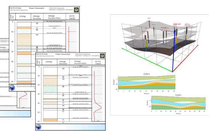
To see a practical example of how templates ease the learning curve, here’s a real-world scenario. A geoscience consultant was preparing a soil texture classification ternary diagram for a client report with a fast-approaching deadline. The problem? It was the consultant’s first time creating this type of graph in their current software, and they didn’t have hours to spend combing through documentation or watching tutorials to figure out the formatting from scratch.
Instead of starting from a blank file, the consultant found a ready-to-use Ternary Diagram template. With just a few clicks, they downloaded a template, populated it with their dataset, and instantly had a professional-quality visualization. A few quick tweaks to the colors and labels later, and the graph was tailored exactly to the project’s needs.
They delivered the visualization on time, proud of the polished output and confident that stakeholders would understand the information and use the graph to make informed decisions. There were no long hours reviewing product material. No extensive trial and error. Using a template made the process straightforward and led to a fast, precise, and publication-ready graph.
Turning the Learning Curve Into a Shortcut
A learning curve shouldn’t hinder your productivity. As the example showed, templates transform what can be a time-consuming, uncertain process into a smooth, efficient workflow. They provide a strong foundation to build from, ensuring you don’t need hours to create the great graph you envision. Templates can bring your graph to life more efficiently than ever before.
However, keep in mind that templates can do more than simply reduce a learning curve. In the next installment, we’ll explore how templates help you create a faster, more efficient recreation process so you can remake graphs in less time. Stay tuned so you don’t miss out!