Transform Your Water Quality Data Into Effective Visualizations Stakeholders Understand and Act On
August is National Water Quality Month, a time focused on remembering the importance of having access to clean water. If you work with water data, there’s no better time to highlight the value of clean, safe water and the role your work plays in protecting it.
Whether you’re monitoring contamination levels, assessing groundwater remediation efforts, or helping communities secure a reliable water supply, your findings matter. But raw data alone isn’t always enough to provide the necessary insight people need to protect water quality. For stakeholders to make informed decisions, they first need to understand your data—and that’s where data visualization comes in.
The Role of Data Visualization in Water Quality Assessment
Stakeholders don’t want to dig through tables, spreadsheets, or dense reports. It doesn’t matter if you’re sharing your findings with a policymaker, agency regulator, or investor. You need to provide your data in a way that’s easy to understand and act on. Data visualization equips you to do that—but that doesn’t mean any data visualization will work. When you want to make complex water quality data understandable and actionable, you need to create effective data visualizations.
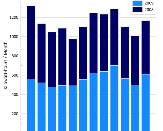
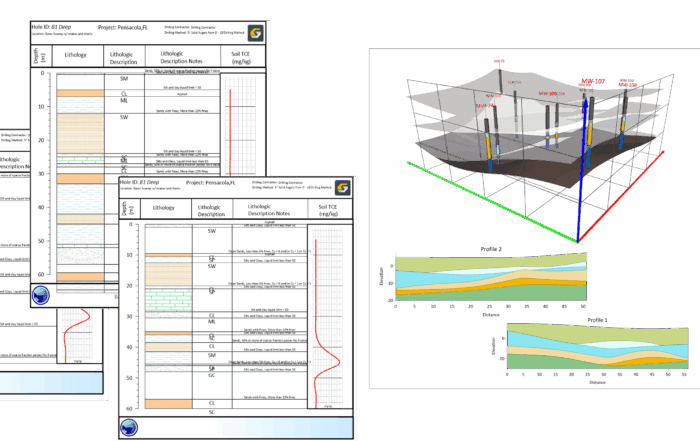
An effective data visualization is clear, compelling, and accurate. It’s either a map, model, graph, or chart, and it’s also in a 2D or 3D format. However, in every instance, an effective data visualization equips you to distill complex data into visuals that improve comprehension and lead to informed decision-making. To put that into perspective, here are just three of the top ways effective data visualizations help you enhance stakeholders’ understanding and decision-making.
Bridges the Technical Gap
Anytime you use an effective data visualization, it acts as a translator between you and decision-makers. It helps make complex, scientific data digestible for people without a background in hydrology, chemistry, environmental science, or anything water-related.
Highlights Patterns and Problem Areas
It’s much easier to spot contamination hotspots or seasonal trends when they’re visualized spatially or over time. With the right layout and a compelling color scheme, you can use your data visualization to quickly and easily call attention to urgent water quality issues before they escalate.
Accelerates Decision-Making
When you create clear, compelling, and accurate data visualizations, stakeholders can act faster. Whether it’s allocating funds, approving a remediation plan, or adjusting monitoring protocols, a well-designed visualization can reduce delays and improve outcomes.
Best Practices for Visualizing Water Quality Data Effectively
Now, if you want to create effective data visualizations, there’s good news: it’s not as challenging as you may think. With a willingness to try new ideas, you can start creating maps, models, graphs, and charts that stakeholders understand and act on. That being said, here are six proven design techniques you should start using first to help you create effective data visualizations that produce meaningful results in water quality.
1. Remove the Clutter
People can only absorb so much information at once, so eliminate anything that doesn’t directly support your message. It can be busy gridlines, unnecessary background elements, decorative fonts, or too many colors.
Of course, this doesn’t mean your visualizations need to be dull. They just need to be deliberate. Use white space strategically, choose a clean layout, and let your most important data do the talking.
2. Create Clear Labels
You can’t expect your audience to guess what they’re looking at. Use clear axis titles, legends, and units of measurement to give your visualizations the context they need. Better yet, label key data points directly when it makes sense. That way, viewers don’t have to scan across the screen or flip through pages to find the insight.
3. Prioritize Accuracy
Misleading visualizations can do more harm than good, so always double-check that your data visualization reflects the data truthfully. Avoid common pitfalls like:
- Truncated axes that exaggerate differences
- Inconsistent scales between maps
- Inappropriate graph types (e.g., using a pie chart when a bar chart would make more sense)
Also, unless there’s a compelling reason not to, start your axes at zero to prevent distortion.
4. Emphasize Major Points
Want to make sure stakeholders walk away with your key takeaways? Draw their eye to the most important insights. This taps into the Von Restorff Effect, also known as the Isolation Effect. It suggests that when something stands out, people remember it. That means you should use bold colors, arrows, or annotations to highlight things like contaminants of concern, thresholds exceeded, and regions of interest.
5. Use Color With Purpose
Color can do a lot of heavy lifting—but only if you use it wisely. Stick to a limited palette that enhances understanding rather than creating confusion. For example, you can do the following:
- Use red to signal contamination or danger
- Use blue to represent water resources or healthy conditions
- Use green to show improvements or safe zones
These associations can help stakeholders instantly grasp the severity or status of a water quality issue.
6. Tell a Cohesive Story
Ultimately, your visualization should do more than inform. It should communicate, so don’t just display data. Use your visualizations to guide your audience through a clear narrative. You can do this by starting with context: what are you measuring, and why does it matter? From there, you can lead into your findings, emphasize the key takeaways, and finish with a call to action or next steps.
Help Stakeholders See What Matters Most
National Water Quality Month is a great reminder of just how critical clean water is to every aspect of life. As someone who works with water data, you have a unique opportunity and responsibility to make the data you collect understandable and actionable—and by turning raw numbers into effective data visualizations, you can do just that. Whether you’re identifying contamination zones, tracking groundwater remediation progress, or building support for new water quality initiatives, an effective data visualization can make all the difference.
Need an intuitive software to start creating the maps, models, graphs, and charts that’ll make a difference? Download a 14-day free trial of Surfer and Grapher to start transforming your water quality data into effective data visualizations that drive real-world decisions.
