Need Inspiration to Create Your Graph? Look to Great Examples.
When you’re about to create a graph, do you already have a clear vision of how it should look? Sometimes the answer is yes—but let’s be honest, sometimes it’s not. Designing a compelling, effective graph isn’t always easy, especially when you’re trying to present complex data in a clear and engaging way.
The good news? You don’t have to start from scratch. Looking at examples of well-designed graphs can spark new ideas, reveal formatting techniques you hadn’t considered, and help you land on a visual style that brings your data to life. The only thing you have to do is take advantage of the great examples that are available to you.
Why Inspiration Beats Starting from Scratch
When it comes to designing a great graph, the instinct might be to go rogue—start with a blank canvas and try to dream up something original. But a research study published in Science suggests that’s not the most effective approach. In fact, you’re more likely to generate better, more creative ideas when you start with a structure—like a template or example—rather than brainstorming from scratch.
That’s because great examples act as a helpful constraint. They give you a defined starting point and clear parameters, which in turn frees up your brain to focus on improving and adapting the design rather than inventing something entirely new. Instead of asking, “Where do I begin?” you’re asking, “How can I make this work for my data?” That small shift leads to bigger, better outcomes.
That same study in Science found that when people are given examples or frameworks to work from, they generate more ideas—and better ones—than when they’re told to ‘think outside the box’ with no guidance at all. As it turns out, creativity thrives not in the absence of structure but because of it.
So instead of starting from nothing, it’s good to start from something. By beginning with a great example, you don’t limit your creativity. You unlock it.
A Built-In Source of Graphing Inspiration
Now, where can you find something to inspire your next graph? If you’re not familiar with it yet, Grapher is our 2D and 3D graphing tool that bridges the gap between data and decision-makers, equipping you to present your findings in a manner that resonates with both technical and non-technical audiences alike.
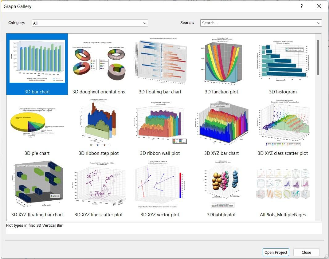
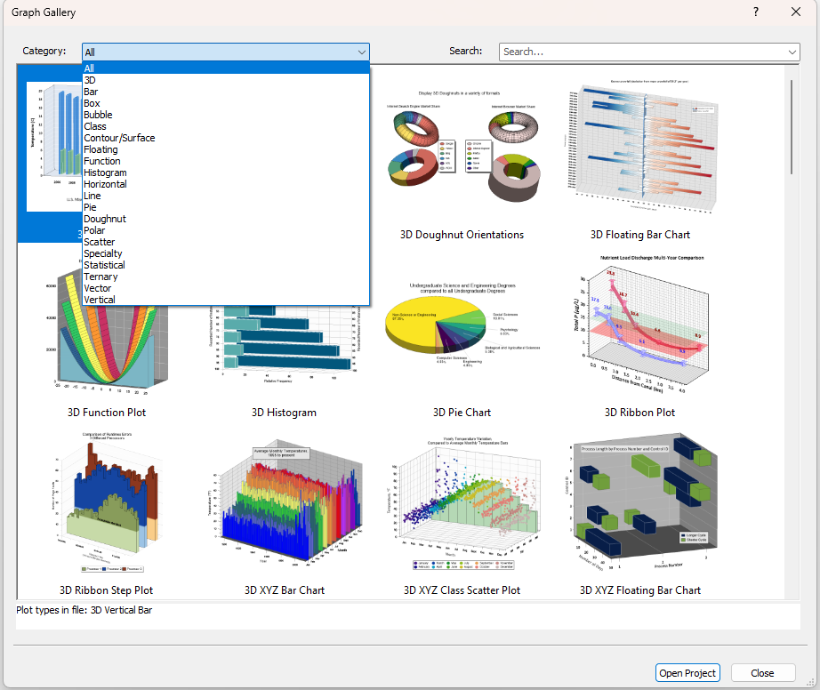
Whether you’re preparing graphs for a research paper, a client presentation, or internal analysis, Grapher makes it easy to create stunning graphical representations that simplify complex datasets so they’re accessible and understandable. And if you’re ever unsure where to start to create a cool data visualization, the Graph Gallery has you covered. This built-in library is packed with sample projects you can browse, learn from, and use as examples and templates to build on with your own data. It’s a practical, in-program source of inspiration to help you create effective, engaging graphs—without starting from scratch. For a deeper understanding of what the Graph Gallery provides, here are the categories of sample visualizations you’ll find:
Line and Scatter Plots
These include classic 2D line plots, scatter plots, line/scatter combos, and step plots, perfect for displaying relationships between two variables. The Graph Gallery also features 3D ribbon, wall, and step plots, along with XYZ scatter plots for visualizing data across three axes.
Class and Bubble Plots
Class and bubble plots are great for adding categorical or size-based meaning to your visuals. In the Graph Gallery, you’ll find examples of 2D class scatter plots and bubble plots, as well as XYZ versions that extend your data into a true three-dimensional space.
Function Plots
The examples in this category include vertical, horizontal, and parametric function plots. You’ll also find contour and surface function maps, along with polar function plots for circular or angular data relationships.
Bar Chart
There are multiple 2D, 3D, and XYZ vertical and horizontal bar charts and floating bar charts in the Graph Gallery. With so many visualizations to inspire you and build on, you can create the perfect bar chart for your datThere are multiple 2D, 3D, and XYZ vertical and horizontal bar charts and floating bar charts in the Graph Gallery. With so many visualizations to inspire you and build on, you can create the perfect bar chart for your data.
Statistical Plots
Need to visualize distributions or compare data sets? Sample histograms, box-whisker plots, pie and doughnut charts, and Q-Q plots are available in both 2D and 3D formats. These are perfect for statistical summaries and data distribution insights.
Ternary Plots
You can plot compositional data using the ternary scatter, line, class, and bubble plot examples. This category also includes piper and Durov plots, ideal for displaying chemical or mineral compositions across three variables arranged in a triangular format.
Polar Plots
Display circular data using the polar line, scatter, bar, and class plots examples, as well as rose, wind, and radar chart samples. These are great for visualizing directional data, cyclical patterns, or multi-variable comparisons on circular axes.
Contour and Surface Maps
Capture elevation, intensity, or other continuous variables with the contour maps and surface plot examples as your guide. These sample visualizations include 2D contour lines and 3D surface maps, with both data-driven and function-based options available.
Vector Plots
There are 1-point and 2-point vector plots available in 2D, 3D, and polar formats to help you visualize vertical, horizontal, and parametric function plots. If you study meteorology, fluid dynamics, and structural engineering, these graphing examples can be helpful.
Specialty Plots
For niche needs, the Graph Gallery includes specialty plot visuals like high-low-close charts, candlestick plots, and stiff plots—the latter is commonly used to display ionic concentrations in water quality studies.
Let Great Graphs Guide Your Next Great Graph
When you’re staring down a blank canvas, designing a compelling graph can feel overwhelming. But as we’ve seen, you don’t need to start from scratch to create something effective. Drawing inspiration from examples—especially well-crafted ones—gives you a creative springboard, a framework to build on, and a head start toward visual clarity.
That’s exactly what the Graph Gallery is designed to offer. It’s a ready-made library of smart, polished, and purposeful graph examples that help you move from “What should this look like?” to “Let’s make it happen.” Whether you’re visualizing trends, relationships, distributions, or spatial patterns, the Graph Gallery gives you examples you can trust—and adapt—to suit your own data and goals. So whenever you open Grapher and wonder where to begin, don’t go rogue—go to the Gallery. It just might spark your best graph yet. Ready to get started?
Recent Articles
- May 27, 2026|Gabbie Rhodes|5 min
Dennis Seger has played a key role at Golden Software, and our team took time to celebrate his leadership legacy as he steps into retirement.
- May 20, 2026|Gabbie Rhodes|14 min
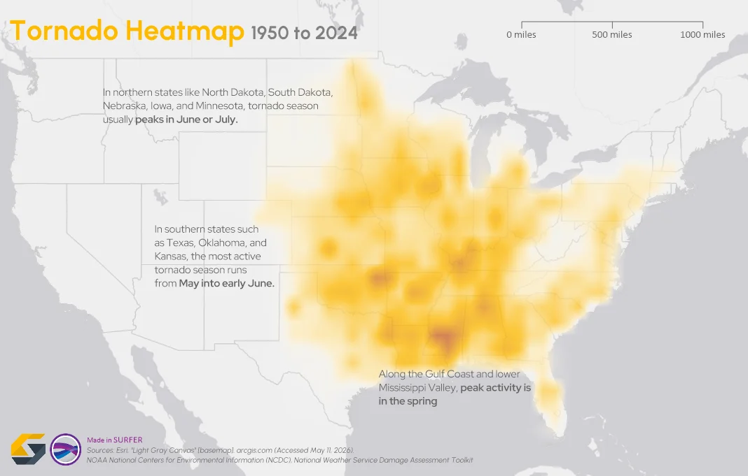
To truly answer the question, "what damage can a tornado cause," the first step is analyzing broader patterns across communities and landscapes.
- May 20, 2026|Gabbie Rhodes|7 min
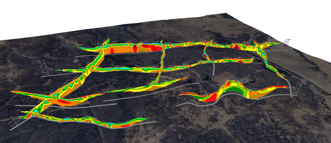
The gap between analysis and true spatial understanding has real consequences in subsurface mapping. 3D modeling closes that gap.
- May 14, 2026|Gabbie Rhodes|10 min
Should you create a grouped, stacked, or a simple bar chart? The structure you choose matters. Discover bar chart examples to guide your choice.