Essential Design Principles for Effective Graphing
Graphing is a powerful way to convey complex information clearly and effectively. However, the effectiveness of a graph largely depends on its design. Poorly designed graphs can mislead or confuse your audience, while well-crafted graphs can be insightful and help tell a compelling story. Here are some essential design principles to ensure your graphs are both informative and impactful.
Principle 1: Know Your Audience and Understand Your Purpose
Before you start designing, ask yourself what message you want to convey. Is the goal to show trends over time, compare categories, or highlight outliers? The type of graph you choose should align with your objective. For instance, line graphs are great for showing trends, while bar charts are better for comparing categories.
Also, consider who will be viewing your graph. Are they experts familiar with your data, or are they new to the subject? Tailor the complexity and detail of your graph to your audience. For example, if you want your graph to be accessible to a broad audience, simplify it by focusing on the most critical data points.
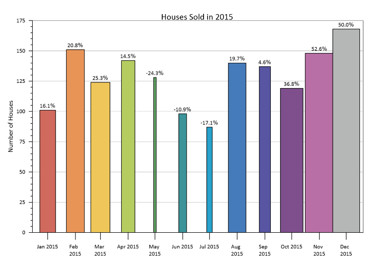
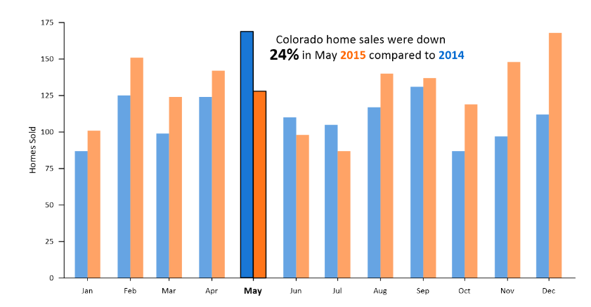
In the example below, your audience is interested in the number of homes sold in Colorado in May 2014 and May 2015. Graph #1 is overwhelming and has too much information that isn’t relevant to your audience. Graph #2 still provides the same information as the first graph, but it’s much easier to digest while highlighting the information your audience is most interested in.

Fig 1: Bar width indicates percentage increase/decrease over the previous year. Label is the actual percentage increase/decease over previous year.

Fig 2: Blue bars represent homes sold in 2014, while the orange bars represent homes sold in 2015. The orange and blue words in the text subtly reveal this link.
Principle 2: Less Is More
Simplify your graph by removing anything that doesn’t add value to your message. A clean, uncluttered design helps your audience focus on what matters most, so avoid using excessive gridlines, decorative fonts, and too many colors, which can distract from your data. That doesn’t mean you can’t use creative elements in your graph. However, it does mean you should use them wisely to enhance the readability and impact of your graph. For instance, use a limited color palette to highlight important data points or differentiate between categories. Also, include a bold color or a larger font size to make the most critical data point stand out. Another idea is to consider using patterns or textures in addition to color to differentiate between data points.
Keep in mind that you should design graphs that are accessible to as many people as possible. Ensure the colors you choose are accessible to those with color vision deficiencies by utilizing tools that simulate how your graph might appear to them. This helps ensure that your audience sees and understands the key information first. Additionally, use high-contrast colors and legible fonts to ensure that everyone, including those with visual impairments, can read and understand your information.
Principle 3: Label Clearly and Ensure Accuracy
Clear labeling is crucial for graph comprehension. All axes should be labeled clearly, and the units of measurement should be specified. If using multiple data series, include a legend — but keep it simple. Consider placing labels directly on your data points or lines to avoid making your audience search for the legend. In Graph #2, we use our text as a legend, clearly marking the data for our audience and negating the need for a formal title.
Ensuring your graph is accurate is also paramount, as improper scaling, truncated axes, or inappropriate graph types can be misleading. Always start your axes at zero (unless there’s a compelling reason not to), and be mindful of how data is represented to avoid distorting the message. Double-check your data and the graph’s representation to ensure it accurately reflects the information.
Principle 4: Iterate and Refine
Creating an effective graph often requires multiple revisions. After designing your initial graph, seek feedback from colleagues or test it with a sample audience. Use this feedback to refine your design, making adjustments to improve clarity, accuracy, and impact. With each iteration, you can clean up your graph and take the above steps to ensure your graph is delivering the intended message accurately. One strategy you can employ here is to start your graph by pushing everything to the background, forcing you to make explicit decisions regarding what to highlight.
A Blend of Art and Science
Effective graphing is a blend of art and science, requiring careful consideration of design principles to communicate your message clearly. By knowing your purpose, understanding your audience, simplifying your design, and ensuring accuracy, you can create graphs that not only inform but also engage and persuade your audience. Remember, the goal of a graph is not just to display data but to tell a story that resonates with viewers. Want to try these design principles for yourself? Download the free trial of Grapher to get started!
Recent Articles
- Apr 29, 2026|Gabbie Rhodes|10 min
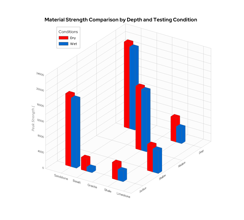
When you’re working with three variables that interact with one another—a 3D bar chart can reveal patterns that a flat chart can’t fully capture.
- Apr 23, 2026|Gabbie Rhodes|16 min
The strongest candidates are often in high demand. But with the right approach, you can attract and recruit top talent to build a stronger team.
- Apr 23, 2026|Gabbie Rhodes|9 min
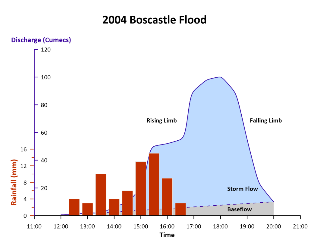
Even accurate data can fall short if time is displayed poorly. That’s why thoughtful time formatting is essential for your data visualization.
- Apr 15, 2026|Gabbie Rhodes|11 min
You’re trained to value precision. Every contour, parameter, and assumption matters. But how do you share complex data to non-experts? Learn tips.


