The Overlooked Power of Time Formatting: How Better Temporal Visuals Improve Scientific Storytelling
Time is at the center of nearly every scientific workflow. Groundwater levels fluctuate over months and years. Seismic activity unfolds in seconds. Environmental samples are collected seasonally. In geoscience especially, understanding change over time is often the key to stakeholders making informed decisions.
But here’s the challenge: even accurate data can fall short if time is displayed poorly. That’s why we’re exploring how thoughtful time formatting can improve clarity so your data visualizations drive informed decision-making.
Why Is It Worth Diving Into Time Formatting So Deeply?
Time is frequently the backbone of a dataset. It structures groundwater monitoring records, defines seismic event sequences, anchors environmental sampling, and frames long-term climate trends. Yet despite its importance, time formatting is one of the easiest elements to overlook. When the focus is on measurements, units, and precision, the way time is displayed can feel secondary.
However, poor time formatting can quietly undermine even the most accurate dataset. In fact, it can do the following:
- Hide trends by compressing intervals or crowding labels so patterns become difficult to see
- Make comparisons difficult when date formats shift inconsistently between years, months, or timestamps
- Overwhelm non-technical audiences with excessive precision or cluttered axes that distract from the main insight.
By contrast, thoughtful time formatting strengthens your final output. It can help you achieve several important objectives, including the following:
- Highlight patterns and changes by presenting time in clear, logical intervals
- Align visuals with natural interpretation so viewers can intuitively follow chronological flow
- Make complex datasets easier to understand by structuring time in a way that supports—not competes with—the story your data is telling
The main takeaway? Time formatting directly influences how clearly your stakeholders see change, relationships, and trends over time, impacting their ability to make the right decisions.
What Mistakes Can Lead to Poor Time Formatting?
Now, what mistakes can lead to poor time formatting? There are a few common issues, especially in technical workflows, that you want to avoid.
Overly Detailed Timestamps
Including hours, minutes, and seconds when only dates are relevant may feel more precise, but it often creates unnecessary visual clutter. If your analysis focuses on monthly groundwater trends or annual production data, displaying second-level detail distracts from the broader pattern and compresses the axis unnecessarily.
Inconsistent Date Formats
Mixing formats—such as MM/DD/YYYY and DD/MM/YYYY—can quickly lead to confusion. Even subtle inconsistencies force viewers to pause and interpret formatting instead of focusing on the data itself. Consistency is critical for smooth interpretation.
Poor Axis Label Spacing
When too many labels crowd the time axis, they overlap or become unreadable. When too few labels are shown, viewers lose context and struggle to understand intervals. Effective spacing requires balance, where you include enough reference points to guide interpretation without overwhelming the visual.
Misaligned Time Intervals
Choosing inconsistent or inappropriate intervals—such as plotting daily labels for a multi-year dataset or grouping data monthly when trends are annual—can distort how patterns appear. Time intervals should match the scale of analysis. When they do not, trends become harder to recognize, and comparisons lose clarity.
Practical Solutions for Better Time Formatting
If those mistakes are common, the next question becomes: how do you fix them? Improving time formatting doesn’t require overhauling your entire data visualization workflow. It requires intentional decisions that align time formatting with the purpose of your analysis. Below are practical strategies that strengthen clarity without sacrificing accuracy.
Match the Time Scale to the Question
The level of temporal detail should always reflect the analysis you’re doing. That said, consider how the scope of the analysis influences the appropriate time interval. Here are a couple of general rules to keep in mind:
- Short-term analysis requires finer intervals, such as hours or days
- Long-term trend evaluations often benefit from broader intervals, such as months or years
If stakeholders are evaluating daily fluctuations in groundwater levels after a storm event, hourly data may be appropriate. If they are reviewing multi-year production trends, yearly aggregation may be clearer. The right level of detail depends entirely on what the audience needs to understand—not on how granular the raw dataset happens to be.
Reduce Precision to Increase Clarity
Precision is valuable, but unnecessary precision can obscure insight. To avoid overwhelming your visual with excess detail, focus on simplification where appropriate by considering these two tips:
- Remove time details that don’t meaningfully contribute to interpretation
- Retain only the granularity that supports the analysis
For example, if you’re presenting monthly environmental sampling trends, timestamps down to the second do not improve understanding. Instead, they compress the axis and distract from broader patterns. Strategic simplification increases readability without compromising rigor.
Use Consistent, Intuitive Formats
Consistency reduces cognitive effort and prevents confusion. To create a seamless viewing experience, apply formatting intentionally by doing the following:
- Stick to a single date format throughout the visual
- Use formats that align with your audience’s expectations or regional standards
When viewers do not need to mentally translate date structures, they can focus entirely on the data itself. Consistent formatting prevents subtle misinterpretation and strengthens clarity.
Control Label Density and Spacing
The spacing of time labels plays a significant role in visual clarity. To maintain balance on your axis, adjust the structure carefully by focusing on two key refinements:
- Modify tick marks to avoid overcrowding
- Ensure labels remain readable while preserving sufficient contextual reference points
This balance is especially important when applying the second adjustment. Too many labels create clutter and force viewers to work harder than necessary. Too few remove orientation and make it difficult to gauge intervals accurately. When label density is thoughtfully controlled, viewers can follow the timeline naturally and recognize meaningful shifts without distraction.
Align Formatting With the Insight You’re Emphasizing
Time formatting should reinforce your message. To ensure your formatting supports interpretation, structure time intentionally using the following approaches:
- Emphasize meaningful periods, such as seasonal cycles or event windows
- Highlight the time ranges most relevant to the decision at hand
When formatting aligns with the key takeaway, the timeline itself becomes part of the explanation. For example, if a regulatory threshold was exceeded during a specific month, subtle formatting choices can draw attention to that period without overwhelming the visual. Likewise, when seasonal patterns drive interpretation, grouping data accordingly makes the insight easier to grasp. In each case, the goal is the same: allow formatting to guide understanding rather than merely display dates.
Customizing Time Formatting for Better Visuals
Understanding best practices is one thing. Having the tools to implement them effectively is another. When working in Grapher, you can utilize the best tips and tricks for time formatting—but you don’t have to stick with the basics. You can use various customization tools that equip you to tailor how time is displayed so it adds even more clarity to your visualization.
These customizations give you control over language, structure, spacing, and interpretation without requiring you to alter the underlying data. For context, here are several ways you can refine time formatting in Grapher to level up your data visualizations.
Modify Date and Time Display Formats
Grapher empowers you to control how dates and times appear on your axes. You can adjust formats to match regional standards, display full month names or abbreviated labels, or customize how day, month, and year are presented.
This flexibility is especially helpful when collaborating across international teams or preparing reports for global audiences. Whether your stakeholders expect DD/MM/YYYY, MM/DD/YYYY, or another format, you can ensure your visuals align with their expectations.
Combine Separate Date and Time Columns
In many datasets, date and time values are stored in separate columns. Grapher equips you to combine those fields into a unified date/time structure for accurate plotting. This is particularly valuable when working with monitoring data collected over multiple days. Combining date and time ensures that your timeline reflects the true chronological sequence of events, preventing gaps or misaligned intervals in your visualization.
Preserve Date/Time Formatting Across File Types
Not all data file formats treat dates the same way. Grapher supports saving and working with file types that maintain date/time formatting integrity. This helps prevent a common frustration: reopening a dataset only to find that your date columns have reverted to plain text or numeric values. By storing data in compatible formats, you protect your temporal structure and maintain consistency in future edits.
Display Numeric Values as Dates
In some cases, datasets use numeric sequences to represent dates. One example is serial numbers that correspond to days in a calendar year. Grapher provides the opportunity to interpret and display those numeric values as readable date/time labels.
This feature is particularly useful when working with legacy datasets or non-standard formats. Instead of manually converting numbers outside the software, you can define how those values correspond to real-world dates directly within your visualization.
Control Date/Time Axis Intervals
Beyond formatting labels, Grapher equips you to adjust the spacing of time intervals on an axis. You can define whether major ticks appear yearly, quarterly, monthly, daily, or at another custom interval. This control is essential for matching the time scale to the analytical question. For example, a quarterly interval may better reveal seasonal trends, while yearly spacing may improve clarity in a long-term production dataset.
Automatically Generate Date/Time Axes
When creating graphs from properly formatted temporal data, Grapher can automatically recognize and apply date/time formatting to the axis. This reduces manual configuration while still ensuring full customization afterward. The benefit here is efficiency. You can start with an intelligently structured timeline and then refine it as needed to align with your analytical focus.
Make Time Work for You—Not Against You
Time formatting may seem like a small detail, but as you’ve seen, it directly shapes how clearly your audience understands change, patterns, and relationships in your data. By matching time scales to the question, reducing unnecessary precision, maintaining consistency, controlling label density, and aligning formatting with the insight you’re emphasizing, you transform time into a structural advantage. And with tools like Grapher, you’re not limited to default settings. You can go beyond the basics to give stakeholders the clarity they need to move forward successfully.
If you’re ready to see how intentional time formatting can elevate your own visualizations, start a free trial of Grapher and explore these capabilities firsthand. With the right formatting tools in place, your data won’t just show change over time but also make that change unmistakably clear.
Recent Articles
- Jul 22, 2026|Gabbie Rhodes|6 min
Your team needs to work together effectively. Discover strategies to enhance team collaboration, so projects move forward with greater confidence.
- Jul 22, 2026|Gabbie Rhodes|8 min
You need to produce clear, accurate maps, models, and graphs. Can AI tools for data visualization help? Here's the answer.
- Jul 15, 2026|Gabbie Rhodes|4 min
Technology has advanced, and now, Surfer has taken the lead over Voxler. Learn how to convert your Voxler file to a Surfer file to get better results.
- Jul 15, 2026|Gabbie Rhodes|12 min
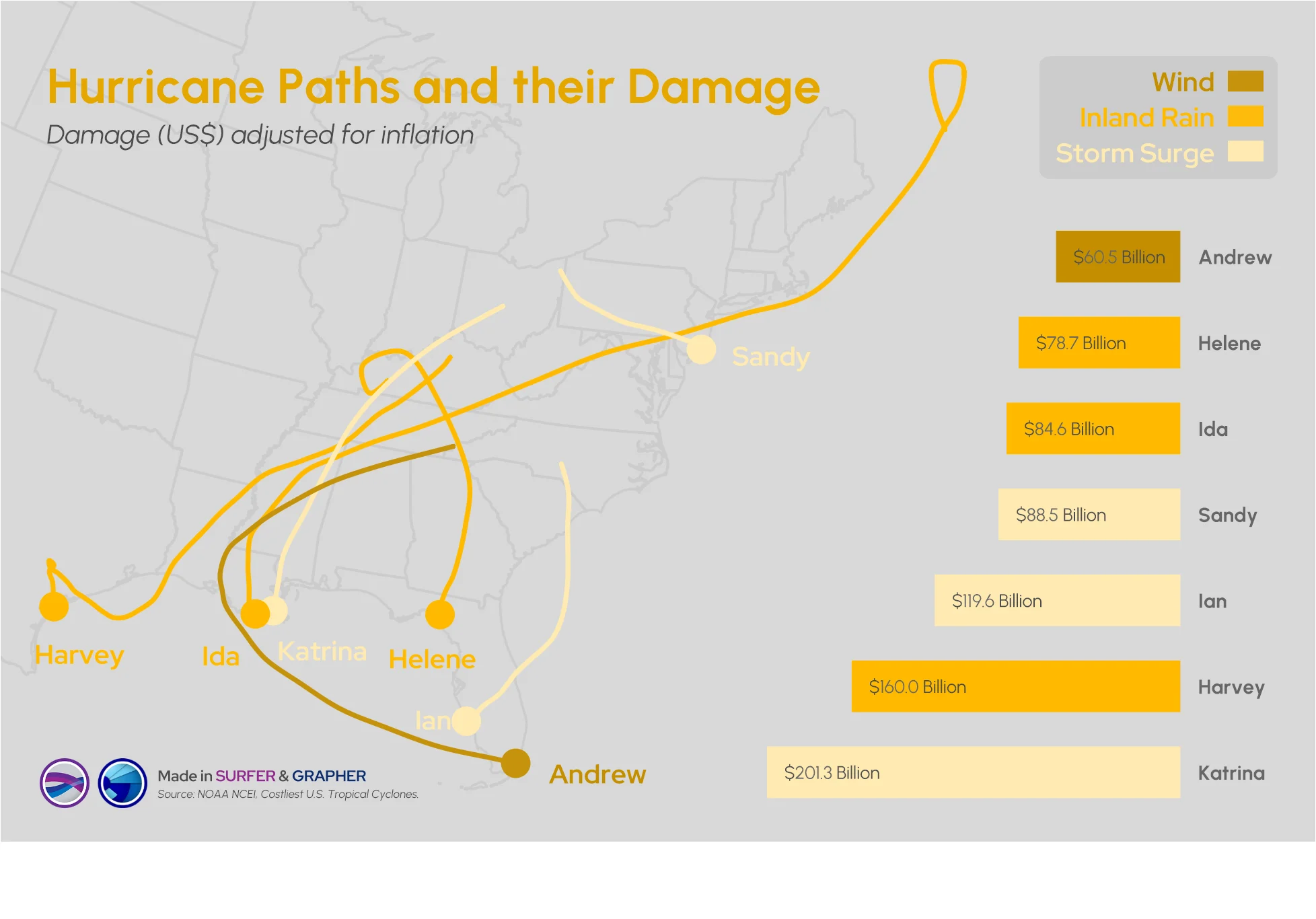
Answering this question isn't easy: what damage can a hurricane cause? Multiple factors come into play, but maps and graphs can provide insight.