How to Communicate Complex Data to Non-Experts Without Losing Accuracy
In geoscience and engineering, complexity is the norm. Whether it’s subsurface modeling, geochemical analyses, monitoring trends, or terrain interpretations, you work in complexity every day. The problem? Some of the people making decisions about your projects don’t do the same. That’s where good science can get lost in translation.
You’re trained to value precision. Every contour, parameter, and assumption matters. But the stakeholders reviewing your work—project managers, regulators, community leaders, and executives—aren’t always equipped to interpret dense figures or technical terminology. And yet, their understanding determines whether a project gets approved, funded, or delayed.
This creates a tension: accuracy matters, but so does clarity. Oversimplify too much, and you risk distorting the science. Overload your audience with detail, and the core message disappears. Fortunately, the goal isn’t to “dumb down” your work but to communicate it strategically. That’s why this blog is walking through practical, field-tested strategies for translating complex data into visuals and explanations that non-experts can understand without sacrificing rigor, nuance, or credibility.
Why Complex Data Is Difficult for Non-Experts
Let’s start by diving deeper into why complex data is difficult for non-experts. The type of data you work with is inherently technical. You’re often analyzing surface and subsurface relationships, interpreting terrain or spatial patterns, and evaluating long-term monitoring trends. Each dataset may represent multiple variables at once: depth, concentration, elevation, velocity, uncertainty, and time. To you, those dimensions are expected. To someone outside the discipline, they can feel overwhelming.
For greater context, here are several common barriers that tend to get in the way of non-experts grasping complex data:
- Technical terminology: Terms like anisotropy, resistivity contrast, kriging variance, or hydraulic conductivity may be second nature to you, but they can create instant cognitive friction for someone unfamiliar with the field.
- Multilayered visuals: Maps with multiple overlays, 3D models with several subsurface layers, or graphs with numerous data series can be powerful analytical tools—but without guidance, they can be visually dense and hard to interpret.
- Dense reports: Long blocks of text filled with qualifiers, caveats, and technical explanations may preserve accuracy, but they can bury the main takeaway.
- Assumed background knowledge: It’s easy to unintentionally skip foundational context because it feels obvious. But what’s “obvious” to a trained geoscientist or engineer isn’t necessarily obvious to a regulator, stakeholder, or executive.
It’s important to recognize that confusion is rarely about intelligence. Most stakeholders are highly capable professionals. The gap is usually about communication. When someone struggles to understand complex data, it’s often because the information isn’t structured in a way that matches how they process it. Understanding this distinction is the first step toward communicating complex data clearly without compromising its integrity.
Practical Steps for Communicating Complex Data Clearly
Now, what strategies can you implement to make complex data clearer to non-experts? Here are practical steps you can take to both visualize and communicate data more effectively without sacrificing accuracy.
Step 1: Start with the decision, not the dataset
One of the most common communication mistakes is starting with everything you know instead of what your audience needs. Before creating a single map, model, or graph, pause and ask the following:
- What decision needs to be made?
- What question is the stakeholder actually trying to answer?
Is the goal to determine whether a site is buildable? Whether contamination exceeds a regulatory threshold? Whether slope stability meets safety standards? The decision defines the narrative.
From there, identify the primary insights that matter most for that decision. That doesn’t mean you should hide complexity in your visualization. It just means you should filter your insights through relevance rather than volume. You may have analyzed dozens of parameters, but if only two drive the final recommendation, those should anchor your visuals.
When you start with the decision, your audience immediately understands why they’re looking at the data. Once they understand the “why,” they’re far more prepared to engage with the “how.”
Step 2: Choose the right visualization for the message
Once you’ve clarified the decision at hand, the next step is selecting the visual that best supports that decision. Different visuals serve different purposes. When the goal is to show elevation levels, a map is often the clearest option. When the focus is on change over time, comparisons, or rankings, a graph typically communicates those patterns more effectively. On the other hand, when depth, layering, or underground geometry influence the outcome, a 3D model may provide the most accurate representation, especially when both surface and subsurface realities need to be understood together.
The key is intentional alignment. The visual should reinforce your message, so take time to choose the best one.
It can be tempting to default to the most technical-looking option, especially when working with complex datasets. However, sophistication does not automatically equal clarity. A dense 2D map may demonstrate analytical depth, but if a well-designed 3D model communicates the conclusion more clearly, it’s the stronger choice. Effective communication prioritizes clarity over complexity.
Step 3: Simplify design, not meaning
After selecting the right type of visual, the next focus should be on the design. This is often where stakeholders’ confusion begins—not because the data is incorrect, but because the visual is overloaded.
When a map contains too many overlapping layers, when color gradients become overly detailed, or when graphs are filled with heavy gridlines and competing symbols, stakeholders must work harder to interpret what they’re seeing. That cognitive effort can obscure the main takeaways.
To improve clarity without sacrificing rigor, apply these strategies:
- Include only the layers necessary to support the key insights
- Use consistent, purposeful color scales that reinforce meaning rather than decoration
- Choose clean, non-distracting backgrounds
- Limit symbols and visual elements to those that are essential and clearly differentiated
Simplification doesn’t mean removing important information. It means structuring the information so that essential insights are easier to see. The science remains intact; the distractions are reduced.
Step 4: Highlight what matters most
Even a clean, well-designed visual can fall short if stakeholders are unsure where to focus their attention. Once the design is simplified, your next responsibility is guidance. Complex visuals rarely speak for themselves. Viewers benefit from subtle cues that direct them toward the most important findings.
You can accomplish this by doing the following:
- Use color contrast strategically to emphasize key results
- Add callouts to clearly label critical findings or thresholds
- Applying transparency or advanced lighting in 3D models to bring critical layers or anomalies forward
When you intentionally guide attention, you reduce the cognitive effort required to interpret the visual. Stakeholders should never have to search for the insight; they should see it almost immediately.
Step 5: Translate technical terms into everyday language
When your visual is clear and the key insight is highlighted, language becomes the next barrier to address. During the actual presentation, technical terminology is often necessary in scientific work, but it should not stand alone without context. When specialized terms are introduced without explanation, they can create unnecessary distance between the expert and the audience.
To maintain both precision and clarity, consider the following tips:
- Provide brief, direct definitions for essential terms
- Use analogies when appropriate, while ensuring they do not oversimplify or distort the concept
- Adjust vocabulary to match the audience’s familiarity, while preserving scientific accuracy
To illustrate the third point, an example may be helpful. Instead of stating “anisotropic permeability variations,” you might explain it this way: “The soil allows water to move more easily in one direction than another.” This adjustment preserves scientific accuracy while making the concept easier to grasp.
Overall, the objective is not to eliminate technical language, but to ensure it does not become a barrier to understanding.
Step 6: Provide context without overwhelming
Another great presentation tactic is to remember that clarity requires context. Stakeholders need to understand not only what the complex data shows but also why it was collected and how you formed conclusions. At the same time, too much context—especially when presented all at once—can dilute your primary message.
A balanced explanation typically includes:
- The reason the data was collected
- The major assumptions used in the analysis
- Any limitations or areas of uncertainty
When it comes to the third point, present uncertainty honestly and clearly. If confidence varies across a site, explain where and why. If interpretations rely on assumptions, acknowledge them succinctly. Transparency builds credibility. However, avoid burying the central conclusion beneath excessive caveats. The purpose of context is to strengthen trust.
Step 7: Invite clarification during presentations
Even the clearest visual and explanation can raise questions. This is not a sign of failure, as it can signal that your audience is engaged.
When presenting complex data, build in intentional moments for clarification. Rather than delivering information in a one-directional stream, pause and invite questions. Ask whether the conclusion makes sense before moving into deeper technical detail. Encourage stakeholders to articulate what they’re seeing in their own words. This approach accomplishes two important things.
First, it reveals where misunderstandings may exist. If a stakeholder interprets a map differently than intended, you can correct that interpretation immediately rather than discovering confusion later in the decision-making process. Second, it reinforces trust. Inviting clarification signals confidence in your work. It demonstrates that you are not guarding the analysis behind technical language, but are willing to walk through it transparently.
Clear communication is not just about how you design visuals or structure reports. It is also about how you engage in dialogue. When stakeholders feel comfortable asking questions, complex data becomes collaborative rather than intimidating.
Common Mistakes to Avoid When Communicating Complex Data
Best practices are great to know, but it’s equally important to understand common mistakes to avoid. We mentioned some indirectly while walking through the strategies above, but they deserve their own section so they’re not overlooked. Without further ado, here are common mistakes to avoid when communicating complex data.
- Showing every layer of analysis at once: It can be tempting to demonstrate the full depth of your work by turning on every layer in a map or model. However, presenting all variables simultaneously often overwhelms non-experts and obscures key insights.
- Using color scales that exaggerate minor differences: Highly saturated or overly granular color gradients can make small variations appear more dramatic. This risks misleading interpretation, even unintentionally.
- Assuming stakeholders understand geoscience conventions: Not everyone knows that red might indicate higher elevation, that dashed lines imply uncertainty, or that certain contour intervals carry specific meaning. When conventions are left unexplained, misinterpretation becomes more likely.
- Explaining methodology before explaining findings: Beginning with data collection techniques, modeling processes, or software parameters can cause stakeholders to lose sight of the conclusion. While the methodology can reinforce credibility and rigor, it can distract from the main message when you explain it first.
Avoiding these mistakes is just as important as applying best practices, so make sure to intentionally restrain yourself where it matters so you communicate clearly. By being mindful of common pitfalls, you’ll protect the integrity of your work while making it easier for stakeholders to understand, trust, and act on your findings.
When 3D Helps and When It Doesn’t
Another thing to consider is when to use 3D for complex data. 3D models are powerful. They can reveal spatial relationships, layering, and depth in ways that flat visuals simply cannot. When stakeholders need to understand how surface and subsurface features interact—or how geology changes vertically as well as horizontally—3D often provides clarity that 2D maps struggle to achieve. It allows viewers to see the full structure of a site, not just a slice of it.
However, 3D is not automatically the better choice. If the goal is to compare a few values, show a trend over time, or summarize key metrics, a well-designed 2D visual may communicate the message more directly. In these cases, adding a third dimension can introduce unnecessary visual complexity. Rotation and perspective may distract from the insight rather than reinforce it.
Ultimately, the decision should be driven by the nature of your data and the question being answered. When depth and spatial interaction are central to the decision, 3D can be transformative. When clarity depends on simplicity, 2D is often more effective.
Turn Insight Into Action With Clear, Confident Communication
Communicating complex data clearly helps stakeholders understand, trust, and act on it more effectively. When you begin with the decision, align your visuals intentionally, simplify the design without sacrificing meaning, and guide stakeholders through your findings with clarity and transparency, your science becomes more powerful. So as you prepare your next graph, map, or model, challenge yourself to apply best practices deliberately, while avoiding common pitfalls. Clear communication is a skill non-experts will appreciate.
If you want more practical strategies for turning technical work into understandable insights that drive confident decisions, subscribe to our blog for ongoing tips you can trust!
Recent Articles
- Jul 15, 2026|Gabbie Rhodes|4 min
Technology has advanced, and now, Surfer has taken the lead over Voxler. Learn how to convert your Voxler file to a Surfer file to get better results.
- Jul 15, 2026|Gabbie Rhodes|12 min
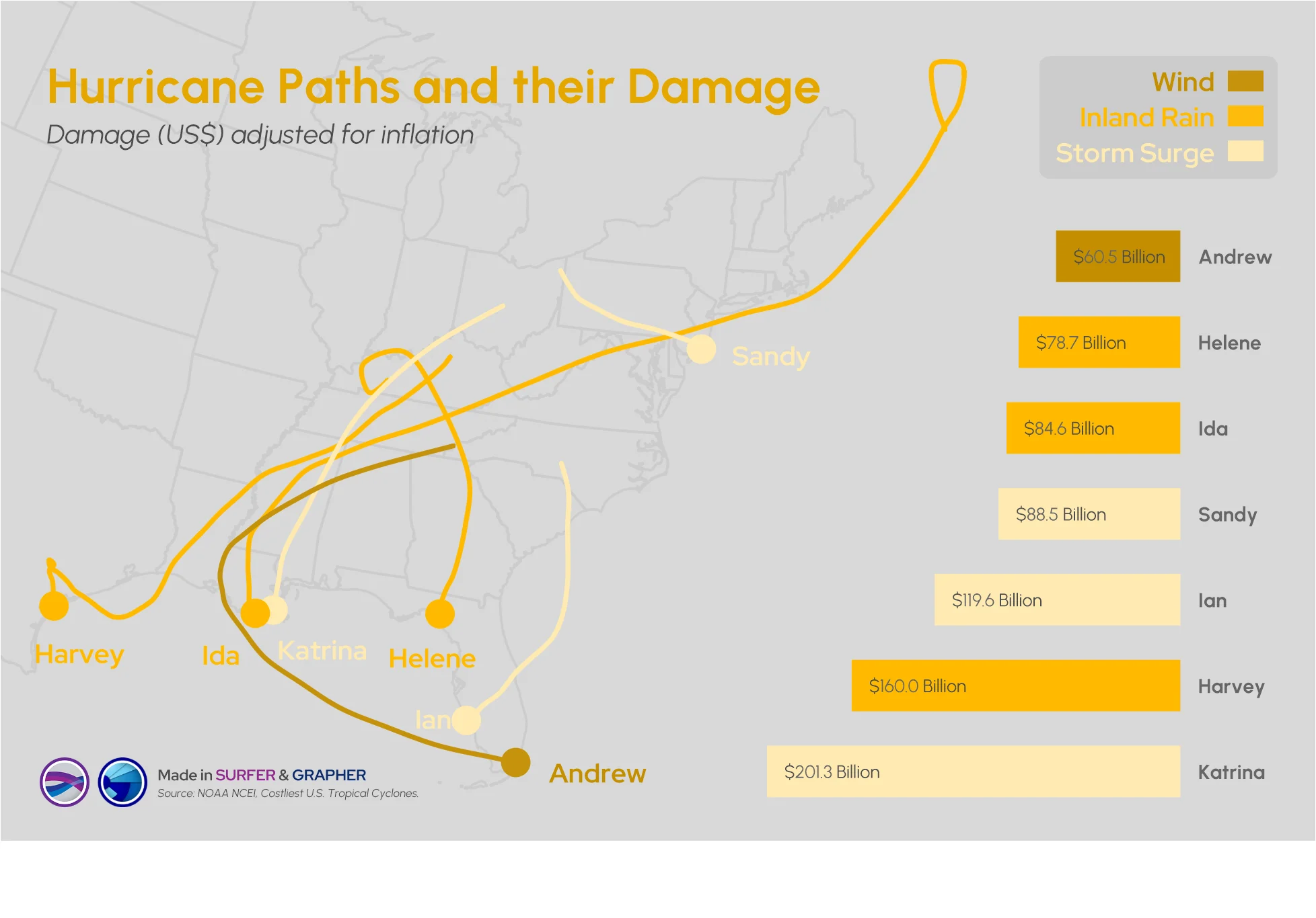
Answering this question isn't easy: what damage can a hurricane cause? Multiple factors come into play, but maps and graphs can provide insight.
- Jul 8, 2026|Gabbie Rhodes|14 min
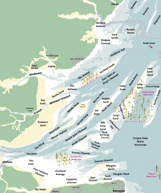
Roger creates passage and tide tables that help mariners understand when and how they can move through the Thames Estuary’s swatchways.
- Jul 8, 2026|Gabbie Rhodes|10 min
Effective data communication is about making your maps and models easy to understand, and there are ways to achieve that goal. Discover the tips!