- Sep 23, 2026|Gabbie Rhodes|8 min
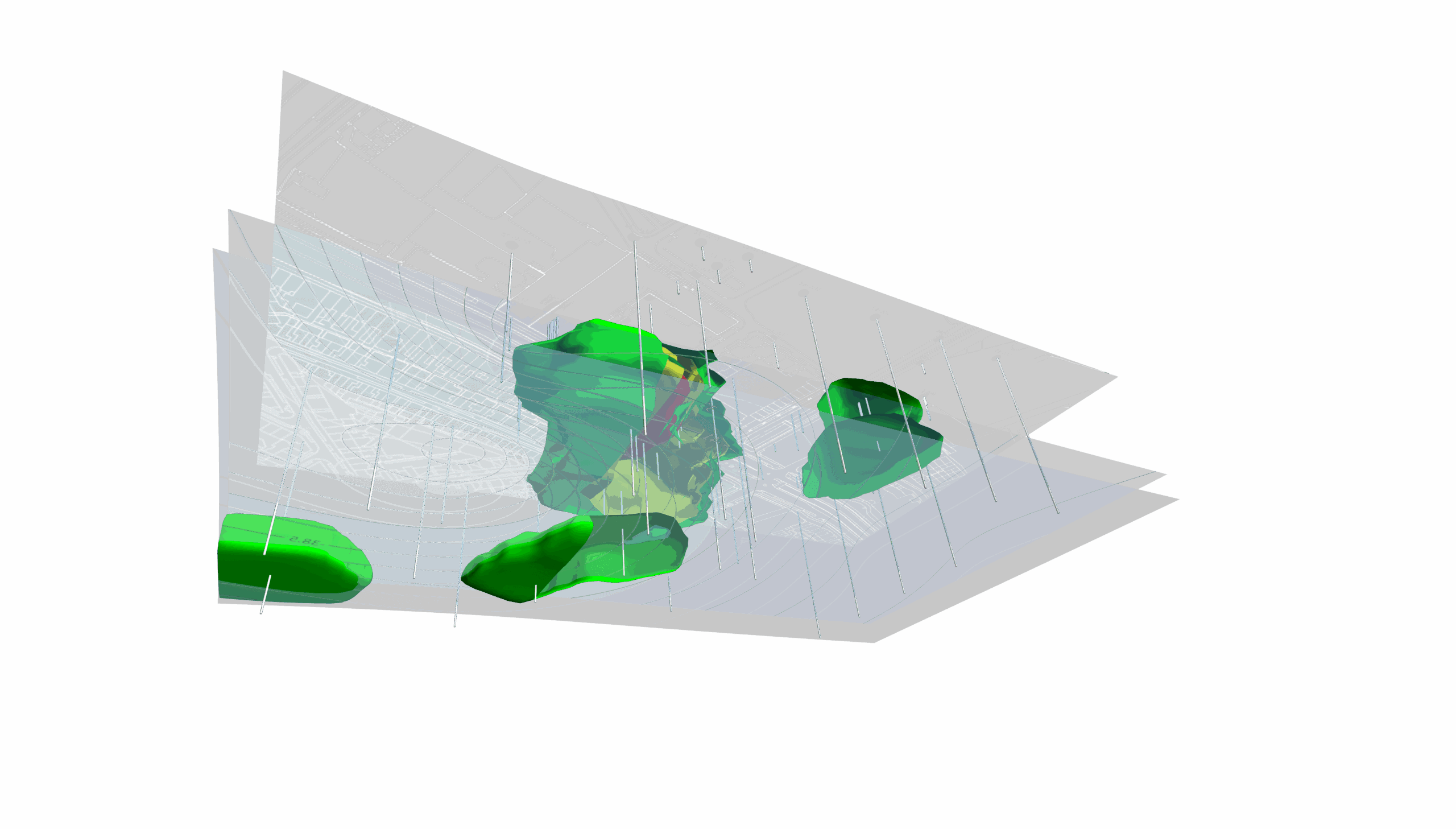
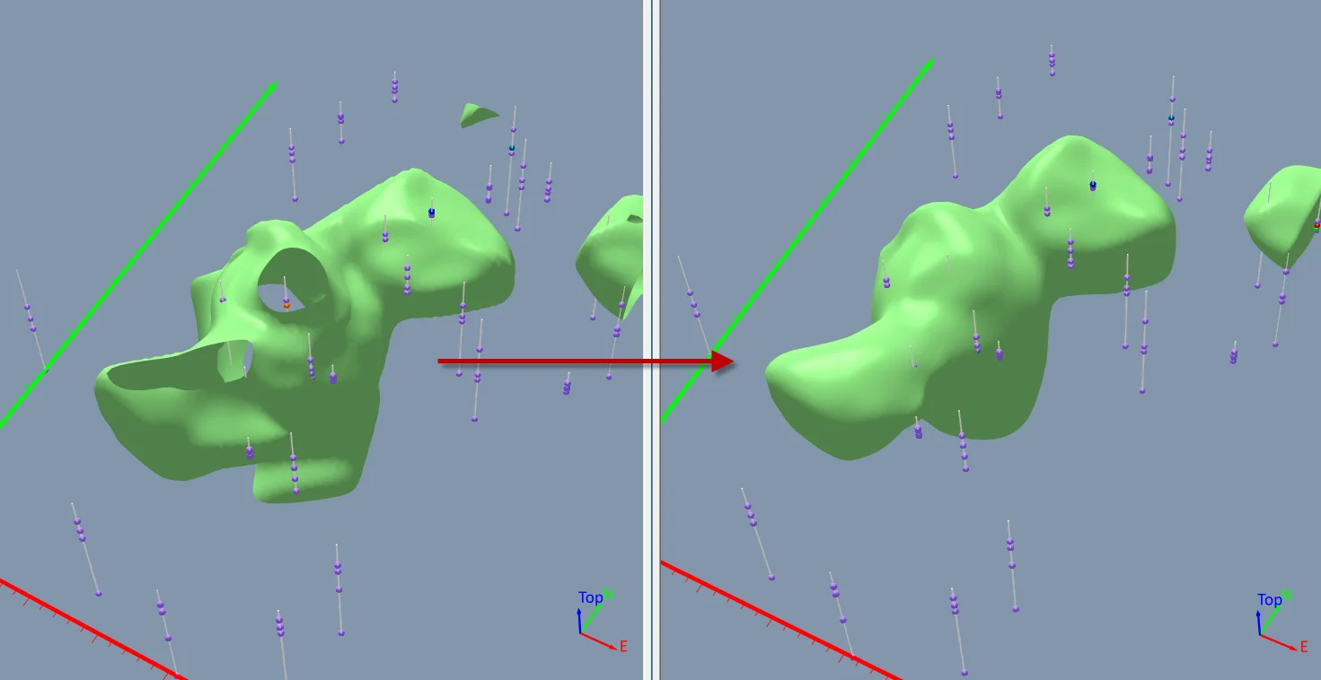
The best 3D data visualizations depend on the quality of your underlying grid. To achieve a great result, sometimes you need to use 3D grid filters.
- Sep 23, 2026|Gabbie Rhodes|11 min
When you're working with complex data, you need to communicate clearly. Graphs can help, especially when you follow design best practices.
- Sep 16, 2026|Gabbie Rhodes|7 min
The latest Surfer release delivers smarter 3D modeling, cleaner maps, and faster workflows. Unlock these benefits by discovering the top features.
- Sep 9, 2026|Gabbie Rhodes|4 min
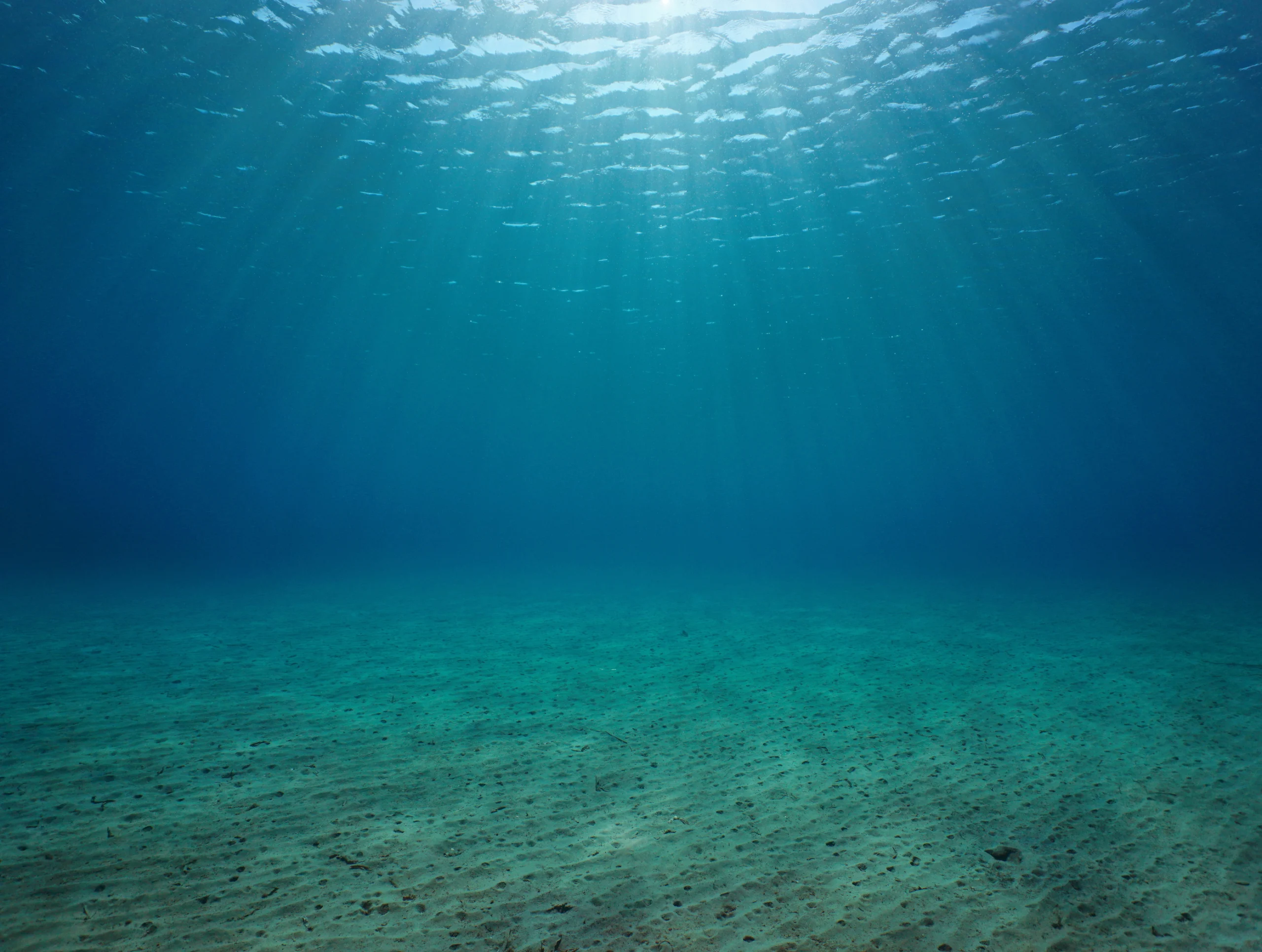
Explore how Submara Survey bridged the gap between terrestrial elevation data and underwater bathymetry to guide costal development in Norway.
- Sep 9, 2026|Gabbie Rhodes|10 min
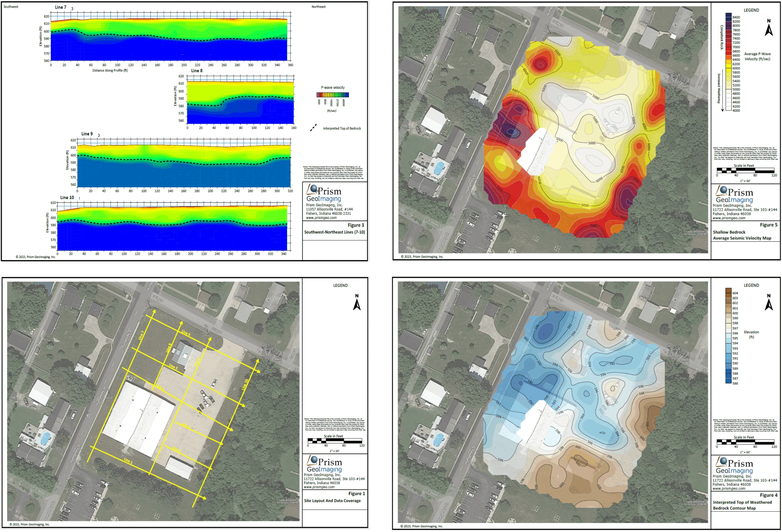
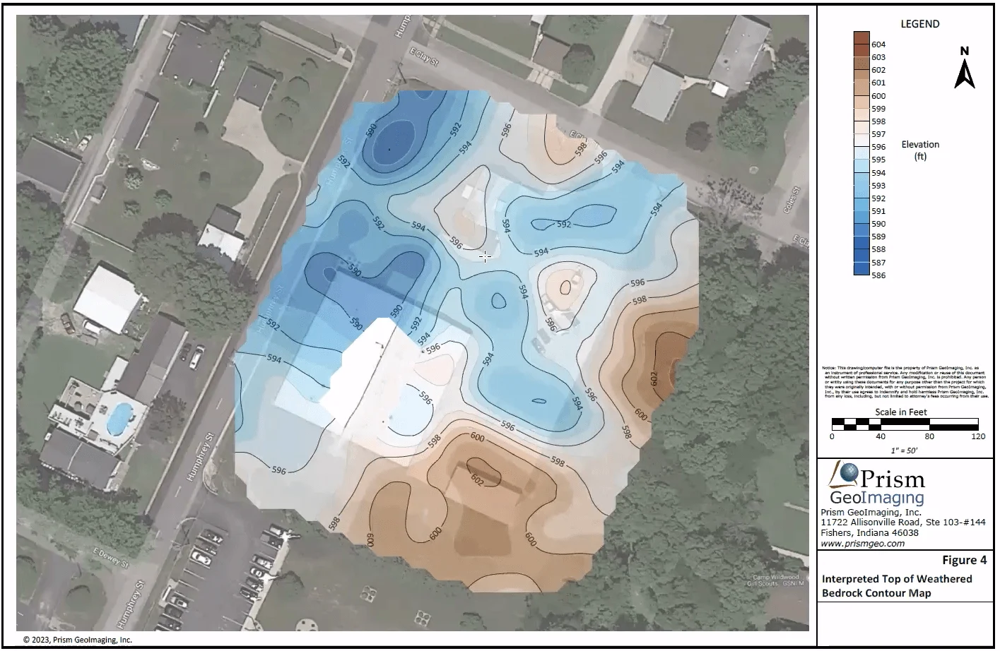
In a recent webinar, John Vanderlaan, founder and owner of Prism GeoImaging, Inc., explored how to visualize geophysical data effectively.
- Sep 2, 2026|Gabbie Rhodes|8 min
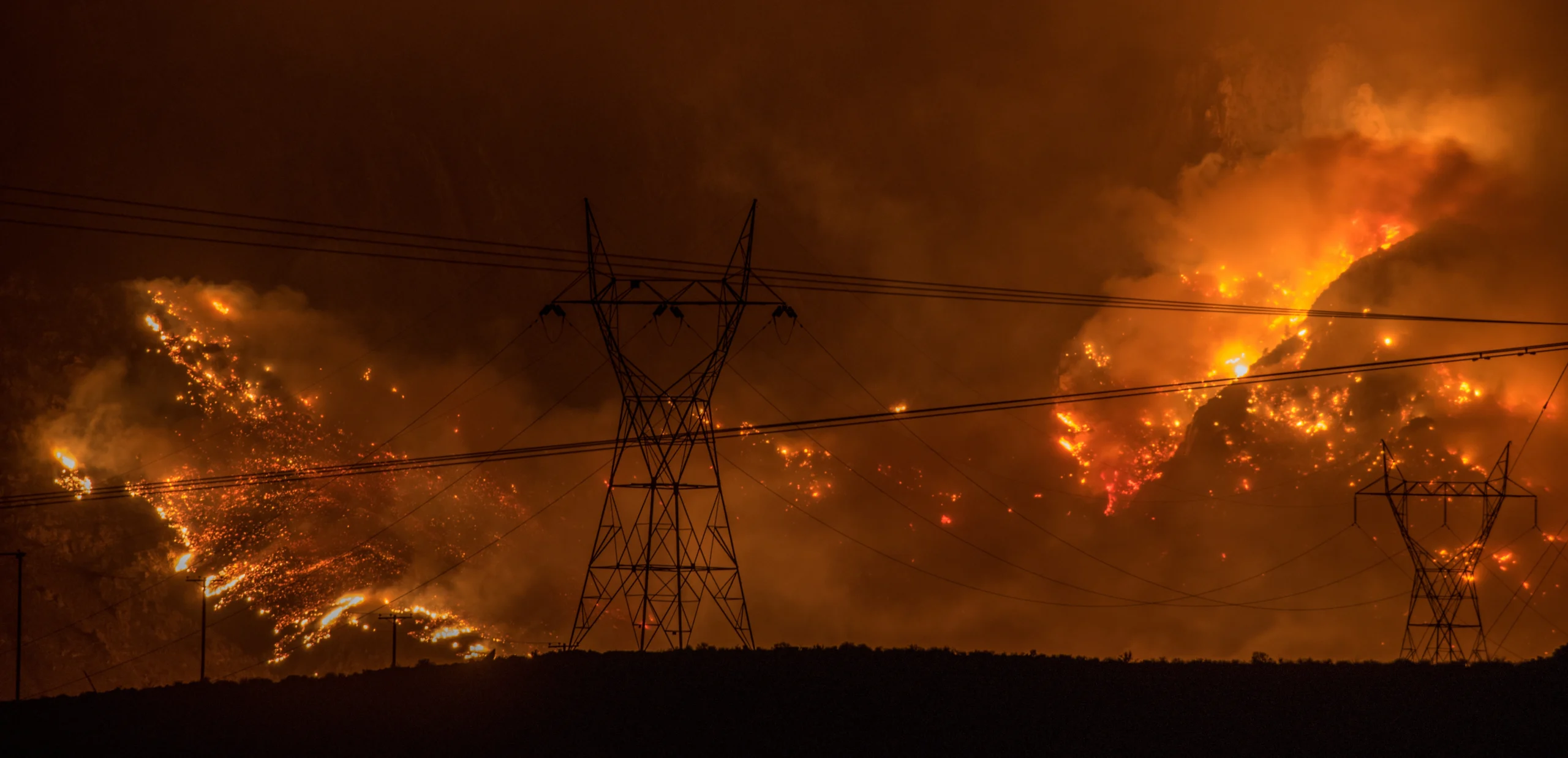
Effective wildfire mitigation requires more than tracking fire behavior alone. You have to monitor multiple variables, and visualizations can help.
- Sep 2, 2026|Gabbie Rhodes|6 min
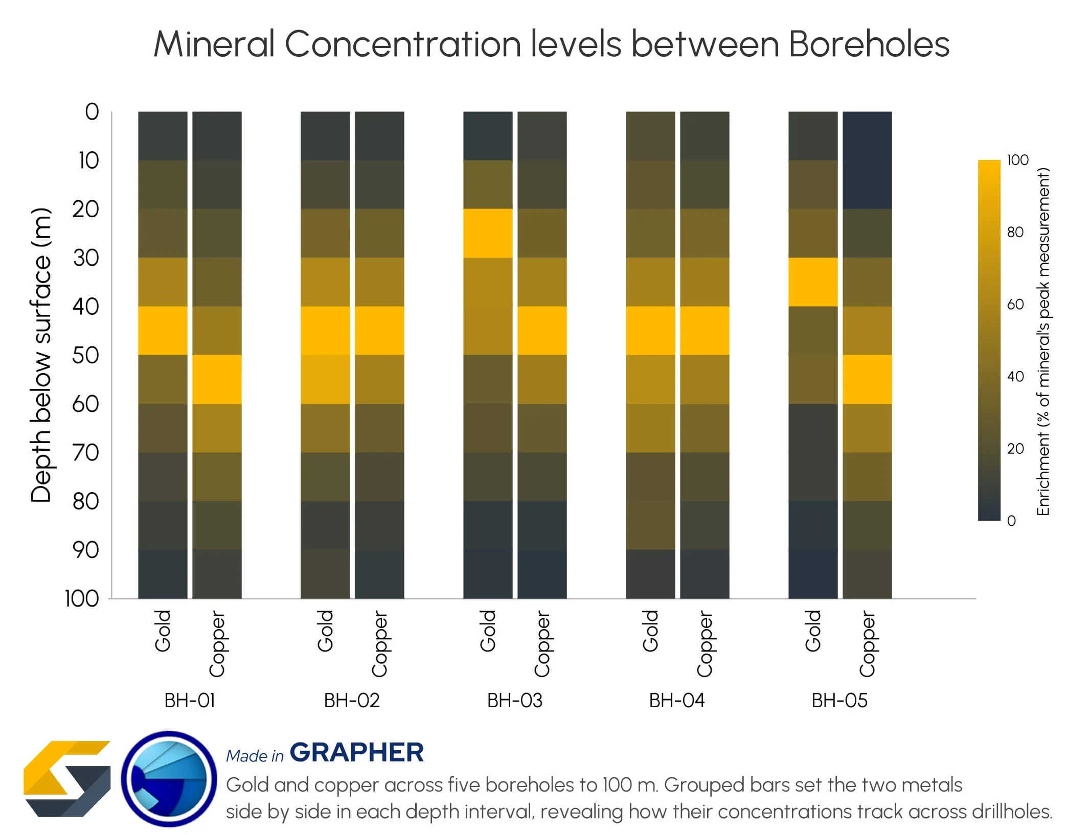
Promising mineral deposits are rarely identified by a single variable. That's why multivariate data visualization is essential to mineral exploration.
- Aug 26, 2026|Gabbie Rhodes|8 min
Whether you produce visuals every day or only occasionally, small workflow improvements when mapping data can save you significant time.
- Aug 26, 2026|Gabbie Rhodes|8 min
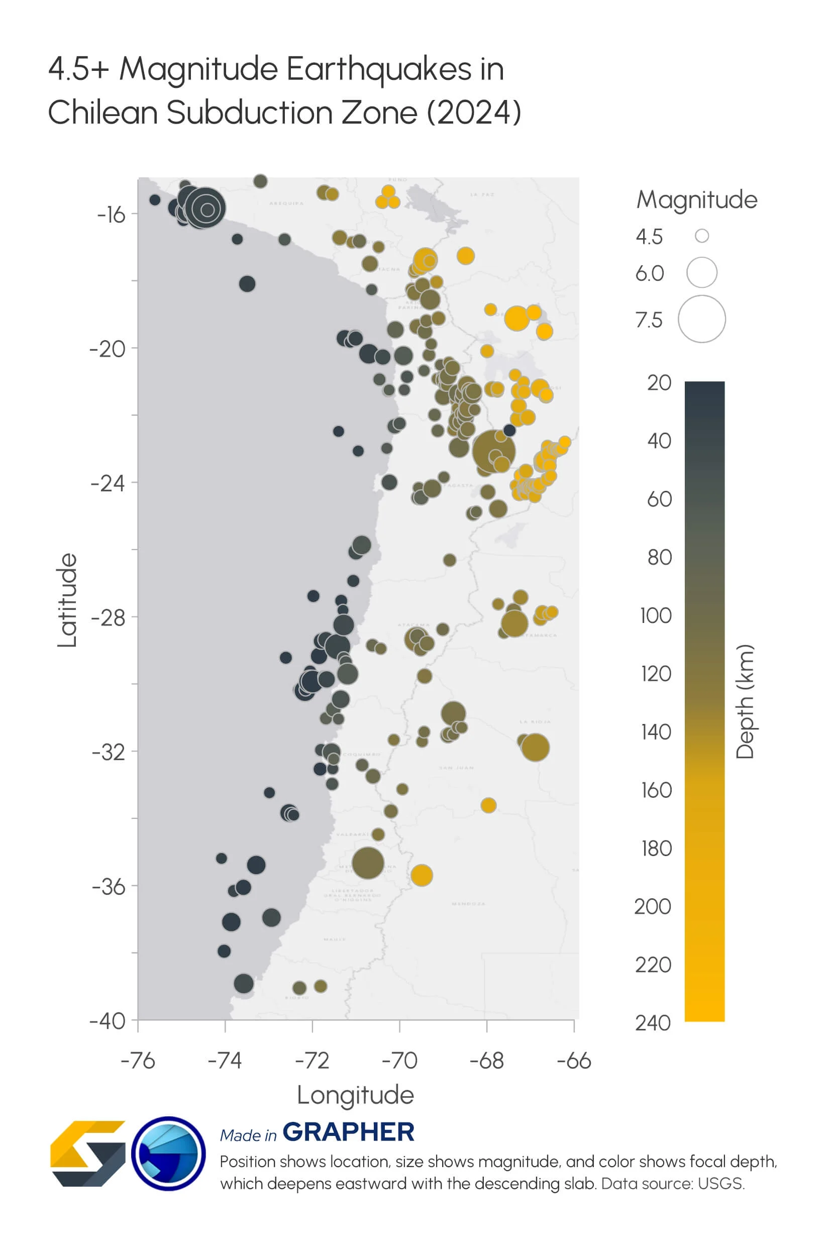
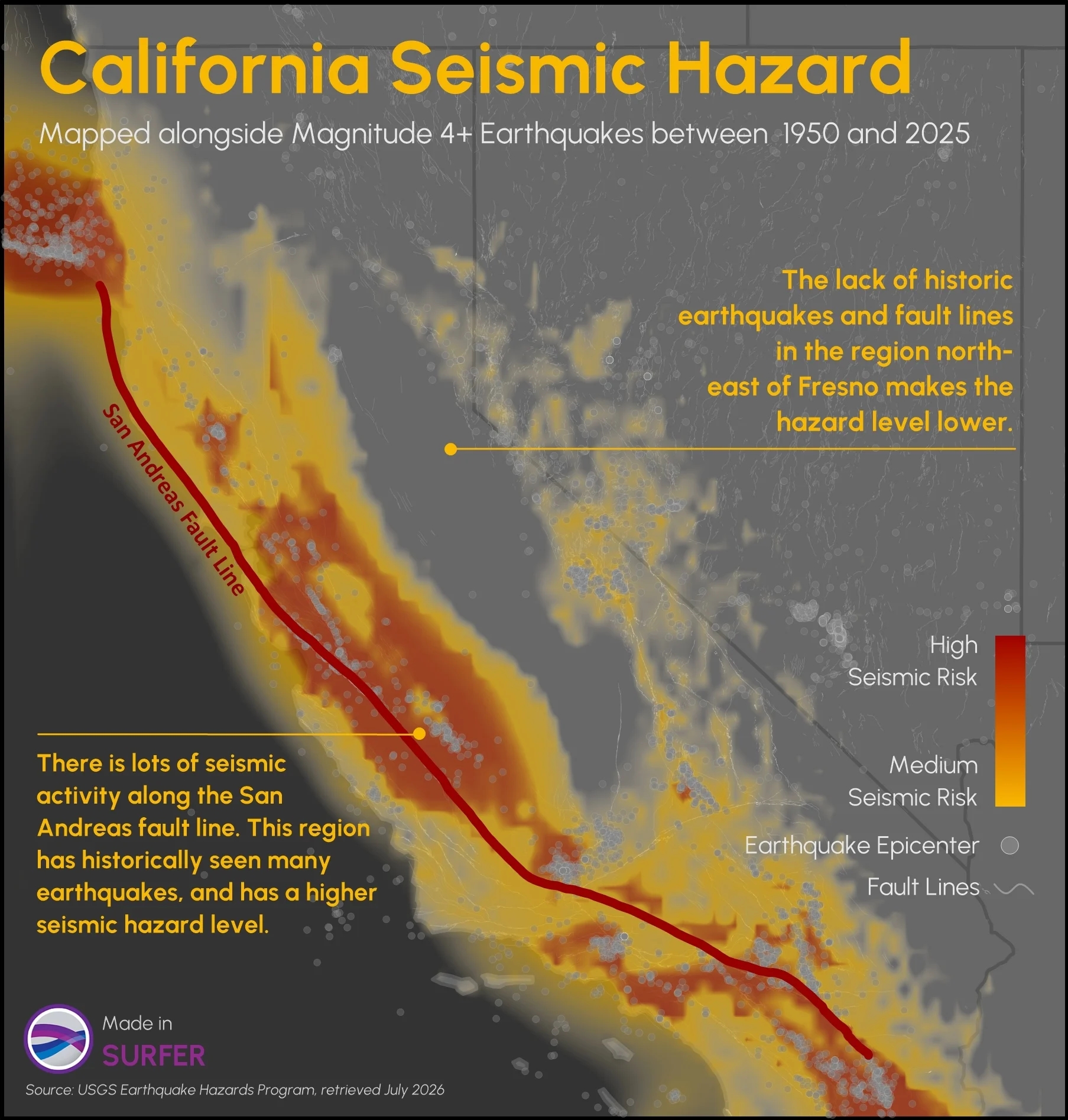
Explore how to create multivariate visualizations for earthquake data so you can easily interpret and share the complete picture with stakeholders.
- Aug 19, 2026|Gabbie Rhodes|9 min
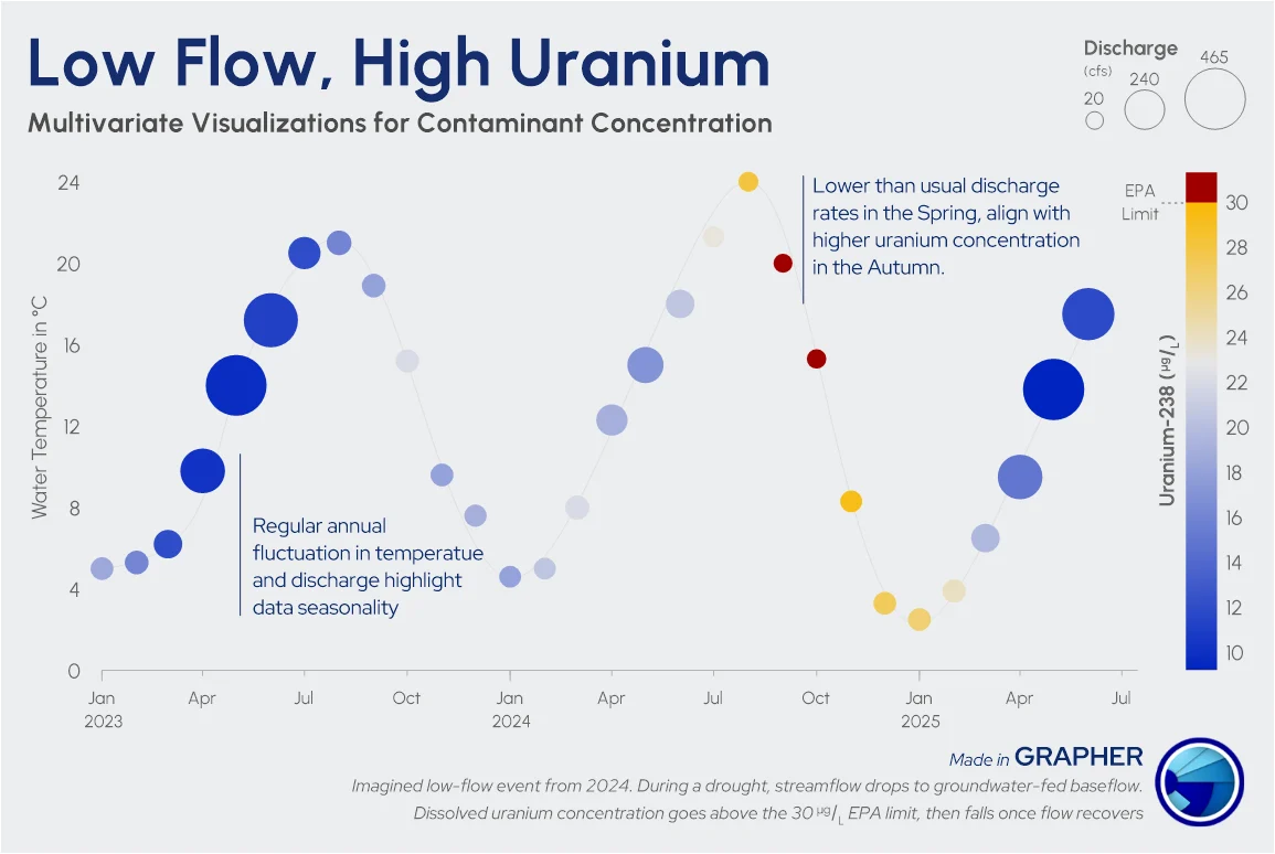
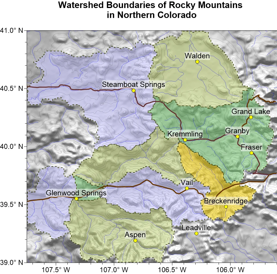
No single measurement exists in isolation with watersheds. Discover how to bring your multivariate hydrological data together.
- Aug 19, 2026|Gabbie Rhodes|7 min
The latest version of Grapher is here! Its new features are designed to help you work more efficiently while delivering greater clarity and impact.
- Aug 12, 2026|Gabbie Rhodes|6 min
Two geo-professionals sitting side by side can approach a watershed map in completely different ways. Which approach is best? Let's find out.
- Aug 12, 2026|Gabbie Rhodes|12 min
How do you design infrastructure that can withstand earthquakes? It starts with transforming raw numbers into visuals for infrastructure resilience.
- Aug 5, 2026|Gabbie Rhodes|5 min
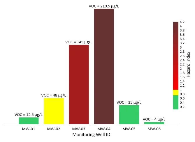
Need to show the relationship between multiple interconnected factors? Visualize multivariate data using an XYZC data structure.
- Aug 5, 2026|Gabbie Rhodes|10 min
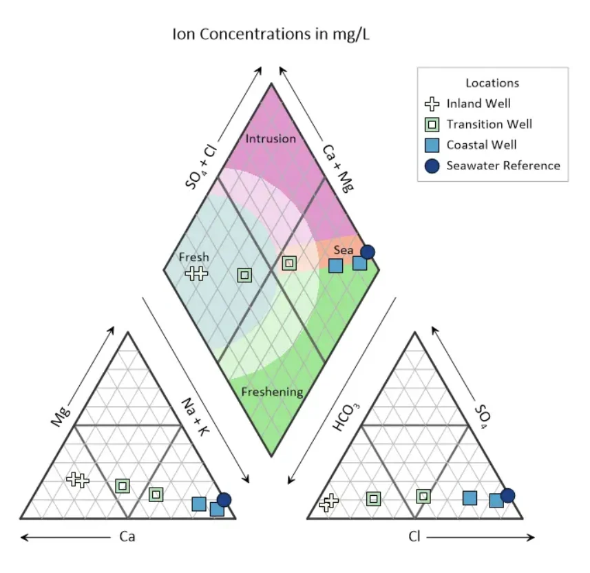
It's critical to turn seawater intrusion into something you can easily interpret and communicate. Here's how piper plots can help you.
- Jul 29, 2026|Gabbie Rhodes|12 min
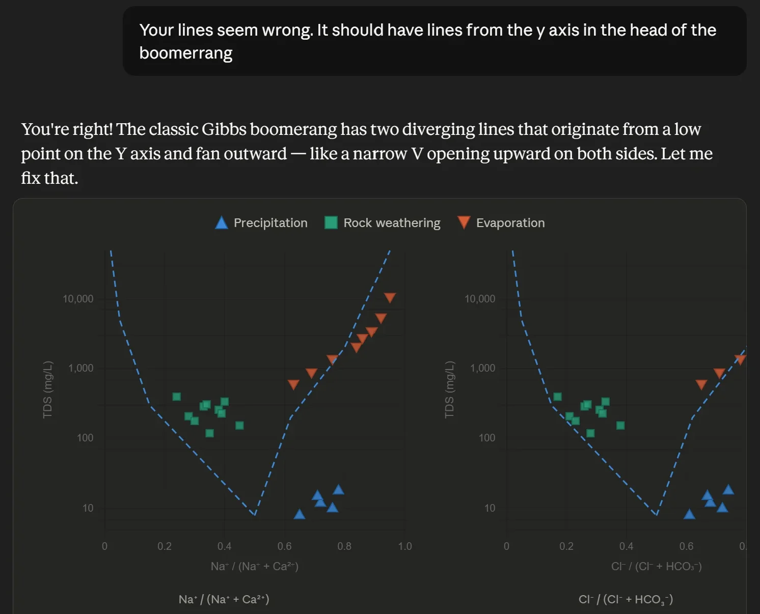
Want to use AI for data visualization? First, consider this: while many AI-generated graphs initially look great, they can misrepresent your data.
- Jul 29, 2026|Gabbie Rhodes|9 min
Map elements often have the biggest impact on how confidently stakeholders interpret your data and make decisions. Discover which ones to use.
- Jul 22, 2026|Gabbie Rhodes|6 min
Your team needs to work together effectively. Discover strategies to enhance team collaboration, so projects move forward with greater confidence.
- Jul 22, 2026|Gabbie Rhodes|8 min
You need to produce clear, accurate maps, models, and graphs. Can AI tools for data visualization help? Here's the answer.
- Jul 15, 2026|Gabbie Rhodes|4 min
Technology has advanced, and now, Surfer has taken the lead over Voxler. Learn how to convert your Voxler file to a Surfer file to get better results.