Visualizing Technical Data (Part 3): How to Combine Maps and Graphs for Better Mineral Exploration


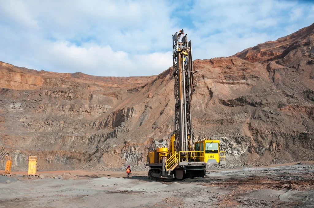
Mineral exploration comes with a clear challenge: you have to make decisions about what you can’t fully see. While you might have samples from across a project area, there are still questions about what lies between those locations and, equally important, where the available evidence suggests you should investigate next.
Answering those questions requires analyzing multiple variables, like where your samples were collected, what those samples contain, how concentrations vary, and whether meaningful patterns emerge across your measurements. Looking at your data from various angles will provide critical insight for decision-making, but doing so often means using both maps and graphs in your workflow.
In the third post of our Visualizing Technical Data blog series, we’re exploring how maps and graphs can work together to build a more complete picture of mineralization potential. That way, you can effectively interpret your exploration data and make more informed decisions about which areas to prioritize for further investigation.
Why Mineral Exploration Requires More Than One Type of Visual
Before diving into how maps and graphs work together, it helps to understand why relying on one type of visualization can leave important questions unanswered.
Mineral exploration datasets can contain many different types of information, including:
- drillhole and sampling locations
- elevation and depth
- geology
- geochemical measurements
- mineral or elemental concentrations
- assay results
With all of that information, you can’t rely on one type of visual to effectively and clearly give you needed insights. A map of drillhole or sample locations can show where data collection happened and help you understand those places within the broader exploration area. However, a map alone may not make it easy to understand how concentrations are distributed throughout the dataset or how individual measurements compare.
The reverse is also true. A graph can help you examine assay results and other measurements to identify comparatively high or low values, distributions, and variability, but without spatial context, it’s harder to understand where those measurements occur within the exploration area and how they relate to other sampling locations.
Ultimately, you’re trying to connect two sides of your mineral exploration data: Where are the samples and areas of interest, and what do the measurements collected from them reveal? That’s where maps and graphs add value. Rather than asking one type of visualization to provide every answer, you can use maps to investigate the spatial side of your data and graphs to dig deeper into the measurements themselves.
Use Maps to Understand Where Mineralization Occurs
Let’s start with the spatial side of your mineral exploration datasets. Maps place measurements within their physical context, helping you see where samples were collected, what’s around them, and how mineral concentrations vary across the project area. To put that into greater perspective, here’s what to know about the benefits maps bring to your workflow.
Put drillhole and sample locations into context
Knowing where a drillhole or sample is located is useful. But you might find yourself asking: How does that location relate to the geology, terrain, and other features around it?
Depending on the available data, you can map drill and sampling locations alongside the following:
- Exploration boundaries
- Geological units
- Faults and other structural features
- Elevation and topography
- Roads and infrastructure
- Surrounding geographic features
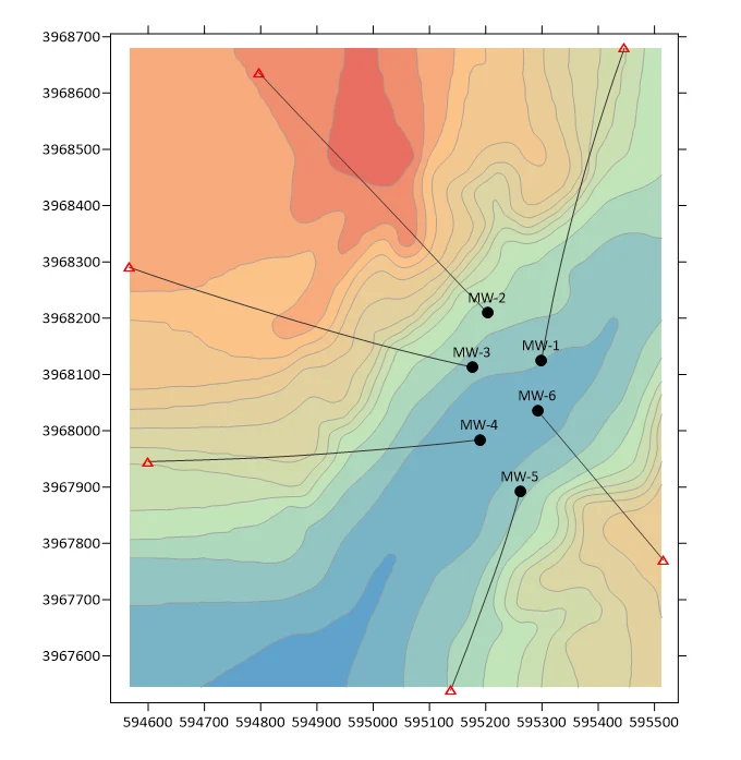
Showcasing this information on visuals like site maps, base maps, contour maps, or color-relief maps can help you examine multiple features together and identify spatial relationships worth investigating.
For example, you could create a site map that plots drillhole locations alongside mapped faults and geological units. If drillholes with elevated mineral concentrations occur near a particular structure or within the same geological unit, seeing those features together can help identify a pattern that warrants further investigation.
Or, perhaps the terrain is especially relevant to your project. You could overlay surface-sampling locations on a color-relief map to see where elevated mineral concentrations occur relative to ridges, valleys, and other terrain features. That additional context can help inform where you conduct follow-up field investigations.
Visualize spatial patterns in mineral concentrations
Individual sampling locations can tell you what was measured at specific points, but you might also want to know: How do mineral or elemental concentrations vary across the broader exploration area? Maps can help you move beyond individual locations to investigate those larger spatial patterns.
When the dataset and sampling density support interpolation, contour and color-relief maps can help visualize how measured concentrations vary across an exploration area. Depending on the data and your goal, you could also use point maps symbolized by concentration to show the spatial distribution of geochemical or assay data.
These various types of maps make it easier to identify:
- Clusters
- Anomalies
- Spatial gradients
- Areas with comparatively high or low concentrations
- Broader patterns that may warrant further investigation
You could, for example, create a contour map from geochemical sample data to visualize how copper concentrations vary across an exploration area. If comparatively elevated concentrations extend across several nearby samples, that area could become a candidate for additional sampling or investigation.
Use Graphs to Understand Mineral Concentrations and Distributions
Understanding where drill and sampling locations occur, what surrounds them, and how mineral concentrations vary across an exploration area can reveal important spatial patterns, but that’s only one part of your analysis. To understand how significant those measurements may be, you need to examine the values behind the spatial patterns you’re seeing.
Graphs provide a key way to analyze your mineral exploration data by visualizing how measured values are distributed, how they compare, and how much they vary. Let’s look at a few ways that can strengthen your analysis.
Understand how mineral concentrations are distributed
An individual assay or geochemical measurement becomes more meaningful when you see how it compares with the rest of your dataset. Histograms and frequency-distribution plots can specifically help provide that context by showing the overall distribution of measured concentrations.
Depending on your data, these graphs can help you answer questions like:
- What concentration ranges are most common?
- What is the shape of the distribution, and is it log-normal or heavily skewed?
- Are there unusually high or low values?
- Does the distribution suggest the dataset may contain multiple populations?
Perhaps you’re reviewing assay results, for example, and notice that most samples contain relatively low concentrations while a smaller number have substantially higher values. A histogram can put those higher-value samples into context by showing how they compare with the overall distribution. You can then return to your map to see where those samples occur and whether their locations reveal a spatial pattern worth investigating.
Compare mineral concentrations
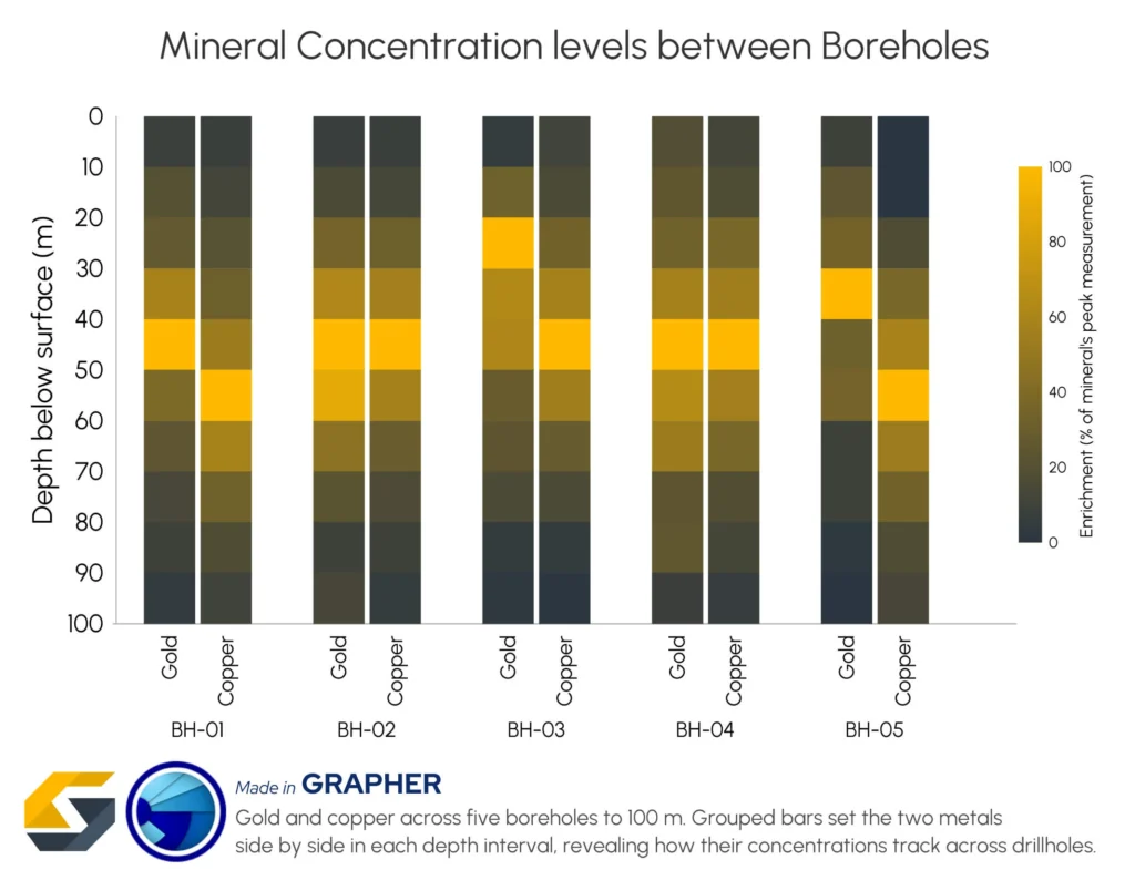
Sometimes you don’t need to examine the entire distribution. Instead, you may be asking: How do mineral concentrations compare among specific samples, locations, other minerals, or exploration areas? In this case, bar charts are great for placing those measurements side by side so it’s easier to identify which categories have comparatively higher or lower concentrations.
Say you’ve identified several locations of interest on a map and want a more direct way to compare their measurements. A bar chart can display the mineral concentrations from those locations side by side, making differences among them easily visible.
Identify variability and potential anomalies
Two exploration areas could have similar measurements at first glance while showing very different levels of variability across broader datasets. Understanding that spread can help you determine whether measurements within a particular area or group are relatively consistent or widely dispersed.
Box plots, in particular, can help you answer questions like:
- How do median concentrations compare among groups?
- Which groups show greater or less variability?
- How does the overall spread of measurements differ among groups?
- Are there potential outliers worth investigating?
For example, box plots comparing copper concentrations across several exploration zones could reveal that one zone has both a higher median concentration and several unusually high measurements. You could then map those samples to determine where the elevated values occur and whether they form a spatial pattern worth investigating further.
See the Full Mineral Exploration Picture
When you’re trying to determine where to investigate next, it’s helpful to have multiple views of your exploration. Maps can reveal where samples, geological features, and mineralization patterns occur, while graphs can showcase how concentrations are distributed, how measurements compare, and where potential anomalies may exist.
As you tackle your next mineral exploration project, don’t have one visualization to do all the heavy lifting. Use maps and graphs together to explore your data from multiple angles so you can make more informed decisions about where to investigate next.
Also, we’re not done exploring what maps and graphs can uncover when used together. In part four of our Visualizing Technical Data blog series, we’ll turn our attention to climate change data and explore how different visual perspectives can help you better understand and communicate changing conditions.
Until then, leave a comment below and tell us: How are you using maps and graphs together in your mineral exploration work?
Recent Articles
- Oct 14, 2026|Gabbie Rhodes|7 min
Mineral exploration requires you to analyze multiple variables. To do that successfully, you need to rely on both maps and graphs.
- Oct 7, 2026|Gabbie Rhodes|8 min
In the second post of our Visualizing Technical Data series, learn how maps and graphs can showcase your water quality data and uncover insights.
- Oct 7, 2026|Gabbie Rhodes|12 min
Have you ever wondered: what are the causes of a landslide? Discover the answer and how to visualize at-risk areas.
- Sep 29, 2026|Gabbie Rhodes|9 min
When visualizing technical data, a map will reveal certain insights, while a graph will reveal other insights. You need both to get the full picture.