How to Visualize Multivariate Data in Mineral Exploration



Every drillhole represents a significant investment. Between drilling, sampling, and laboratory analysis, collecting subsurface data can cost hundreds of dollars per meter, making every decision about where to drill a high-stakes one.
The challenge is that promising mineral deposits are rarely identified by a single variable. High assay grades may look encouraging until they’re viewed alongside lithology, alteration, depth, structural features, or the concentrations of associated elements. When these variables are evaluated independently in spreadsheets or separate graphs, important relationships can be overlooked, increasing the risk of missed exploration targets, unnecessary drilling, and costly misinterpretation.
That’s why multivariate data visualization is an essential part of modern mineral exploration. By bringing multiple dimensions of drillhole data together into a single visualization, geo-professionals can see how geology, geochemistry, and depth interact, making it easier to identify promising targets and improve drilling decisions.
Why Multi-Dimensional Borehole Data Is Difficult to Interpret
Every borehole tells part of the geological story, but rarely the whole story. To determine where an orebody begins, ends, or changes character, exploration geologists must compare information across multiple drillholes, depth intervals, and datasets simultaneously. That often means jumping between assay tables, lithology logs, cross sections, and separate graphs to piece together what’s happening beneath the surface.
While each visualization provides valuable information, manually cross-referencing them becomes increasingly difficult as a project grows. Questions that seem straightforward—such as Where do the highest grades occur? or How does mineralization change with depth?—often require comparing several datasets before a meaningful pattern begins to emerge.
One way to simplify that process is to incorporate additional dimensions into a single visualization. Rather than limiting a graph to just two variables, a multivariate visualization assigns different visual properties to represent different aspects of the drillhole data.
Here’s an example of how it works in Grapher:
- X and Y (Position): Represents the primary axes of the graph, such as drillhole location, distance along a cross section, time, or another foundational measurement.
- Z (Depth or Bubble Size): Adds a third quantitative dimension. In a 3D visualization, Z commonly represents depth or elevation. In a 2D visualization, it can be represented through bubble size or another visual scale to communicate magnitude.
- C (Color): Illustrates an additional variable using a color gradient. In mineral exploration, this might display assay grade, mineral concentration, rock type, alteration intensity, or another important geological measurement.
By assigning multiple variables to different visual properties, a single graph can communicate far more information than a traditional scatter plot or line log alone. Instead of comparing separate charts to understand how multiple geological variables relate to one another, exploration geologists can evaluate those relationships within a single view so it’s easier to identify promising targets and make more informed drilling decisions.
Visualizing Multi-Borehole Data in Mineral Exploration
Now that we’ve explored how multivariate visualization expands beyond traditional charts, let’s see what that looks like practically in mineral exploration.
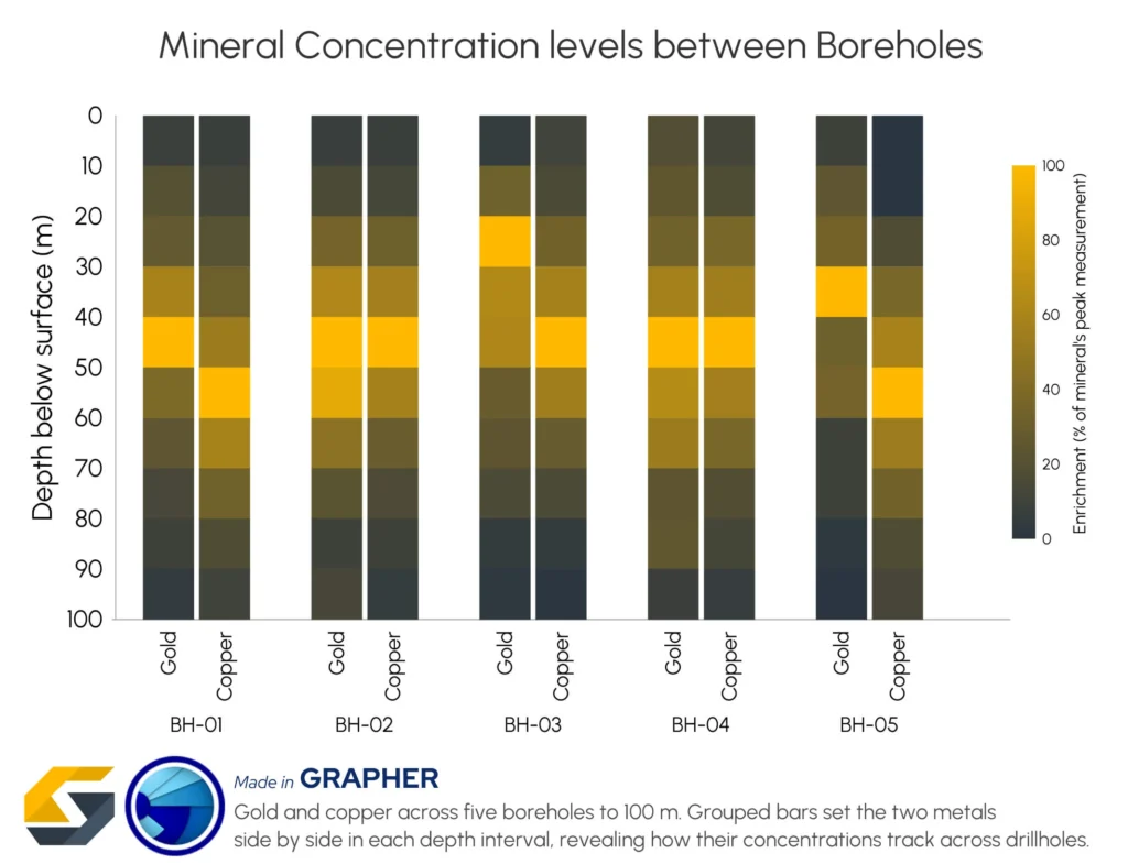
The heatmap below compares gold and copper concentrations across five boreholes drilled to a depth of 100 meters. Rather than displaying each drillhole or mineral in its own graph, the visualization brings them together into a single view, making it much easier to compare mineralization patterns throughout the exploration area.
To understand how the graph works, it’s helpful to break down each visual element:
- X (Horizontal Axis): Represents the individual borehole (BH-01 through BH-05).
- Y (Vertical Axis): Represents depth below the surface, increasing downward from 0 to 100 meters to reflect how exploration geologists typically view borehole data.
- C (Color): Represents relative enrichment (% of each mineral’s peak concentration), with darker charcoal tones indicating lower assay values, while bright gold highlights peak mineralization, making it easy to see where and at what depth each mineral reaches its highest concentration.
- Grouped Bars: Display gold and copper side by side within each sampling interval, creating a heat-mapped profile for every borehole to ensure both elements are visually evaluated and compared at the exact same depth.
What patterns emerge?
One of the first observations is that the strongest mineralization generally occurs between 20 and 60 meters below the surface. Several boreholes show brighter colors for both gold and copper within this interval, making it easy to identify zones where the two elements become enriched together.
At the same time, the grouped bars reveal that the relationship isn’t identical everywhere. In BH-03, for example, gold reaches a strong enrichment zone at a shallower depth than copper. Meanwhile, BH-05 displays a different distribution, with its most pronounced copper concentrations occurring a little deeper in the borehole than some neighboring holes. These differences can help exploration geologists distinguish localized mineralization from broader geological trends.
Tips for Designing Multivariate Visuals for Mineral Exploration
A multivariate visualization is only as useful as the design decisions behind it. Exploration datasets often combine measurements with different units, ranges, and geological significance, so thoughtful design is essential for making meaningful comparisons. That said, here’s how to make relationships between variables in mineral exploration easier to recognize and interpret in your visualizations.
Normalize variables before comparing them
Not every element is measured on the same scale. Gold assays may be reported in parts per million (ppm), while other elements are measured as percentages or occur across vastly different concentration ranges. Displaying those values without adjustment can make one variable dominate the visualization simply because of its scale, not because it’s more geologically significant.
In mineral exploration, normalizing assay measurements—such as expressing values as a percentage of each element’s peak concentration—allows vastly different elements to be compared on a single, unified scale. This makes it easier to evaluate how different elements vary together, identify potential pathfinder relationships, and recognize meaningful patterns that might otherwise be hidden.
Choose color palettes that reflect the data
Color should help stakeholders interpret the data, not distort it.
Sequential color palettes that progress smoothly from darker shades to brighter colors make it much easier to recognize increasing mineral concentrations. In the previous example, the dark gray-to-gold gradient naturally draws attention to areas of higher enrichment, allowing potential mineralized zones to stand out during technical reviews or executive presentations.
Avoid non-uniform color schemes that exaggerate small differences or make similar values appear unrelated. An intuitive, consistent gradient helps ensure that visual differences accurately reflect differences in the underlying data.
Keep related variables together
Where variables are placed within the visualization is just as important as how they’re displayed.
Grouping related measurements in mineral exploration—such as gold and copper enrichments from the same drillhole—equips decision-makers to compare those elements immediately at each sampling interval. Instead of scanning across multiple charts or widely separated datasets, they can evaluate relationships with a quick visual comparison.
This approach reduces unnecessary eye movement, makes depth-dependent trends easier to recognize, and helps exploration geologists spend more time interpreting mineralization patterns rather than searching for corresponding data.
Bringing the Bigger Picture into Focus
Successful mineral exploration depends on more than identifying high assay values. It requires understanding how location, depth, geology, geochemistry, and other exploration variables interact to define the shape and continuity of a potential orebody. When those variables are analyzed in isolation, important relationships can be overlooked, making it harder to identify promising targets and increasing uncertainty in drilling decisions.
Multivariate data visualization brings those relationships together into a single, easy-to-interpret view. By transforming complex drillhole data into clear, heat-mapped comparisons, exploration teams can spot trends faster, reduce drilling risk, and make more confident decisions throughout the exploration process.
Now we’d love to hear from you: What’s the biggest challenge you face when communicating exploration results to your team or stakeholders? Leave a comment below and share your experience.
Recent Articles
- Oct 14, 2026|Gabbie Rhodes|7 min
Mineral exploration requires you to analyze multiple variables. To do that successfully, you need to rely on both maps and graphs.
- Oct 7, 2026|Gabbie Rhodes|8 min
In the second post of our Visualizing Technical Data series, learn how maps and graphs can showcase your water quality data and uncover insights.
- Oct 7, 2026|Gabbie Rhodes|12 min
Have you ever wondered: what are the causes of a landslide? Discover the answer and how to visualize at-risk areas.
- Sep 29, 2026|Gabbie Rhodes|9 min
When visualizing technical data, a map will reveal certain insights, while a graph will reveal other insights. You need both to get the full picture.