Streams of Insight: How to Visualize Multivariate Hydrological Data for Better Watershed Analysis

At first glance, hydrological measurements for a watershed can seem like independent pieces of data. In reality, a watershed functions as a connected system. No single measurement exists in isolation, which means your analysis shouldn’t either—but that’s sometimes how hydrological data is presented.
Streamflow is graphed separately from water quality. Monitoring locations are shown on their own map. Additional measurements are scattered across individual charts. While each visualization answers a specific question, it becomes harder to understand how the watershed behaves as a whole.
Fortunately, multivariate visualization takes a different approach by bringing related variables together into a single graph. Why does that matter? Let’s start by looking at what you can miss when hydrological data is analyzed in isolation.
Why Siloed Hydrological Data Can Hide Critical Insights
Watersheds are dynamic systems where changes in one variable often influence many others. Streamflow affects sediment transport. Rainfall influences nutrient concentrations. Seasonal conditions alter both water quantity and water quality. Because these variables constantly interact, separating them into individual visuals makes it much harder to understand what’s actually happening within the watershed. This disconnect becomes especially apparent in three common areas of watershed analysis.
Water Quantity and Quality
Flow rate and water quality are often analyzed independently, but doing so can obscure important relationships. For example, a sudden increase in streamflow may dilute contaminant concentrations, making pollutant levels appear lower than they would under normal conditions.
Conversely, prolonged low-flow conditions can concentrate those same contaminants, resulting in higher measured concentrations even when pollutant inputs remain relatively unchanged. If flow rate and water quality are viewed in separate graphs, it’s harder to see an accurate picture.
Geographic Context
Where a sample is collected is often just as important as the measurement itself. A table of monitoring results may show elevated nitrate concentrations at one site and lower concentrations downstream, but it doesn’t explain why those differences exist. Without geographic context explicitly built into the visualization, it becomes much harder to perform upstream-versus-downstream analysis. You lose the ability to easily see how point sources of pollution (like an industrial discharge pipe) or non-point sources (like agricultural runoff from a specific farming valley) physically intersect the river network.
Temporal Trends and Seasonal Patterns
Environmental conditions in a watershed rarely remain static over time. The relationship between streamflow, temperature, and water quality changes dramatically depending on the season, storm events, or even the time of day.
If temporal data is isolated on separate charts, crucial cyclical relationships are easily missed. For instance, a spike in sediment runoff during spring snowmelt looks completely different on a graph than a spike caused by a sudden summer flash flood, even if the peak flow rates are identical.
Similarly, agricultural fertilizer runoff often peaks during specific planting windows. If you view nutrient concentrations on one calendar plot and river discharge on another, you lose the ability to see how timing and flow volume collide to create high-risk “loading” events.
The Anatomy of a Graph with Multivariate Hydrological Data
Now that we’ve explored what you can miss when hydrological data is analyzed in isolation, the next question is: how can a single graph bring multivariate relationships together?
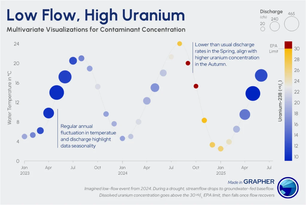
One effective approach is to use an XYZC data structure, where each visual property represents a different dimension of the watershed. Rather than displaying water quantity, water quality, and other variables in separate graphs, XYZC data combines them into a single visualization that makes relationships much easier to recognize and analyze.
For hydrological data, you might organize the graph like this:
- X and Y would represent the graph’s horizontal and vertical axes. Depending on the visualization, these axes can display variables such as time/date, temperature, or geographic location.
- Z or Size Variable can represent water flow rate or discharge volume, with larger bubbles indicating higher flow conditions.
- C (Color) could represent a water quality measurement—such as pH or contaminant concentration—making it easier to identify differences in water chemistry.
By assigning each variable to a distinct visual property, a single graph communicates far more than any individual chart could on its own. Instead of comparing separate visuals, you can immediately see how something like flow conditions, water quality, and location interact across a watershed, making complex hydrological data easier to interpret and communicate.
How to Read a Multivariate Hydrological Graph
It’s one thing to understand how a multivariate graph is set up. It’s another to see the benefits of that setup in a real-world example.
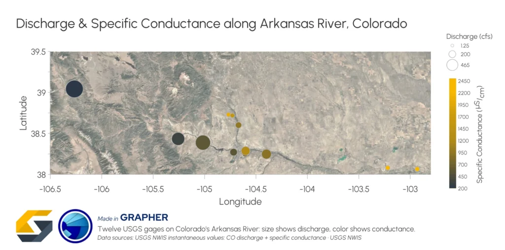
The graph below displays discharge and specific conductance measurements collected from twelve USGS monitoring stations along the Arkansas River in Colorado.
The graph below displays discharge and specific conductance measurements collected from twelve USGS monitoring stations along the Arkansas River in Colorado. Specific conductance measures how easily water carries an electrical current—the higher the reading, the more dissolved salts and minerals (charged ions) are in the water. That makes it a quick, reliable stand-in for tracking overall water salinity as conditions change downstream.
To highlight the discharge and specific conductance measurements, the graph uses an XYZC dataset, with the variables structured as follows:
- X and Y represent the geographic coordinates (Longitude and Latitude) of each monitoring station.
- Z or Size Variable represents river discharge (cfs), with larger bubbles indicating higher streamflow.
- C (Color) represents specific conductance, with the color scale shifting from dark blue to bright yellow as dissolved-load concentrations increase.
Rather than separating these measurements into multiple graphs, the visualization combines them into a single view of the watershed.
What stands out immediately?
Even before analyzing the individual values, several patterns begin to emerge.
- The largest bubbles are concentrated near the headwaters, indicating that streamflow is greatest in the upper reaches of the river.
- Bubble size generally decreases downstream, suggesting lower discharge at many of the remaining monitoring stations.
- Bubble color gradually shifts from darker shades to brighter yellow tones, showing that specific conductance generally increases farther downstream.
What do these patterns tell us?
Even before analyzing the individual numbers, a crucial environmental relationship stands out immediately: as river discharge decreases downstream, specific conductance sharply increases.
Near the headwaters (the top-left of the plot), the large, dark-blue bubbles represent a high volume of cold, dilute snowmelt. With so much fresh water and very little dissolved mineral content to carry a current, specific conductance stays low.
As you trace the river’s path downstream to the right, the bubbles shrink and shift toward bright yellow. This shift is a classic dilution response: as agricultural and municipal diversions pull fresh water off the river, less flow remains to dilute the river’s dissolved load. At the same time, irrigation return flows wash natural salts out of the valley’s agricultural soils and underlying marine shales, while evaporation further concentrates what’s left. Ultimately, less water carrying more salt is what drives specific conductance sharply upward through the lower, heavily managed reaches of the watershed.
Why does location matter?
The graph not only compares flow and water quality but also shows where those relationships occur across the landscape. Because every measurement is tied to its exact geographic location (Longitude and Latitude), you can quickly identify stretches of the river where lower flows coincide with higher specific conductance.
For example, the saltiest, lowest-flow stations cluster along the eastern stretch of the map—in the exact same reaches as the valley’s heavily irrigated farmland. This is precisely where you’d expect to see irrigation return flows and evapoconcentration driving up dissolved mineral levels. That spatial context lets you isolate the primary drivers behind water quality shifts rather than guessing, making it easier to evaluate factors such as:
- Diversions, where water is drawn off for farms and towns, leaving less flow in that section of river
- Tributary inputs and saltier groundwater baseflow
- Local geology, such as salt-bearing marine shales
- Irrigation return flows loaded with leached salts and urban land use
Instead of interpreting isolated measurements, you can see how conditions evolve across the watershed and communicate those findings faster and with much greater confidence.
Best Practices for Designing Multivariate Hydrological Graphs
While visualizing multivariate hydrological data on a single plot is powerful, how you design it matters. In fact, without thoughtful design, additional data on a graph can quickly make the visualization harder—not easier—to interpret.
The goal is to reveal relationships across a watershed while keeping the graph intuitive enough that you and stakeholders can quickly recognize those relationships. The design practices below can help you strike that balance.
1. Build a legend that explains every variable
When a graph communicates multiple variables simultaneously, the legend becomes key to interpreting the visualization correctly. An effective legend for a multivariate plot should clearly explain what each visual property represents.
In the Arkansas River example, the bubble-size legend immediately shows how marker size corresponds to discharge, while the color scale explains how specific conductance changes across monitoring stations. Together, these two legend elements equip decision-makers to interpret both variables without referring to additional documentation.
2. Avoid visual clutter
Multivariate graphs communicate several variables at once, which means every visual element should earn its place. While it may be tempting to add extra labels, symbols, gridlines, or decorative formatting, too many competing elements can make the graph harder to understand.
Instead, keep the design as clean as possible so the relationships between your variables remain the focus. Use labels selectively, minimize overlapping symbols whenever possible, and avoid unnecessary colors or formatting that draw attention away from the data. A clean, well-organized graph empowers stakeholders to quickly recognize patterns across multiple variables without getting distracted by visual noise.
3. Use labels and callouts to highlight what matters most
Even a well-designed multivariate graph may contain important findings that deserve additional emphasis. That’s when strategic labels and callouts are essential, as they can help guide decision-makers directly to those insights.
For example, you might annotate:
- Monitoring stations that exceed regulatory water quality thresholds
- Locations where discharge changes dramatically between sampling sites
- Areas where water quality shifts unexpectedly along the river
- Levels of concern for drinking water or irrigation
Instead of expecting stakeholders to discover these patterns on their own, concise annotations help the graph communicate key findings immediately. This is especially valuable when presenting results to people who may not have a technical background or extensive hydrological expertise.
Bringing the Whole Watershed into Focus With Multivariate Hydrological Data
A watershed is an interconnected system where changes in one variable often influence many others. By visualizing multivariate hydrological data in a single graph, you can move beyond isolated observations to better understand how water quantity, water quality, location, and other measurements work together across the landscape. The result is a clearer picture that’s easier to interpret, communicate, and use to support informed watershed management decisions.
Now we’d love to hear from you: How do you want to use multivariate visualizations to better understand watershed data? Leave a comment below to share your thoughts!
Recent Articles
- Sep 29, 2026|Gabbie Rhodes|9 min
When visualizing technical data, a map will reveal certain insights, while a graph will reveal other insights. You need both to get the full picture.
- Sep 29, 2026|Gabbie Rhodes|5 min
Repetition slowing you down? Automation can quicken your high-volume workflow, remove manual steps, and even improve consistency.
- Sep 23, 2026|Gabbie Rhodes|8 min
The best 3D data visualizations depend on the quality of your underlying grid. To achieve a great result, sometimes you need to use 3D grid filters.
- Sep 23, 2026|Gabbie Rhodes|11 min
When you're working with complex data, you need to communicate clearly. Graphs can help, especially when you follow design best practices.