Unlocking Subsurface Mapping: Harnessing 3D Modeling for Clearer Insights
Subsurface features rarely exist in neat, flat layers. They dip, thicken, thin, and intersect in ways that aren’t always obvious on a cross-section or contour map. Yet it’s easy to rely primarily on 1D logs and 2D visuals to analyze what’s happening underground. While those formats are valuable, they often require mental reconstruction as they force stakeholders to imagine how subsurface features connect in three-dimensional space. That gap between analysis and true spatial understanding has real consequences. The good news? 3D modeling changes that reality entirely.
Why 1D and 2D Fall Short in Subsurface Mapping
First, what are the real consequences of relying on 1D logs and 2D visuals for subsurface features?
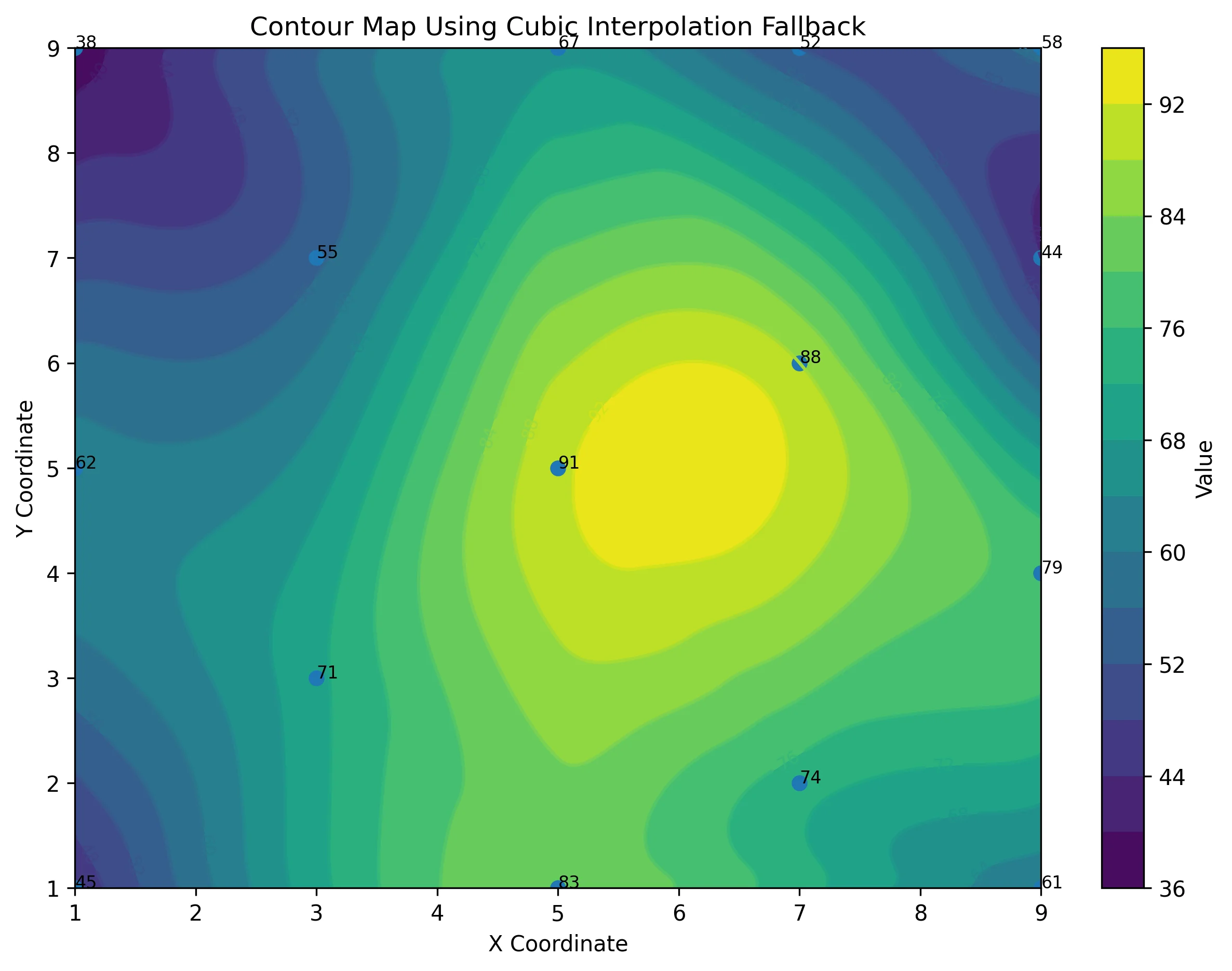
At their core, 1D and 2D formats can’t effectively represent three-dimensional space. A borehole log shows vertical variation. A cross-section reveals a slice through the subsurface. A contour map displays values across a surface. Each perspective is useful, but each is incomplete on its own. To understand how formations, contaminant plumes, or structural features truly relate to one another, stakeholders must mentally stitch these separate views together. Of course, you could try putting everything on a 2D map to give a more complete look at the subsurface—but that just creates an overwhelming amount of clutter.
All of this friction leads to several common challenges:
- Hidden connections between datasets that aren’t immediately visible across separate maps, logs, or sections
- Increased cognitive effort as viewers work to mentally reconstruct spatial relationships or parse through overloaded and overwhelming visuals.
- Greater risk of misinterpretation, especially when multiple depths, surfaces, or variables are involved
On the analysis side, this can result in important spatial relationships being missed or oversimplified. On the communication side, stakeholders may struggle to fully understand the data, leading to slower decisions or, in some cases, incorrect ones.
Key Ways to Create Great 3D Models for Subsurface Mapping
To approach subsurface mapping effectively, the solution is to build 3D models that provide a realistic depiction of what’s happening underground so insights are clear. There are a few steps you can take to implement that solution, particularly when you have the right data visualization software.
Combine multiple data sources into a unified model
Before creating 3D surfaces or volumes, the first step is to ensure your datasets align spatially and structurally. Once alignment is verified, you can begin bringing together these disparate elements into a single 3D workspace:
- Point-based data: Borehole intervals, well screens, and sampling points.
- Geophysical datasets: resistivity grids or seismic profiles to validate stratigraphic continuity between physical borings.
- Spatial surfaces: Topographic LIDAR, water table elevations, and CAD-based site layouts.
Because subsurface data is inherently discontinuous, the 3D modeling process relies on advanced interpolation algorithms—like Kriging or Radial Basis Functions—to accurately “fill the gaps” between these datasets. These mathematical models predict formation behavior in unsampled areas, turning isolated borehole observations into a statistically defensible 3D environment.
When these elements exist within a unified model, the need for mental reconstruction disappears. Instead of flipping between separate logs and contour maps, stakeholders can see exactly how geological layers, contaminant plumes, and topography connect and influence one another.

Integrate CAD to anchor your model in reality
A 3D subsurface model becomes significantly more powerful when it aligns directly with engineering design files. That’s where CAD and geoscience workflow integration comes into play.
Importing DWG files into your 3D environment equips you to position subsurface layers, volumes, and drillholes relative to real-world site layouts, utilities, structures, and grading plans. This alignment ensures your interpretation reflects actual project constraints, not just theoretical space.
Add multiple 3D elements to represent complexity
Subsurface systems are layered, variable, and rarely uniform. A strong 3D model reflects that complexity without overwhelming the viewer. The key is layering visual elements intentionally, each serving a specific interpretive purpose.
Enhance your model with these design elements:
- Contact points to define boundaries between materials or horizons
- Contact surfaces to represent stratigraphic layers or modeled elevations
- Drillholes to ground the model in measured data
- Isosurfaces to highlight thresholds or concentration limits
- Slices to reveal internal structure within volumes
Each element answers a different spatial question. Surfaces define structure. Volumes quantify extent. Drillholes validate interpretation. Isosurfaces clarify thresholds.
But despite the clarity these design elements bring, keep this in mind: the goal is to only include what supports the analysis. When used thoughtfully, these elements create a cohesive representation of subsurface conditions rather than a visually complex scene.
Use Images Along Polylines to Show Spatial Change
Some of the most meaningful insights occur along a defined path, like across a transect, along infrastructure, or between monitoring points. Instead of relying solely on static surfaces, placing images along polylines equips you to visualize change across distance.
This approach is especially useful for the following:
- Showing how conditions evolve along a corridor
- Visualizing gradients across a site
- Comparing measurements along transportation routes or boundaries
By tying visual information to a defined path, you make spatial transitions easier to interpret. Stakeholders can follow a logical progression rather than mentally reconstructing it from separate visuals. When done well, this technique bridges analysis and storytelling, clarifying not just what exists underground but how it changes across space.

How 3D Models Improve Subsurface Mapping Outcomes
After creating a 3D model, the real test of its effectiveness is how much better your outcomes are because of it. A well-designed 3D data visualization changes how you analyze risk, communicate findings, and move projects forward with confidence. For context, here’s what that looks like in practice.
Better Analysis: See What 2D Can’t Reveal
In 3D, relationships become more visible. Instead of inferring how a contaminant plume intersects with stratigraphy, or estimating how formation thickness varies across a site, you can see those relationships directly. Subtle pinch-outs, depth-dependent trends, or proximity to infrastructure become immediately apparent.
This leads to multiple benefits, including the following:
- Clear identification of relationships between datasets
- Faster detection of spatial patterns and anomalies
- Reduced reliance on assumptions or mental reconstruction
- Greater confidence when tackling complex spatial problems
When thresholds are exceeded, gradients shift, or zones overlap, those interactions aren’t buried across separate maps and sections. They’re revealed in context. That shift alone can change the quality of interpretation.
Better Communication: Help Stakeholders Understand Instantly
Even the strongest analysis loses impact if stakeholders struggle to visualize it. A well-built 3D model replaces fragmented visuals—logs, contours, cross sections—with a unified spatial representation. Instead of explaining how layers relate, you can show it.
This improves communication in subsurface mapping by:
- Eliminating the need to mentally piece together multiple visuals
- Reducing misinterpretation of depth, extent, or proximity
- Making it easier to justify recommendations visually
- Increasing stakeholder confidence in the findings
When stakeholders can see how a subsurface zone interacts with a planned excavation—or when regulators can clearly view plume boundaries relative to property lines—discussions become grounded in shared understanding rather than abstract explanation.
Faster Decision-Making and Stronger Outcomes
Clarity accelerates alignment. When spatial relationships are immediately visible, meetings become more focused. Fewer clarifying questions are needed because the model provides the clarity and insight needed.
As you incorporate more 3D visuals in your workflow, you’ll notice these results:
- Clearer visuals lead to fewer back-and-forth revisions
- Better understanding drives quicker team alignment
- More accurate interpretation results in faster, more defensible decisions
Subsurface projects carry real financial, environmental, and safety implications. Clear, defensible 3D models reduce uncertainty and support quicker, confident, and informed decision-making at every stage of the project.
Move Beyond 2D Thinking to Better Subsurface Mapping
Relying solely on 1D logs and 2D visuals forces interpretation to happen in someone’s head. That mental reconstruction increases effort, introduces risk, and can lead to missed relationships or flawed conclusions. 3D modeling changes that dynamic. When data is integrated, layered intentionally, and aligned with real-world context, spatial relationships become visible instead of assumed, and decisions become clearer as a result.
The goal is to build a 3D model that communicates clearly. Better subsurface mapping will happen when you achieve that objective.
Are you unsure whether your current 2D visuals are truly limiting clarity? Download our free guide “Why 2D Isn’t Enough” to find out whether your 2D visuals are falling short and how to develop 3D models that improve both analysis and stakeholder communication.
Recent Articles
- Jul 1, 2026|Gabbie Rhodes|7 min
Geoscience projects are built on collaboration, but even the strongest teams can struggle with communication silos. Learn how to overcome them.
- Jul 1, 2026|Gabbie Rhodes|7 min
See how 3D visualization transforms geophysical data by connecting profiles with terrain, boreholes, and other datasets for better interpretation.
- Jun 23, 2026|Gabbie Rhodes|10 min
Ever stop and wonder: does AI make mistakes? Before you start using AI tools to create your maps, discover the answer to this key question.
- Jun 23, 2026|Gabbie Rhodes|7 min
What contributions are women making in STEM? Discover eight examples of women in STEM fields and the meaningful impact they’re making.