Quick Guide to a Scientific Bar Chart: Purpose, Benefits, Types, and Examples
From environmental monitoring to laboratory analysis, scientists constantly need to compare categorized data. Which sampling site shows the highest concentration? Which material performs best under stress? Which region experienced the greatest change over time? Clear comparisons drive better decisions, and that’s exactly where a scientific bar chart proves its value.
A scientific bar chart is a deliberate communication tool that translates technical datasets into structured, understandable insights. So rather than viewing bar charts as elementary graphics, it’s worth taking a closer look at how they function within scientific analysis and how to use them intentionally to communicate complex findings with clarity and confidence.
What Is a Scientific Bar Chart?
Before exploring different formats, let’s clarify what makes a bar chart “scientific.”
A scientific bar chart communicates complex, technical data in a structured and understandable way. Broadly, these charts fall into two categories: specialized formats developed specifically for technical applications, and foundational bar chart formats that become scientific when used to present measured data with appropriate structure, units, and analytical context. In both cases, the goal remains the same—to make complex findings clear and easy to understand.
Types of Scientific Bar Charts
Now that we’ve defined what a scientific bar chart is, the next step is to dive deeper into its various formats. We’ll dive into the specialized formats first. These bar charts are designed specifically for technical applications, so they’re built to represent the unique characteristics of scientific data more precisely than a standard bar chart can achieve. Below are four commonly used specialized scientific bar charts.
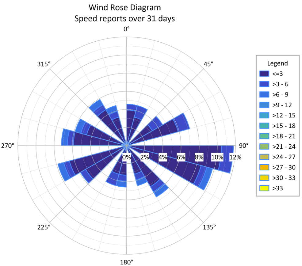
Wind Rose Bar Chart
A wind rose is a specialized circular bar chart used to display wind speed and direction frequency. Instead of comparing categories along a straight axis, it organizes data radially around a compass. Each “spoke” represents wind direction, while the stacked bars within each spoke show how often wind occurred at different speed categories. This structure makes dominant wind directions and their intensity immediately visible.
Common Applications: Meteorology, air quality studies, environmental monitoring, renewable energy site evaluation
Real-World Example: An environmental consultant analyzing pollutant dispersion may use a wind rose to determine the prevailing wind direction at a site, helping identify potential downwind impact zones.
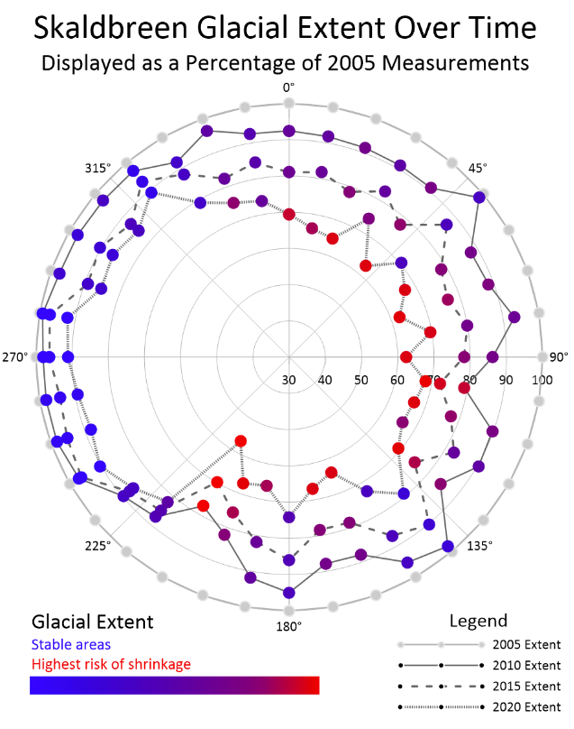
Polar Bar Chart
A polar bar chart is another circular variation used to represent directional or cyclical data. Unlike a wind rose chart, which focuses specifically on wind patterns, polar bar charts can represent any dataset where direction or periodicity matters. These charts are useful for visualizing wave direction, fracture orientation, seasonal patterns, or other measurements that repeat or vary by direction or cycle. The radial layout emphasizes spatial or angular relationships that a standard vertical bar chart might obscure.
Common Applications: Structural geology, oceanography, civil engineering, seasonal environmental analysis
Real-World Example: An engineer studying fracture orientations in bedrock may use a polar bar chart to visualize dominant structural trends and assess how they might influence excavation or stability.
Directional Frequency Bar Chart
A directional frequency bar chart is similar to a polar chart but is specifically engineered to show how often events occur within defined angular “bins.” While a standard polar chart might plot a variable’s magnitude—like wave height—against an angle, a directional frequency chart focuses on count and probability. You can think of it as a polar histogram. This format is essential for datasets where the orientation of an event—such as flow direction, sediment transport, or structural alignment—is the primary driver of the analysis.
Common Applications: Hydrodynamics, structural geology, coastal engineering, and ocean current analysis.
Real-World Example: A coastal scientist might use a directional frequency chart to analyze the most common wave approach angles over a decade, using that frequency distribution to inform the placement and orientation of shoreline protection structures.
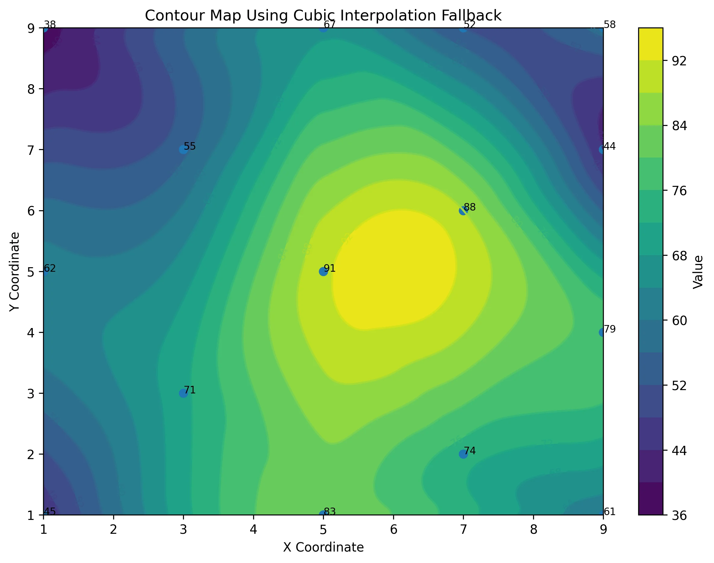
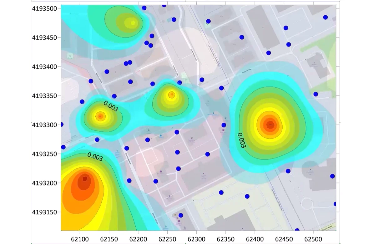
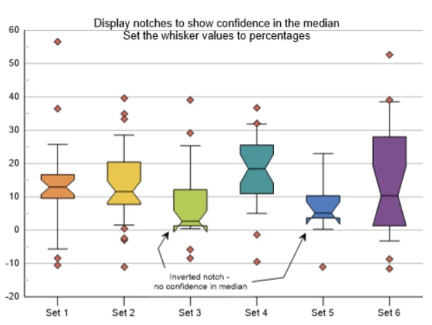
Range (Floating) Bar Chart
Unlike traditional bar charts that display a single value per category, a range—or floating—bar chart visualizes a span between minimum and maximum values. In scientific reporting, this structure is unparalleled for representing variability, uncertainty, or tolerance ranges. By “floating” the bar between two points on the Y-axis rather than anchoring it to zero, you shift the viewer’s focus from a single average to the entire spread of the data. In fields like stratigraphy, these are the foundational components of lithology logs, where each “bar” represents the depth interval of a specific rock unit.
Common Applications: Engineering tolerances, environmental sampling variability, statistical reporting
Real-World Example: An environmental scientist might use a floating bar chart to display minimum and maximum contaminant concentrations at multiple sampling sites, highlighting both compliance thresholds and variability across locations.
Foundational Bar Charts Used in Scientific Workflows
Foundational bar chart formats also play a critical role in scientific workflows. While these formats aren’t exclusive to technical disciplines, they frequently serve as the backbone of scientific comparison. When applied with proper units, analytical context, and clear structure, they become just as rigorous and defensible as specialized charts. Below are the primary foundational bar chart formats and how they support technical analysis.
Standard Bar Chart (Vertical or Horizontal)
The standard bar chart—whether vertical or horizontal—is best suited for straightforward comparisons across discrete categories. This format is frequently used to compare measurements across samples, field sites, materials, or experimental conditions. Its simplicity ensures the viewer can immediately identify which category is highest, lowest, or within a specific threshold.
The orientation can be adjusted based on readability. Vertical bars work well when category names are short and comparisons are sequential. Horizontal bars are often preferable when category labels are long or numerous.
Real-World Example: A hydrogeologist comparing nitrate concentrations across monitoring wells may use a vertical bar chart to quickly show which sites exceed regulatory limits.
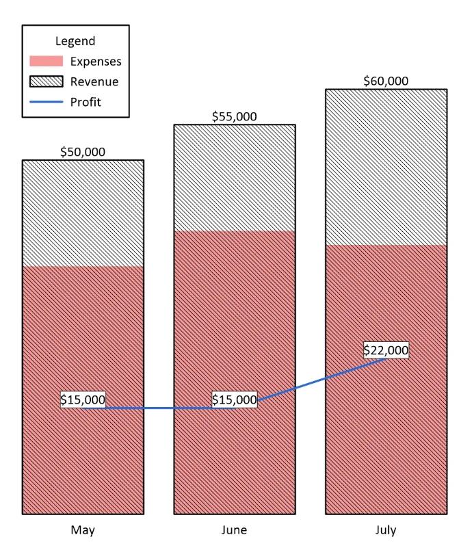
Stacked Bar Chart
A stacked bar chart shows how subcomponents contribute to a total value. Rather than displaying variables side by side, each bar is divided into segments representing parts of the whole.
This format is helpful when both overall magnitude and internal composition matter. It empowers the viewer to understand total values while simultaneously seeing how different components contribute to that total. Stacked bar charts are most effective when the number of subcomponents is limited, and color differentiation is clear.
Real-World Example: An environmental scientist analyzing land cover change might use a stacked bar chart to show total land area by year, with segments representing forest, urban, agriculture, and water classifications.
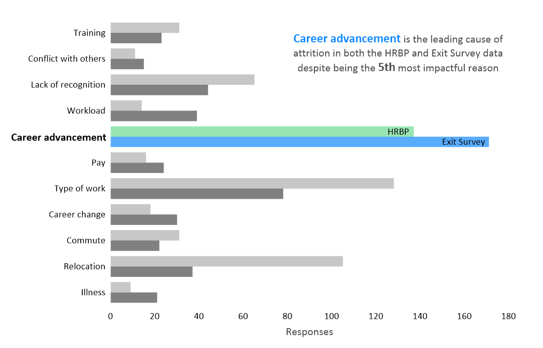
Grouped (Adjacent) Bar Chart
A grouped—or adjacent—bar chart compares multiple variables across the same set of categories. Instead of displaying a single value per category, it places related bars side by side for direct comparison.
This structure is especially useful when analyzing different conditions, time points, or scenarios. It equips viewers to compare not only within a category but also across related variables. Grouped bar charts are particularly effective when examining how outcomes differ under varying experimental treatments or environmental conditions.
Real-World Example: An engineer evaluating material strength might use a grouped bar chart to compare performance under dry and saturated conditions across several material types.
Make Scientific Comparisons Clear and Intentional
A scientific bar chart is designed to communicate complex data. Whether you’re working with a specialized format built for directional analysis or a foundational structure designed for straightforward comparison, the goal is the same: to organize technical information so data is clear and easy to understand.
When used intentionally, a scientific bar chart will clarify trends, support evaluation, and strengthen the decisions that follow. The structure you choose should just align with your project goals and stakeholders’ needs. Strong scientific communication is the result of deliberate design choices that turn raw data into meaningful insight.
If you want more practical guidance on building clear, effective scientific visuals, subscribe to our blog, Golden Discoveries, to continue refining how you communicate your data.
Recent Articles
- Jun 23, 2026|Gabbie Rhodes|10 min
Ever stop and wonder: does AI make mistakes? Before you start using AI tools to create your maps, discover the answer to this key question.
- Jun 23, 2026|Gabbie Rhodes|7 min
What contributions are women making in STEM? Discover eight examples of women in STEM fields and the meaningful impact they’re making.
- Jun 17, 2026|Gabbie Rhodes|8 min
Both work and family require energy and intentionality. To ensure you approach them effectively, discover tips to balance work and family life.
- Jun 17, 2026|Gabbie Rhodes|11 min
Senior Technical Sales Specialist Drew Dudley hosted a webinar to provide tips for ensuring coordinate systems display accurately and consistently.