Guide to a 3D Bar Chart: Its Purpose, Benefits, Types & Examples of When to Use It
In most cases, a well-designed 2D bar chart communicates differences clearly and efficiently. It’s simple, direct, and easy to interpret, which is exactly why it works so well. But sometimes, two dimensions aren’t enough.
When you’re working with three variables that interact with one another—such as location, time, and measured value—a 3D bar chart can reveal patterns that a flat chart can’t fully capture. It can make relationships between variables more visible and understandable. At the same time, adding depth isn’t automatically an improvement. When used without intention, 3D visuals can introduce issues. That’s where intentionality matters.
What Is a 3D Bar Chart?
First things first: what exactly is a 3D bar chart?
At its core, a 3D bar chart is a multidimensional visualization that uses three axes—X, Y, and Z—to represent relationships among three different variables. Unlike a standard 2D bar chart, which plots a value against a single category, a 3D bar chart equips you to plot a value against the intersection of two different categories or coordinates.
Structurally, a bar chart includes these elements:
- The Base (X- and Y-axes): These two axes form the horizontal floor of the chart. They represent your independent variables, such as Location (X) and Time (Y).
- The Vertical (Z-axis): This represents the Measured Value or magnitude. The height of each bar indicates the data point for that specific X/Y intersection (e.g, Contaminant Concentration).
In a traditional 2D chart, you might see how nitrate levels vary by site. In a 3D bar chart, you can visualize how those nitrate levels vary by Site (X) and Season (Y) simultaneously. This creates a “surface” of bars that reveals trends across two dimensions at once, such as seeing if a specific contaminant plume is moving across both time and space in a single visual.
When a 3D Bar Chart Adds Value and When It Doesn’t
While adding a third dimension to your bar chart can sharpen analysis, it can also blur it. The difference comes down to whether depth is revealing something meaningful or simply making the chart more complicated. For context, let’s dive into when 3D bar charts add value and when they’re not a fit for the job.
When it adds value
A 3D bar chart adds value when you’re analyzing three variables together, and the interaction between them matters—not just the individual comparisons. For example, maybe you’re evaluating how contaminant concentration changes across both location and depth. Or perhaps you’re analyzing how material performance varies by model type and testing condition. In cases like these, separating the data into multiple 2D charts may fragment the story. A 3D bar chart can consolidate those relationships into a single view, making patterns easier to recognize.
When designed carefully, 3D helps reveal the following:
- Clusters where certain combinations consistently produce higher or lower values
- Gradients that show progressive change across two dimensions
- Interactions where one variable influences how another behaves
In these situations, the third dimension empowers deeper analysis. It equips you to explore how variables relate to one another in a more holistic way.
When it doesn’t add value
At the same time, 3D is not always the right choice. You should avoid a 3D bar chart when these various factors are true:
- A straightforward comparison across one category is all that’s required
- The third dimension does not introduce meaningful insight
- The added depth creates clutter or makes labels difficult to read
There is a tradeoff to consider. Adding a third dimension increases informational depth, but it also increases cognitive load. If the extra dimension does not clarify relationships, it may distract from the core message instead. The key is intentionality. Use 3D when it reveals something new about how variables interact. Stick with 2D when simplicity communicates the insight more effectively.
Types of 3D Bar Charts
If you decide to create a 3D bar chart, choosing the right structure matters. Not all 3D bar charts are built the same. The arrangement of bars changes how you perceive patterns and what insights stand out. Below are three common formats that are usually available in geoscience workflows.
Grid-based 3D bar chart
In a grid-based 3D bar chart, bars are arranged across an X–Y grid. One categorical variable is displayed along the X-axis and a second along the Y-axis. The bar height on the Z-axis represents the measured value.
This format is especially common when working with spatial or matrix-style data, where your dataset is already structured in rows and columns. For example, you might visualize contaminant concentration on the Z-axis across monitoring locations on the X-axis and sampling depths on the Y-axis. The grid layout allows clusters, gradients, and hotspots to emerge naturally.
This structure is particularly effective when spatial relationships or structured combinations of variables matter more than isolated comparisons.

Grouped (adjacent) 3D bar chart
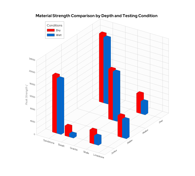
A grouped (adjacent) 3D bar chart organizes bars in clusters, with depth representing a secondary category rather than a full grid. Instead of forming a continuous matrix, bars are grouped within primary categories and then separated by a second condition in the third dimension. This format works well when comparing multiple variables across the same base category.
For example, you might compare material strength on the Z-axis across various material types on the X-axis and testing conditions on the Y-axis, such as dry vs. saturated rows. By using the Y-axis for depth, the grouping structure keeps comparisons tight and focused, equipping you to see at a glance how the “saturated” row performs relative to the “dry” row across every material type. This format is ideal when the clarity of side-by-side and front-to-back comparison is more important than spatial continuity.
Layered or stacked 3D bar chart
A layered—or stacked—3D bar chart combines composition with a third dimension. Each bar is divided into segments representing subcomponents, while the bars themselves are arranged across two categorical axes.
This format equips you to show part-to-whole relationships across multiple conditions simultaneously. For example, you might display total annual land area on the Z-axis across regions on the X-axis and years on the Y-axis, while stacking land cover types within each bar.
Because this structure adds both depth and composition, it should be used carefully, as perspective can make it difficult to judge the exact value of middle segments. When designed clearly, it is best utilized to reveal big-picture shifts in how totals and internal breakdowns move across conditions.

Best Practices for Creating Clear and Effective 3D Bar Charts
Because 3D visuals introduce another layer of depth, they also introduce another layer of complexity. That means clarity matters even more than it does in 2D charts. A well-designed 3D bar chart can reveal powerful relationships, but a cluttered one can quickly overwhelm your audience. That said, here are key principles to keep your 3D bar charts clear and effective:
- Keep the design clean and avoid overcrowding: Resist the temptation to include every possible category or variable. Too many bars competing in three dimensions can obscure patterns instead of revealing them. Simplicity strengthens interpretation.
- Limit the number of bars to maintain readability: 3D charts scale quickly in visual density. If you’re working with dozens of categories in both dimensions, consider filtering, grouping, or breaking the data into multiple visuals. Readability should always outweigh density.
- Use color intentionally to highlight patterns: Color should reinforce structure. Use consistent color schemes to distinguish variables or emphasize meaningful groupings. Avoid overly saturated or competing colors that make it harder to identify trends.
- Clearly label all three axes: In a 3D chart, orientation can sometimes be less intuitive than in 2D. Make sure each axis is clearly labeled with units where appropriate. This reduces ambiguity and prevents misinterpretation.
- Adjust viewing angles to reduce distortion: Perspective can dramatically affect how bar heights appear. Choose an angle that minimizes occlusion—the ‘hidden bar’ effect where taller foreground bars block shorter background bars—and prevents exaggerated or flattened values. The goal is accuracy, not dramatic effect.
- Highlight key insights to guide interpretation: Use annotations, subtle emphasis, or callouts to direct attention to meaningful clusters, gradients, or outliers. Since 3D visuals can contain more information, guiding the viewer’s eye becomes even more important.
Ultimately, a 3D bar chart should feel structured and intentional. When clarity leads the design process, the added dimension enhances insight instead of adding cognitive load.
Real-World Examples of 3D Bar Charts
Best practices are important, but context is what makes a chart meaningful. To understand when a 3D bar chart truly adds value, it helps to see how it functions in real geoscience workflows. Below are several common scenarios where 3D structure supports clearer interpretation.
Environmental monitoring
Environmental datasets often vary across both location and time. A 3D bar chart can compare contaminant concentrations on the Z-axis across monitoring sites on the X-axis and sampling periods on the Y-axis.
This structure makes it easier to see not just which site has the highest concentration, but how levels shift spatially and temporally. Patterns such as seasonal spikes, regional clusters, or gradual increases across multiple wells become more apparent when both dimensions are visible simultaneously.
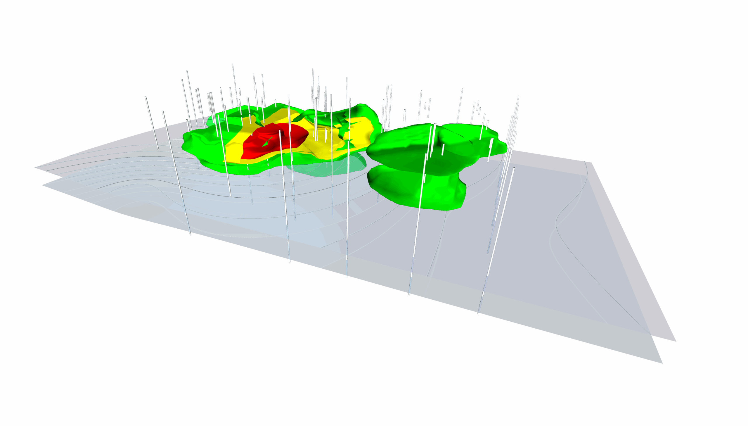
Resource exploration
In resource exploration, values often vary with drilling location and depth. A 3D bar chart can represent drillhole location along one axis, depth interval along another, and assay values as bar height.
This allows geoscientists to quickly identify subsurface patterns, such as zones of elevated concentration that repeat across multiple boreholes or depth intervals where grades increase or taper off. Instead of reviewing separate depth profiles for each location, relationships emerge in one cohesive view.
Weather and climate analysis
Weather and climate data often involve comparisons across regions and time intervals. A 3D bar chart might display regions along the X-axis, months or seasons along the Y-axis, and measured values—such as precipitation or temperature anomalies—along the Z-axis.
This setup highlights how variables shift across both geography and time. It can reveal regional gradients, seasonal cycles, or anomalies that may not stand out in a simple 2D comparison.
Engineering and operational data
Engineering workflows frequently require evaluating performance across systems and operating conditions. A 3D bar chart can show the system type on the X-axis, the scenario or input condition on the Y-axis, and the performance metric as the bar height.
This format helps teams understand how variables interact under different constraints. Instead of analyzing isolated performance values, engineers can see how efficiency, stress response, or output changes across combinations of inputs and systems.
Choosing 3D Bar Charts with Intention
A 3D bar chart is not automatically better than a 2D one. In many cases, a simple bar chart communicates comparisons more clearly and efficiently. But when your data involves two interacting categorical dimensions—and the relationship between them matters—that third dimension can reveal patterns that flat visuals simply cannot show.
The key is intentional use. When applied thoughtfully, a 3D bar chart becomes a powerful analytical tool. When added without purpose, it can introduce unnecessary complexity.
If you’re working with multi-dimensional data and want to explore how structure, depth, and interaction influence your results, experiment with 3D visualizations and evaluate whether they truly strengthen interpretation. When the format aligns with the question you’re asking, the added dimension can turn layered data into meaningful insight.
If you found this breakdown of 3D bar charts helpful and want more practical advice on designing, customizing, and using data visualizations, don’t miss an update. Subscribe to our blog, Golden Discoveries, to get the latest expert guides, design tips, and industry use cases delivered straight to your inbox!
Recent Articles
- Jun 10, 2026|Gabbie Rhodes|9 min
During peak season, it’s hard to complete high-quality work on time. Fortunately, some practical workplace productivity hacks can help.
- Jun 10, 2026|Gabbie Rhodes|5 min
When it comes to software, the right licensing model matters. A one-time fee and subscription are common options. Which is right for you?
- Jun 3, 2026|Gabbie Rhodes|9 min
What's the difference between these two 3D data visualizations: 3D View and 3D surface maps? Discover their top differentiators.
- Jun 3, 2026|Gabbie Rhodes|8 min
Hiring a skilled geoscientist or engineer is the first step to strengthening your team. The next is training new employees for success.