What Is a Bar Chart: A Quick-Start Guide to Effective Application & Design
Bar charts are one of the most effective tools for scientific communication. In geoscience and engineering workflows—where datasets are diverse, stakeholders vary in technical expertise, and decisions depend on clear interpretation—bar charts offer a level of clarity that more complex charts sometimes obscure. But to really show why bar charts are such effective visuals, we’re breaking down not only what a bar chart is, but also the benefits it brings and the best way to design one, so you use it with confidence and clarity in your own projects.
What Is a Bar Chart?
At its core, a bar chart is one of the simplest and most powerful ways to compare values across discrete categories. With this visual, each bar represents a category, and the length or height of a bar corresponds directly to its value. This makes patterns, differences, and rankings immediately visible.
Additionally, bar charts come in two common orientations:
- Vertical bar charts: These are ideal for showing changes or comparisons along a natural left-to-right progression.
- Horizontal bar charts: These excel when category names are long, numerous, or better read top-to-bottom.
What makes bar charts especially effective is their intuitiveness. Our eyes easily compare lengths, so even complex datasets become clearer when placed in a bar-based format. That accessibility is why bar charts remain a foundational tool in scientific communication.
Pro Tip
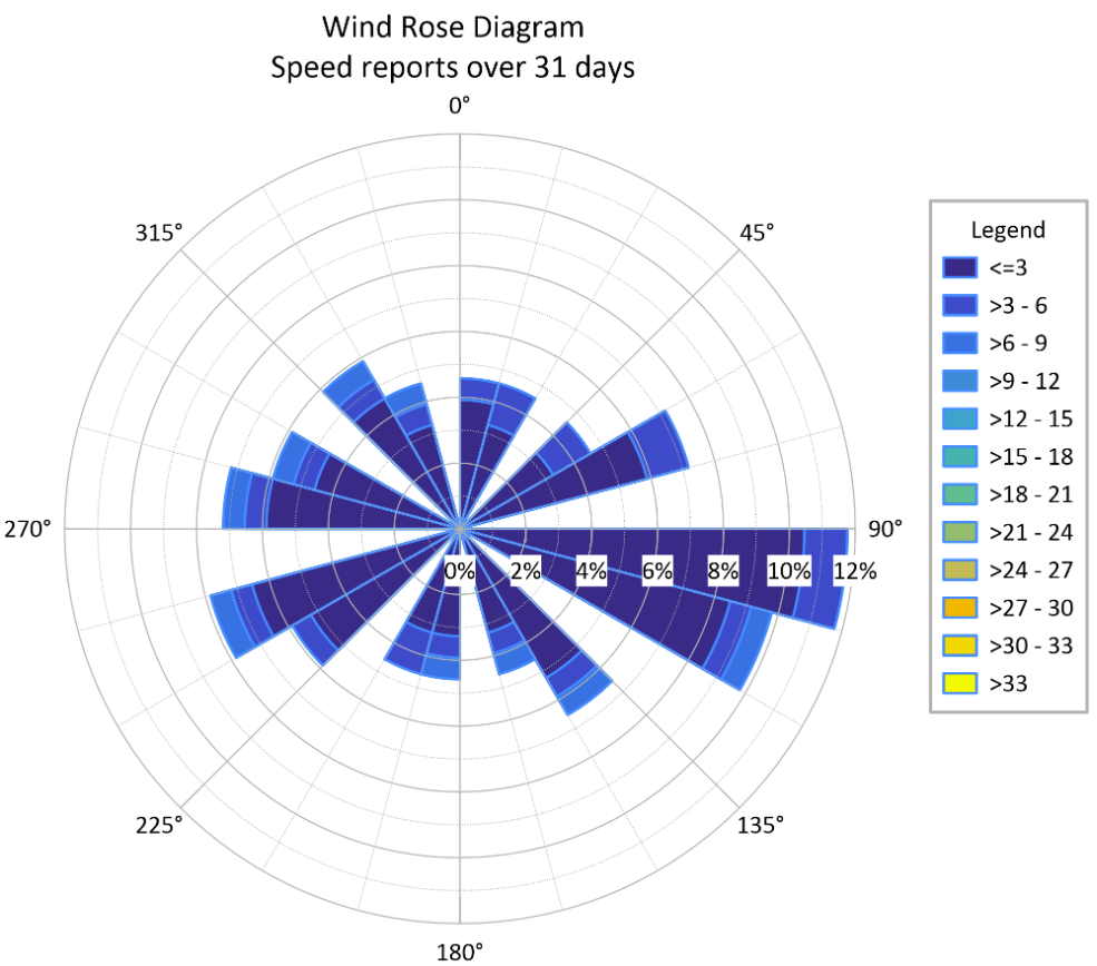
While most bar charts use a linear x and y axis, another visual worth highlighting is a polar bar chart, which plots data on a circular grid. These are excellent for showing cyclical data (like monthly rainfall) or directional data (like crop yields by field orientation). However, in geoscience, it’s important not to confuse a polar bar chart with a rose diagram.
- Polar Bar Charts represent values by the length of the bar extending from the center.
- Rose Diagrams are specialized directional histograms where the area of the “petal”—not just the length—often represents the frequency of data, such as the strike of rock fractures or wind direction.
The takeaway: use polar charts when the circular layout adds specific geographical or chronological meaning, but stick to traditional bar charts for the most accurate “at-a-glance” comparisons of magnitude.

Why Bar Charts Work Well for Categorized Data
Now that we’ve defined a bar chart, the next question is: what makes bar charts uniquely effective for categorized data? In geoscience and engineering workflows, categorized data appears constantly—whether you’re comparing sample sites, evaluating different materials, reviewing test conditions, or summarizing results from multiple scenarios. Because these categories are discrete rather than continuous, you need a visual that makes comparisons clean, direct, and unmistakable.
That’s exactly where bar charts excel. By giving each category its own clearly separated bar, they make differences in magnitude instantly visible. You don’t have to interpret curves or infer trends; the comparison is built right into the visual structure. This clarity becomes especially valuable in situations such as the following:
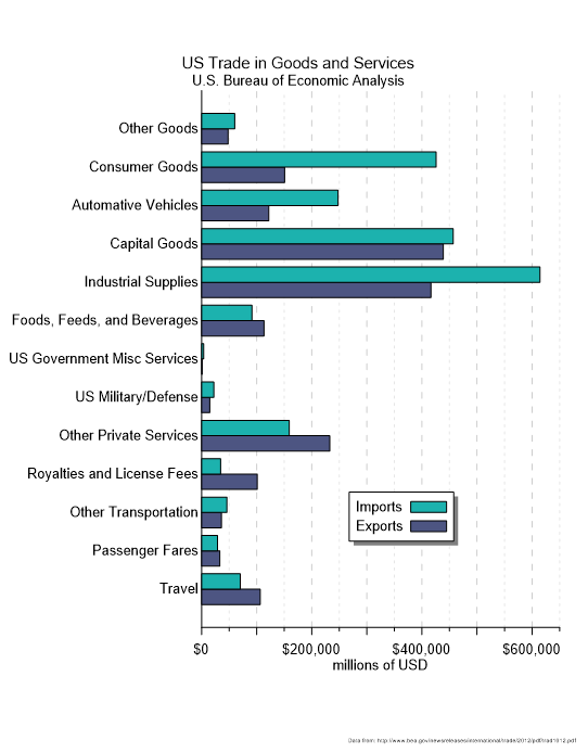
- Comparing measurements across locations, samples, or materials, like contaminant levels across wells or mineral content across drillholes.
- Summarizing results from experiments or simulations, where each scenario or parameter set forms its own category.
- Visualizing frequency counts or categorical distributions, such as soil classifications or event occurrences.
- Supporting quick comparisons in reports and presentations, where stakeholders need insight quickly.
Another key advantage is that bar charts avoid implying continuity where none exists. Unlike line charts, they don’t suggest that values flow from one category into the next. This prevents misinterpretation and ensures your stakeholders see the data accurately.
When a Bar Chart Is Better Than Other Visuals
On top of understanding the advantages of bar charts, it’s equally important to know when bar charts outperform other types of data visualizations entirely. Below are a few types of plots that are just as simple and powerful at communicating scientific data, but aren’t the best choice in certain circumstances.
Bar charts vs. line charts
Line charts imply continuity and progression. They connect points as if one value flows naturally into the next. But in some geoscience and engineering workflows, your categories aren’t continuous. Examples are sampling locations, material types, field sites, treatment conditions, and borehole IDs. Using a line chart here artificially suggests a trend where none exists. A bar chart avoids that trap by keeping each category independent and clearly labeled.
Bar charts vs scatter plots
Scatter plots are powerful for relationships, but when your goal is comparison—not correlation—they can introduce unnecessary noise. If you simply need to show that Site B has twice the concentration of Site A, or that Sample 4 produced the lowest value, a bar chart does that in a single glance. It doesn’t require axes interpretation, point clusters, or guesswork.
Bar charts vs tables
Tables are great for storing values, but they’re ineffective at communicating patterns. Your stakeholders would have to scan numbers, calculate differences mentally, and search for the highest or lowest value. Bar charts eliminate that cognitive burden by turning comparisons into immediate, visual insight. Instead of reading, calculating, and interpreting, your stakeholders can simply see the insights.
Key Design Principles for Accurate and Effective Bar Charts
While bar charts have specific purposes and benefits over other visuals, their design still matters. Strong design choices ensure your bar charts make comparisons clear, intuitive, and trustworthy. That said, here are some essential design principles that will help your bar charts communicate insight with accuracy and clarity.
1. Start axes at zero to avoid misleading comparisons
Because bar length visually represents value, starting the axis anywhere other than zero can exaggerate small differences and distort your data. A zero baseline keeps comparisons honest and easy to interpret.
2. Limit the number of categories so insights stay visible
Bar charts shine when a stakeholder can compare values quickly. Overloading your chart with too many categories makes bars thin, labels cramped, and patterns difficult to spot. A focused set of categories keeps your chart readable and the insight clear.
3. Use color purposefully, not decoratively
Color should clarify relationships, not complicate them. Consistent color choices help reinforce grouping and comparison, while avoiding unnecessary or overly vibrant palettes keeps attention on the data rather than the design.
4. Ensure labels are clear, readable, and helpful
If someone has to squint, rotate the document, or guess at a label’s meaning, your chart loses its impact. Choose straightforward category names, keep axis values legible, and position labels horizontally whenever possible; if you find yourself tilting or rotating text to make it fit, it’s usually a sign you should switch to a horizontal bar chart.
5. Remove clutter that distracts from the main message
Excessive gridlines, 3D effects, heavy borders, and ornamental design elements often obscure the point of the chart. Simplicity is your ally. A clean layout puts the focus exactly where it belongs: on the differences between the bars.
Bringing Clarity, Comparison, and Confidence Together
Bar charts remain one of the most effective tools for geoscientists and engineers because they make comparisons clear, emphasize meaningful differences between categories, and help stakeholders interpret results quickly and confidently. That’s why they deserve a spot in your workflow, especially when you’re working on a project where they’ll shine. Just make sure you design it effectively so stakeholders also experience the power and benefits of bar charts.
Want to create high-quality, professional bar charts that inform your stakeholders? Explore the ready-to-use bar chart templates in the Golden Gallery, so you don’t start from scratch and have a strong design foundation for communicating insights.