How to Know When Your Project Calls for 3D Visualization
In geoscience and engineering, there’s no one-size-fits-all approach to visualization. Sometimes, a well-made 2D map communicates your data perfectly. Other times, it only scratches the surface.
The truth is, 2D has an important place in your workflow. It’s fast, efficient, and sometimes all you need to communicate insights. But the challenge isn’t whether to use 2D; it’s knowing when you shouldn’t, so you can pivot to 3D.
Many professionals rely on 2D longer than they should, missing the opportunity to use 3D visualization where it truly shines. That’s why this blog is exploring when 3D adds real value, how to recognize those moments in your projects, and why using it at the right time can make you more effective in your work.
When 2D Performs & Fails
Before diving into 3D, let’s start with when you should use 2D.
In many cases, 2D is the simplest and most effective choice. When you’re visualizing a single variable—like elevation, temperature, or concentration—across a relatively uniform surface, a contour or heat map often gives you all the clarity you need. It’s fast to produce, easy to interpret, and ideal for quick comparisons or report-ready visuals.
2D also shines when your goal is straightforward communication. If stakeholders only need to see trends at a glance, or if spatial depth doesn’t meaningfully change the interpretation, 2D keeps the message clear without adding unnecessary complexity.
That said, the limitations of 2D become clear once projects move beyond the surface. When your data starts spanning multiple layers or complex subsurface features, 2D maps can flatten critical context, making it harder to fully understand what’s really happening. And that’s where 3D starts to make all the difference.
Signs It’s Time to Move From 2D to 3D
When depth, interaction, or scale become important, 3D visualization will make the complex information significantly clearer than a 2D map. But to help you recognize when those moments arrive, here are five signs it’s time to move beyond 2D and start visualizing your data in 3D.
Sign #1: You’re Working With the Subsurface
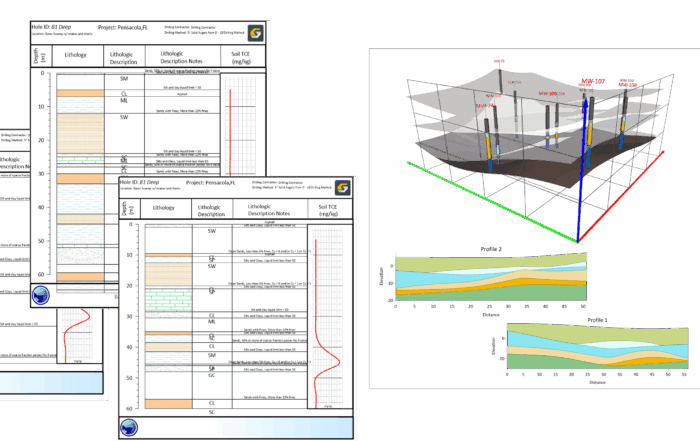
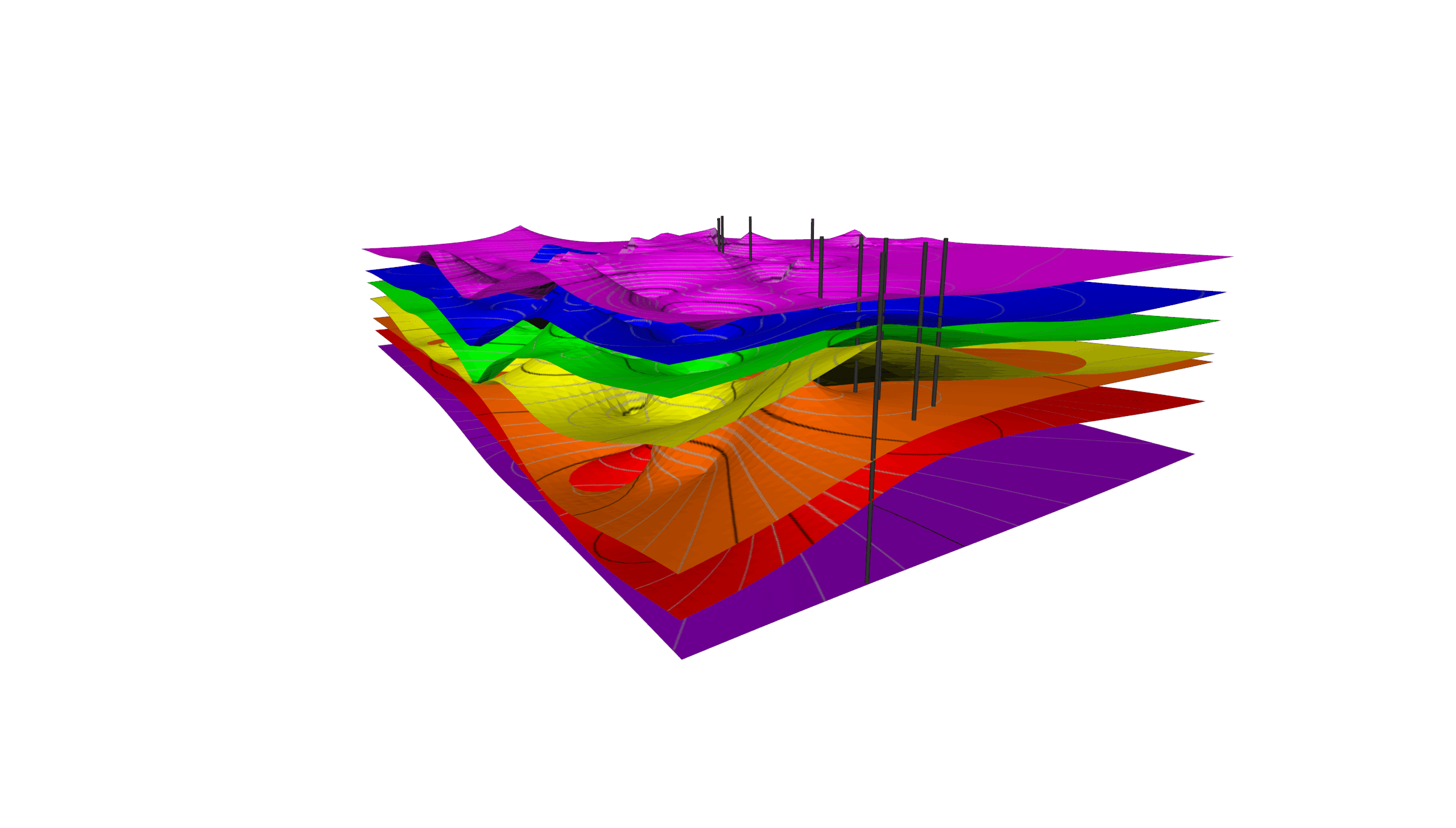
Whenever your project extends below the surface—whether you’re mapping contamination plumes, tracking groundwater flow, or characterizing ore bodies—2D cross sections can only take you so far. Each view shows part of the story, but not how layers or features connect across space.
For example, imagine trying to trace a contaminant plume through multiple cross sections. You might be able to guess its shape or direction, but without 3D, you’re essentially piecing together a puzzle one slice at a time. A 3D model, however, lets you see the plume’s true geometry, including its volume, spread, and relation to wells or structure, so you can interpret and act with confidence.
Sign #2: Multiple Datasets Need To Be Interpreted Together
Many projects require bringing together different datasets like drillholes, geophysical grids, and modeled surfaces. With 2D, you can communicate these insights by creating separate maps or trying to put everything onto a single map, but both options produce unnecessary complexity.
Take, for example, a mining project where drillhole data, magnetic surveys, and surface mapping all overlap. In 2D, you might overlay these datasets or separate them onto their own maps, but relationships between depth, grade, and structure would become complicated and unclear or disjointed. With 3D, those same datasets could come together in a cohesive model, revealing patterns—like a mineralized zone’s true extent—that are impossible to easily detect otherwise.
Sign #3: You’re Making or Supporting High-Impact Decisions
When your project outcomes influence cost, safety, or environmental risk, visual clarity becomes non-negotiable. Fortunately, 3D provides it so you can reduce uncertainty. For instance, if an environmental consultant is siting new monitoring wells, 3D visualization helps confirm that proposed locations intersect the plume’s flow path, not its edge. That clarity minimizes guesswork, supports better recommendations, and helps stakeholders make faster, more confident decisions.
Sign #4: You Need To Communicate Findings to Non-Technical Audiences
Even the most detailed report can fall flat if your audience can’t visualize what you’re describing. Whether you’re presenting to regulators, clients, or community stakeholders, 3D helps bridge the gap between technical data and intuitive understanding.
For example, instead of explaining a remediation plan using a stack of cross sections, imagine showing a 3D model where the plume, wells, and infrastructure are all spatially visible. In that scenario, stakeholders can immediately see what’s happening and why it matters, reducing explanation time and increasing buy-in.
Sign #5: You’re Iterating, Updating, or Testing Scenarios
Environmental and engineering projects evolve constantly as new data comes in. With 2D, incorporating updates can mean recreating multiple maps or redrawing cross sections just to see how conditions have changed.
With 3D, updates happen in context. Say you add new borehole data to your model. Suddenly, you can visualize how the plume boundary shifts, how the groundwater gradient changes, or how structural interpretations evolve. That adaptability keeps your project agile and your insights accurate.
The Hallmark of Great Geoscience and Engineering
Strategic 3D visualization use demonstrates mastery of your craft. It shows you know when a 2D map is sufficient and when your data demands more depth. That’s why you should consider using 3D when the opportunity arises. It’ll help you communicate complex insights effectively but also ensure stakeholders clearly see and understand your data, leading to stronger, more informed decision-making. And that’s the hallmark of great geoscience and engineering work: visualizations that don’t just display information but also drive real-world results.
Want more tips to enhance your data visualizations to sharpen your craft and impress stakeholders? Subscribe to the blog now!