An Inside Look at How We Incorporate Your Feedback to Continuously Improve Our Products
Most companies ask for customer feedback, but how often do you actually see that feedback put into action? In some cases, it’s not often.
At Golden Software, we do things a little differently. Being customer centric isn’t just a buzzword for us—it’s one of our core values. That means we don’t just collect suggestions and comments from you; we act on them.
Whether you’re sharing a feature idea, offering ways to enhance an existing tool, or flagging something that’s not quite working, your feedback doesn’t disappear into a void. It’s reviewed, discussed, prioritized, and used to shape what comes next. But instead of just saying that we have a commitment to utilizing your customer feedback, we’re pulling back the curtain to show exactly how our process works and giving real examples of improvements that were inspired by amazing users like you.
Where Feedback Starts: Conversations That Drive Change
We cast a wide net when it comes to gathering customer feedback—but the most valuable insights often come from the most direct sources. While we occasionally collect input through customer review sites, Net Promoter Score (NPS) surveys, and other questionnaires, the majority of our feedback comes from one-on-one interactions. Every time you reach out via phone or email—whether you’re asking, “Can Surfer or Grapher do this?” or “I’m trying to get this feature to work and can’t find the option”—you’re giving us insight into how you use our software and where we can make it better.
We also hear from you when something doesn’t go as expected, like a crash or bug. These reports are more than support tickets; they’re real-world use cases that help us understand your pain points and identify opportunities for improvement.
Beyond support conversations, our team also chats with customers like you through ongoing discovery and usability interviews. Members of our product team regularly schedule face-to-face video chats to better understand your workflow and uncover ideas for new features or process improvements. Our customer support team also helps, as they’re not just on the frontlines—they’re your internal champions. They continuously advocate for product enhancements based on what they hear day in and day out from you, and this feedback loop helps ensure your voice is present throughout every stage of our development process.
We don’t let your feedback sit in a queue either. We review and organize customer input as it comes in—whether it’s a quick email, a detailed support ticket, or a suggestion during a video call. Our goal is to always understand what you’re experiencing in real time, not just at the beginning or end of a quarter or at a strategy meeting.
How We Decide What to Tackle Next: Turning Feedback into Action
Once we’ve gathered your feedback, the next step is prioritizing it. This is where our product team takes the reins. If a particular issue or request repeatedly shows up in emails, support tickets, or calls, it naturally rises to the top of their list. But they don’t just consider the number of times something is mentioned; they also look at your workflow, pain points, and the potential impact a new feature or fix might have. That means, even if a feature hasn’t been widely requested, it can still become a priority if they know it’ll solve a problem and have a big impact.
Take the SRF file thumbnails feature, for example. Only a handful of users requested it, but the product team thought it would dramatically improve the product experience based on what they had learned about users’ workflow—and it did. Now, you no longer have to double click on every Surfer file to open it and see if it’s the one you want. Surfer files can display a thumbnail preview of their contents in File Explorer, making it much easier for you to locate the file you need without opening them one by one. This simple addition was a major hit when it was released.
All in all, prioritization is a careful blend of user demand, what our product team has learned about your workflow and pain points, and the potential impact an improvement will have. Our product team considers questions like: How many people have requested it? How will it enhance customers’ workflow? How many users will create better visualizations? Then, they use their answers to deliver useful and meaningful product updates.
Feature Requests That Became Real Improvements
Now, what are some actual examples that can show the improvements our team has made based on gathering and prioritizing your feedback? We can look at Surfer and Grapher to answer that question. Below are just a few standout examples of how input from users like you has shaped the evolution of both products.
Surfer: Turning Suggestions into Smarter, Smoother Mapping
1. Google Maps in XYZ Tiles List
One of the most common requests we received was for better map imagery. Users wanted a server that provided high-quality, up-to-date, and reliable imagery with global coverage. So we brought Google Maps imagery directly into Surfer’s XYZ Tiles List—offering the level of detail and timeliness that only Google can currently provide.
2. Drillholes in 3D
This was a big one. For a long time, Surfer users wanted to view drillhole data in true 3D—not just the pseudo-3D representation available in the 2D plot window. Eventually, we made it happen. Now, you can visualize your drillhole data within a real 3D environment. If you’re a geoscientist, this feature brings an entirely new level of insight to subsurface modeling.
3. Open Multiple Files at Once
It might sound small, but this improvement made a big impact. Opening project files one at a time was frustrating—especially if you were juggling several datasets. After hearing this from customers, we introduced multi-file loading. Now, you can select and open all your needed files in a single click, saving time and a few extra steps.
4. 3D View PDF Export
3D modeling is one of Surfer’s biggest benefits—but sharing models wasn’t always easy. That changed with the launch of the 3D PDF export feature. Thanks to user demand, you can now export interactive 3D PDFs of your models, helping clients and stakeholders see your work in a much more dynamic and intuitive way.
5. Co-Kriging
This was a major need from our interpolation power users. After multiple requests and some careful implementation, co-kriging is now built into Surfer—and already making a big difference for those who rely on it. This gridding method opens the door to multi-variable interpolation, allowing for more refined and accurate models.
Grapher: Customer-Driven Visualization Advancements
1. Piper Plots
When we looked at the most upvoted feature requests for Grapher, one stood out above the rest: Piper plots. This specialized chart type is essential in fields like hydrogeology, and customers were clear: they needed it. So we made it happen. It’s now part of Grapher’s ever-growing visualization toolbox.
2. Flexible Data Filtering
Some users wanted more control when working with large or complex datasets, so we added advanced filtering tools. Now, Grapher supports comparisons like multiple inclusion or exclusion criteria using any columns in the data file, equipping you to isolate the exact data you want to visualize, all without editing the underlying files.
3. Grouped Box Plots
This improvement came out of a combination of direct user feedback, customer-related research, and usability sessions. With grouped box plots, you now have a more nuanced way to display comparative data without restructuring your data—an enhancement that’s both powerful and elegant.
4. Stacked/Adjacent Option for Histograms
Grapher users wanted the same control over histograms that they had with bar charts—specifically, the ability to create a histogram with stacked data to represent different groups. After discovering this, we made the necessary updates. Now, with this improvement, you can create histograms that clearly differentiate between multiple groups by stacking or aligning them side by side, making your data comparisons more flexible and visually effective.
5. Golden Gallery
While we didn’t get a flood of direct requests for a template library, we received feedback about how hard it was to get started in Grapher. That inspired us to create the Golden Gallery—a growing collection of clear, polished, and scientific templates designed to accelerate and simplify your workflow. It’s currently available in Grapher Beta, but it’s already proving to be a game-changer.
Your Voice, Our Roadmap
Our team doesn’t just develop software—we build it alongside you. Continual feedback from you is more than a collection of ideas and requests; it’s the foundation of how we evolve our products and support your work.
From small tweaks to game-changing features, many of the improvements you see in Surfer and Grapher exist because you spoke up. Whether you reached out with a suggestion, described a challenge, or participated in a discovery interview, you played a role in shaping tools that better serve the geoscience community.
Are you a Grapher or Surfer user and have feedback to help shape the product you use regularly in your workflow? Click HERE to join an elite group of scientists and engineers who can directly share their expertise with our product management team!
Recent Articles
- May 5, 2026|Gabbie Rhodes|9 min
Geoscience and engineering projects rarely live inside a single software. Learn how CAD integration with other tools can achieve project results.
- Apr 29, 2026|Gabbie Rhodes|10 min
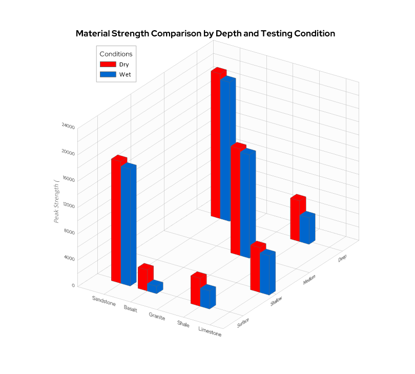
When you’re working with three variables that interact with one another—a 3D bar chart can reveal patterns that a flat chart can’t fully capture.
- Apr 23, 2026|Gabbie Rhodes|16 min
The strongest candidates are often in high demand. But with the right approach, you can attract and recruit top talent to build a stronger team.
- Apr 23, 2026|Gabbie Rhodes|9 min
Even accurate data can fall short if time is displayed poorly. That’s why thoughtful time formatting is essential for your data visualization.


