How to Make a Bar Chart That Informs & Impresses: Customizations That Work
Bar charts are one of the most familiar tools in data visualization. They’re straightforward, recognizable, and effective at comparing categories. But if you’re wondering how to make a bar chart that truly informs and impresses, it takes more than simply populating it with your data and accepting the default settings.
The difference lies in customization. Thoughtful adjustments can highlight what matters most, clarify meaningful differences, and guide stakeholders toward a clear conclusion that leads to informed decision-making. But which tweaks actually make a measurable impact? This blog serves as a roadmap for moving from standard to standout, so your bar charts don’t just display data, but communicate it with precision and professionalism.
Common Bar Charts You Can Customize
Before adjusting your bar chart, customization begins with something more fundamental: choosing the right visual for your data. The type of bar chart you select will determine how your audience interprets information and which customizations will help ensure your visual informs and impresses stakeholders. That said, here are the most common types of bar charts and when to use them.
Vertical bar charts
This is the classic format and often the go-to for time-based data. When you’re showing changes across months, quarters, or years, vertical bars follow a natural left-to-right progression. They make trends over discrete time intervals easy to scan and compare.
Horizontal bar charts
Horizontal bar charts are ideal when your category labels are long or when you’re ranking items. If you’re comparing site names, sample IDs, or regulatory categories that don’t fit neatly along a horizontal axis, flipping the chart improves readability immediately. It also works especially well when your goal is to emphasize ranking from highest to lowest.
Grouped bar charts
Grouped bar charts let you compare multiple adjacent variables within the same category. For example, if you’re evaluating Lead and Copper concentrations across three sites, placing those variables side by side within each site makes the comparison clear. This structure is especially useful when the relationship between variables matters just as much as the values themselves.
Stacked bar charts
Stacked bar charts are best when totals matter. They empower you to show how individual components contribute to a whole, such as contaminant fractions within a total concentration or material types within a full sample depth. This structure helps viewers see both magnitude and composition at the same time.
Customizations You Can Make
Once you’ve identified the right bar chart for your data, the next step is where your visual begins to separate itself from the default: intentional customization. Let’s walk through some of the main adjustments you can make to your bar chart to inform and impress stakeholders.
Color coding with intent
Color shouldn’t be decorative but directional. In other words, it should guide your stakeholders’ attention to what matters most.
A simple but highly effective approach is to use one neutral color (such as grey or a light blue) for most of your bars, and then apply a bold highlight color (like orange or red) to the specific data point you want stakeholders to notice. This technique immediately answers the question: What should I focus on? Instead of forcing your audience to compare every bar equally, you’re clearly signaling the key takeaway.
Beyond highlighting, it’s also important to match your color strategy to the type of data you’re presenting. A couple of things to consider are the following:
- Sequential color schemes use varying shades of a single color to represent intensity or magnitude. For example, a darker blue might represent deeper wells or higher concentrations, while a lighter blue indicates shallower depths or lower volumes. This approach works well when your data progresses along a spectrum, as the change in saturation naturally mirrors the change in value.
- Categorical color schemes assign distinctly different colors to separate groups. For instance, green might represent “Passed” samples, while red indicates “Failed.” This approach is ideal when you’re distinguishing between discrete classifications rather than degrees of intensity.
Finally, accessibility should always be part of your customization strategy. It’s estimated there are around 300 million people with color blindness, so using colorblind-safe palettes—such as Viridis—will ensure your chart remains readable for all viewers.
Adjusting bar width to add meaning
Color isn’t the only way to ensure your bar chart is informative and impressive to stakeholders. Another powerful customization is adjusting the width of your bars.
Most bar charts use uniform bar widths by default. Every category gets the same visual weight, regardless of what the data represents. In many cases, that works fine. But when your dataset includes an additional dimension—like duration, sample size, area, or volume—you can go a step further.
Instead of keeping bar widths consistent, you can create variable-width bar charts, where the width of each bar dynamically adjusts based on specific values in your data. Rather than being purely aesthetic, the width becomes informative. By defining bar width using axis units, you can visually encode another layer of meaning into your chart.
For example, maybe you’re comparing contaminant concentrations across multiple sites. The bar height could represent concentration, while the width reflects the size of the site or the number of samples collected. In a single visual, stakeholders can now understand magnitude and scale simultaneously.
This approach is especially useful when you want to communicate proportional impact. A tall, narrow bar sends a different message than a tall, wide bar. By customizing the width intentionally, you prevent viewers from assuming that each category carries equal weight.

Pro Tip
While variable-width bars add meaning, they should be used with caution, given how the human brain processes visual information. If the result of a bar’s height and width creates a third meaningful metric—such as concentration multiplied by volume equaling total mass—it can be tempting to ask viewers to compare the resulting area of those bars. However, the human eye is significantly better at comparing one-dimensional lengths than it is at accurately judging two-dimensional areas.
If your stakeholders need to compare a total amount represented by the area of the bars, it is often more effective to create a separate and standard bar chart for that specific metric. You should reserve variable widths for instances where the height and width are meant to be interpreted as two independent and non-multiplicative insights.
Enhance clarity with data labels and gridlines
The next customization focuses on clarity at the most granular level: how easily someone can read your values. There are a few different adjustments you can make here.
1. Direct labeling
One of the simplest ways to improve clarity is to place the exact value directly on the bar itself. Instead of forcing stakeholders to glance back and forth between the top of the bar and the y-axis, you can label the bar with the precise number, such as 45.2 mg/L.
This small adjustment reduces cognitive effort. Stakeholders don’t have to estimate where the bar meets a gridline or interpret axis intervals. The information is right where their eyes are already focused. In technical settings, where precision matters, direct labeling reinforces both accuracy and confidence.
2. Cleaning the clutter
Once you introduce data labels, you often don’t need heavy gridlines anymore. In fact, removing or softening gridlines can make your bar chart look cleaner and more modern.
Gridlines are helpful when your audience must estimate values. But if the values are clearly labeled, those horizontal lines can become visual noise. By simplifying the background, you keep attention on the data itself rather than on unnecessary structural elements.
3. Sorting for impact
Clarity also comes from order. In most cases, you should sort bars by magnitude—typically from highest to lowest—to immediately showcase the “highs” and “lows” without requiring extra explanation. This intentional ordering ensures the largest values anchor one side of the chart while the pattern reveals itself at a glance.
However, you should break this rule if your categories have an inherent, underlying sequence. For example, if your data is chronological, the bars must follow the timeline to show progression. Similarly, if you are presenting spatial or stratigraphic data, such as soil samples taken at increasing depths or monitoring stations along a downstream flow, you should maintain that logical physical order. In these cases, the insights are available in the sequence; sorting by magnitude would actually destroy the context your stakeholders need to interpret the results.

Add context with error bars and benchmarks
Up to this point, the customizations we’ve discussed improve structure and clarity. But if you want your bar chart to truly inform and earn credibility, adding context is essential. Here are a few tips you can consider.
1. Add error bars to show rigor
For geoscientists and engineers, precision matters. A single value rarely tells the whole story. By adding error bars—to represent standard deviation, uncertainty, or confidence intervals—you signal that your data is grounded in rigorous analysis rather than presented as an absolute.
Error bars act as a built-in “safety margin.” They communicate variability and help stakeholders understand the range behind the number. In many technical settings, this level of transparency is what elevates a chart from visually appealing to scientifically trustworthy.
If your goal is to impress a technical audience, showing uncertainty clearly is far more compelling than any decorative formatting.

2. Include a benchmark or goal line
Another powerful customization is the addition of a horizontal benchmark line, such as a regulatory limit, internal goal, or performance threshold. Instead of making stakeholders compare values mentally, a benchmark line makes the insights immediate. Your audience can instantly see which bars cross the line and which fall below it. In compliance reporting, environmental monitoring, or performance tracking, this simple addition can transform your chart from descriptive to decision-oriented.

3. Use transparency for overlapping comparisons
When comparing two related datasets—such as Actual vs. Target—you may need to show overlapping bars. In these cases, adjusting the transparency of each bar equips viewers to see both values clearly without one completely hiding the other. This technique maintains clarity while preserving visual comparison. Rather than splitting the data into separate charts, you keep the relationship intact in a single, readable view.

From Basic to Memorable
If you’re wondering how to make a bar chart that truly informs and impresses, the answer is intention. Impressive charts are structured thoughtfully, sorted strategically, colored with purpose, and supported by clear labels and meaningful context.
When you want your bar chart to stand out, go beyond the default options. Add customizations that help you communicate your data more effectively. By leveling up your visuals, you’ll not only inform stakeholders but leave a professional impression that lasts long after a meeting ends.
Want more tips for creating visuals that are clear and memorable? Subscribe to our blog so you never miss an update!
Recent Articles
- Jul 15, 2026|Gabbie Rhodes|4 min
Technology has advanced, and now, Surfer has taken the lead over Voxler. Learn how to convert your Voxler file to a Surfer file to get better results.
- Jul 15, 2026|Gabbie Rhodes|12 min
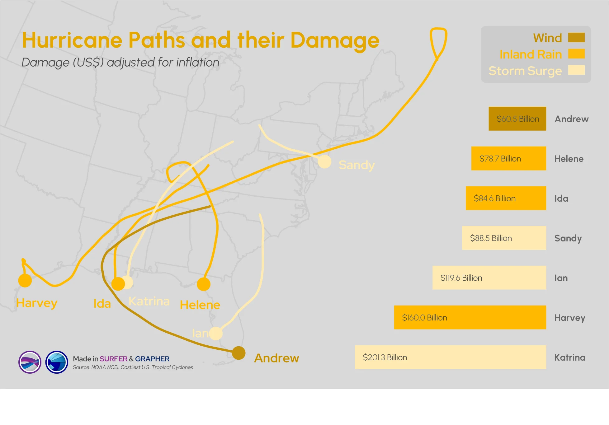
Answering this question isn't easy: what damage can a hurricane cause? Multiple factors come into play, but maps and graphs can provide insight.
- Jul 8, 2026|Gabbie Rhodes|14 min
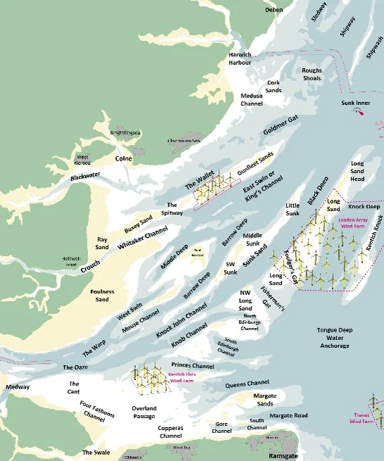
Roger creates passage and tide tables that help mariners understand when and how they can move through the Thames Estuary’s swatchways.
- Jul 8, 2026|Gabbie Rhodes|10 min
Effective data communication is about making your maps and models easy to understand, and there are ways to achieve that goal. Discover the tips!