How Geoscientists Can Clearly Communicate Insights from Their 3D Data Visualization
3D data visualization has transformed the way geoscientists and engineers interpret and explain complex information. This format showcases depth and spatial relationships that would otherwise be difficult—if not impossible—to understand in 2D. But while 3D models can reveal underground features, surface and subsurface connections, and complex spatial relationships, there are still two elements that can take 3D data visualizations to the next level: motion and interactivity.
Humans don’t just understand space visually. They understand it through motion and interaction. People walk around objects to understand their shape, tilt their heads to gauge depth, and shift their perspective to see how features relate. That’s why adding motion and interactivity to your 3D data visualizations is key to making them even more intuitive and impactful for stakeholders.
Why Complex Geoscience Data Often Needs Movement to Be Understood
What does it mean to add motion and interactivity to your 3D data visualization? It means providing the opportunity to move, rotate, zoom, engage with, or shift perspectives so stakeholders can infer depth, scale, and spatial relationships even more than before.
Geoscience and engineering data are inherently dynamic. Subsurface layers dip and fold. Plumes migrate. Geological contacts intersect in ways that only make sense when seen from multiple angles. A static view can’t capture all of that effectively, which is why motion and interactivity are indispensable.
Motion equips stakeholders to explore depth in a natural way. Rotating a 3D model, for example, exposes features that would otherwise stay hidden behind surfaces. Zooming in and out helps grasp true scale, especially in datasets where dimensions span hundreds of meters vertically and horizontally. And navigating through 3D visualizations gives stakeholders the same perspective they would experience in the real world.
Interactivity also reduces the need for lengthy explanations. For instance, instead of describing the concentration levels of a plume, you can let the visualization do the communicating. When stakeholders can manipulate the 3D model themselves—by turning layers on and off—they can understand the situation faster and more intuitively, and that leads to clearer discussions and better decisions.
Ways to Incorporate Motion and Interactivity Into 3D Data Visualizations
Bringing motion and interactivity into your 3D data visualizations doesn’t require overhauling your workflow; it simply requires incorporating tools that let your visualizations behave more like real environments. Below are some of the most effective ways to add movement and interactivity to deepen understanding among your stakeholders.
Walking on 3D Model: Helping Viewers Explore the Data Themselves
Walking on a 3D model gives stakeholders the opportunity to navigate your insights at their own pace, moving through results as if they were walking across the project area. This freedom to explore equips stakeholders to focus on the areas most relevant to them—whether that’s a potential drilling location, a suspected contamination zone, or a region of structural complexity. Instead of relying solely on your chosen viewpoints, stakeholders can inspect the project area from angles that help them build their own understanding. As a result, they’re more likely to grasp subtle relationships, like how a proposed site sits relative to slopes or drainage.
Fly-Throughs: Showing the Big Picture First
Fly-throughs are an excellent way to set the stage. By providing a pre-recorded tour of your 3D model, fly-throughs can establish spatial context early. This can help stakeholders understand where key features sit relative to each other—like watershed boundaries, elevation changes, infrastructure locations, or regional geological patterns—before the conversation shifts into more granular analysis.
Also, because fly-throughs are pre-recorded, they offer a structured narrative that gently leads stakeholders through the insights you want to share. They prevent information overload by introducing complexity in a gradual, intentional way. Instead of overwhelming stakeholders with a model they must explore on their own, fly-throughs equip you to curate the experience, ensuring everyone receives the same clear orientation before deeper discussion begins.
Video: Making Complex Insights Easy to Share
Videos are one of the most accessible formats for communicating 3D insights, especially when sharing results with audiences who may not have the software or technical background needed to explore a model interactively. A well-made video equips stakeholders to absorb the information without navigating any tools themselves, removing barriers and ensuring consistent understanding across the group.
Repeatability is another major advantage. Unlike a live demonstration, a video can be replayed, paused, and reviewed as many times as needed—whether during internal discussions, stakeholder meetings, or regulatory reviews. This makes videos incredibly powerful for communicating complex insights.
Tech Tip: If you want to create videos to showcase your 3D models, the good news is that it’s not a difficult task. With a couple of clicks in Surfer Beta, you can record videos in the 3D View and export them to an MP4 to share them with stakeholders. Not sure if you have access to Surfer Beta? Check out this article to find out: What is Surfer Beta and how can I participate?
Animations: Revealing Patterns Over Space and Time
Animations help show progression, movement, or relationships as they unfold. Whether you’re visualizing plume migration, changes in groundwater elevation, or the evolution of terrain, motion reveals trends that would otherwise remain hidden. The key advantage of animations is that they control the pace of information delivery. Smooth transitions highlight what’s changing—and what isn’t—helping your stakeholders detect relationships that could be missed when comparing individual snapshots.
Exporting to 3D PDF: Giving Stakeholders Lightweight, Click-and-Explore Interactivity
Exporting your model to a 3D PDF will lead to an intuitive file that anyone with Adobe Reader can open, explore, and use to understand key insights. With a 3D PDF, stakeholders can rotate, zoom, and pan the model. Most importantly, they can toggle layers on and off, a powerful way to help them focus on the insights that matter most. For example, a regulator reviewing a remediation plan may want to isolate the plume layer, then add stratigraphy, then add monitoring wells to understand spatial relationships step by step.
Best Practices for Using Motion and Interactivity Effectively
Even if you add motion and interactivity to your 3D data visualization, you need to do it well for it to be effective. Thoughtful design ensures stakeholders quickly grasp insights instead of getting lost in movement or overwhelmed by details. That said, here are three key best practices to ensure your 3D models are clear as you add motion and interactivity.
Keep motion intentional and purposeful
Every rotation, zoom, or camera path should serve a purpose. Ask yourself: What insight does this movement reveal that a static view cannot? If the motion doesn’t help clarify a relationship, show a transition, or draw attention to something important, it’s most likely unnecessary. Only purpose-driven movement is recommended.
Control pacing so viewers can follow the story
Even the best visuals lose impact when they move too quickly. Slow, deliberate pacing allows stakeholders to absorb details, understand spatial context, and connect what they’re seeing to what you’re explaining. Whether you’re creating a fly-through or animating a plume boundary over time, err on the side of clarity over speed.
Avoid unnecessary complexity that distracts from the message
Too much movement, too many layers, or overly dramatic transitions can work against you. If stakeholders are dazzled by the animation but unclear about the insight, the visualization has failed its purpose. Keep the interactivity simple wherever possible and reserve motion for the moments that truly elevate understanding.
Helping Your 3D Data Visualizations Speak for Themselves
By adding motion and interactivity—whether through walking on a 3D model, fly-throughs, animations, videos, or 3D PDFs—you give stakeholders the opportunity to experience your data rather than simply view it. That shift transforms complex geologic structures, subsurface features, and spatial relationships into something intuitive, memorable, and far easier to act on.
But ultimately, the goal shouldn’t be to create movement for movement’s sake. You need to ensure you’re following best practices so your model is clear. Take intentional and thoughtful steps to highlight the insights that matter most. When motion and interactivity is used purposefully, your 3D visualizations become powerful communication tools that build understanding, empowering better decisions among stakeholders.
Ready to take your 3D communication to the next level? Explore how motion tools in Surfer can help you present your work with more clarity, impact, and confidence. You can try Surfer free for 14 days and experience firsthand how dynamic 3D visualization transforms understanding.
Was this helpful?
Share This Article:
Leave A Comment
Recent Articles
- Mar 25, 2026|Gabbie Rhodes|10 min
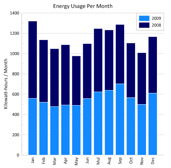
Stacked bar charts are one of those visuals that everyone recognizes but doesn’t always use to their full potential. Discover how to use it effectively.
- Mar 25, 2026|Gabbie Rhodes|11 min
One of the most common choices in scientific data visualization is deciding between a log scale vs. linear scale. Here's how to choose wisely.
- Mar 20, 2026|Gabbie Rhodes|6 min
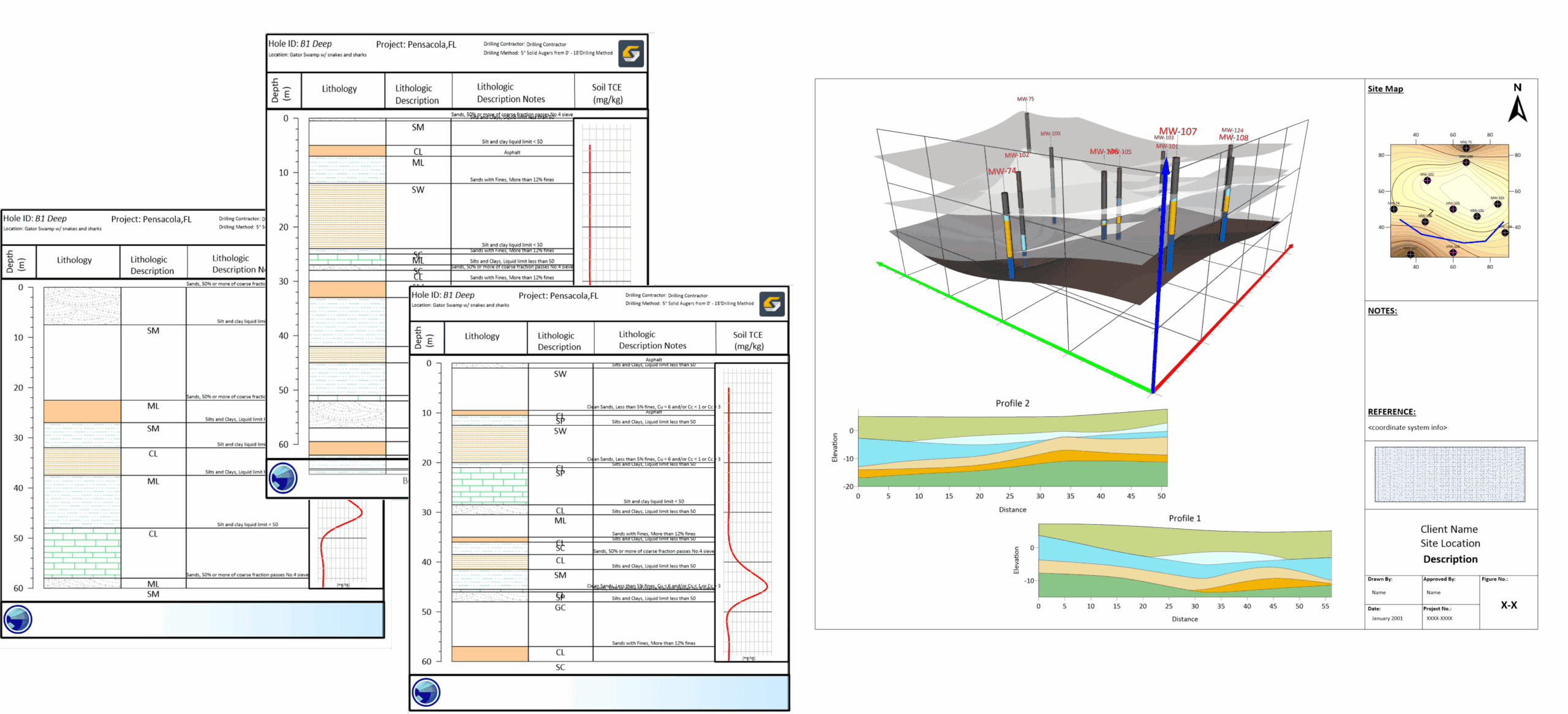
In a recent webinar, Drew Dudley showed how to transform raw borehole data into polished 2D borehole logs and 3D models.
- Mar 20, 2026|Gabbie Rhodes|9 min
Behind many landmark discoveries are historical women in geosciences. Discover the women who helped lay the groundwork for modern research.