“If It Ain’t Broke, Don’t Fix It”—Or Should You? A Case for Using 3D Visualizations
You’ve probably heard the saying, “If it ain’t broke, don’t fix it.” This 20th-century adage warns against changing things that already work well. It’s solid advice—until you realize that sticking with the status quo might be costing you time and efficiency.
Organizations that lean into continuous improvement see a 10% to 30% boost in efficiency, a significant jump in productivity that injects more room in your day for strategic thinking and problem-solving. But what’s the first thing you should change to kickstart this efficiency boost? Our advice: incorporate immersive 3D visualizations into your workflow.
The Time-Saving Tool You Didn’t Know You Needed
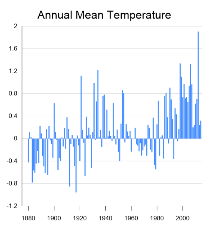
When presenting data to stakeholders, clarity is key. You can provide this with tried-and-true 2D visuals, but let’s be honest: sometimes, they just don’t cut it, especially if you’re trying to illustrate complex data. Enter 3D models, which often deliver a faster and more comprehensive understanding.
With high-quality 3D visualizations, you can simplify complex data into clear, actionable insights, reducing the need for lengthy explanations and back-and-forth clarifications. At a practical level, here’s the transformation you can expect with 3D models in your workflow (at least, when using Surfer’s 3D tools):
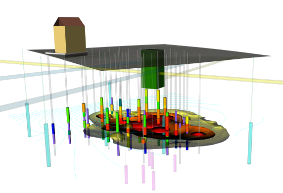
- Detailed View of Subsurface Geology: Want to show off what’s happening underground? Design 3D drillholes to reveal your subsurface’s lithology or geological properties. It’s like providing stakeholders X-ray vision to see through the strata.
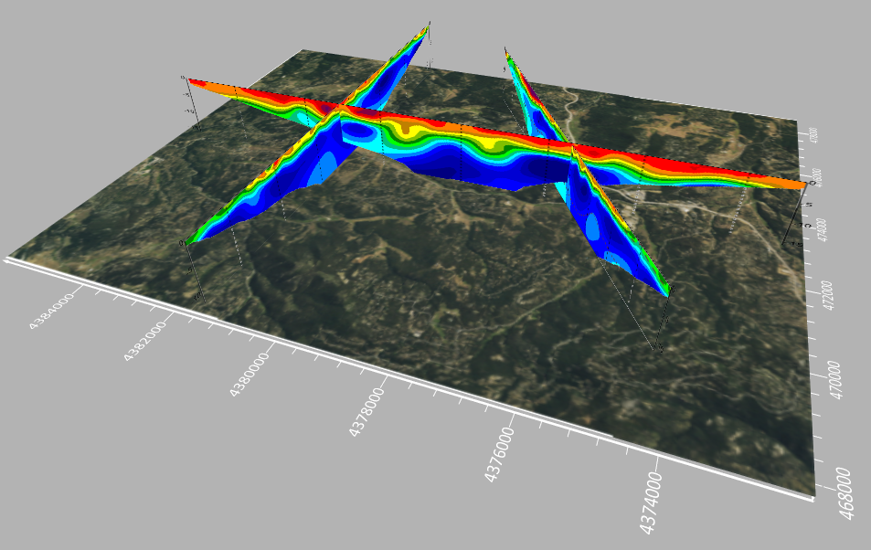
- Comprehensive Geophysical Data: Give decision-makers a thorough understanding of what’s happening above and below ground, so there’s no confusion. All it takes are a few steps and voilà! You’ve got a clear, attractive snapshot showing your geophysical profile data in true 3D space.
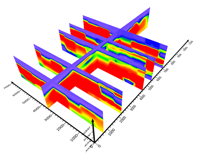
- Clear View of Data Depth: Create and slice 3D grids to illustrate the depth of your data. It’s a straightforward way to convey complex information.
- Interactive Data Exploration: Export your 3D model as a VRML or 3D PDF file, then spin it, twist it, and turn it during stakeholder discussions. They’ll get a complete view of your project from every angle.
- Immersive Data Experience: Sometimes, people need to see it to believe it. Build a flight path over your 3D map or create a walkable surface on your 3D model. Let stakeholders “walk the talk” with your data, literally bringing them inside the information.
In the end, 3D visualizations don’t just tell a story—they show it, loud and clear. That means you can spend less time explaining and more time making decisions that move projects forward.
Better Visuals, Better Results
Steve Boynton, Owner and Operator of Subsurface Environmental Solutions, knows the impact of 3D visualizations. After a significant jet fuel release at Pease International Airport in New Hampshire, Steve was tasked with determining the remaining fuel levels in the ground so that the Department of Defense could decide if ongoing remediation was necessary.
Steve created a 3D visualization of the LNAPL fuel plume, characterizing its shape, spread, and interaction with underground features like the groundwater table, piping, and vaults. This 3D model provided a clear and immediate understanding of the situation, equipping the Department of Defense to make an informed decision swiftly.
Check out the short video clip below of Steve explaining how his 3D visualization impacted stakeholder understanding and decisions. He shared this story in a recent webinar with our Senior Business Development Manager, Drew Dudley. Keep in mind that you’ll notice Steve used Surfer and a now-retired Golden Software product, but don’t worry — the latest version of Surfer has all the critical 3D features and functionality you need. You can enjoy the same tools Steve used to deliver similar results: a quick and complete understanding among stakeholders to ensure swift decision-making.
Embrace the Change (Even If It’s Working Just Fine)
Change isn’t always easy, especially when you’re tinkering with something that already works. But if it can save time and boost efficiency, it’s worth the leap. Integrating 3D visualizations into your workflow helps stakeholders grasp information quickly, making for faster decisions and fewer back-and-forth discussions. It doesn’t mean you have to ditch your 2D visuals; they’ve got their time and place. However, by adding 3D models to your toolkit, you’ll find that the time saved and the clarity gained can make the change well worth it.
Want to get started? Download a 14-day free trial of Surfer to design easy-to-understand 3D visualizations, and contact our customer success team if you need help using the 3D tools effectively!
About Kari

Kari Dickenson is a product manager for one of Golden Software’s signature products, Surfer®. Kari has been with Golden Software since 2000. She grew up in the California Bay Area and received a B.S. in Earth Sciences from the University of California, Santa Cruz. Upon graduating, Kari worked as an intern at Lawrence Livermore National Laboratory, learning more about hydrogeology and performing laboratory experiments and some basic computer modeling on groundwater remediation strategies. She then returned to school at the Colorado School of Mines where she earned a M.S. in Geology, focusing on economic geology. During her graduate program, Kari discovered that she enjoyed helping other students use computers to solve problems. As a product manager at Golden Software, Kari is able to utilize her knowledge of geology with fulfill her desire to solve problems and help users.
Recent Articles
- May 14, 2026|Gabbie Rhodes|10 min
Should you create a grouped, stacked, or a simple bar chart? The structure you choose matters. Discover bar chart examples to guide your choice.
- May 14, 2026|Gabbie Rhodes|7 min
Discover how a scientific bar chart translates technical datasets into structured, understandable insights for stakeholders.
- May 5, 2026|Gabbie Rhodes|9 min
Geoscience and engineering projects rarely live inside a single software. Learn how CAD integration with other tools can achieve project results.
- Apr 29, 2026|Gabbie Rhodes|10 min
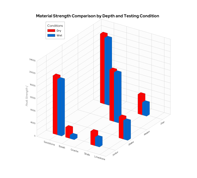
When you’re working with three variables that interact with one another—a 3D bar chart can reveal patterns that a flat chart can’t fully capture.
