Latest Articles
- Jul 1, 2026|Gabbie Rhodes|7 min read
Geoscience projects are built on collaboration, but even the strongest teams can struggle with communication silos. Learn how to overcome them.

Trending articles
- By Golden Software
- By Golden Software
- By Golden Software
- By Gabbie Rhodes
- Jul 1, 2026|Gabbie Rhodes|7 min read
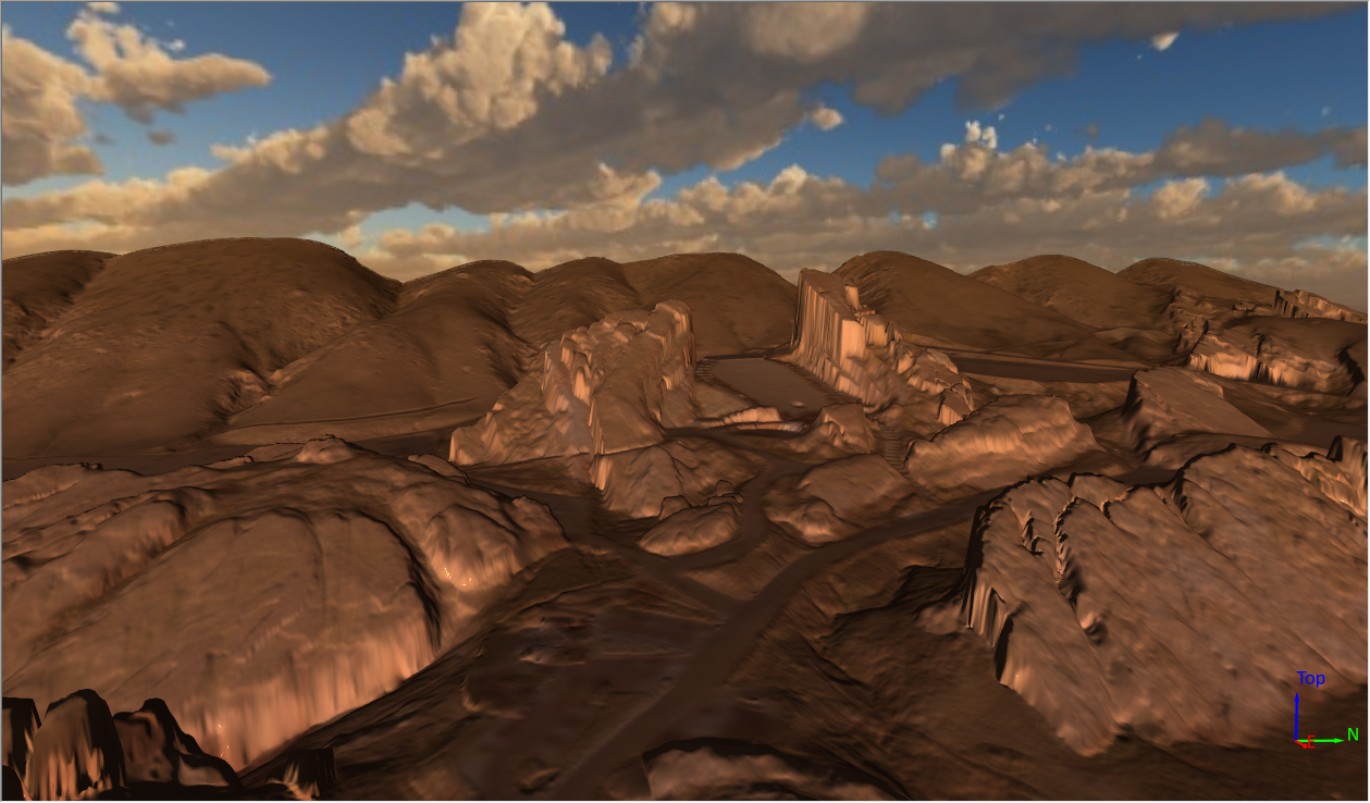
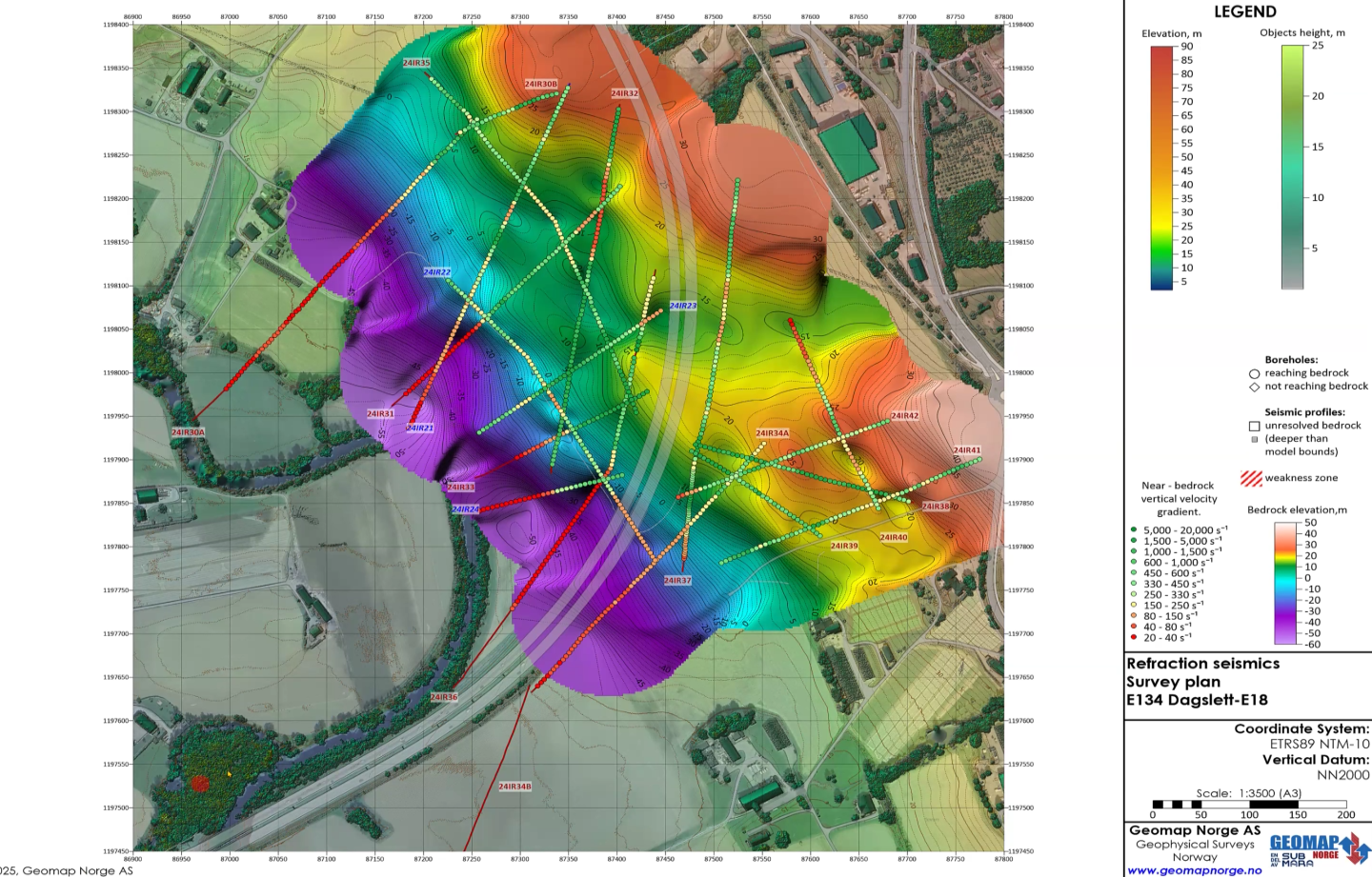
See how 3D visualization transforms geophysical data by connecting profiles with terrain, boreholes, and other datasets for better interpretation.
- Jun 23, 2026|Gabbie Rhodes|10 min read
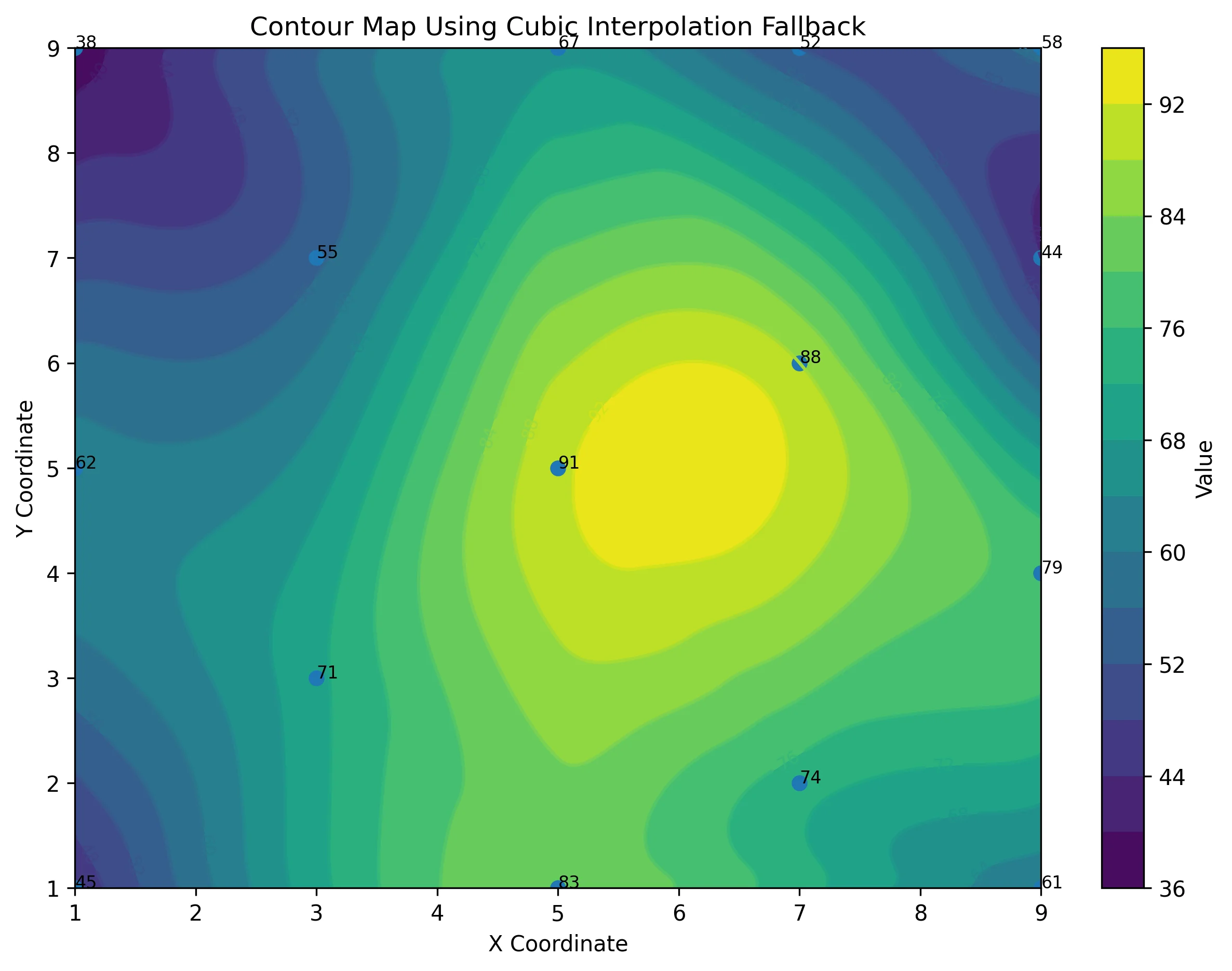
Ever stop and wonder: does AI make mistakes? Before you start using AI tools to create your maps, discover the answer to this key question.
Data Visualization
- Jul 1, 2026|Gabbie Rhodes|7 min
Geoscience projects are built on collaboration, but even the strongest teams can struggle with communication silos. Learn how to overcome them.
- Jun 23, 2026|Gabbie Rhodes|10 min
Ever stop and wonder: does AI make mistakes? Before you start using AI tools to create your maps, discover the answer to this key question.
- Jun 23, 2026|Gabbie Rhodes|7 min
What contributions are women making in STEM? Discover eight examples of women in STEM fields and the meaningful impact they’re making.
- Jun 17, 2026|Gabbie Rhodes|8 min
Both work and family require energy and intentionality. To ensure you approach them effectively, discover tips to balance work and family life.

Spotlights
- Apr 8, 2026|Gabbie Rhodes|5 min read
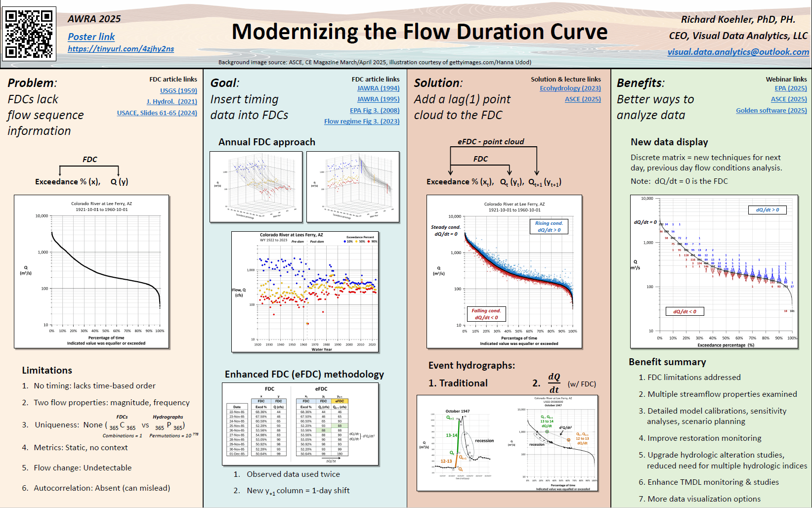
At large conferences, posters compete for attention. Rick Koehler, Ph.D., PH, understands this well and uses information design to stand out.
- Apr 1, 2026|Gabbie Rhodes|6 min read
From surface to subsurface features, Alexey Shulgin translates geophysical measurements into clear insight to drive stakeholders' decision-making.
- Jan 27, 2026|Gabbie Rhodes|5 min read
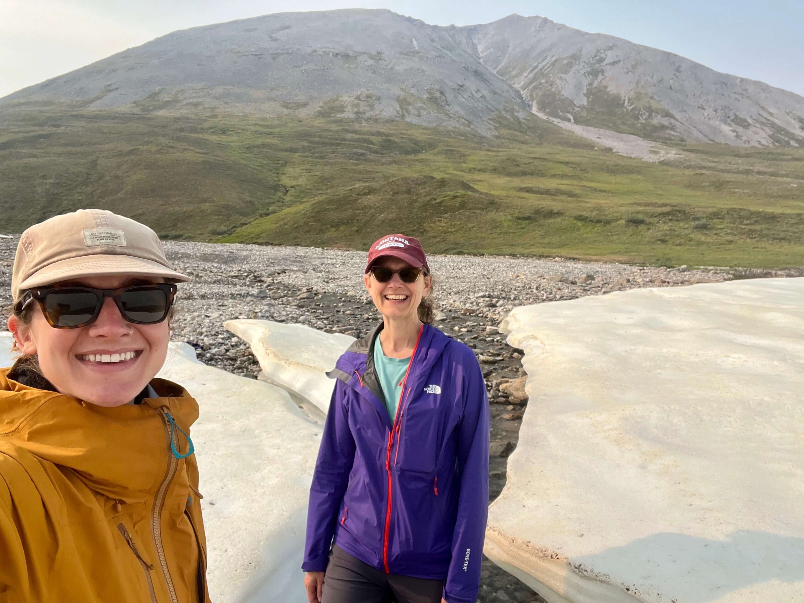
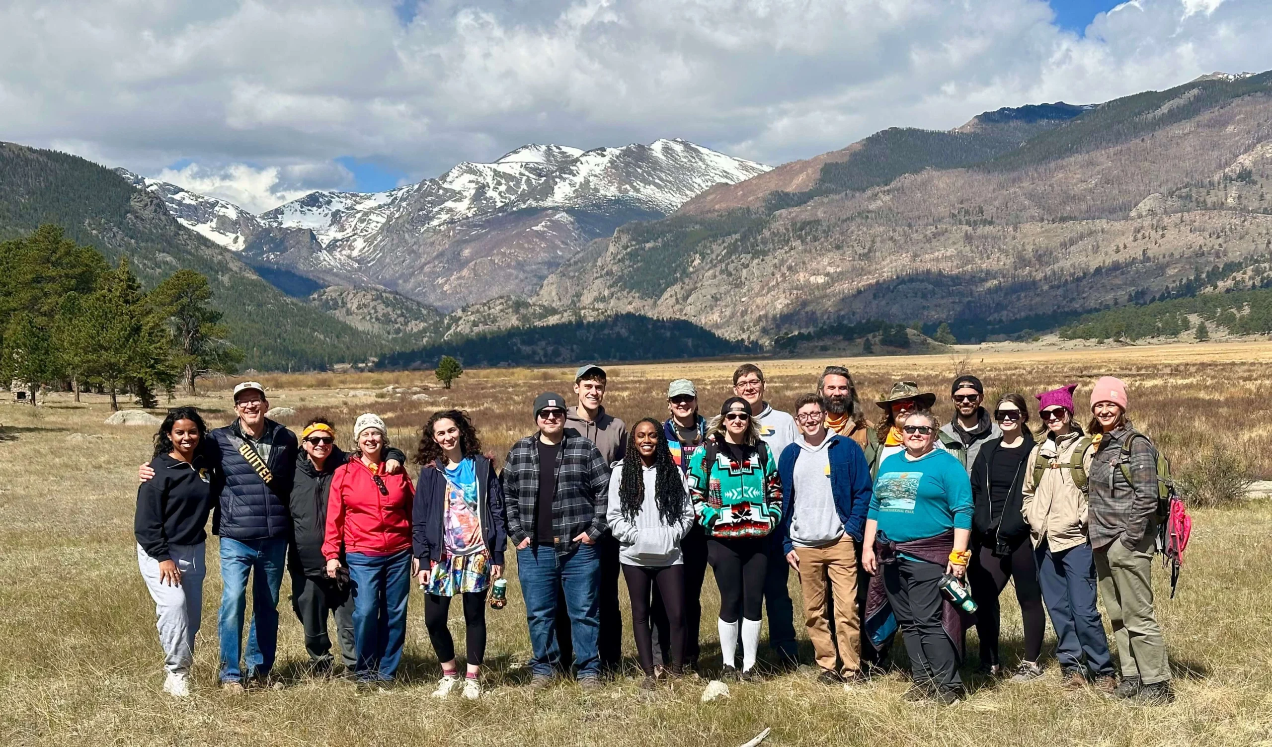
Scientists and students at the University of Montana are helping update an archive that’s empowering engineers, communities, and more.
Announcements
- May 27, 2026|Gabbie Rhodes|5 min read
Dennis Seger has played a key role at Golden Software, and our team took time to celebrate his leadership legacy as he steps into retirement.
- Mar 20, 2026|Gabbie Rhodes|6 min read
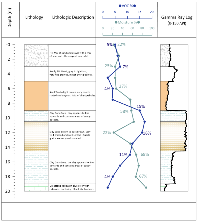
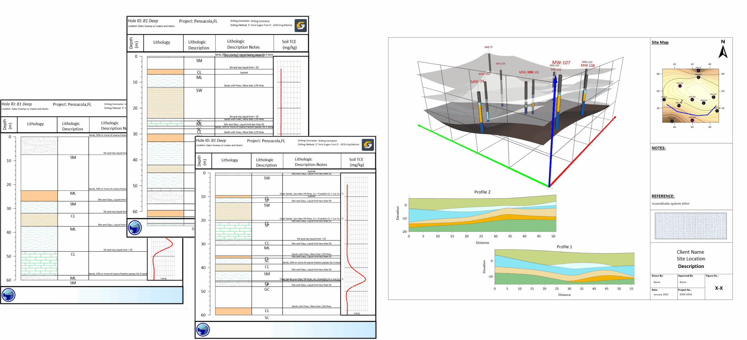
In a recent webinar, Drew Dudley showed how to transform raw borehole data into polished 2D borehole logs and 3D models.
Resource Exploration
- Mar 4, 2026|Gabbie Rhodes|7 min
Designing boreholes can be time consuming and difficult. Fortunately, there's a way to boost efficiency and visual quality when visualizing boreholes.
- Feb 25, 2026|Gabbie Rhodes|3 min
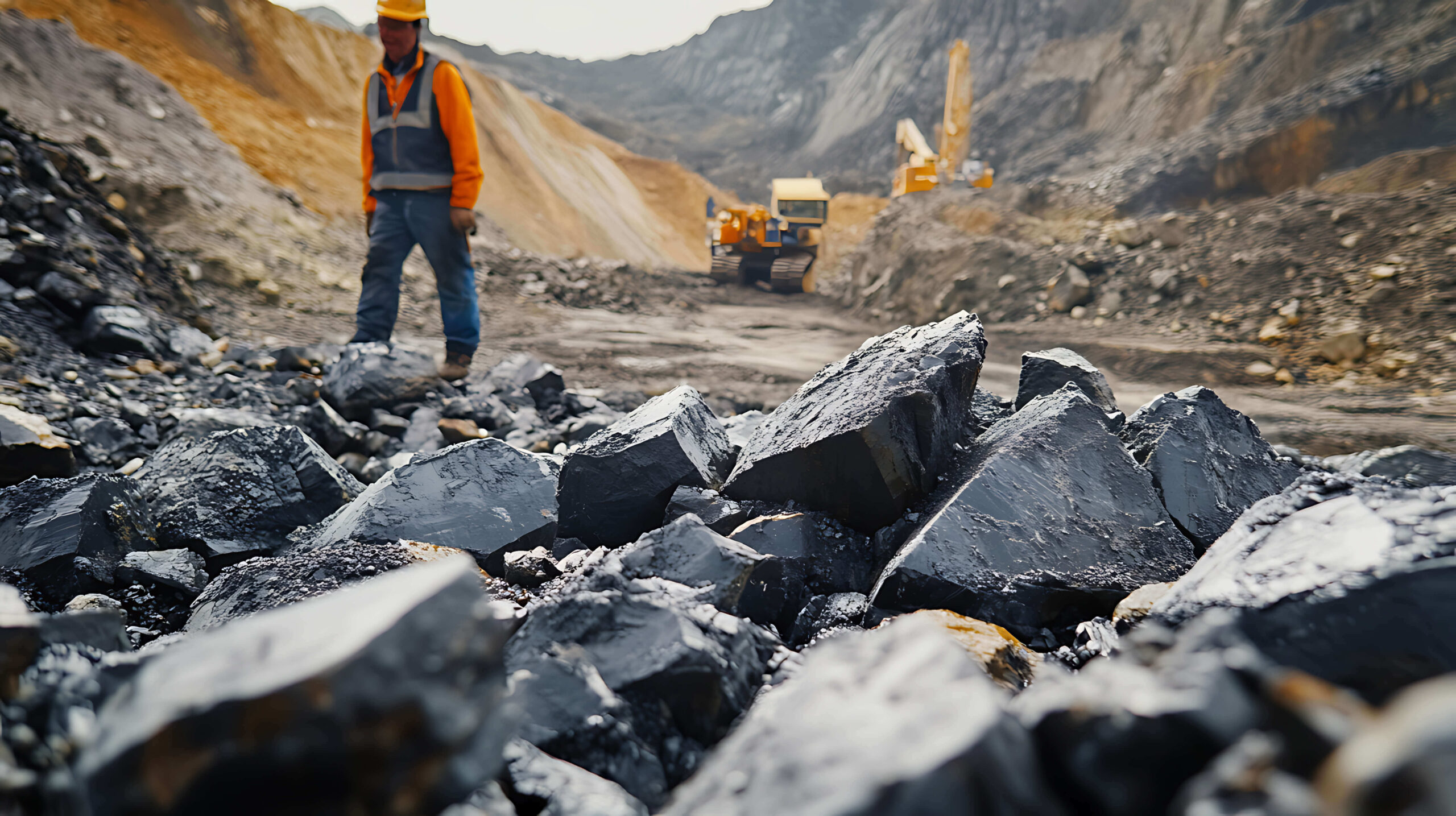
You work with geophysical surveys, core samples, and more. To make sense of it, learn how 3D is innovating resource exploration.
- Dec 4, 2025|Gabbie Rhodes|5 min
John Andersen is a Senior Geologist with O’Chiese Energy LP. He helps guide drilling decisions using subsurface data. Learn how.
- Oct 21, 2025|Gabbie Rhodes|6 min
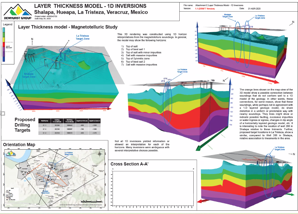
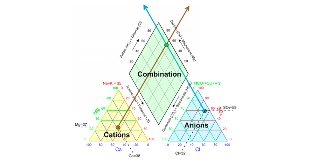
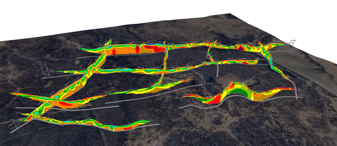
Recently, the Dewhurst Group had to take an untraditional data analysis approach to create a monster map that visualized pure salt in Mexico.