Log Scale vs. Linear Scale: How to Choose the Right Scale
When you’re visualizing data, the scale you choose shapes the perception your audience has of your graph. It directly affects how trends, patterns, and relationships are understood. A subtle shift from one scale to another can make a stable trend look erratic, small variations look dramatic, or flatten important details until they disappear entirely.
That’s why one of the most common choices in scientific data visualization is deciding between a logarithmic (log) scale and a linear scale. Both can be correct in different situations, but they reveal very different perspectives of the same dataset, which is why you need to choose wisely which one to use.
This blog will dive into a log scale vs. a linear scale to help you make that choice confidently.
- What Is a Linear Scale?
- What is a Log Scale?
- Log Scale vs. Linear Scale: What’s the Real Difference?
- When to Use a Linear Scale (With Examples)
- When to Use a Log Scale (With Examples)
- Common Mistakes When Choosing a Log Scale vs. Linear Scale
- Use Both Scales Because Sometimes One View Isn’t Enough
- How to Communicate Your Scale Choice Clearly
- The Scale You Choose Shapes the Insights You See
- FAQ: Log Scale vs Linear Scale
What Is a Linear Scale?
Let’s start by grounding ourselves in the most familiar option: the linear scale.
A linear scale is the most straightforward and familiar way to represent numerical values. On a linear axis, equal distances correspond to equal changes in value. For example, the space between 0 and 10 is the same as the space between 40 and 50. This uniform spacing makes it easy for viewers to judge differences, compare values, and interpret trends at a glance.
Because a linear scale increases in steady, predictable increments, it feels intuitive to most audiences. The axis labels progress in a simple numerical sequence, visual spacing reflects actual differences in value, and the relationship between the numbers and the plot’s geometry is easy to understand. This clarity makes linear scaling a natural starting point for many types of data visualizations.
What is a Log Scale?
If a linear scale shows data in steady, evenly spaced steps, then what does a log scale do differently? A log scale is a nonlinear way of displaying numerical values so that equal distances on the axis represent equal multiplicative changes—often powers of ten—rather than equal absolute changes. In other words, moving the same distance along a log axis might represent going from 1 to 10, 10 to 100, and 100 to 1,000. Each step increases by an order of magnitude, not by a fixed amount.
Because of this structure, a log scale compresses large values and expands smaller ones, allowing data that spans several orders of magnitude to fit neatly into a single plot. However, this also introduces an important constraint: log scales can only display positive values. Zero and negative numbers cannot be represented because logarithms are undefined at those values.
This way of scaling can feel unintuitive at first—especially for audiences accustomed to linear spacing—because the axis tick marks are unevenly spaced and the visual “distance” between values no longer represents straightforward numeric differences. But once your audience understands how the scale transforms value ranges, the underlying patterns become much easier to interpret.
Log Scale vs. Linear Scale: What’s the Real Difference?
So what are the key differences between a log scale vs. a linear scale? Although both scales can display the exact same dataset, they highlight completely different aspects of the story your data is telling.
- On a linear scale, equal spacing represents equal numerical change. The visual emphasis falls on absolute differences—the “physical” gap between two numbers.
- On a log scale, spacing represents multiplicative change. A jump from 10 to 100 occupies the same distance as a jump from 100 to 1,000. Instead of spotlighting absolute values, a log scale emphasizes relative or proportional change.
To see how dramatically this affects interpretation, consider the pattern of how data aligns. The “right” scale choice can actually turn complex curves into straight lines, making them much easier to analyze:
- Exponential Growth (y = abx): If your data grows by a constant percentage (like compound interest or bacterial growth), it will appear as a straight line on a log-linear plot, where the Y-axis is log and the X-axis is linear.
- Power-Law Relationships (y = axk): If your data follows a power law (like the relationship between an earthquake’s frequency and its magnitude), it will appear as a straight line on a log-log plot, where both axes are logarithmic.
When you use the correct scale, the patterns transform: early values that were “squashed” at the bottom of a linear plot become visible and meaningful, and consistent multiplicative patterns that were hidden suddenly become obvious.
The important point is this: The scale you choose doesn’t change your data. It changes how your data is perceived. That’s why scale choice isn’t a stylistic preference but a scientific decision.
When to Use a Linear Scale (With Examples)
Now that the differences between a log scale vs a linear scale are clear, the next question is: When is a linear scale the right choice? A simple way to decide is to look at the questions you’re trying to answer. If you’re asking one of these questions, then a linear scale is usually the best fit:
- How much did something change?
- What are the absolute differences between values?
Linear scales shine when your data changes at a steady, additive pace, where each increment represents the same kind of real-world change. They also work well when your values fall within a relatively narrow range, or when the magnitude of differences (not proportions) is what matters most for interpretation.
Here are a few scenarios where a linear scale is the clear choice:
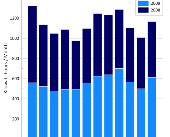
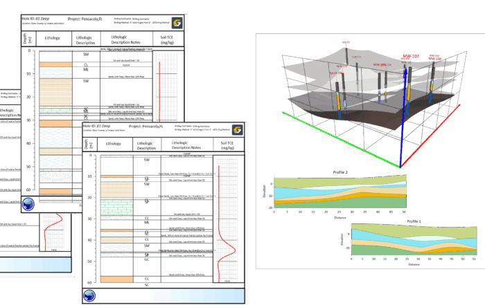
- Depth over time: If you’re plotting drilling progress—say, meters drilled per hour—the absolute change in depth is what matters, and a linear scale displays that cleanly.
- Temperature variations: Temperature typically fluctuates in small, additive increments. A shift from 15°C to 20°C is the same absolute change as 25°C to 30°C, making a linear scale more intuitive.
- Distance or displacement measurements: When tracking ground movement, erosion distances, or survey offsets, you care about exact differences—not order-of-magnitude jumps—so linear scaling provides the necessary clarity.
- Any dataset where the values all live in a tight range: Maybe porosity is changing from 12% to 18%, or water table depth is fluctuating a few meters over a season. A log scale would distort the view unnecessarily.
In these contexts, a linear scale keeps your visualization honest, clear, and easy for stakeholders to interpret because they can instantly see the true size of each change.
When to Use a Log Scale (With Examples)
Just as linear scales help you understand absolute differences, log scales help answer a different set of questions, ones centered around proportion and scale. Specifically, if you’re asking one of these two questions, then a log scale is often the clearer, more meaningful choice:
- How does this change relative to its size?
- How do values compare across several orders of magnitude?
Log scales are especially powerful when your dataset includes extremely small and extremely large numbers together, or when the process you’re studying grows or declines multiplicatively rather than additively.
Here are the most common situations where a log scale is the right fit:
- Values span multiple orders of magnitude: Environmental concentration data often does this. Suppose contaminant measurements range from 0.01 mg/L to 500 mg/L. A linear scale would flatten the low values into an unreadable strip, but a log scale preserves the full pattern.
- Exponential growth or decay: Processes like radionuclide decay, bacterial growth, or certain geochemical reactions behave exponentially. A log scale linearizes these curves, making trends much easier to interpret.
- When relative change matters more than absolute numbers: Let’s use an example for this one. Increasing from 1 to 10 ppm is a tenfold jump. It’s far more meaningful than going from 91 to 100 ppm, even though both changes are “+9.” A log scale visually represents this difference in significance.
- Frequency distributions or particle-size data: Many grain-size or sediment distribution plots are easier to interpret on a log scale because the sizes themselves (e.g., 0.1 mm, 1 mm, 10 mm) are naturally multiplicative.
- Earthquake magnitudes, sound intensity, or pressure measurements: These are classic examples of phenomena that follow a power-law or exponential pattern, which is perfect for a log scale.
In all of these cases, a log scale doesn’t just make the graph look tidy but also reveals behavior that would be invisible or misleading on a linear axis.
Common Mistakes When Choosing a Log Scale vs. Linear Scale
Even with a solid understanding of a log scale vs a linear scale, it’s easy to make mistakes when trying to apply them to real datasets. In fact, here are some of the most common scale-selection mistakes to keep on your radar so you can avoid them.
1. Applying a log scale to data that contains zero or negative values
Logarithms are undefined for zero and negative numbers, which means log scales simply cannot display those points. While analysts sometimes use a “+1” offset to force these values onto the scale, this can distort the mathematical relationships in your data.
If your dataset includes zeros or negatives but still requires compression of large values, consider professional alternatives like a Symmetrical Log (Symlog) scale or an Inverse Hyperbolic Sine (IHS) transformation. These advanced scales handle zero and negative values around the origin while applying logarithmic scaling to the higher magnitudes.

2. Choosing a scale for aesthetic reasons instead of analytical insight
A plot that “looks nicer” isn’t necessarily more truthful. Selecting a scale based solely on visual appeal—rather than the perception your audience will take away—can flatten meaningful variation or exaggerate noise. The right scale should always support accurate interpretation, not just presentation.
3. Misinterpreting slopes or trends on a log scale
Slopes behave differently on log scales. On a linear scale, a steeper line means a faster “additive” rate of change (e.g., more meters per hour). However, on a log scale, the steepness represents a constant rate of growth (a fixed percentage increase).
A straight line on a log scale doesn’t mean the data is increasing by the same amount each year; it means it is increasing by the same proportion each year. Treating log-scale slopes as though they represent linear change is a common analytical error that can lead to incorrect conclusions about the actual speed or impact of a trend.
Use Both Scales Because Sometimes One View Isn’t Enough
While we’ve explained the differences between a log scale vs a linear scale and when to use each, there’s something else we want to make clear: it’s not only okay to use both scales, it’s sometimes the smartest choice. Linear and log scales aren’t competitors; they’re complementary tools that highlight different aspects of the same dataset.
Each scale answers different questions. A linear scale shows how much something changed. A log scale shows how that change compares proportionally or across magnitudes. When you look at your data through both lenses, patterns that were invisible on one scale may suddenly become obvious on the other. A subtle uptick on a linear plot might reveal a clear exponential trend on a log plot. A dramatic spike on a log plot might flatten out on a linear one, confirming that the proportional jump isn’t as impactful in absolute terms.
This is why experienced analysts routinely switch between a log scale and a linear scale when exploring data. Using both scales equips you with a fuller, more accurate understanding of the dataset before you commit to the scale that best supports your analysis or communicates your insights.
How to Communicate Your Scale Choice Clearly
Once you’ve selected the best scale for your data, the next step is helping others understand why that choice makes sense. Below are some best practices that will help your audience understand and trust your decision.
- Label your axes explicitly: Always indicate when a log scale is being used. Clear labeling prevents misinterpretation and ensures viewers immediately recognize the transformation.
- Add a brief explanation for non-technical audiences: A short note—such as “Log scale highlights proportional changes”—helps prevent confusion and keeps everyone aligned on what the graph shows.
- Show both scales when it adds clarity: If different audiences care about different questions, or if both absolute and proportional changes matter, include side-by-side plots to support insight.
- Maintain consistency across related visuals: Using multiple scales without explanation can mislead viewers. Stick to one scale within a set of visuals, or clearly call out when you’ve switched and why.
In short, good communication isn’t just about choosing the right scale; it’s about ensuring everyone understands what they’re looking at and why it matters.
The Scale You Choose Shapes the Insights You See
Deciding between a log scale vs a linear scale is a fundamental part of interpreting your data accurately. The scale you select determines which patterns stand out, which relationships remain hidden, and the perception your audience has about your graph. By knowing what each scale emphasizes, recognizing common mistakes, and giving yourself permission to examine your data through both lenses when necessary, you equip yourself to make interpretations that are clearer, more accurate, and more defensible.
If you found this article helpful and want more practical tips on data visualization, subscribe to our blog so you never miss an update!
FAQ: Log Scale vs Linear Scale
A linear scale displays equal numerical changes as equal visual distances, while a log scale displays equal multiplicative (order-of-magnitude) changes as equal distances. Linear scales emphasize absolute differences; log scales emphasize proportional or relative ones.
Use a linear scale when:
- You care about absolute differences (“How much did this value change?”)
- Your data changes at a steady, additive rate.
- Values fall within a relatively narrow range.
- Your audience needs the most intuitive, straightforward view of the numbers.
Example scenarios include the following: temperature changes, depth measurements, distances, water levels, porosity ranges, or any dataset where values cluster within a tight numeric window.
Use a log scale when:
- Your data spans multiple orders of magnitude.
- The process shows exponential growth or decay.
- Relative change (percent increase or fold-change) matters more than absolute difference.
- You need to reveal patterns hidden on a linear scale.
- Your data has a high dynamic range.
Example scenarios include the following: contaminant concentrations, grain-size distributions, hydraulic conductivity, earthquake magnitudes, frequency distributions, or anything that grows or declines multiplicatively.
Ask yourself what question you’re trying to answer:
- “How much did something change?” → Linear scale
- “How does this change relative to its size?” → Log scale
Choosing a scale is about aligning the visualization with the perception your audience should have when viewing your graph.
No. Log scales cannot represent zero or negative numbers because logarithms are undefined at those values. If your dataset includes these values, you’ll need a different transformation or a linear scale.
Log scales use uneven spacing and multiplicative intervals (1, 10, 100…), which can feel unintuitive if you’re used to linear spacing. Clear labeling and explanations help audiences understand what they’re seeing.
No, the underlying values stay the same. The scale simply changes how patterns appear visually. A poor scale choice can hide meaningful trends or exaggerate unimportant variations.
Because each scale reveals different aspects of the same dataset, it can be helpful to see your data on a log scale vs a linear scale.
Linear scales highlight absolute differences; log scales highlight proportional patterns. Viewing both often uncovers trends or anomalies that would otherwise be missed.
Best practices include:
- Label the axis clearly, especially when using log scaling.
- Explain briefly why the scale was chosen, especially for non-technical audiences.
- Show side-by-side views when both absolute and relative perspectives matter.
- Maintain consistent scaling across related visuals to avoid confusion.
Common mistakes when choosing a scale include the following:
- Applying log scales to data containing zero or negative values
- Choosing scales based on aesthetics rather than analytical clarity
- Misinterpreting slopes on log plots as if they were linear
- Forgetting to clarify that a log scale is being used