How to Visualize Multivariate Earthquake Data for Deeper Insights

An earthquake is rarely defined by a single measurement. Every seismic event generates multiple layers of data that, together, help reveal what occurred beneath the Earth’s surface.
The challenge is that earthquake data rarely exists in a form that’s easy to interpret and communicate. Information about location, magnitude, depth, frequency, and other variables is often spread across multiple visuals. Even when each one is accurate, understanding and sharing the full story requires constantly piecing those views together.
That’s where multivariate visualization comes in.
By bringing multiple dimensions together into a single graph, you can understand and communicate complex relationships more effectively. But how exactly does this happen? Let’s explore how to create multivariate visualizations for earthquake data so you can easily interpret and share the complete picture with stakeholders.
Analyzing Earthquake Data One Variable at a Time Falls Short
First, it’s worth asking: why isn’t it enough to analyze earthquake data one variable at a time? The answer lies in the fact that earthquakes are inherently multivariable events.
Every earthquake has a location, magnitude, depth, time of occurrence, and many other characteristics that work together to determine its overall impact. Looking at each variable separately can certainly provide useful information, but it rarely reveals how those variables interact.
Consider a histogram showing the distribution of earthquake magnitudes. It does an excellent job of answering one question: How strong were the recorded earthquakes? However, it doesn’t reveal where those earthquakes occurred, how deep they originated, or whether they were isolated events or part of a larger seismic sequence. Important context is missing.
The same limitation applies to other single-variable visualizations. A time-series graph may reveal periods of increased seismic activity, while a depth distribution graph shows how earthquakes are distributed beneath the Earth’s surface. Each visualization tells part of the story, but none of them shows how magnitude, depth, location, and timing relate to one another.
Those relationships often make all the difference. For example, two earthquakes may both register a magnitude of 6.0, yet produce drastically different impacts depending on their focal depth. A shallow earthquake concentrates its energy near the surface, generating intense, high-frequency ground shaking directly above the focus. Conversely, a deeper earthquake of the same magnitude must travel farther through the crust to reach the surface; its energy dissipates along the way, arriving weaker directly above the epicenter and producing less severe localized damage, but spreading the seismic energy across a much broader geographic area. Looking at magnitude alone doesn’t reveal these important differences.
The Anatomy of a Multivariate Graph
Visualizing multivariate earthquake data on a single graph is critical for interpreting and communicating the full picture of seismic events. But what does this type of graph even look like?
The answer lies in an XYZC data structure, where each visual property represents a different dimension of the earthquake-related dataset. Rather than displaying one variable at a time, an XYZC data structure can fuse chronological, physical, spatial, and categorical variables into a single plot, transforming raw measurements like location, time, magnitude, or focal depth into one highly intuitive visual narrative.
When using this data structure, you might organize your graph like this:
- X and Y represent the geographic coordinates of each earthquake epicenter, establishing where each seismic event occurred.
- Z or Bubble Size represents earthquake magnitude, with larger bubbles indicating stronger earthquakes.
- C (Color) represents the depth of the earthquake’s focus, with different colors corresponding to shallow or deep events.
By distributing the data across various visual attributes, a single plot provides a holistic view of a seismic event. This eliminates the guesswork of cross-referencing disjointed charts, ensuring critical patterns in the data emerge more naturally.
Putting XYZC Data Into Practice
While understanding the abstract data structure of an XYZC plot is a great foundation, examining a real-world seismic event demonstrates exactly how these dimensions operate in practice.
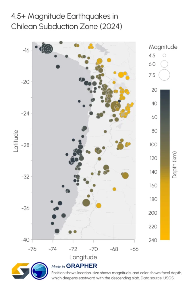
Consider the graph below, which visualizes magnitude 4.5 and greater earthquakes that occurred along the Chilean subduction zone during 2024. It uses an XYZC dataset, where X and Y represent the geographic coordinates of each earthquake epicenter, Bubble Size represents earthquake magnitude, and C represents focal depth through color. Instead of separating these variables into individual graphs, the plot combines them into a single visualization.
At first glance, the graph immediately communicates where earthquakes occurred because each bubble is positioned according to its latitude and longitude. But the additional variables quickly add another layer of insight.
Notice how bubble color gradually changes from darker shades to brighter yellows as you move east across the graph. Because color represents focal depth, this trend reveals that earthquakes become progressively deeper farther inland. This sloping band of ever-deeper quakes is known as the Wadati-Benioff zone, and it directly traces the Nazca Plate descending beneath the South American Plate.
Bubble size adds even more context. Larger bubbles identify higher-magnitude earthquakes, allowing you to quickly distinguish the most powerful events from the many smaller earthquakes occurring throughout the region. Instead of searching through a table of magnitudes, the largest events immediately stand out.
The real power of this graph, however, comes from seeing all four variables interact simultaneously. Rather than asking separate questions such as Where did earthquakes occur?, How large were they?, and How deep were they?, you can answer them all within a single view. Relationships between earthquake location, magnitude, and focal depth become immediately apparent, making it easier to recognize regional seismic patterns and communicate those findings with confidence.
Best Practices for Visualizing Multivariate Earthquake Data
As the Chile subduction zone example demonstrates, a well-designed multivariate graph can communicate a remarkable amount of information at once. But combining multiple variables into a single visualization also introduces a challenge: if the graph becomes too cluttered, the insights can quickly become harder to find than the data itself. To present the most important relationships in a way that’s easy to interpret, here are a few best practices to help you create clear, effective multivariate graphs.
Keep the visualization focused
Every additional visual element competes for the viewer’s attention. While it may be tempting to represent every available metric in your dataset using a chaotic mix of different colors, shapes, symbols, and background layers, doing so instantly increases cognitive load and makes the graph more difficult to interpret.
The goal of an XYZC plot is to streamline complex data, not crowd it. For instance, the Chile graph remains highly scannable precisely because it limits itself to four key dimensions—longitude, latitude, bubble size, and color—leaving other non-essential data variables off the canvas entirely.
Additionally, when possible, avoid unnecessary background graphics, excessive marker styles, or decorative elements that compete with the data itself. The cleaner the visualization, the easier it becomes for stakeholders to recognize meaningful seismic patterns at a single glance.
Choose color palettes that reveal depth clearly
Color is one of the most powerful tools in a multivariate graph, but only when it’s used thoughtfully. Since earthquake depth represents continuous numerical data, perceptually uniform color palettes—such as Viridis or Cividis—are often excellent choices. These palettes transition smoothly across values, making subtle depth differences easy to distinguish.
They also offer another important advantage: they’re designed to remain readable for viewers with color vision deficiencies, helping ensure that technical findings are communicated clearly to a broader audience.
Pro Tip
Don’t waste time manually building accessible color scales! Grapher users can easily expand their palette options by downloading a ready-to-use collection of perceptually uniform colormaps. Check out our latest article, Customizing the Colormap Presets in Grapher, to access the collection and see step-by-step instructions on how to customize and add colormap presets to quickly enhance your visuals.
Temporal Trends and Seasonal Patterns
Environmental conditions in a watershed rarely remain static over time. The relationship between streamflow, temperature, and water quality changes dramatically depending on the season, storm events, or even the time of day.
If temporal data is isolated on separate charts, crucial cyclical relationships are easily missed. For instance, a spike in sediment runoff during spring snowmelt looks completely different on a graph than a spike caused by a sudden summer flash flood, even if the peak flow rates are identical.
Similarly, agricultural fertilizer runoff often peaks during specific planting windows. If you view nutrient concentrations on one calendar plot and river discharge on another, you lose the ability to see how timing and flow volume collide to create high-risk “loading” events.
Design legends that tell the viewer what matters
A multivariate graph communicates several variables at once, so the legend plays a much larger role than it does in a traditional chart.
Rather than simply identifying symbols, an effective legend clearly explains what each visual property represents. In the Chile example, separate guides for bubble size (magnitude) and color (depth) equip viewers to decode both variables immediately without searching through accompanying text.
Targeted annotations and callouts can also strengthen the visualization even further. While the Chile example relies on a clean, sleek presentation, adding concise labels or arrows directly to a plot can draw a stakeholder’s eye immediately to significant features—such as a cluster of high-magnitude events or an unusually deep outlier—without requiring them to hunt for the pattern themselves.
These small design choices help direct attention to the story hidden within the data, making multivariate graphs easier to interpret and more effective when communicating insights to stakeholders.
Bring the Full Story Together
Earthquake data becomes far more valuable when it’s viewed as a complete picture rather than a collection of separate variables. By combining location, magnitude, depth, and other dimensions into a single multivariate graph, you can uncover relationships that are difficult to recognize when each dataset is analyzed independently. The result is a visualization that’s not only easier to interpret but also effective in communicating seismic insights to stakeholders.
Now we’d love to hear from you: How do you want to use multivariate data to analyze or communicate earthquake activity? Leave a comment below and join the conversation.
Recent Articles
- Oct 7, 2026|Gabbie Rhodes|8 min
In the second post of our Visualizing Technical Data series, learn how maps and graphs can showcase your water quality data and uncover insights.
- Oct 7, 2026|Gabbie Rhodes|12 min
Have you ever wondered: what are the causes of a landslide? Discover the answer and how to visualize at-risk areas.
- Sep 29, 2026|Gabbie Rhodes|9 min
When visualizing technical data, a map will reveal certain insights, while a graph will reveal other insights. You need both to get the full picture.
- Sep 29, 2026|Gabbie Rhodes|5 min
Repetition slowing you down? Automation can quicken your high-volume workflow, remove manual steps, and even improve consistency.